Instructions for using Pareto, Histogram and Waterfall charts in Excel 2016
Excel 2016 has improved some new features. Among them, there are 6 new charts that are Waterfall, Histogram, Pareto, Box & Whisker, Treemap and Sunburst.
Table of Contents
Excel 2016 has improved some new features. Among them, there are 6 new charts that are Waterfall, Histogram, Pareto, Box & Whisker, Treemap and Sunburst.
In the following article, Network Administrator will show you how to use 3 charts in Excel 2016, which are Waterfall, Histogram, Pareto.
1. Histogram displays the range of values
Histogram charts in Excel 2016 are similar to normal column charts, but each column will represent the "range" of values (also called a bin) instead of a single value.
Histogram charts used to explore and analyze frequencies in statistical tables, analysis . In addition, the Histogram chart also displays height, weight, distance . results.
1. Open your spreadsheet and select the database. Click Insert => Insert Statistical Chart => Histogram.
Now on the screen, a small chart appears and opens on the Menu Tools / Design Ribbon Menu.
Scroll down to the Design option and select the option that fits your project.
2. Click the + sign icon to edit the elements of the chart, then click on the drawing brush icon to change the style, color and chart design.

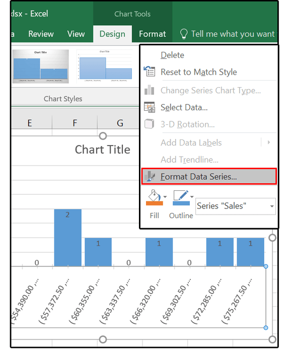
3. Right-click any rectangle on the chart and select Format Data Series .
In the Format Data Series table, click the Series Options option (chart icon).
4. Click on the downward-facing arrow next to the Series Options option and browse the Dropdown menu to determine how to make options. From the list of options, select the Horizontal Category Axis .

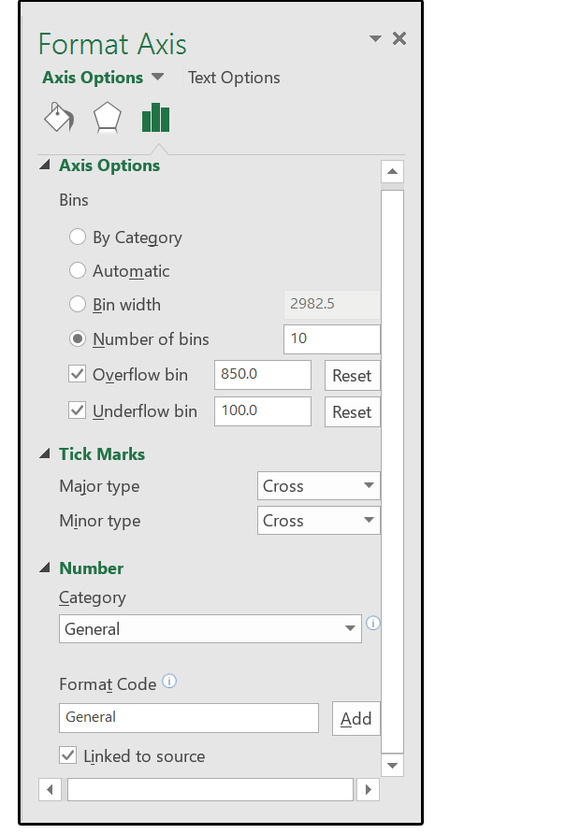
5. Under Axis Options, select Number of Bins and change the value to 10. With Overflow bin, enter the value of 850.0, with Underflow bin enter the value of 100.0.
In the Tick Marks section, select the option you want to see inside or outside the chart either Cross (both inside and outside), or other options.
Then select Number and choose the number format you like in the options list.
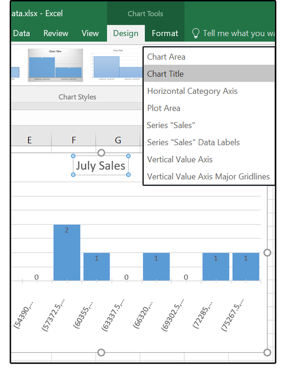
6. Next on the Dropdown Series Options menu, select Chart Title , enter a new title and then adjust the link you want.

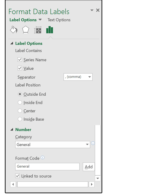
7. Finally from the Dropdown Series Options Menu, select the Sales Data Labels Series , then select Label Options and click the chart icon again.
Check the Series Name and Value boxes to display both values on the chart.
In the Label Position section, you can select Outside End, Inside End, Center or Middle. Then select the numeric format for Data Labels.
2. Pareto chart combines address bar and graph line
Pareto charts use a combination of address bar and graph line. Users can use this chart to analyze frequency data or analyze the causes of certain processes, focusing on analyzing problems or analyzing specific components.
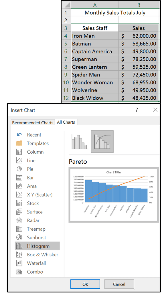
1. Open your spreadsheet, then black out the table and then click Insert => Insert Statistical Chart => Pareto .
Now a chart appears and opens on the Menu Tools / Design Ribbon Menu. Scroll through Design and select an option that fits your project.
2. Click the + sign icon to edit some elements in the chart: Axes, Axes Titles, Chart Title, Data Labels, Gridlines, and Legend. Next click on the brush broom icon to change the chart style, design and color.

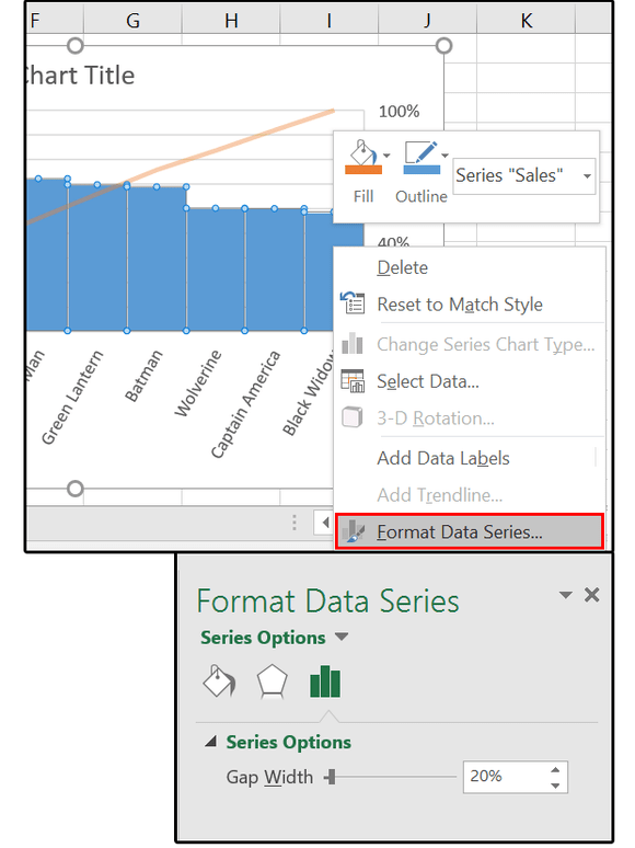
3. Right-click any rectangle on the chart and select Format Data Series. In the Format Data Series table, click to select Series Options (chart icon). Move the slider to change the slot width - the distance between the columns on the chart.
4. Click on the downward-facing arrow next to the Series Options option and browse the Dropdown menu to determine how to make options. From the list of options, select the Horizontal Category Axis.
5. Under Axis Options => Bins , then select By Category .

In the Tick Mark section, select the option you want to see inside or outside the chart either Cross (both inside and outside), or other options.
Then select Number and choose the number format you want from the options list.
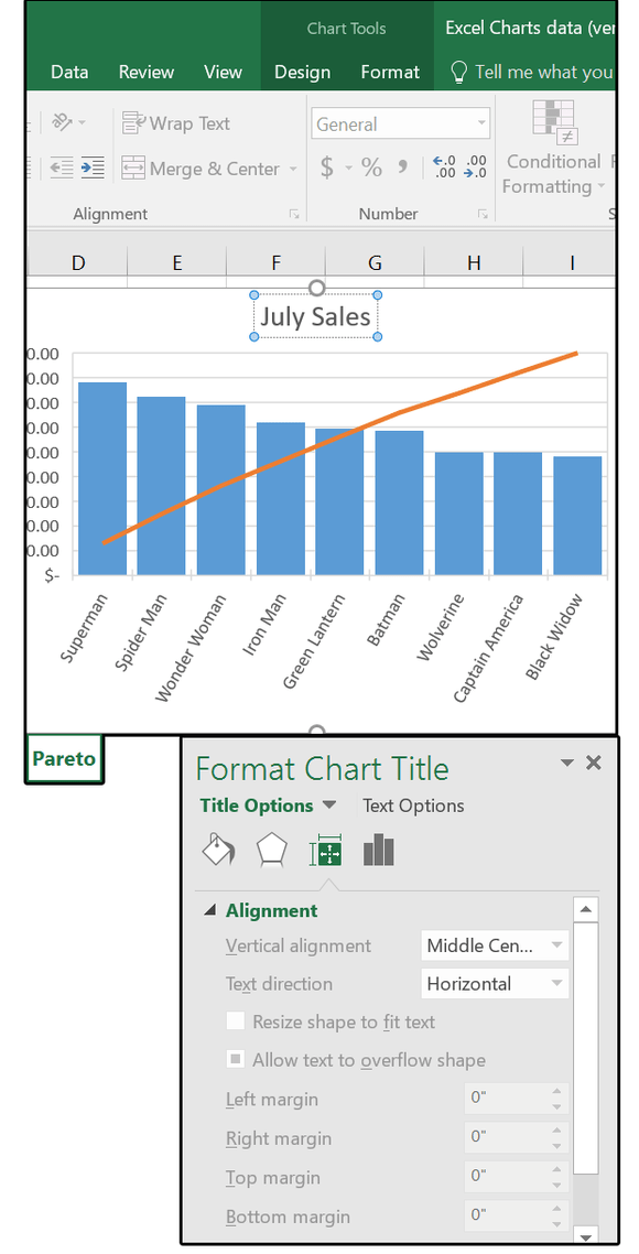
6. Next from the Menu Dropdown Series Options you select Chart Title , enter a new title, then adjust the link you want.
Note:
Now the chart will change. Browse through some of the main options in the Dropdown Series Options Menu, including charts, Plot Areas and Axis settings.
Once done, close the Format Data Series window and you're done.
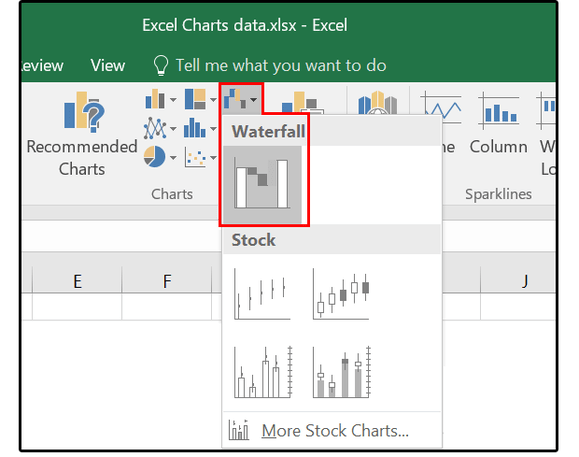
3. Waterfall chart displays trend value
Use Waterfall to display the initial value affected by positive or negative integers. Waterfall or Bridge chart, Flying Bricks and Mario.
1. Open the spreadsheet and select the database. Click Insert => Waterfall. Now a chart appears on Menu Chart Tools / Design Ribbon.
Scroll through the Design option and select a clear move option. Next click on Colors and choose a color palette with bright colors, contrasting colors (to illustrate the best increase, decrease and intermediate values).
2. Click the + sign icon to edit a number of elements on the chart: Axes, Axes Titles, Chart Title, Data Labels, Gridlines, and Legend. Next click on the brush broom icon to change the chart style, design and color.

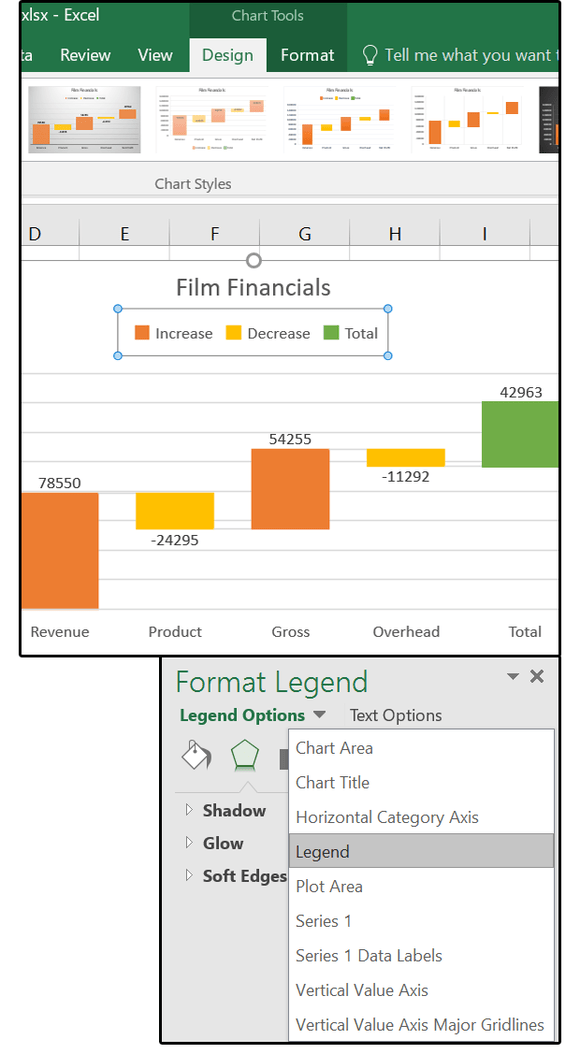
3. Right-click any rectangle on the chart and select Format Data Series. Browse through the options on the board and adjust.
4. Right-click the chart again and select Format Legend => Legend , then enter the text label to make the chart legend.
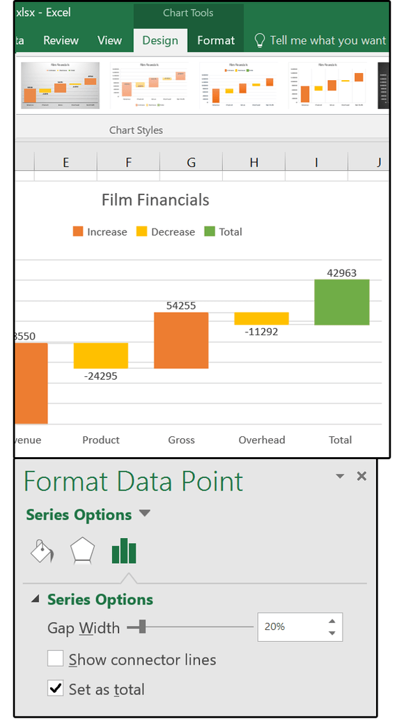
5. Double-click the last data point to open the Format Data Point panel. Here you select Set As Total.
Refer to some of the following articles:
- You want to print text, data in Microsoft Excel. Not as simple as Word or PDF! Read the following article!
- How to change the default save file format in Word, Excel and Powerpoint 2016?
- Hide and show sheets in Excel
Good luck!
Was this article helpful?
Your feedback helps us improve.
Related Articles
 Steps to use Pareto chart in Excel2 minutes read
 Instructions for drawing probability distribution charts in Excel2 minutes read
 Instructions on how to create charts in Excel professional7 minutes read
 10 most exotic waterfalls in the world5 minutes read
 How to draw a map chart on Excel4 minutes read
 How to Create a Histogram in Excel8 minutes read
Reader Comments 0
Sign in with email or Google to join the discussion.