10 best free Google fonts for professional presentations
You can spend hours choosing templates and colors, but if you use inappropriate fonts, the presentation will not produce the expected results.
Typography can make a presentation successful or break it. You can spend hours choosing templates and colors, but if you use inappropriate fonts, the presentation will not produce the expected results.
In a professional environment, it is important to choose fonts that convey seriousness but still show joy. This balance is difficult to achieve. Below, TipsMake.com will introduce you to free Google fonts, perfect for professional presentations.
Perfect Google top font for presentations
- Serif font and Sans-Serif font
- The best free Google fonts for professional presentations
- 1. Playfair Display
- 2. Arvo
- 3. Crimson
- 4. Open Sans
- 5. Lato
- 6. Montserrat
- 7. Merriweather
- 8. Abril Fatface
- 9. Ubuntu
- 10. Raleway
Serif font and Sans-Serif font
Fonts are mainly divided into two categories: serifs and sans-serifs. Serif means 'tail' in Latin. The serif font is the font with the strokes at the end of the letters.Times New Roman is the best example of popular serif fonts.
Sans stands for 'without'. Therefore, sans-serif fonts are non-sharp fonts at the end of the text (eg Helvetica or Arial).
For a professional presentation, it is best to use sans-serif fonts. But some new serif fonts can also work quite well for title slides.
The best free Google fonts for professional presentations
1. Playfair Display
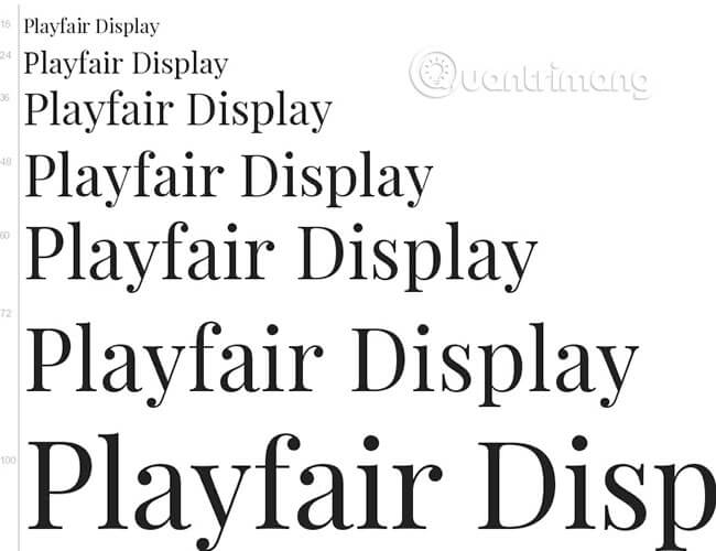
Playfair Display is a delicate serif font. It can be traced back to the Enlightenment Age in Europe in the late 18th century when bold pens were replaced with sharp steel pens. This change gives Playfair a feminine charm, in stark contrast to the boring serif fonts like Times New Roman.
Playfair Display makes a more elegant title text in the presentation; Especially when combined with pastel color backgrounds.
Good match with: Open Sans
2. Arvo
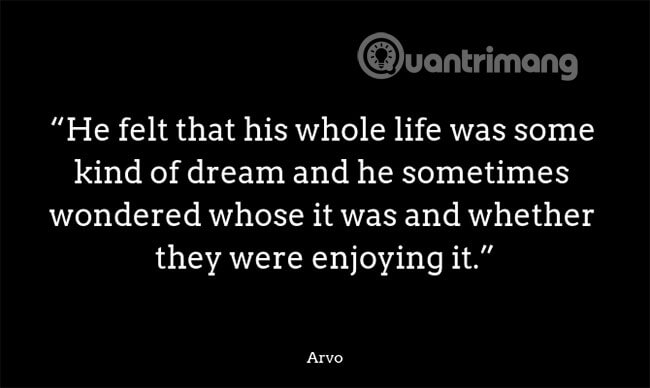
Arvo is a perfectly designed slab-serif font. It has a geometric typeface that combines classic and modern beauty. Arvo Regular is the modern version, the sliver of slab serif, while the Arvo Bold has thicker features and sharp corners.
Arvo Bold works best in large font sizes, like titles for business-related presentations or businesses. When combined with the right colors, Arvo can become a powerful 'weapon'.
Good match with: Lato
3. Crimson
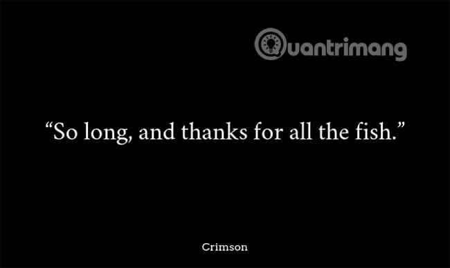
Crimson has a simple beauty, which is not much of a font. If you want to impress your audience with a classic but interesting presentation, consider using Crimson for the titles and subtitles.
Crimson is a sans-serif font, inspired by Garamond fonts. Crimson is a modern version of traditional old-style fonts and designed to look better on the screen and the web. If you're tired of using Times New Roman in a presentation, switch to Crimson.
Good match with: Montserrat
4. Open Sans
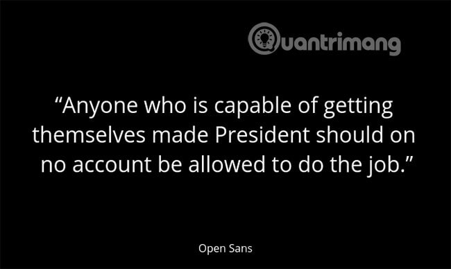
When preparing to make a professional presentation, the first rule is to avoid writing long paragraphs of text. Even a list of bullet points can sometimes make the audience feel bored. But if you need a few lines to explain something or want a long quote as a slide, try using Open Sans.
Open Sans is an open source sans-serif font, a type of Humanist (a term to classify typefaces). Open Sans works well in almost all cases where long paragraphs are needed. Open Sans is an easy-to-read font, even at a small size. The semibold version (typeface with thick but not thick strokes) of this font works well as a title font.
Good match with: Raleway
5. Lato

Lato means summer in Polish. When you look closely at this font, you will be surprised that such a detailed meticulous font is available for free in open source.
Lato was commissioned by a large corporation but then decided to go in a different direction. Therefore, Lato has now been converted into a free font. Fonts look very fun with semicircular details, but still professional. Because Lato is designed to be a flexible font, it can be used for both long paragraphs and title fonts.
Good match with: Open Sans, Raleway
6. Montserrat
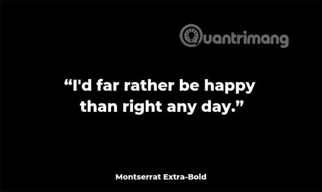
Montserrat is the perfect way to convey youthfulness and forward thinking in a professional presentation. Montserrat is the font you often see on technology startup landing pages. This font is inspired by old posters and signs from the neighborhood of Montserrat in Buenos Aires.
Thanks to its geometric appearance, Montserrat is one of the fonts that combines very well with other sans-serif fonts. For example, Montserrat in Bold will work well with Open Sans and Lato.
Good match with: Open Sans
7. Merriweather
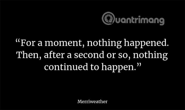
Merriweather is a serif font designed for on-screen reading. Merriweather is a traditional serif font but has more generous features. The letterform itself is condensed, creating more space between letters.
Good combination with: Open Sans, Roboto
8. Abril Fatface

Abril Fatface is part of Abril's family with 18 different typefaces, from the Display version to the Text version. Fatface version is not for everyone. In fact, Abril Fatface is the style choice for people with special 'gu'.
The Abril Fatface has a thick, grainy texture combined with a thin tail. This combination gives this font a unique 'personality' and gives a strong impression when it appears on the screen. Using Abril Fatface, the presentation will create a sense of solemnity and make viewers feel happy. If you want your text to stand out while maintaining a professional look for the presentation, try using Abril Fatface as the title font.
Good match with: Raleway, Open Sans
9. Ubuntu

Consider Ubuntu as its own version of Open Sans. Ubuntu is also an open source sans-serif font, belonging to the humanist type. Canonical, the company behind Ubuntu Linux, has sponsored the development of Ubuntu.
While Open Sans has symmetrical rounded edges, Ubuntu bends from a single edge. This is most evident in letters such as 'u' and 'n'.
Good match with: Open Sans, Raleway
10. Raleway

Raleway offers elegant serif fonts for sans-serif fonts. Raleway has a slim font designed to be used for title sections, making it a perfect choice for title slides.
If you find the regular version somewhat fragile, then you can try the semibold version.
Good match with: Roboto, Merriweather
The most important aspect of designing a presentation is not to do everything. Just choose one or two fonts and use them all over the presentation. The same rule applies to colors and templates. Keep things simple and consistent.
If you feel confused because there are too many different fonts, or can't distinguish serif and sans-serif fonts, just choose a simple sans-serif font like Open Sans and use it.
Besides, try combining different sans-serif and serif fonts, such as 'Crimson' pairing with Lato or Playfair Display with Open Sans and see if the effect they bring meets your needs. is not.
The combination of fonts can be done quickly and easily online. You do not need to download all fonts on the computer. Use websites like Google Fonts and Font Pair to find the perfect font pair for your presentation.
Wish you find the right font and have a successful presentation!
Discover more
Google fonts Crimson Montserrat UbuntuShare by
David PacYou should read it
- How to install and remove fonts on Mac
- Differentiate between TTF and OTF fonts
- How to add fonts to Google Docs
- How to Download Fonts
- How to install and remove fonts on Linux
- The Quiet Details That Make a Sports Betting Platform Feel Reliable
- Instructions on creating toy set images with ChatGPT AI
- How are AI agents changing the journalism industry?
- Share PowerPoint 2016 presentations online
- How to automate Microsoft Word forms with custom fields
- How to use the REPT function on Excel