Table of Contents
This updated guide examines Tips for Using Fonts in Powerpoint Files and organizes the essential facts, background, and practical takeaways in clear American English.
1. Contrast between font and background
The first and most important thing about using fonts in a presentation is to ensure a sharp contrast between the font color on the slide and the slide background color.

2. Use the standard font
Keep abreast of popular fonts for every computer. If using a cool font, but not installed on your computer, it will be replaced with another font and may distort your formatting on the slide.
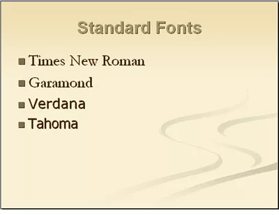
Choose the right font for the presentation. If your presentation is aimed at young children, use a font that looks fun and eye-catching. If the presentation needs solemnity, you should choose a simple font. However, if the selected font is not installed on the presentation computer, you need to make sure to embed the correct font in the article. Although this will increase the file size of the presentation, at least make sure it appears as intended.
3. Consistency makes presentations more beautiful
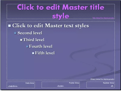
You should only use two or at most three fonts for the entire presentation. Use the master slide before entering text to set the selected font on the slide, helping to avoid changing individual slides.
4. Type of font
Serif is a font with a small tail attached to each word. Times New Roman is an example of this type of font. These fonts are the most readable on slides with lots of text, although there should be no text on slides when making a PowerPoint presentation. Newspapers and magazines use serif fonts for easy reading.
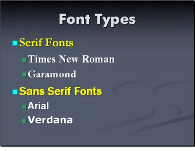
The Sans serif is a simple font that should be used for slide titles. Some types of Sans serif fonts are Arial, Tahoma and Verdana.
5. Do not use all capital letters
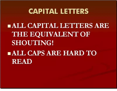
Avoid using all uppercase letters on the slide, even for headlines because it is difficult to read.
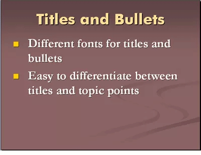
6. Use different fonts for headlines and bullet points
Choose different fonts for headlines and bullet points to make text slides more interesting. Bold text as needed for readability.
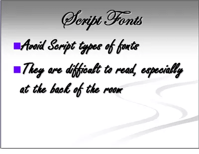
7. Avoid handwritten font styles
Avoid font styles like handwriting because these fonts are hard to read. In the dark room and especially when sitting at the end of the room, the audience could hardly read the words.
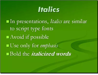
8. Limit the use of italics
Avoid using italic text unless absolutely necessary and then make sure to highlight it to emphasize it. Italics also cause the same problem as handwriting fonts, making it difficult for the audience to read the text on the slide.
9. To font with large sizes
Do not use fonts smaller than 18pt, preferably 24pt as the minimum font. Larger fonts not only fill the slide, leave little space, but also limit text on them. Too many words on the slide show you're new to the presentation.
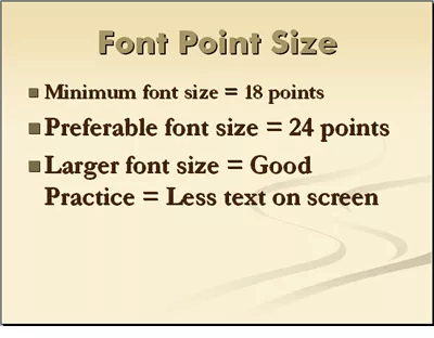
Note: Not all font sizes are the same. The 24pt font is a good fit for Arial but small for Times New Roman.
10. Use the text blurring feature
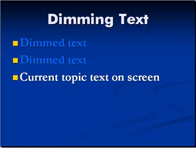
Use the text blurring feature for bullet points. This helps the audience to focus on the issues currently presenting.
I wish you successful implementation!
FAQ
What is Tips for Using Fonts in Powerpoint Files about?
It provides a structured overview of tips for using powerpoint fonts, explains the main context, and highlights practical takeaways for readers.
Why does this topic matter?
Understanding the main concepts helps readers evaluate the issue, avoid common mistakes, and make better-informed decisions.
How should readers use this information?
Use the guidance as a practical starting point, confirm details that may have changed, and follow current product, safety, or security recommendations.
Related Articles
 How to Installing Default Fonts in Word, Excel and4 minutes read
 Tips to Reduce the Size of Powerpoint Files Should Be Known11 minutes read
 How to Convert PowerPoint Files to PDF, Word6 minutes read
 PowerPoint 2019 (Part 6): Applying Themes: Explained5 minutes read
 How to Embed Fonts in PowerPoint So That They Don't Have Font Errors When3 minutes read
 How to Convert PDF Files to PowerPoint: Convert PDF to PowerPoint7 minutes read
Reader Comments 0
Sign in with email or Google to join the discussion.