Max-width, maximum element width in CSS
Width and max properties: width defines the width of the element.
Width and max properties: width defines the width of the element.
As mentioned earlier, the block element always takes up the full width (pull from the left to the right).Setting the width by the width property for the block element will prevent it from stretching to the outer edge.You can then set the margin automatically, centering the element horizontally.The element will only occupy the predefined width, the rest will be divided equally for the two margins.
Note: When the window width is smaller than the element, the browser adds a horizontal scroll bar to the page.In this case, max-width should be used.This just makes the browser easier to handle when the window is too small, which is also important on small screen devices.
Here is an example of how to use the above two width and max-width features.
 div.ex1 {
  width :  500px ;
  margin :  auto ;
  border :  3px solid #73AD21 ;
 }

 div.ex2 {
  max-width :  500px ;
  margin :  auto ;
  border :  3px solid #73AD21 ;
 }
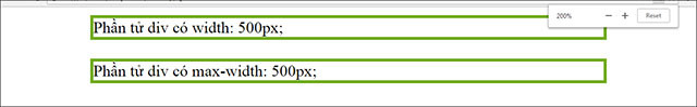
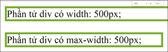
Change the browser window width to see the difference
Previous lesson: Display element in CSS
The following article: Location of elements in CSS
Was this article helpful?
Your feedback helps us improve.


Reader Comments 0
Sign in with email or Google to join the discussion.