Height and width in CSS
Height and width properties are used to set the height and width of elements in CSS. They can get the following values:
Set height and width in CSS
height and width properties are used to set the height and width of elements in CSS. They can get the following values:
- auto - is the default mode in which the browser calculates the height and width
- length - value in px, cm .
- percent (%) - the value in percent
 div {
  height: 200px;
  width: 50%;
  background-color: powderblue;
 }

 div {
  height: 100px;
  width: 500px;
  background-color: powderblue;
 }

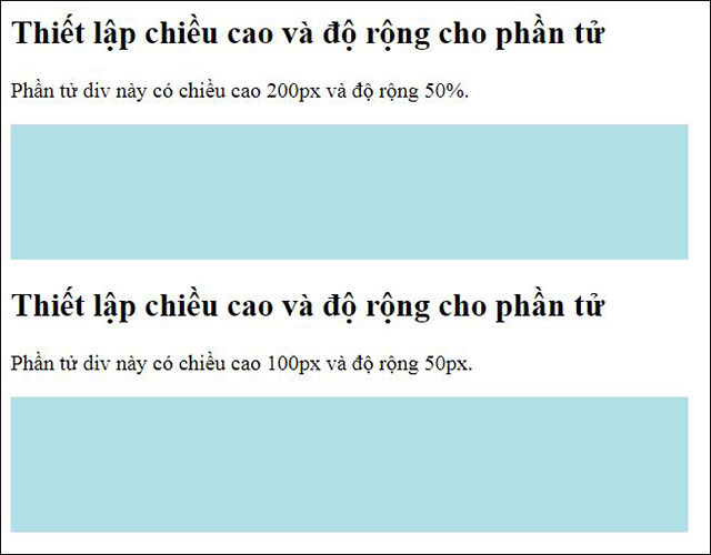
The image displayed on the browser of the above two examples
Note: height and width properties do not include padding, borders, and margins. They will determine the height / width of the area inside the element's padding, border, and margin.
Max-width setting
The max-width used to select the maximum width for the element, can use the values:
- length - length in px, cm .
- percen (%) - percent
- No - this is the default mode, meaning there is no maximum limit
Possible problems with the card
above is when the browser window is smaller than the element width (500px), the browser will add a vertical scroll bar to the rang. If using max-width, the browser will handle it better when the window is small.
Note: max-width will override the width.
The example below shows the element
has a height of 100px and a maximum width of 500px.
 div {
  max-width: 500px;
  height: 100px;
  background-color: powderblue;
 }
Previous article: Padding in CSS
The following article: Box Model in CSS
Discover more
CSS height css width css CSS layout CSS element widthShare by
Samuel DanielYou should read it
- Change the width of columns and the height of rows in Excel
- Complete tutorial of Excel 2016 (Part 6): Change the size of columns, rows and cells
- How to change the height or width of the Taskbar on Windows 10
- Simple calculation to know how high your child will be
- CSS Selector in jQuery
- The Quiet Details That Make a Sports Betting Platform Feel Reliable
- Instructions on creating toy set images with ChatGPT AI
- How are AI agents changing the journalism industry?
- Box Model (Box Model) in CSS
- Outline in CSS
- Text - Text in CSS