Master CSS Flexbox in just 5 minutes
Invite the Administrator to learn the article of mastering CSS Flexbox in just 5 minutes below!
Table of Contents
- Top 5 popular CSS Framework that you should keep in mind
- 5 free online HTML editing tools that test the best code
- 13 skills needed to become Frontend Developer
In this article, you will learn the basics of CSS Flexbox , which is a must-have skill for website developers and designers in the last few years. Invite the Administrator to learn the article of mastering CSS Flexbox in just 5 minutes below!

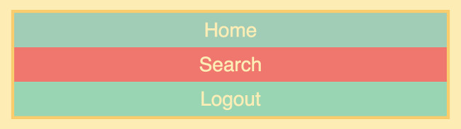
We will use navbar as an example, because this is a typical case for Flexbox. This will introduce you to the most used properties of the module, while eliminating unimportant features.
First Flexbox layout
The two main components of the Flexbox layout are the container and the items .
This is the HTML for our example, containing a container with three items:
Before turning them into Flexbox layouts, the elements will be stacked as follows:
I created a little style for it, but that doesn't affect Flexbox.
To turn it into a Flexbox layout, we just need to supply the following CSS attribute container:
 .container {
  display: flex;
 }
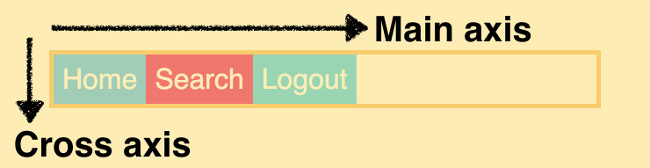
This will automatically sort items according to the horizontal axis.

If you want to check the actual code, you can access the Scrimba playground (https://scrimba.com/c/c3zpnuB).
Now rearrange these items a bit.
Justify-content and Align-item
Justify-content and align-item are two CSS properties that help us distribute items in the container. They control how items are positioned along the main axis and cross axis .
In this case (not always), the horizontal main axis and vertical cross axis:
In this article, we only look at justify-content , as I see it being used more than align-items . However, in the upcoming course, I will pass both specific properties.
Focus all the items along the main axis using justify-content :
 .container {
  display: flex;
  justify-content: center;
 }

Or maybe set it to space-between , there will be more space between items like:
 .container {
  display: flex;
  justify-content: space-between;
 }
Here are the values you can set for justify-content:
- flex-start ( default )
- flex-end
- center
- space-between
- space-around
- space-evenly
You should learn about these values and see how they show up on the page. That will help you understand the concept correctly.
Single item control
We can control individual items. Suppose we want to keep the first two items on the left and move the logout button to the right.
To do this, we will use the old technique to set the auto margin.
 .logout {
  margin-left: auto;
 }

If you want both the search and logout items to be pushed to the right, simply add margin-left instead of the search entry.
 .search {
  margin-left: auto;
 }
It will push the search item to the right, again you will push the logout item as shown:

Flex properties
Up to now, we have only fixed-width entries. But what if we want to display responsive? To do this, we need to have an attribute called flex . This makes it much easier than the old way of using percentages.
Simply aim all the items and give them a flex value of 1 .
 .container > div {
  flex: 1;
 }

As you can see, it extends the items to fill the entire container.
In many cases, you may want to select one of the items to open more widths and therefore, only put one if they have flexible width. For example, we can make the search item have more space:
 .search {
  flex: 1;
 }

Before the end of the article, I want to tell you that flex properties are an abbreviated feature from three attributes: flex-grow , flex-shrink and flex-basis .
Author: Per Harald Borgen
Refer to some more articles:
- Beginners of computer programming need to focus on what?
- 9 reasons you should equip a little knowledge of HTML and CSS
- Do you know the 15 hottest programming languages on this GitHub?
Having fun!
Was this article helpful?
Your feedback helps us improve.
Related Articles
 Use the Flexbox page layout in CSS15 minutes read
 Coin Master gameplay tips and tricks you absolutely must know.11 minutes read
 How to use Clean Master to clean up, speed up Windows6 minutes read
 What is the Master Partition Table?4 minutes read
 Link to download Typing Master 10.1.1.8496 minutes read
 EASEUS Partition Master - Download the latest EASEUS Partition Master2 minutes read
Reader Comments 0
Sign in with email or Google to join the discussion.