How to create a grid chart on MathType
Grid charts are very commonly used in Math and you can show right on MathType to import into Word.
Table of Contents
MathType tool not only supports creating expressions and mathematical equations, but also helps you draw grid graphs and numbers. These are the types of charts that often appear in Math. After drawing diagrams on MathType, users can immediately enter content into Word easily. Compared to Word that can only display expressions with simple characters, MathType supports importing more advanced content. The following article will guide you how to draw grid graphs on MathType.
- How to create charts, graphs in Excel
Instructions for inserting, drawing and creating charts in Word 2007- Instructions for using Pareto, Histogram and Waterfall charts in Excel 2016
How to create a grid chart on MathType
Step 1:
At MathType interface click on Format and then select Define Spacing .

Step 2:
A new table interface appears, change the size at Line Spacing to 100% .

Continue dragging down the Operator Spacing section to 1% . Finally click OK to save the changes.

Step 3:
Go back to the MathType interface and click Format and select Align Center .
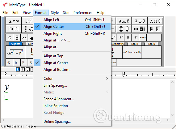
Next, type Y and press Enter. Click the arrow upwards on Up Arrow .

Step 4:
Press Enter down the line and then type X and select the arrow on the left Left Arrow .

Step 5:
Next in the icon bar on MathType we find the icon section with small squares, then select the grid chart in the list.

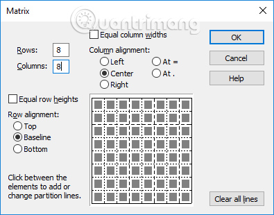
Step 6:
In the new Matrix interface, select Rows and Columns as 8 . Click next to the middle of the cells to create a dashed line for the grid chart . You click on the white space to change the type of dashed lines you want to use
Step 7:
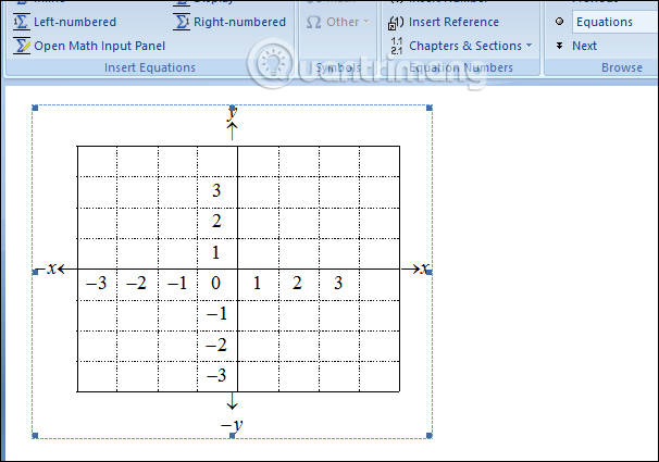
The grid chart will display on MathType as shown below.

Next click the mouse to the right of the chart and insert the arrow to the right of arrow Rightwadrs .
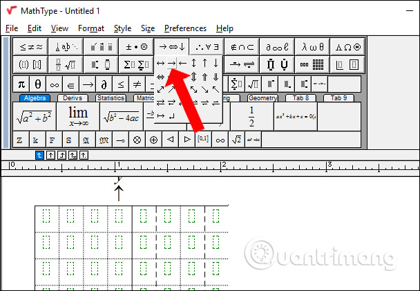
Then enter X in the arrow and press Enter. You continue with the Y symbol below. This is the positive and negative part for the chart axis.
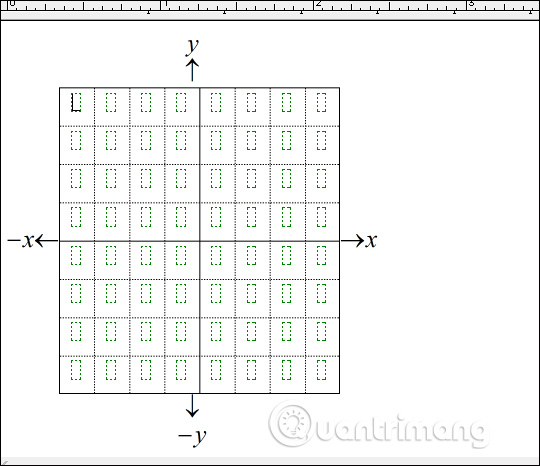
Step 8:
Finally, you enter the number on the axes in the grid chart and export to Word will be a grid chart as shown below.
Thus users have finished performing grid graphs on MathType and then entering Word content. We continue to edit the grid chart content in MathType to better align it into Word.
See more:
- How to create shortcuts on MathType
- How to write math formulas on Word with MathType
- How to use MathType to write math formulas
I wish you all success!
Was this article helpful?
Your feedback helps us improve.
Related Articles
 MathType - Download MathType here5 minutes read
 MathType keyboard shortcuts - All MathType keyboard shortcuts you need to know1 minutes read
 Lesson 38: Grid Systems from Stacked to Horizontal in Bootstrap 53 minutes read
 Lesson 41: Grid Medium in Bootstrap 57 minutes read
 How to create a grid in Photoshop4 minutes read
 How to create shortcuts on MathType4 minutes read
Reader Comments 0
Sign in with email or Google to join the discussion.