How to Choose Fonts
Sure, you can choose a font simply by clicking the drop-down menu on your word processor and picking the style that catches your eye. However, you should think of choosing fonts like choosing outfits. Just as your clothing choices make a....
Method 1 of 4:
Selecting Fonts for Your Brand
-
 Choose branding fonts based on first impressions. Think of fonts like you do clothing—tuxedos and ballgowns make a different impression than worn-in jeans and beat-up sneakers, and different fonts likewise make different impressions. When you're looking at a selection of fonts, think about the immediate impression each one makes on you, and consider the likely impression each would make on your intended audience. Then, ask yourself if this is the impression you want your text to make.[1]
- Some well-known fonts have earned general reputations—Helvetica is clear but a bit dull, Garamond is traditional but maybe too old-fashioned, Times New Roman is a safe choice but quite generic. However, it's really up to you do decide what type of impression each font makes in terms of how you intend to use it.
- Just like with clothing, some people can pull off using Verdana font, while others can't—and very few can pull off using Comic Sans!
-
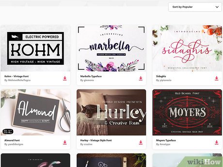
 Use a font 'family' with several variations for an overall branding strategy. If you're picking a font for a one-time effort—typing a letter to a friend, etc.—you can choose pretty much any font that makes the right impression. However, if you're selecting a font for ongoing use—for instance, as part of a branding strategy for your small business—choose one that has a large 'family' of slight variations suited to different purposes.[2]
- That way, you can use the same font family across your entire brand, but utilize the variations within the family for signage, flyers, logos, and so on.
- In Google Docs, for example, both Montserrat and Merriweather fonts offer a lot of variations in letter thickness and other factors.
-
 Aim for either correspondence or contrast when using multiple fonts. If your intended use calls for multiple fonts, they should be either similar-but-distinguishable (correspondence) or appealingly different (contrast). Don't use two fonts that are so similar that your reader gets caught up trying to figure out if they're the same or different.[3]
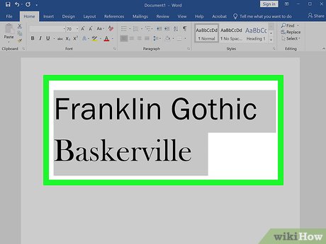
- For example in Microsoft Word, Franklin Gothic and Baskerville correspond nicely, while Gill Sans and Garamond make an appealing contrast in fonts.[4]
-
 Break the 'rules' of using fonts as you see fit. If you read enough webpages, you'll come across several 'rules' for using fonts—for example, that you should use as few fonts as necessary, and that you should never use more than three fonts.[5] However, most font-lovers agree that these should be treated more as recommendations than hard-and-fast rules. If using four or five fonts makes the impression you're seeking, give it a try!
- At the end of the day, choosing fonts is both an art and a science. So follow the rules ('science') except when it feels right to you to ignore them ('art').
Method 2 of 4:
Picking Fonts to Use on Signage
-
 Emphasize a font's readability and the impression it makes on signage. Whether you're posting flyers on telephone poles or designing a highway billboard, easy readability is essential on signage. Fortunately, once you get above 16-point font sizes, most serif and sans serif fonts are easy to read. From there, narrow your font choices to those that make the first impression you're seeking.[6]
- So-called 'slab serif' fonts like Courier, which have a somewhat blocky appearance that can project a slightly softened degree of authority, are very readable at sizes from 16-point to 24-point. This might be a good choice for making your sign feel important but not domineering or threatening.
-
 Use 'display' fonts sparingly for maximum impact. As the name indicates, display fonts are meant for display purposes—for instance, to set apart a title or other very brief portion of text. They're good at catching the eye, but aren't appropriate for widespread use, especially in longer strings of text.[7]
- Syncopate is an example of a display font in Google Docs. It might, for instance, make a good header font for your restaurant menu, but readability would be an issue if you used it when describing individual menu items.
-
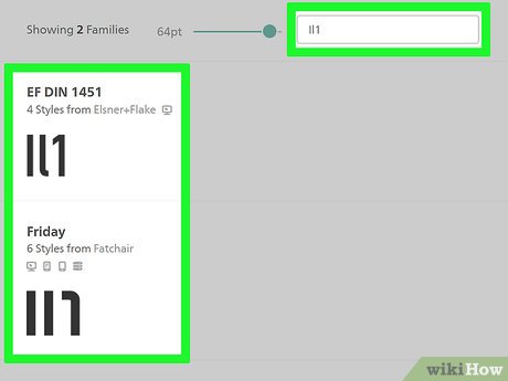 Do the I/l/1 test to limit confusion on signage. For this test of readability, type in a capital 'I,' a lowercase 'l', and the number '1' side-by-side with your chosen font and size. If the font does not make it easy to distinguish among the three, your text may be challenging to read, especially on signage or if you're using both letters and numbers in the text.[8]
- For example, in Montserrat font the capital 'I' and lowercase 'l' are practically indistinguishable, while in Lora the lowercase 'l' and number '1' look very similar.
Method 3 of 4:
Settling on Fonts for Documents and Online Text
-
 Ask if there are any font requirements or recommendations for your document/text. If you're writing paper for a class, the instructor may require certain fonts (e.g., 12-point Times New Roman) or ban certain types (e.g., no Comic Sans). If you aren't given clear guidance, consider asking your instructor, boss, advisor, etc., if they have any font preferences based on the nature of the work being created.
- Even if you are given free reign to choose whatever font you like, always keep in mind the impression you might make on your audience. Your college professor may not be enthused by your use of five fonts in a short essay, and using Lobster font on your c.v. probably won't impress a job recruiter.
-
 Use serif fonts for long text blocks and printed text. Serif fonts, which have 'tails' or 'feet' at the tips of the letters, are generally considered to be more readable over longer blocks of text. The tails/feet create a connective flow between the letters, hinting at cursive writing while remaining easily decipherable.[9]
- Serif fonts also give a classic appearance and easy readability to printed pages, no matter the length of the text blocks.
- However, serif fonts become less readable at smaller sizes, below around 12-point.
- Garamond, Times New Roman, and Georgia are all examples of serif fonts.
-
 Choose sans serif fonts for online text and small text sizes. Sans serif fonts lack the tails/feet of serifs, which give them a cleaner, simpler look. This makes them more readable in smaller fonts (12-point or less), especially on computer, smartphone, or tablet screens.[10]
- The tails/feet of serif fonts don't always show up well on screens, and may become distracting, so stick with sans serifs for your lengthy blog posts.
- Sans serif fonts include Helvetica, Verdana, and Arial, among many others.
-
 Check the x-height differential for smaller text sizes. The 'x-height' refers to the vertical height of lowercase letters in the font, and is traditionally based on the height of the lowercase 'x.' Fonts with a lower 'x-height,' which results in a greater differential in the vertical sizes of capital and lowercase letters, are usually easier to read. This is particularly true for smaller text sizes (for instance, 10-point or lower).[11]
- For example, while they share several similarities as sans serif fonts, Gill Sans has a much lower x-height (and therefore greater difference between lowercase and uppercase) than Avant Garde.[12]
Method 4 of 4:
Identifying Font Categories and Terms
-
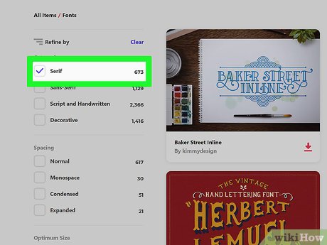
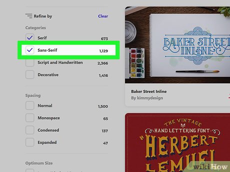
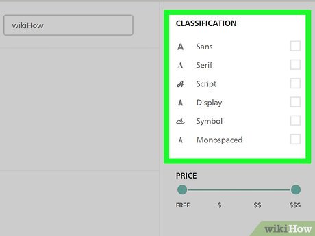 Categorize the four major font types based on appearance. There are many ways to group fonts, but it's common to ascribe each font to one of four broad categories. These include serif, sans serif, script, and display fonts.[13]
- Serif fonts offer a traditional look with their 'feet' or 'tails' that protrude from the ends of the letters. Georgia is a common example.
- Sans serif fonts lack feet/tails and appear more streamlined. Arial is a typical sans serif font.
- Script fonts are meant to resemble, to some degree, cursive handwriting. Corsiva and Pacifico are both script fonts.
- Display fonts are intended to 'jump off the page' in limited use. Syncopate is a good example.
-
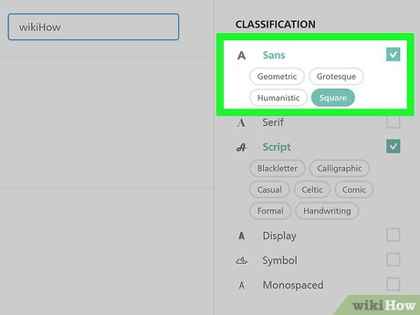 Break up serif and sans serif fonts into five basic types. While display and script fonts have more niche uses, serif and sans serif fonts are by far the most commonly used when creating text in both printed and online form. Serif and sans serif fonts can, in turn, be broken down into five primary categories:[14]
- Geometric Sans: these are clean, useful sans serif fonts that some may describe as a bit boring. Helvetica is a notable example.
- Humanist Sans: these have a bit more handwriting influence than geometric sans fonts, but some say this gives them a 'fake' aspect. Vedana is an example.
- Old Style: these are the classic, traditional serif fonts, which some people deride as too old-fashioned. Garamond is a well-known example.
- Transitional/Modern: these serif fonts put a more modern spin on the classics, but some seem them as blandly trapped in between classic and modern. Times New Roman is a famous example.
- Slab Serif: these fonts have a blocky appearance that some see as authoritative, but others view as too conspicuous. Courier is a good example.
-
 Don't get caught up in the difference between 'font' and 'typeface.' Technically speaking, a 'typeface' denotes a particular design of letters, numbers, etc., while a 'font' is the combination of a particular typeface, particular size, and particular 'weight' (bold, italics, etc.). This means "Arial" is a typeface, while "Arial 12-point bold" is a font. However, unless you're talking to a graphic designer, the terms are practically interchangeable.[15]
- The difference was important when individually-cut blocks were set individually for printing, but it's not such a big deal when you're just working with a drop-down menu or two.