 Home
Home
 Wifi Tips
 Fix Computer
 Windows 10
 Windows 11
 Artificial Intelligence
 Space Science
 Strange story
Transition transition effect in CSS
Transition properties in CSS are widely used in web design to create beautiful transition effects on websites easily.
Transition properties in CSS are widely used in web design to create beautiful transition effects on websites easily.

Transition works by changing the attribute value smoothly from one value to another in a certain time period. Commonly used parameters:
- transition-delay: the time interval for each transition effect.
- transition-duration: the duration of the transition.
- transition-property: attribute to convert.
- transition-timing-function: conversion speed occurs.
How to use Transition in CSS
To create a Transition transition effect, you must specify at least two things :
- CSS properties want to add effects
- Duration of conversion (duration).
Note: If the duration is not specified, the conversion will not be smooth and smooth because the default value is 0.
Change the value of an attribute
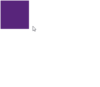
Example: Element
 div {
  width: 100px;
  height: 100px;
  background: purple;
  -webkit-transition: width 2s; /* Safari */
  transition: width 2s;
 }
The transition effect will take place when the width attribute is changed in value.
 div:hover {
  width: 300px;
 }

Full code:
Transition properties
Hover over the element to see the transition effect:
Note : When the cursor moves away from the element, it will gradually change back to the original type.
Change the value of multiple attributes
Example: Add transition effects for both width and height attributes, with a duration of 2 seconds for width and 4 seconds for height.
 div {
  -webkit-transition: width 2s, height 4s; /* Safari */
  transition: width 2s, height 4s;
 }
Conversion speed
The transition-timing-function attribute is used to determine the rate of change when converting.
The values available are as follows:
- ease : create transition effect at the beginning, then slowly and quickly and slowly end slowly (default value).
- linear: create transition effect from start to finish at the same speed.
- ease-in: create a slow transition effect at the start.
- ease-out: create a slow transition effect at the end.
- ease-in-out: create a slow transition effect at the beginning and end.
 #div1 {transition-timing-function: linear;}
 #div2 {transition-timing-function: ease;}
 #div3 {transition-timing-function: ease-in;}
 #div4 {transition-timing-function: ease-out;}
 #div5 {transition-timing-function: ease-in-out;}
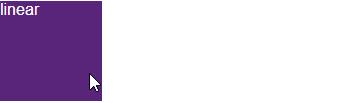
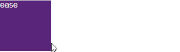


Run the following code yourself to see the difference:
Delay of Transition effect
The transition-delay attribute is used to determine the delay between the time a property changes and when the transition actually starts.
Example : Delay of 1 second before starting conversion.
 div {
  -webkit-transition-delay: 1s; /* Safari */
  transition-delay: 1s;
 }

When dragging the mouse, the effect does not happen immediately but will be delayed 1s is the time that we set for it.
Full code:
The transition-delay attribute
Hover over the element to see the transition effect:
Combine Transition with Transform
Transform Quantrimang learned in the previous lesson, go to the 2D Transform review here and 3D Transform here.
Combining Transition with Transform together will create extremely beautiful transition effect.
 div {
  -webkit-transition: width 2s, height 2s, -webkit-transform 2s; /* Safari */
  transition: width 2s, height 2s, transform 2s;
 }
Transition + Transform
The same effects at the beginning of the lesson also use a combination of Transition and Transform. You add some properties to change the color, style, font size . to your liking. The code below for your reference.

Previous lesson: 3D Transform in CSS
Next lesson: Animation animation effect in CSS
 Micah Soto
- Apply transition effects in PowerPoint 2016
- How to create text color changing effects in PowerPoint
- How to create sky effect for photos with B612
- How to use Photoshop CS6 (Part 4): Create a fading effect
- How to Teach Cause and Effect to Your Kids
- How to create whirlpool effect on Photoshop
- How to create fisheye effect style avatar
- How to Create an Orton Effect in Photoshop


 PowerPoint 2019 (Part 7): Applying Transition Effects
 PowerPoint 2016: Apply transition effects
 Set Slide transition effects in PowerPoint
 How to Add Transitions in Movie Maker
 Apply transition effects in PowerPoint 2016
 Program
 Unix and Linux
 SQL Server
 SQL
SQL Python
 Programming C
 PHP
PHP NodeJS
 MongoDB
 jQuery
 JavaScript
 HTTP
HTTP HTML
HTML Git
Git Database
 Data structure and algorithm
 CSS and CSS3
 C ++
C ++ C #
C # AngularJS
 System
 Mac OS X
 Hardware
 Game
Game Tech info
 Technology
 Science
 Life
Life Application
 Electric
 Mobile