Table of Contents
Tooltip CSS: Tooltip Effect in CSS is easier to understand when the core ideas are paired with practical examples. The sections below explain the topic clearly, highlight useful steps, and point out details that can prevent common errors.
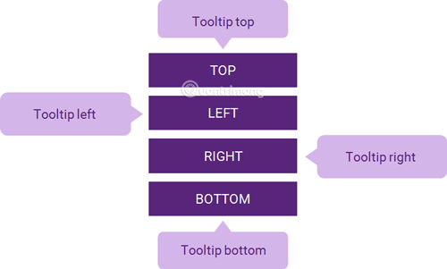
Tooltip is often used to make a small box appear when hovering over a text or image with information related to the component moved by the mouse. In terms of user experience, tooltips provide users with the quickest and easiest way to source information without having to click on anything.
Create basic Tooltip
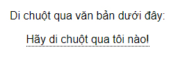
Create a Tooltip that appears when the user moves the mouse over an element:
/* Định kiểu cho vùng chứa Tooltip */.tooltip {position: relative;display: inline-block;border-bottom: 1px dotted black; /* Thêm dấu chấm dạng gạch chân cho văn bản */}/* Định dạng text trong tooltip */.tooltip .tooltiptext {visibility: hidden;width: 120px;background-color: black;color: #fff;text-align: center;padding: 5px 0;border-radius: 6px;/* Xác định vị trí tooltip */position: absolute;z-index: 1;}/* Cho hiển thị tooltip khi di chuột qua vùng chứa tooltip */.tooltip:hover .tooltiptext {visibility: visible;}

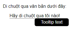
However, the tooltip in this new example is the most basic.
See the full code:
Hover over the text below:
Tooltip text
Location of Tooltip
Tooltip is on the side (Left or right)
.tooltip .tooltiptext {top: -5px;left: 105%;}
In this example, Tooltip is placed on the right ( left: 105% ) of the text "Please hover over me!" (
Note that the top: -5px helps place the Tooltip in the middle of its element , because the tooltip has a padding top and a padding bottom of 5px. If you increase this value, you should also increase the top value to make sure that the tooltip is in the middle (for balance, nice). The same applies if you want the tooltip to be placed on the left.

Same with Tooltip located on the left.
.tooltip .tooltiptext {top: -5px;right: 105%;}

Full code:
Tooltip is on the left
Hover over the text below:
Tooltip text
Tooltip is located above
.tooltip .tooltiptext {width: 120px;bottom: 100%;left: 50%;margin-left: -60px; /* Sử dụng một nửa chiều rộng (120/2 = 60), để căn giữa tooltip */}

Tooltip is located at the bottom
.tooltip .tooltiptext {width: 120px;top: 100%;left: 50%;margin-left: -60px; /* Sử dụng một nửa chiều rộng (120/2 = 60), để căn giữa tooltip */}

Full code:
Tooltip below
Hover over the text below:
Tooltip text
Create an arrow on Tooltip
An arrow, a sharp hook attached to Tooltip, makes them more vivid, like a true quote. Let's do the following, add the arrow for Tooltip above :
.tooltip .tooltiptext::after {content: " ";position: absolute;top: 100%; /* mũi tên ở phía dưới tooltip */left: 50%;margin-left: -5px;border-width: 5px;border-style: solid;border-color: black transparent transparent transparent;}
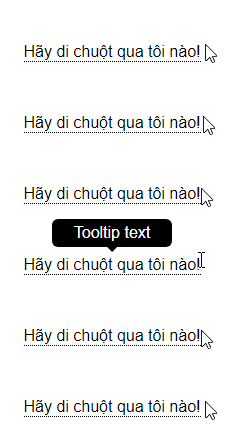
Note: The border-width attribute specifies the size of the arrow; if you change this value, change the margin-left to the same value so that the arrow is always in the middle.
Similarly with the Tooltip arrow below:
.tooltip .tooltiptext::after {content: " ";position: absolute;bottom: 100%; /* mũi tên ở phía trên của tooltip */left: 50%;margin-left: -5px;border-width: 5px;border-style: solid;border-color: transparent transparent black transparent;}
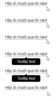
Tooltip's arrow is on the right:
.tooltip .tooltiptext::after {content: " ";position: absolute;top: 50%;right: 100%; /* To the left of the tooltip */margin-top: -5px;border-width: 5px;border-style: solid;border-color: transparent black transparent transparent;}

Tooltip's arrow is on the left:
.tooltip .tooltiptext::after {content: " ";position: absolute;top: 50%;left: 100%; /* To the right of the tooltip */margin-top: -5px;border-width: 5px;border-style: solid;border-color: transparent transparent transparent black;}

Add effects to Tooltip
You can add some effects so that the tooltip can appear better by adding CSS transition properties, gradually making the tooltip clearer. For instance,:
.tooltip .tooltiptext {opacity: 0;transition: opacity 1s;}.tooltip:hover .tooltiptext {opacity: 1;}
Tooltip will appear gradually, opacity gradually increases from 0 to 100% in 2s time.

Full code:
Hover over the text below:
Tooltip text
Previous lesson: Animation animation effect in CSS
FAQ
What should you know about create basic Tooltip?
Create a Tooltip that appears when the user moves the mouse over an element:
What should you know about create an arrow on Tooltip?
An arrow, a sharp hook attached to Tooltip, makes them more vivid, like a true quote. Let's do the following, add the arrow for Tooltip above:
What should you know about add effects to Tooltip?
You can add some effects so that the tooltip can appear better by adding CSS transition properties, gradually making the tooltip clearer. For instance,:
Related Articles
 Tooltip Creation Tools Are Useful with Vanillajs6 minutes read
 Tooltip Creation Tools Are Useful with Vuejs4 minutes read
 Tooltip Creation Tools Are Useful with CSS5 minutes read
 Lesson 24: Tooltips in Bootstrap 53 minutes read
 Tooltip Creation Tools Are Useful for Jquery4 minutes read
 Tooltip Creation Tools Are Useful with Reactjs3 minutes read
Reader Comments 0
Sign in with email or Google to join the discussion.