How to Work with Excel Cubes
You'll learn to work simply with Excel cubes following the steps below to make this image and many more like it. Become familiar with the basic image to be created: === The Tutorial ===
Part 1 of 3:
The Tutorial
-
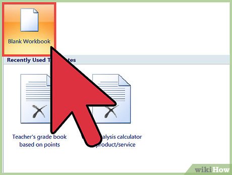
 Create a new workbook with three worksheets: Data, Chart (unless using Chart Wizard) and Saves. Save the workbook into a logical file folder.
 -
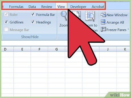
 Set Your Preferences: Open Preferences in the Excel menu and follow the directions below for each tab/icon.
- In General, set R1C1 to Off and select Show the 10 Most Recent Documents .
- In Edit, set all the first options to checked except Automatically Convert Date System . Set Display number of decimal places to blank (as integers are preferred). Preserve the display of dates and set 30 for 21st century cutoff.
- In View, click on show Formula Bar and Status Bar and hover for comments of all Objects . Check Show gridlines and set all boxes below that to auto or checked.
- In Chart, allow show chart names and set data markers on hover and leave the rest unchecked for now.
- In Calculation, Make sure Automatically and calculate before save are checked. Set max change to .000,000,000,000,01 without commas as goal-seeking is done a lot. Check Save external link values and use 1904 system,
- In Error checking, check all the options.
- In Save, select Save preview picture with new files and Save Autorecover after 5 minutes
- In Ribbon, keep all of them checked except Hide group titles and Developer .
-
 Enter the Data Section, which consists of a square's perimeter:
- Into cell A1, enter x and into cell B1 enter y.. Align entries to the column centered horizontally.
- Into cell A2, enter 0, and into cell B2 enter 1.
- Into cell A3, enter 1, and into cell B3 enter 1.
- Into cell A4, enter 1, and into cell B4 enter 0.
- Into cell A5,enter 0, and into cell B5 enter 0.
- Into cell A6,, enter 0 ,and into cell B6 enter 1 to complete the square's perimeter.
Part 2 of 3:
Explanatory Charts, Diagrams, Photos
- (dependent upon the tutorial data above)
-
 Create the Chart.
- Select cell range A2:B6 and from the Ribbon (or using Chart Wizard), select Charts, All/Other, Scatter, Straight Lined Scatter. Copy or Cut the chart that is on your Data worksheet and paste it to the Chart worksheet.
- Tap in the Plot Area and select Chart Layout from the Chart Ribbon, then at left Current Selection = Series 1, Format selection.
- Set Line Width to 1584 pt (the maximum) ,
- Make the Line Color the background color for the cube buttons to reside on that you prefer.
- Tap in the Plot Area and select Chart Layout from the Chart Ribbon, then at left Current Selection = Chart Area. Format selection. Set Fill to Dark Blue, 0% transparent,Bevel . Set 3-D Format to 30 for Top Width and Height and 30 for Bottom Width and Height, and Depth 7 Surface to to Dark Edge. Drag the chart to the exact square of of 5.48" by 5.48"/, or as you prefer (but you may have to resize the cubes to fit just right.)
- Select the third-from far right Media Browser icon at top in the Toolbar.. Scroll down to the cube and drag it out onto the Chart worksheet. Resize it by about double by dragging lower left handle down and to left at 180+45 degrees. Double click on it and set Fill to red and transparency to exact middle.
- Move the transparent cube so that its back face is square with the lower left corner of the background plate. Shift + Option + Grab the cube and move the new copy to the lower right hand corner of the background plate, Now do Shift + Option + Grab and create the center two cubes spaced evenly apart from each other and the outside cubes.
- Now select all 4 cubes by shift-clicking on all 4 until they're all selected. So Shift+Option and create a new row of 4 cubes correctly spaced above the lower row, and do that again and again until you reach the 4th row. Done!
-
 If there are unplanned errors or error values, either the sheet in incomplete and needs further input or Lookup Tables for critical variables or perhaps there's a mistake somewhere along the line. If the instructions have been completed and there are still errors, select the cell that has the error value that is furthest left and topmost first. Look for a typo in a formula or unmatched parentheses. Possibly, a Defined Name is wrong -- they need to be input into the formulas exactly as they were defined. Do Insert Name Define to check. If there is a #DIV/0! error, the example does not, so look for a variable that somehow did not get filled in with a value perhaps. At any rate, what to do is select the cell with the error, and after checking all those typical errors, do Tools Auditing Trace Precedents and/or Trace Error. If fixing all the topmost leftmost errors does not fix the rest of your errors on the worksheet, one may need to do it the hard way, from the bottom right upwards then leftwards; that is the slow but sure way to fix all errors.
- Also, errors in the chart data will most likely plot as zeros. This may be acceptable or desirable even. However, if too many lines (or curves) are returning to 0, it may indicate a logical flaw in the data -- or too many tiny values and then perhaps rescaling the chart is needed by inspecting the horizontal and vertical axes and changing them to zero in on the problem. Hover over or click on a data marker on the series plot and then do a search in the proper column by value for that value, and identify its precedents.

- Also, errors in the chart data will most likely plot as zeros. This may be acceptable or desirable even. However, if too many lines (or curves) are returning to 0, it may indicate a logical flaw in the data -- or too many tiny values and then perhaps rescaling the chart is needed by inspecting the horizontal and vertical axes and changing them to zero in on the problem. Hover over or click on a data marker on the series plot and then do a search in the proper column by value for that value, and identify its precedents.
Part 3 of 3:
Helpful Guidance
-

 Make use of helper articles when proceeding through this tutorial:
- See the article How to Create a Spirallic Spin Particle Path or Necklace Form or Spherical Border for a list of articles related to Excel, Geometric and/or Trigonometric Art, Charting/Diagramming and Algebraic Formulation.
- For more art charts and graphs, you might also want to click on Category:Microsoft Excel Imagery, Category:Mathematics, Category:Spreadsheets or Category:Graphics to view many Excel worksheets and charts where Trigonometry, Geometry and Calculus have been turned into Art, or simply click on the category as appears in the upper right white portion of this page, or at the bottom left of the page.


 Draw a bar graph with positive and negative values in Excel
  How to edit chart notes in Google Sheets
  How to create growth charts in Excel
  Steps to reset chart in Excel
  How to draw a map chart on Excel
  How to draw charts in Excel