How to Create a Different Necklace Pattern in Microsoft Excel
In this article, you'll learn to make this second 'Necklace' pattern and image below, and the dozens of variations the file permits therefrom. Become familiar with the basic image to be created: === The Tutorial ===.
Part 1 of 3:
The Tutorial
-
 This workbook builds on the workbook from Create a Necklace Pattern in Microsoft Excel, and will modify the Defined Variables and Formulas from that file. However, it will be written in such a way that one may input directly from it and arrive at the resulting image above.
 -
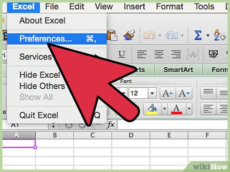 Set Preferences. Open Preferences in the Excel menu. Recommended Settings: Set General to R1C1 Off and Show the 10 Most Recent Documents; Edit - set all the Top options to checked except Automatically Convert Date System. Display number of decimal places = blank (for integers preferred), Preserve display of dates and set 30 for 21st century cutoff; View - show Formula Bar and Status Bar, hover for comments and all of Objects, Show grid lines and all boxes below that auto or checked; Chart - show chart names and data markers on hover. Leave rest unchecked for now; Calculation -- Automatically and calculate before save, max change .000,000,000,000,01 w/o commas if you do goal-seeking a lot and save external link values and use 1904 system; Error checking - check all; Save - save preview picture with new files and Save Autorecover after 5 minutes; Ribbon -- all checked except Hide group titles and Developer.
 -
 Create the Defined Variables upper section of the Data worksheet.
- NEW: Enter AROWS2 into cell A1 and 1439 into cell A2. Insert Name Define Name AROWS2 to cell $A$2.
- NEW: Enter GM2_ into cell B1 and w/o spaces 0.618 033 988 749 895 into cell B2. Insert Name Define Name GM2_ to cell $D$2.
- NEW: Enter FACTORY2 into cell C1 and -.25 into cell C2. Insert Name Define Name FACTORY2 to cell $C$2.
- NEW: Enter MULTERx into cell E1 and 1 into cell E2. Insert Name Define Name MULTERx to cell $E$2.
- NEW: Enter MULTERy into cell F1 and 5 into cell F2. Insert Name Define Name MULTERy to cell $F$2.
- Enter Adj1 into cell G1 and 0 into cell G2.
- NEW: Enter Adj2 into cell H1 and -3 into cell H2.
- Select cell range A2:H2 and Format Cells Border Black Outline and align horizontal center.
-
 Check or Create the Column Headings section of the Data worksheet.
- Enter Base t into cell A3.
- Enter c into cell B3.
- Enter cos into cell C3.
- Enter sin into cell D3.
- Enter x into cell E3.
- Enter y into cell F3.
- NEW: Enter AdjX2 into cell G3.
- NEW: Enter AdjY2 into cell H3.
- Select A3:H3 and align center and Font underline single underline.
-
 REVISE and/or Enter the Column Formulas.
- Enter "=ROUND((308100*PI())+(190),0)" w/o quotes into cell A4. Format Cell Number Number Custom "tip" 0 including quotes. Insert Name Define Name tip to cell $A$4.
- Edit Go To cell range A5:A1444 and with A5 active, enter w/o quotes the formula "=((A4+(-tip*2)/(AROWS2)))" into A5 and Edit Fill Down.
- Select cell B4 and enter -25822 into it. Edit Go To cell range B5:B1444 and with B5 active, enter "=B4" w/o quotes into it and then Edit Fill Down.
- Edit Go To cell range C4:C1444 and with C4 active, enter w/o quotes the formula into it, "=COS((ROW()-4)*PI()/180*FACTORY2)". Factory2 Note: .25*1440 = 360, one full circle/cycle.
- Edit Go To cell range D4:D1444 and with D4 active, enter w/o quotes the formula into it, "=SIN(ROW()-4)*PI()/180*FACTORY2)".
- Edit Go To cell range E4:E1444 and with E4 active, enter w/o quotes the formula into it, "=((SIN(A4/(B4*2))*GM2_*COS(A4)*GM2_*(COS(A4/(B4*2)))*GM2_)+C4)+MULTERx*SIN((SIN(A4/(B4*2))*GM2_*COS(A4)*GM2_*(COS(A4/(B4*2)))*GM2_)+C4)+AdjX2". This is the double whammy again.
- Edit Go To cell range F4:F1444 and with F4 active, enter w/o quotes the formula into it, "=(((SIN(A4/(B4*2))*GM2_*SIN(A4)*GM2_*(COS(A4/(B4*2)))*GM2_)+D4)+MULTERy*COS((SIN(A4/(B4*2))*GM2_*SIN(A4)*GM2_*(COS(A4/(B4*2)))*GM2_)+D4))+AdjY2" and Edit Fill Down,
- Select cell G4 and enter =$G$2 and select cell H4 and enter +$H$2. Edit Go To cell range G4:G1444 and Edit Fill Down and Insert Name Define Name AdjX2 to cell range $G$4:$G$1444. Edit Go To cell range H4:H1444 and Edit Fill Down and Insert Name Define Name AdjY2 to cell range $H$4:$H$1444.
Part 2 of 3:
Explanatory Charts, Diagrams, Photos
- (dependent upon the tutorial data above)
-
 Create the Chart.
- Edit Go To cell range E4:F1444 and, using either the Chart Wizard or the Ribbon, select Chart, All/Other, Scatter - Smooth Line Scatter. If not using Chart Wizard, a small chart should appear atop the data. Copy or Cut and Paste the Chart to the Chart worksheet you create anew now, into cell A1, and expand the chart by hovering over the lower right corner until the cursor becomes the double-headed arrow allowing one to pull down and to the right the chart, expanding it. Using Chart Layout, Select Data Series 1 and Format Selection Line Weight 1. Then select the Plot Area and format Fill grey. Then format Chart Area sky blue fill. Insert Picture WordArt whatever text you feel is appropriate, and format it by clicking on the Home Ribbon tab and using the edit tools.
- Hold down the shift key and copy picture to the Saves worksheet to be created anew, along with the formulas and pasted values from the top rows of the Data worksheet.
- It would be a good idea to Insert New Comment on the original values and formulas of the Data worksheet so that renormalization is a few steps away. Done.
-

Part 3 of 3:
Helpful Guidance
- Make use of helper articles when proceeding through this tutorial:
- See the article How to Create a Spirallic Spin Particle Path or Necklace Form or Spherical Border for a list of articles related to Excel, Geometric and/or Trigonometric Art, Charting/Diagramming and Algebraic Formulation.
- For more art charts and graphs, you might also want to click on Category:Microsoft Excel Imagery, Category:Mathematics, Category:Spreadsheets or Category:Graphics to view many Excel worksheets and charts where Trigonometry, Geometry and Calculus have been turned into Art, or simply click on the category as appears in the upper right white portion of this page, or at the bottom left of the page.