How to Create a Curve in Excel
You will learn to research and locate a curve of interest, then set up the data for graphing (charting) it in Microsoft Excel in the following steps. The example curve in the photo from the text was chosen at random from a standard...
Part 1 of 3:
The tutorial
-


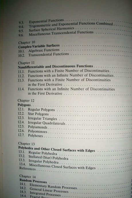
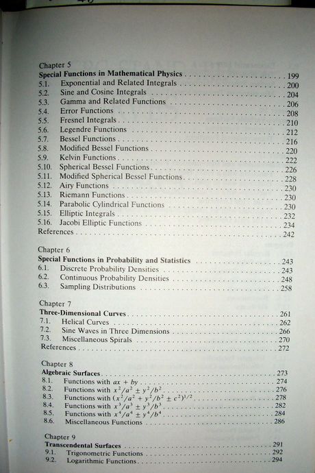
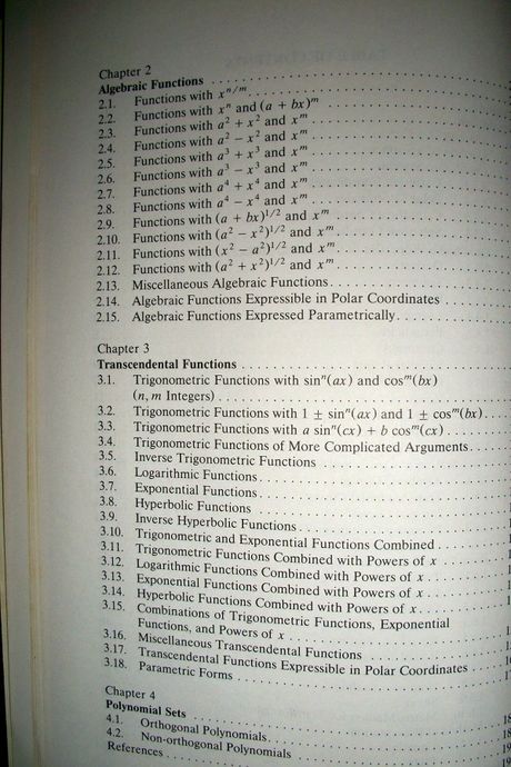
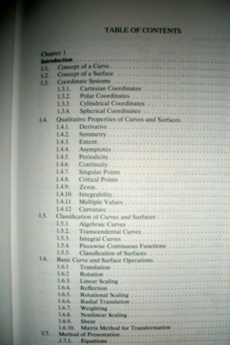
 The first step is to choose a curve to graph (or perhaps you have one in mind already but lack the formula for it). I have found "CRC STANDARD CURVES and SURFACES" by David Von Seggern to be excellent as a source text. When researching on the internet, search terms "CURVE FORMULAS", "HORIZONTAL CURVES", "Curve Equations" and "3-Dimensional CURVE FORMULAS" should get you started. "MyCurve.org" will lead you to a personal website related to the author of this article where instructions are given to graph one type of curve in particular -- a ring of spheroids. You may also find curves under Fractals, Algebra and Geometry and other types of Math, esp. Trigonometry and Calculus. Here are the classifications of Curves and Surfaces from the CRC Standard text:
 -
 The curve done here, 2.11.5, comes from Section '2.11 FUNCTIONS WITH (x^2 - a^2)^1/2 AND x^m'. The first curve of the section is the Hyperbola, y=c(x^2 - a^2)^.5, with 6 variations of a and c given. To start with simply, choose a curve where everything is set equal to y, as above. Here is my smoothed line chart of the curve chosen, as depicted above, with the addition of some little "bumps" along the x-axis which will be discussed later:
 - Open a new workbook in Excel and create two worksheets: Worker1 and Pasted Pictures. For this project, Worker1 will hold both the data and the charts, as well as a picture from the text to be used for comparison as the charts are created. Then pasted pictures of these will go onto the other sheet to preserve original input and any further trial variable changes, or creative constructions.
- Set the Preferences under the Excel menu:
- In General, set R1C1 to Off and select Show the 10 Most Recent Documents .
- In Edit, set all the first options to checked except Automatically Convert Date System . Set Display number of decimal places to blank (as integers are preferred). Preserve the display of dates and set 30 for 21st century cutoff.
- In View, click on show Formula Bar and Status Bar and hover for Comments of all Objects . Check Show grid lines and set all boxes below that to auto or checked.
- In Chart, allow Show chart names and set Data markers on hover and leave the rest unchecked for now.
- In Calculation, make sure Automatically is checked and Calculate before save is also checked. Set max change to .001 as goal-seeking is not done in this project. Check Save external link values and Use 1904 system
- In Error checking, check all the options.
- In Save, select Save preview picture with new files and Save Autorecover after 5 minutes
- In Ribbon, keep all of them checked except Hide group titles and Developer .
- Go to cell A16 and do Freeze Panes under the Window menu. It helps by placing the cursor between the A of Column A and the 1 in Row 1 in the upper leftmost corner and selecting the entire worksheet. Format Cells Number Number Decimal Places 4, Font Size 9 or 10.
-
 Enter the upper Defined Name Variables Section (here's a picture of the data chit):
- In B1, enter the name of the source for the title, as a memo -- here it is "2.11.5 Hyperbolic-type Curve; page 70 of CRC Standard Curves and Surfaces" w/o quotes.
- In B2, enter Givens:
- In C2, enter AYE1_ and in D2 enter .1 (given as "a=.1" ...
- In C3, enter AYE2_ and in D3 enter "=AYE1_+0.1" (... but then this is given as "a=.2" ...)
- In C4, enter AYE3_ and in D4 enter ."=AYE2_+0.1" (... and this was given as "a=.3" but you see, Excel must plot Y1, Y2 and Y3 for each 'a' given, and we cannot name them a1, a2 and a3 because to do so would conflict with cell name references. Even if we name them AYE1, on a fill down Excel will change the next one to AYE2, which is not necessarily what we want when just the value of x is supposed to be changing, not also the value of a. We need a separate column for each a=AYE_ and the 3 AYE_s must be distinct from each other.)
- Select cell range C2:D4 and Insert Name Create Names in Left Column, OK. Align the AYE's right and center-align the 3 values and set them Formula Fill yellow (for input). Command+Select C2:D2, C3:D3, C4:D4 and E2:F2 and do Format Cell Border Blue bold outline and set Font to Blue too.
- In E2, enter CEE and in F2 enter ,2 and Formula Fill yellow F2. Insert Name Define Name CEE for cell $F$2.
- In G2, enter CEE2_ and in H2 enter "=-CEE" w/o quotes. This was not given and had to be figured out from the fact that the the givens resulted in a chart above the x-axis only.
- Enter the column headings of rows 6 and 7:
- Input Charting X into C6 and input X_n (meaning X sub n) into C7.
- Input AYE1_ into D6 and input Charting Y1 into D7.
- Input AYE2_ into E6 and input Charting Y2 into E7.
- Input AYE3_ into F6 and input Charting Y3 into F7.
- Enter the sorter column header and data:
- Input Sorter into B5 and input 1 into B6. Select cell range B6:B89 and do Edit Fill Series Column Linear Step Value=1, OK. We won't be doing the sort but know that I used it to confirm that the X values could not be sorted from minimum to maximum, or the reverse, and have the chart come out correctly. This is a tool you must learn how to use and trust -- to completely rearrange the data for some experiment or other and then restore its order to original condition.
- Enter the column formulas:
- The text does not state, nor does the picture from the text show, the range of x values. I tried -20 to 20 and found that the lines converged horizontally per the givens at -6 and 6. I also wanted a tighter closeup of the curves, so I decided on -2 and 2 as my range, but left it open to the user's discretion. Input -2 to cell C8 and Insert Name Define Name Top to cell $C$8.
- Input 2 to cell C89 and Insert Name Define Name Bottom to cell $C$89.
- Input "=-(Top-Bottom)/40+C8" to cell C9 and select cell range C9:C48 and Edit Fill Down. Excel will automatically fill in +Top for +C8 when you type in the formula, so be careful to overwrite it.
- Enter 0 to cell C49 and Format Cell Number Number Custom "CEE IS NEGATIVE:" including quotes. If you just type text into the cell, it alters the chart. You could also use value -2.
- Select cell range C50:C88 (one up from Bottom) and enter "=C9" w/o quotes into C50 and Edit Fill Down. We're copying the X values because those will remain the same as we change CEE to CEE2_ under Y1, Y2 and Y3. Thus the idea to try sorting them as similar values. Didn't work. Didn't expect it to really. But one of my main objectives is to "play with the data" in order to achieve new effects, i.e. new curves.
- Input "=(CEE*(X_n^2-AYE1_^2)^0.5)/X_n^2" to cell D8.
- Input "=(CEE*(X_n^2-AYE2_^2)^0.5)/X_n^2" to cell E8.
- Input "=(CEE*(X_n^2-AYE3_^2)^0.5)/X_n^2" to cell F8.
- Select cell range D8:F50 and do Edit Fill Down. Do Edit Clear Contents for cell range D49:F49.
- Edit the formula in D50 to read "=(CEE2_*(X_n^2-AYE1_^2)^0.5)/X_n^2" by changing CEE to CEE2_.
- Edit the formula in E50 to read "=(CEE2_*(X_n^2-AYE2_^2)^0.5)/X_n^2".
- Edit the formula in E50 to read "=(CEE2_*(X_n^2-AYE3_^2)^0.5)/X_n^2".
- Select cell range D50:F89 and do Edit Fill Down.
- You will notice some "#NUM!" error values towards the middle of each of the two data sets, top and bottom. No one said they'd be there; there's no note in the text or anything. Usually what this sort of error means is that we're trying to take the square root of a negative number. Excel can handle complex numbers, but awkwardly, in my humble opinion. It can also mean division by zero. I think those two explanations cover all these errors. The result of them is some funny little "bumps" per the curve-smoothing algorithm of Excel -- when the actual value is zero because errors return a value of zero mostly, Excel is saying, 'No, there ought to be a little bit of a curve there, and would be, if you took interpolative values ...' -- which probably just isn't so in this case. I made an unsmoothed line chart to show you and prove it. Here it is:

Part 2 of 3:
Explanatory Charts, Diagrams, Photos
- (dependent upon the tutorial data above)
- Create the Chart:
- Select cell range C8:F89 and using Chart Wizard or the Ribbon, choose Charts, All.Other, Scatter, Smooth Line Scatter. Using Chart Layout on the Ribbon, set the Axes to reasonable minimum values that won't interfere too much with the curve's display, do away with the legend, and introduce vertical grid lines if you like. The usual preference is for Line Weight to equal 1. You can change the value of Top in cell C8, which you should Format Fill yellow (for input) to see those effects. Other than that, you have just charted a random curve and even allowed for some error values to be ignored, for if you hover over the plot series line on the chart at the little bumps, you'll find that the bumps consist of the error values. That there are no bumps in the photo from the text tells me that they either erased them or they interpolated that section of the curve ... until and unless someone provides a better explanation.
-
 Final Image
Part 3 of 3:
Helpful Guidance
- Make use of helper articles when proceeding through this tutorial:
- See the article How to Create a Spirallic Spin Particle Path or Necklace Form or Spherical Border for a list of articles related to Excel, Geometric and/or Trigonometric Art, Charting/Diagramming and Algebraic Formulation.
- For more art charts and graphs, you might also want to click on Category:Microsoft Excel Imagery, Category:Mathematics, Category:Spreadsheets or Category:Graphics to view many Excel worksheets and charts where Trigonometry, Geometry and Calculus have been turned into Art, or simply click on the category as appears in the upper right white portion of this page, or at the bottom left of the page.
Similar Post
- How to Create a Lemniscate Spheroid Curve
- LOGEST - The function returns an array of data that describes an exponential curve that fits the data given in Excel
- What is an elliptical curve code (ECC)?
- How to draw charts in Excel
- How to create a password protection for Excel sheets
- How to create bullet list in Excel


 How to fix formulas in Excel, fix data ranges in Excel
  How to Truncate Text in Excel
  How to create spaces between letters and cell borders in Excel
  How to Add Autonumber in Excel
  Instructions automatic text carriage return in Excel - Auto line breaks when the width of the column in Excel
  Diagonal lines in a cell in Excel