How to Use Minitab
Minitab is a statistics program that allows you to quickly enter your data and then run a variety of analyses on that data. You can quickly prepare charts and calculate regression, and entering data works very similarly to Excel. Minitab....
Part 1 of 4:
Entering Data
-
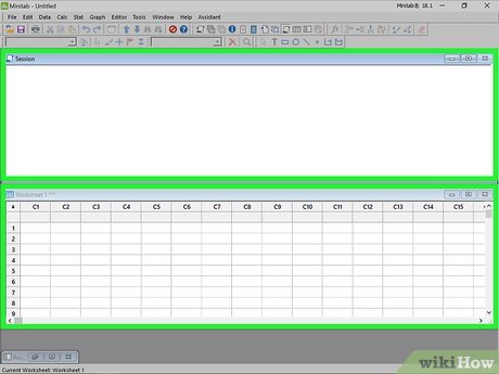 Get familiar with the Minitab layout. When you first start Minitab, you will be shown two main windows: the Session window and the Worksheet window. The Session window will display the output of any analysis, and the Worksheet window is where you enter your data. The worksheet window will look very similar to an Excel spreadsheet.
 -
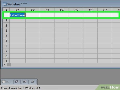 Enter your data labels in the second row of the Worksheet. The first row of the worksheet is reserved for the C1, C2, C3, etc. labels that Minitab assigns to the columns. The second row is reserved for column labels, which you can enter in manually. Simply click an empty second row cell and type in the label for that column.
 -
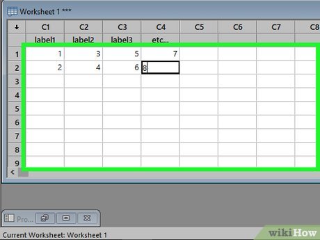 Enter your data into columns. Once you have your column labeled, you can start entering data into the column. Pressing ↵ Enter will take you to the cell below the current one. If you click the little arrow in the upper-left corner of the Worksheet, you can change the direction of data entry so that pressing ↵ Enter will take you to the next column on the same row.
- If data is saved in an Excel spreadsheet, copy and paste it to Minitab. Highlight the data set saved in Excel. Right click the mouse and select copy. Go to Minitab and click the first cell below C1. Right click the mouse and select paste cells.[1]
- Each column should represent one type of data. For example, if you are entering information about baseball teams, one column might be RBI, one might be Errors, and one might be Home Runs.
Part 2 of 4:
Viewing Descriptive Statistics
-
 Understand what descriptive statistics are. Descriptive statistics summarizes a set of data using several important values. Some descriptive statistics include:
- Mean - Arithmetic average value of the data in the column
- Standard deviation - Measure of dispersion of data
- Median - The middle value of a set
- Minimum - The smallest number in a set
- Maximum - The largest number in a set
-
 Click the Stat menu. After entering the data set, click the Stat menu at the top of the window. Hover your mouse over Basic Statistics.
 -
 Select "Display Descriptive Statistics". This will open Display Descriptive Statistics window, which shows all of your columns in a list on the left, and a Variables box on the right.
 -
 Double-click on the variable you want to analyze. The variable will appear in the Variables box on the right side of the window.
 -
 Choose the statistics you want to see. Click Statistics... to choose which statistics you want to display. You can check or uncheck any of the boxes. Click OK when you've finished deciding.
 -
 Read the output. Click OK in the Display Descriptive Statistics window once you are satisfied with the data set and statistics options. The descriptive statistics you chose for the data you selected will appear in your Session window.
Part 3 of 4:
Creating Graphs and Charts
-
 Create a histogram. Histograms graph frequencies with respect to categories. It allows you to visually see the frequency for the number of time a variable occurs.[2]
- Click the Graph menu. After entering the data set, click the Graph menu at the top of the window. Select Histogram...
- Select your graph type. You have four options for creating a histogram: "Simple", "With Fit", "With Outline and Groups", and "With Fit and Groups". Select "Simple".
- Choose your data set. You will be shown a list of available data sets. Double-click the one that you want to create the histogram from and click OK. Your histogram will be constructed and displayed in a new window.
-
 Create a dot plot. A dot plot is similar to a histogram in that it shows which values fall into which category. It it best for small sets of data.
- Click the Graph menu. After entering the data set, click the Graph menu at the top of the window. Select Dotplot...
- Select your graph type. You are given seven options to pick from when creating a dot plot. Select Simple for now to create a dot plot from a single column of data.
- Choose your data set. You will be shown a list of available data sets. Double-click the one that you want to create the dot plot from and click OK. Your dot plot will appear in a new window.
-
 Create a stem-and-leaf plot. The stem-and-leaf plot is also similar to a histogram. It shows the frequency at which values occur. It shows the actual numbers in each category, and there is no visual aspect to it.
- Click the Graph menu. After entering the data set, click the Graph menu at the top of the window. Select Stem-and-Leaf...
- Choose your data set. You will be shown a list of available data sets. Double-click the one that you want to create the stem-and-leaf from and click OK. Your stem-and-leaf plot will appear in the Session window.
- See this guide for more details on stem-and-leaf plots.
-
 Create a probability plot. This plot allows you to quickly identify outliers and other departures from a normal curve.
- Click the Graph menu. After entering the data set, click the Graph menu at the top of the window. Select Probability Plot...
- Choose your graph type. You are given two options for making a probability plot. Choose Single for now.
- Choose your data set. You will be shown a list of available data sets. Double-click the one that you want to create the probability plot from and click OK. Your probability plot will appear in a new window.
-
 Create a bar chart. A bar chart allows you to visually represent your data. It differs from a histogram in that each column in a histogram represents a quantitative variable, while columns in bar charts represent categorical variables.
- Click the Graph menu. After entering the data set, click the Graph menu at the top of the window. Select Bar Chart...
- Choose what your bars represent. Use the drop-down menu to choose what the bars should represent: counts of unique values, a function of a variable, or values from a table.
- Choose your chart type. Typically you will be choosing the Simple bar chart.
- Choose your data set. You will be shown a list of available data sets. Double-click the one that you want to create the bar chart from. You can add labels to your chart by clicking the Labels... button. Click OK to create your bar chart in a new window.
-
 Create a pie chart. A pie chart acts like a bar chart in that the slices of the pie represent categorical variables.
- Click the Graph menu. After entering the data set, click the Graph menu at the top of the window. Select Pie Chart...
- Choose your data set. You will be shown a list of available data sets. Double-click the one that you want to create the pie chart from. You can add labels by clicking the Labels... button. Click OK to build the pie chart in a new window.
Part 4 of 4:
Running a Regression Analysis
-
 Understand what a regression analysis does. A regression analysis models relations between random variables. There are two types of variables in regression analysis: response and predictor variables. Values of predictor variables are chosen to predict the values of response variables, and the regression analysis will, among other things, determine how accurate this prediction tends to be.
- Y usually represents the response variable and X usually represents predictor variable(s)
-
 Create your data set. Enter response and predictor variables individually in separate columns. Make sure that the columns are properly labeled in the second row.
- Response Variable: Measured in an experiment. It is also called dependent variable.
- Predictor Variables: The variables whose values determine the change of other variables. They are also called independent variables.
-
 Open the Regression wizard. Click the Stat menu and hover over Regression, and then select Regression...
 -
 Add your variables. Double-click the data set that is your "Response", or "dependent" variable. This will add it to the "Response" field. Then, double-click the data set that is your "Predictor", or "independent" variable. This will add it to the "Predictors" field. You can add multiple variables to the "Predictors" field.
 -
 Choose any graphs. If you want to generate graphs alongside your analysis, click the Graphs... button. You can then choose which graphs of the residuals that you want to create. Click OK after making your selections.
 -
 Choose to store results. you can have Minitab store your results, such as your residuals and fits. Click the Storage button to choose what aspects you want stored. These will be added to new columns on your spreadsheet.
 -
 Run the regression analysis. After you are finished configuring your options, click OK in the regression window. Minitab will calculate the regression and display any charts and stored values that you set.[3]
- Output from the regression analysis appears in the Session window of Minitab.
- The regression equation gives an approximation of how X's predict Y.
- P-values determine the significance of the predictor variables.
- R-sq describes how well the data fits the model (1 and -1 indicate perfect fit).