How to fix common color problems in Photoshop
Color is one of the most complex topics in photography. Photoshop is a powerful tool and you can manipulate the colors in your images unlimited.
Along with adjusting the brightness and contrast of the image, fixing color problems is one of the most common edits you need to make. Digital images coming out of the camera often don't look very good.
Color is one of the most complex topics in photography. There have been hundreds of books on color theory, how colors affect emotions, and how to color images and movies for best effects. Photoshop is a powerful tool and you can manipulate the colors in your images unlimited.
However, before going into advanced concepts, you need to have certain knowledge about the basics. Let's start by looking at how to fix the three most common color problems you encounter with your images in Photoshop.
How to fix common color problems in Photoshop
- The color is not real
- Color has no contrast
- A distracting color
The color is not real
All light has different tints. Our eyes expect this and the brain will adjust everything accordingly. That's why a blank sheet of paper is white, whether it is illuminated by the sun or a candle. However, when you take a picture and look at the image in the context of the original light source, our brain does not regulate everything itself and we see the piece of paper as it really appears. This means that the piece of paper illuminated by a candle will look much more yellow than it is illuminated by sunlight.
When you take digital photos, you can tell the camera what kind of light is being used (if you leave it in Auto White Balance mode - it will automatically judge the light source) . Whatever happens, your camera may make the colors too unreal. The image will look too yellow or too green. Ideally, you should fix this in Lightroom with RAW files but sometimes you need to make some final edits in Photoshop.
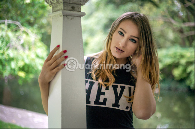
In the image above, you can see everything looks a little yellow. To fix this, you need to add a little blue light to the image.
To do that, select the Color Balance adjustment layer . From the menu, select Midtones. There are three sliders (slider):
- Cyan-Red (Cyan)
- Magenta-Green (Burgundy)
- Yellow-Blue (Green Yellow)
Currently, the article is only interested in Yellow-Blue slider. Slowly pull it towards Blue until the yellow light starts to disappear. When things like skin tones start to look normal, you're done. Don't overdo it.
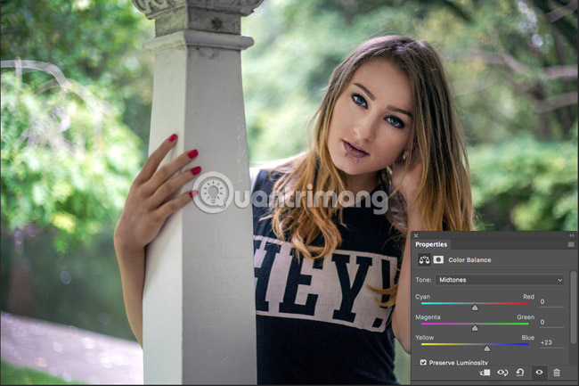
Note: If the image has blue light, then you need to add some golden light instead. In some cases, there will be other color adjustments for the image. In that case, use the remaining sliders to fix everything.
Color has no contrast
Another common problem with digital images is the phenomenon of color (that is, color does not have a clear contrast). This is because they lack a bit of saturation as shown below.
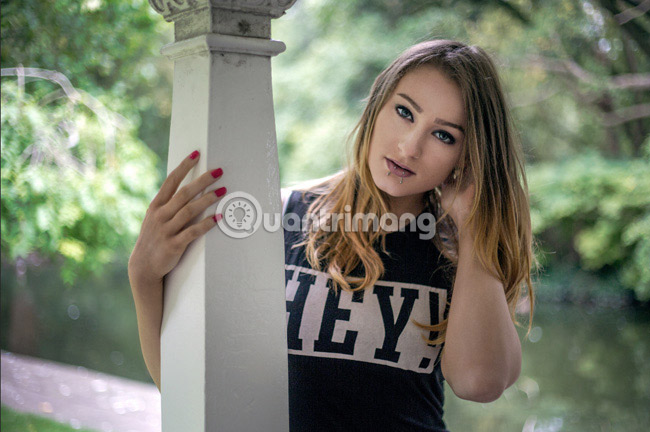
To fix this, select the Vibrance adjustment layer. There are two sliders to adjust: Vibrance and Saturation . Both perform similar things but in different ways.
Vibrance slider selectively adds saturation. It saturates the least saturated areas and ignores saturated parts of the image. You can't do much with this.
The Saturation slider only adds linear saturation. Each region, regardless of how saturated, receives the same saturation index.
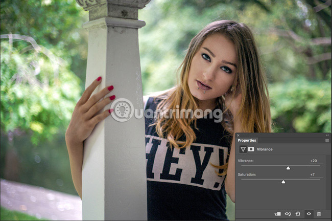
Start by adding Vibrance to the image and see if the problem is fixed. You can add as much as you want, but stop if everything starts to look weird. After you have increased the Vibrance as much as possible, slowly add Saturation. Everything may look bad if you add too much.
In the image above you can see that the author increased by 20% Vibrance but only added 7% Saturation.
A distracting color
When we look at a photo, our eyes will focus on certain things like faces, contrast areas, saturated areas, convergence lines, and lots of other subtle things. . Good photographers (and also photo editors) control these elements so that the eye of the viewer focuses on the most important areas of the picture.
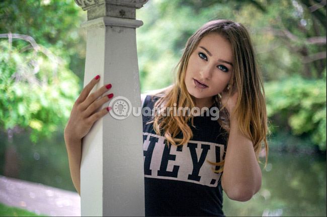
You take a lot of outdoor photos and there's an annoying problem you'll have to face, it's your model standing in front of a really bright green scene. When you look at the photo, your eyes will only focus on the leaves behind. This problem occurs in all types of photography. Perhaps it is the leaves in a portrait picture or sometimes a bright red jacket that someone wore in the street scene you were shooting. Whatever it is, you will want to reduce the impact of these distracting colors on your picture.
To do that, add a Hue / Saturation adjustment layer to the image. We will deal with distracting colors by reducing its Saturation and not affecting other things.
From the Master menu , choose the color that best matches the color you are targeting. In this example is green. Drag the Saturation slider to the left until everything starts to look better.
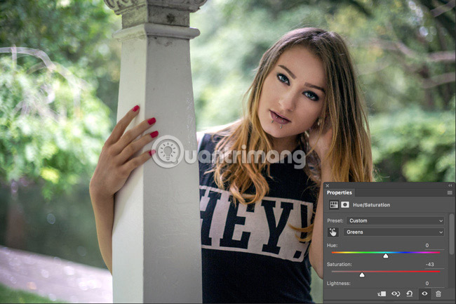
There are two situations you may encounter when you use this method: Distracting colors can be made up of two different colors and distracting colors can also be in the elements that you Do not want to desaturate. Both have simple remedies.
If distraction comes from multiple colors, simply select any additional color from the menu and desaturate it slightly. You can also click on the small drop tool, choose Distraction and drag down. This will eliminate saturation of all related colors.
If the color you are saturating appears in important features, such as an object, add a layer mask to the image and obscure any areas you don't want to be affected.
Color is one of the most important parts of any image. Editing colors too badly or making images of strangely colored actors can ruin a great shot. It is also one of the most difficult things to control.
When you start editing colors, start by fixing the problems you see in your image. Once you have a better way to handle them with tools, you can start to consider how to use them creatively.
Do you have any questions about dealing with color issues in your images? Leave comments in the comment section below!
See more:
- 15 common problems in Photoshop and basic remedies
- How to choose all the same colors in Photoshop
- 45 smart Photoshop tips you need to know


 How to Draw a Circle in Gimp
  How to play Among Us in color blind mode
  Create Button in CSS
  How to add color coded terminal code to Microsoft Word
  How to create and use custom gradients in Google Slides
  How to change the Facebook background color