Table of Contents
Charts and graphs are important data representations used to visually and easily illustrate various types of information. Creating charts in Google Sheets is a familiar process for anyone who frequently uses this office tool. Now, with Gemini integrated into Google Sheets, users have another way to quickly create charts using the built-in tool.
When using Gemini in Google Sheets to create charts, the process can be simplified. AI automatically analyzes the data and then displays chart types appropriate to that data. Charts created with AI in Google Sheets can still be edited in the same way as regular charts. Below are instructions on how to create charts in Google Sheets.
How to create Google Sheets charts using Gemini
Gemini will also generate various chart types, depending on the content data you choose.
- Bar chart: Compares data between different data groups.
- Line charts: Track trends and changes in data over time.
- Pie chart: Shows the proportion of each group within a whole.
- Scatter plot: Suitable for observing the relationship between two sets of data.
Step 1:
In the data table, select all the information so Gemini can read the content and create the table for you. Then select Gemini, and then select Create chart .
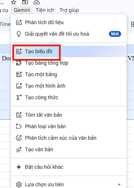
Gemini analyzes the data table and then creates a chart in the right-hand pane of the data table.

Step 2:
The chart created in Google Sheets will have different chart types depending on the data you provide. In each chart section, you will see a Preview option to see the chart as it appears in Sheets, then click Insert to insert it into the data table.
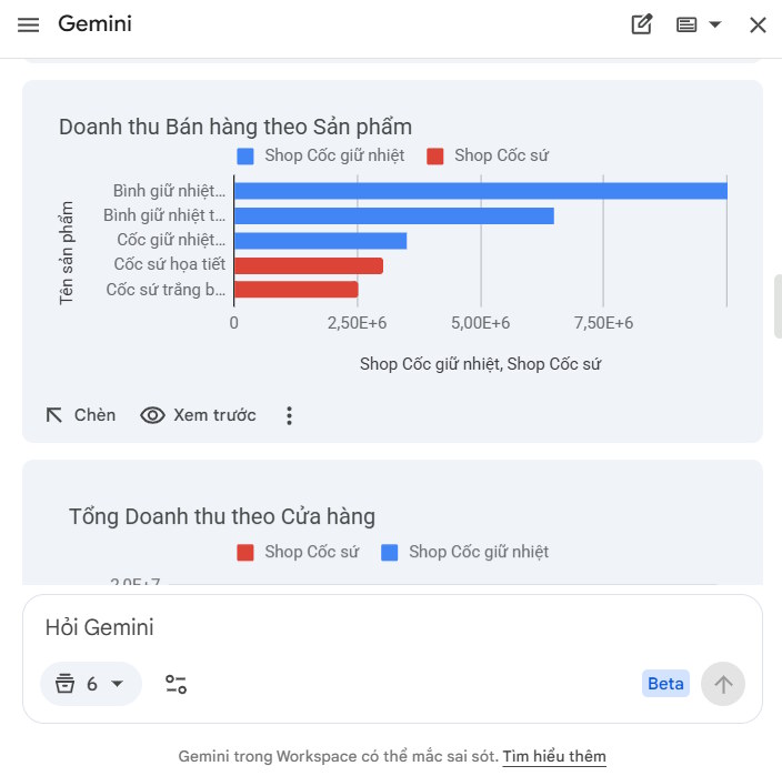
Below you will find detailed instructions on how Gemini creates charts in Google Sheets.
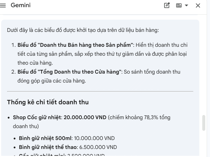
Check the chart; if any part is incorrect or faulty, enter the correction command in the box to send it to Gemini for editing.
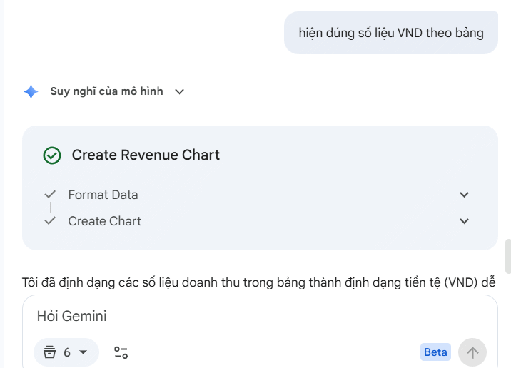
Step 3:
Once you have a satisfactory chart, click insert. The resulting chart will be inserted into your data.
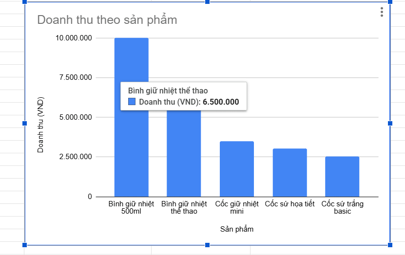
Click the chart icon to display the editing interface on the right side, as shown below. You can change the column colors in the table and the content for each axis in the table.
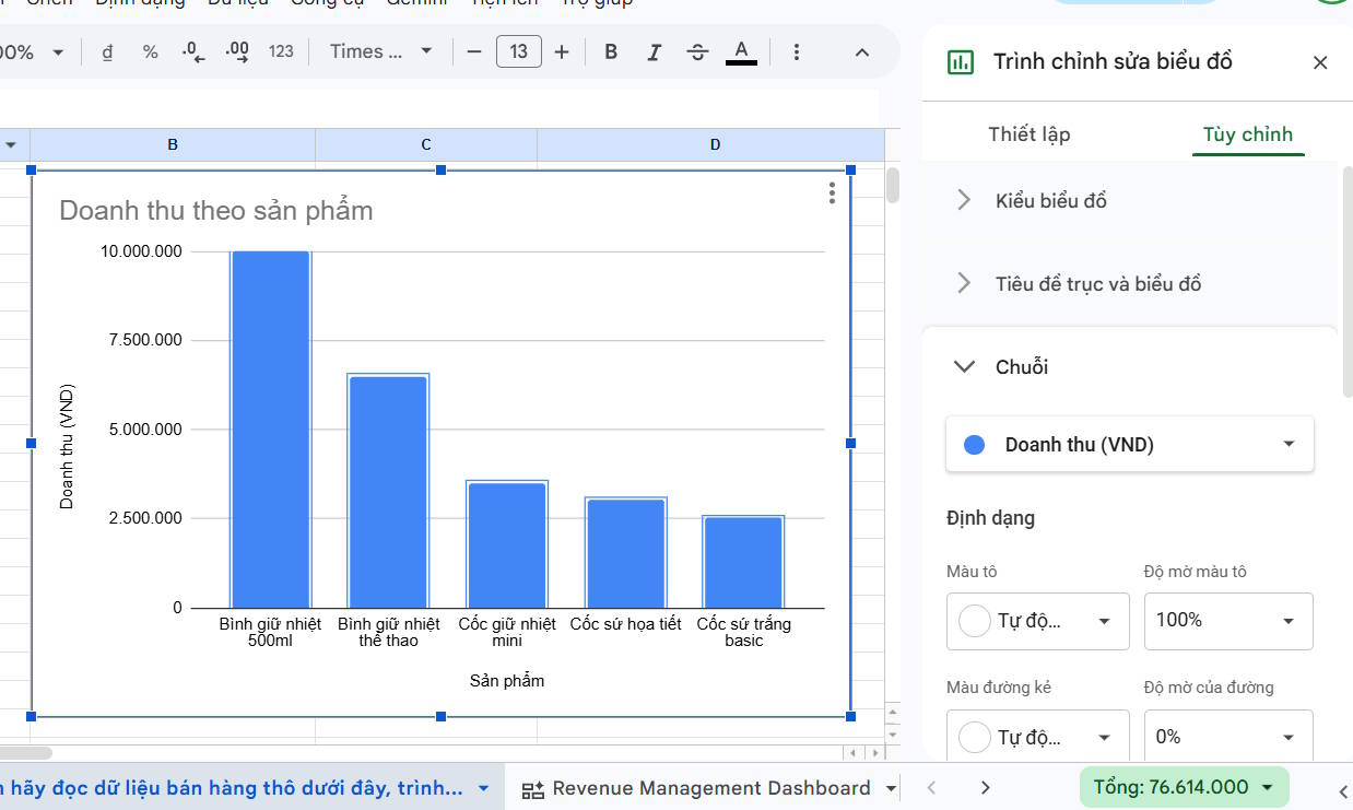
Step 4:
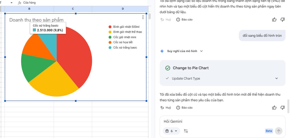
If you want to change the type of an existing chart in your Google Sheets data table, you just need to enter the command into the Gemini box.
How to create charts in Google Sheets
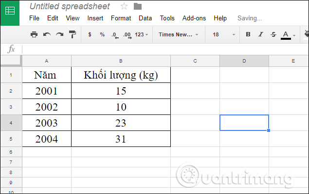
We will use the data table below as an example to create a chart.
Step 1:
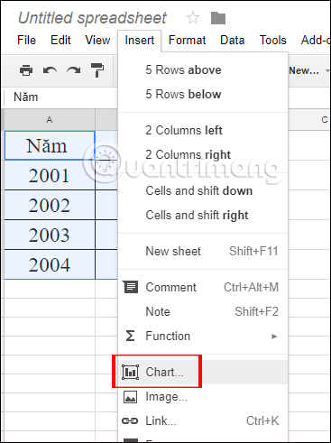
First, you need to highlight the entire data table content you want to display in a chart. Then, click the Insert tab on the toolbar, and then select Chart .
Step 2:
Next, we will see a preview of the chart that Google Sheets displays for you.
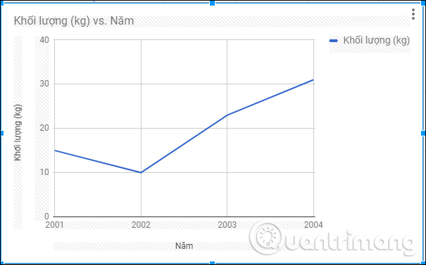
At the same time, a settings frame with options to change the chart will appear on the right side of the screen interface. First, in the Data section , under Chart type, you can change the chart display style.

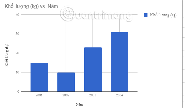
You can scroll down to choose from the chart types provided by Google Sheets. For example, you can switch to a column chart type as shown below.
Step 3:
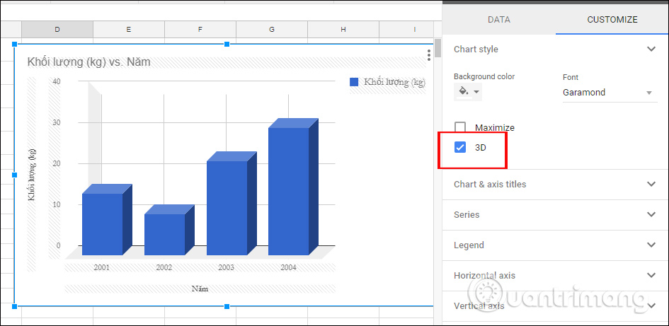
Go to the Customize section . This column will change the font style in the table, the font color, the title of the chart, etc.
We can change the chart style in Chart style, for example, using a 3D chart. Click on the 3D option and we will get a chart like the one below.
Step 4:
To change the chart's color, you can select a background color in the Background color section .
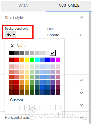
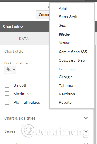
Alternatively, users can change the font for the entire title content in the chart under the Font section .
Step 5:
Next, users can choose to change the formatting for the chart headers . Google Sheets provides header formatting settings for you to select and modify.
We can change the font, font size, formatting, or color for each title in the chart under Customize . Scroll down to the Chart & axis titles section to do so.
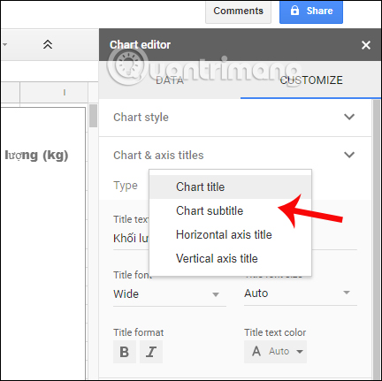
You can change the content for each heading, the font format, the font size, and the color of each heading that appears in the chart on Google Sheets if you wish.
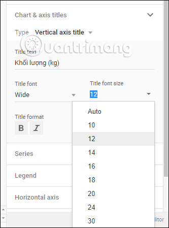
Changes will be applied immediately when we make any modifications. The chart will be automatically saved to the content and created as a file, just like when you create a data table in Google Sheets.
Thus, with the steps above, you can create charts and graphs in your Google Sheets content. Creating graphs is a basic operation not only in Google Sheets, but also in Excel and Word. Charts help make document content more engaging and summarize statistical data. Users can utilize various settings to create a complete chart in Google Sheets.
Related Articles
 How to Create Graphs, Charts in Google Sheets5 minutes read
 How to Insert Google Sheets Charts into Google Docs5 minutes read
 How to Create Interactive Charts and Graphs on Your Mac Using8 minutes read
 Instructions on Using Gemini to Create Images in Sheets: Explained5 minutes read
 minutes read
 How to Draw Charts in Excel: Create Excel Charts7 minutes read
Reader Comments 0
Sign in with email or Google to join the discussion.