Table of Contents
WPS AI can turn a selected spreadsheet range into a chart from a plain-language request. The feature is most useful when your data has clear headers and consistent values; it does not remove the need to verify the selected range, aggregation, labels, or chart type.
Quick process: Open the workbook in WPS Spreadsheet, select the relevant table, open WPS AI, choose the data-analysis tool, describe the chart you want, and review the result before adding it to a report.
Prepare the worksheet first
- Put one field in each column and use a single, descriptive header row.
- Remove duplicate records that should not be counted twice.
- Make dates real spreadsheet dates rather than mixed text formats.
- Keep units consistent; do not mix dollars and percentages in the same value column without clear labels.
- Decide whether totals and subtotals belong in the chart or should be excluded.
- Save a copy of an important workbook before applying AI-generated changes.
If the workbook contains confidential, personal, financial, or customer data, follow your organization's data-handling rules and review WPS's current AI privacy terms before sending a range for analysis.
Create a chart with WPS AI
- Open WPS Office on the computer and open the spreadsheet you want to analyze.
- Select the table or cell range that should supply the chart.
- Choose WPS AI from the Spreadsheet toolbar.
- Open AI Data Analysis or the equivalent spreadsheet-analysis option shown by your version.
- Enter a specific chart request and send it.
- Wait for WPS AI to analyze the range, then inspect and edit the generated chart.
WPS changes feature names and ribbon locations between desktop, web, account, and regional releases. If the labels below differ slightly, look for the WPS AI or spreadsheet assistant entry in the current toolbar.
Step 1: Open the workbook
Launch WPS Office, open WPS Spreadsheet, and load the file. Confirm that formulas have recalculated and that the visible range contains the latest values.
Step 2: Open WPS AI
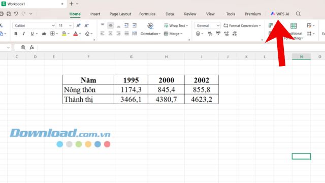
Select the table first, then click WPS AI in the top toolbar. Selecting the range gives the assistant a clearer boundary and reduces the chance that headings, notes, or unrelated tables will be included.
Step 3: Choose AI Data Analysis
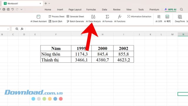
Open AI Data Analysis from the available tools. If WPS prompts you to sign in, upgrade, or use AI credits, review the current account terms before continuing; availability can depend on the installed version and plan.
Step 4: Write a precise prompt
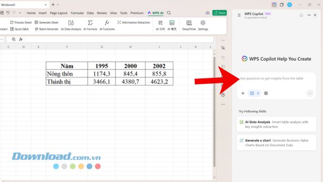
Describe the chart, fields, calculation, order, and labels you need. For example:
Create a line chart of monthly revenue using Month on the horizontal axis and Revenue on the vertical axis. Sort the months chronologically and title it Monthly Revenue.Create a clustered column chart comparing Q1 and Q2 sales by region. Exclude the Grand Total row and show data labels.Create a scatter chart of Ad Spend versus Conversions. Use campaign name as the label and do not aggregate duplicate rows.
A prompt such as “make a suitable chart” gives the AI more freedom but makes an inappropriate choice more likely.
Step 5: Review the generated chart
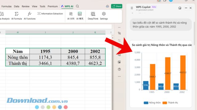
Check that the chart uses the intended rows and columns, the categories are in the correct order, and numerical values were not interpreted as text. Edit the title, legend, axis labels, number format, colors, and data labels as needed.
Choose the right chart type
| Goal | Useful chart | Common mistake |
|---|---|---|
| Compare categories | Bar or column chart | Using a pie chart with too many categories |
| Show change over time | Line chart | Sorting month names alphabetically |
| Show part of a whole | Pie or 100% stacked chart for a small number of categories | Using values that do not form a meaningful total |
| Compare two numerical variables | Scatter chart | Treating the horizontal values as text categories |
| Show a distribution | Histogram | Choosing bins that hide meaningful variation |
For more detail on trends and axes, see Excel chart fundamentals or this guide to making a line graph. The design principles apply even when the buttons differ.
Validate the result before sharing it
- Compare several plotted values with the source cells.
- Confirm whether blank cells were treated as zero, omitted, or connected across.
- Check filters, hidden rows, subtotals, and duplicate categories.
- Verify that axes start and end at sensible values and are clearly labeled.
- Use a readable title that states the metric and time period.
- Remove decorative effects that make comparisons harder.
- Add a source or update date when the chart will be reused outside the workbook.
Troubleshooting
The WPS AI button is missing
Update WPS Office, sign in to the correct account, and check whether the AI feature is available for your platform, region, and plan. A Linux, mobile, web, or older desktop build may not expose the same tools shown in the screenshots.
WPS AI uses the wrong cells
Cancel the result, select only the header and required data rows, and state the exact column names in the prompt. Move notes and separate tables away from the selected range.
Dates or numbers are out of order
Convert date-like text to real dates and number-like text to numeric cells, then sort the source data. Ask the assistant to preserve chronological order.
The chart is not useful
Request the chart type directly and explain the comparison you want readers to make. You can also create it manually from Insert > Chart, which is often faster when the desired type and range are already clear.
Before charting a difficult workbook, these tips for cleaning and presenting Excel data can help make the source easier to analyze.
Related Articles
 How to create graphs and charts in Google Sheets using Gemini
 Instructions for creating interactive charts in Excel with INDEX function
 Instructions on how to create charts in Excel professional
 How to link data between spreadsheets in Google Sheets
 Instructions for creating charts on PowerPoint
 How to create graphs, charts in Google Sheets
Reader Comments 0
Sign in with email or Google to join the discussion.