How to create a heat map (heat map) in Google Sheets
If you want to include a visual representation of your data, then using a heat map is a good idea..
A heatmap with gradient colors quickly displays the details of your data. But if you think it will be difficult for your audience to read the data correctly, you can use a single color for your heatmap.
Typically, this type of map is used to identify anomalous data. In this article, TipsMake will show you how to create both types of heatmaps in Google Sheets.
Create heatmaps with color gradients in Google Sheets
This type of heatmap will color cells depending on their value. In this example, small values will be highlighted with dark shades. The smaller the value, the darker the color.
Follow these steps to create a heatmap with color gradients in Google Sheets:
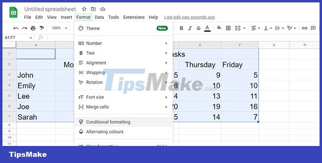
Step 1. Select data from the cell ranges.
Step 2. From the toolbar, click Format > Conditional formatting.
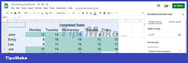
Step 3. In Conditional format rules, select Color scale. Google Sheets will show you a preview of the heat map.
Step 4. If you want Google Sheets to ignore values that are too low or too high, use the Min and Max value fields.
Step 5. Click Done when you are satisfied with the look of your heat map.

Besides adding heatmaps, you can change your Google Sheets theme colors for better looking spreadsheets.
Create heatmaps with a single color in Google Sheets
By creating heatmaps with a single color, you can quickly identify relevant data and use Google Sheets professionally. Here's how you can do it:
Step 1. Select your data from the cell ranges.
Step 2. Go to Format > Conditional formatting.
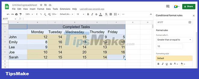
Step 3. Select Single colour.
Step 4. From the Format rules menu, select the rule you want to use. This example will choose Greater than or equal to.
Step 5. Enter the value that Google Sheets will use to format the data in the field below Greater than or equal to.
Step 6. Go to Formatting style and choose how Google Sheets will highlight the data.
Step 7. After you select the formatting rules, click Done.
If you edit your document and introduce new data, Google Sheets will mark it up without you having to go through the formatting process again.
Hopefully you now have a clear visual representation of your data. The biggest advantage is that you can easily import your newly created maps in other documents. If you need more visualization tools, heatmaps aren't the only tools in Google Sheets you can use to present data to your audience.