What do the colors on Google Maps mean?
Google Maps is great for getting around — not only because of its simplicity, but also because the color-coded terrain helps you distinguish forest from road..
Google Maps is great for getting around – not only because of its simplicity, but also because of the color-coded terrain that helps you distinguish between forest and road. Unfortunately, Google Maps doesn't explain what each color means, so let's take a look at the details in the following article.
What does each color on the map mean?
Google Maps is packed with useful features, from navigation to improved safety tools. Google is always looking for ways to improve the user experience, including thoughtful color coding designed to help you instantly distinguish what you're looking at. The idea is to create a detailed picture of the world in a minimalist style.
Start with the basic color categories and work your way up from there.
Roads, railways and underground tunnels
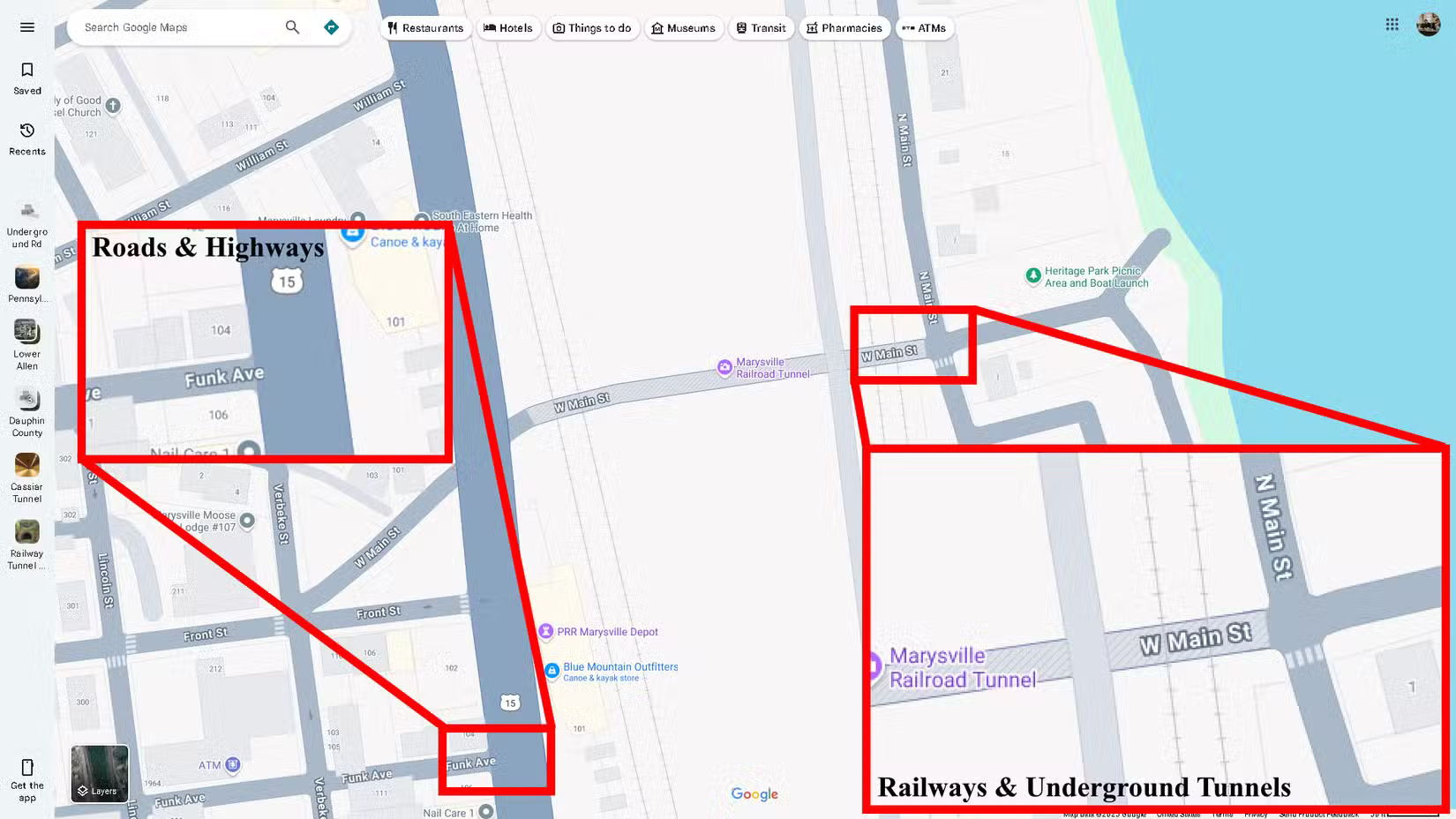
Gray : This color represents roads, highways, railways, and underground tunnels. Roads are a lighter gray, while highways are a much darker color with white dotted lines. These colors are significantly more distinguishable than the nearly identical shades of yellow that Google Maps used before.
Railroads are thin gray lines, the same color as roads. But they have one key difference: The dashed lines are designed to look like cross braces. Underground tunnels are gray with diagonal dashed lines.
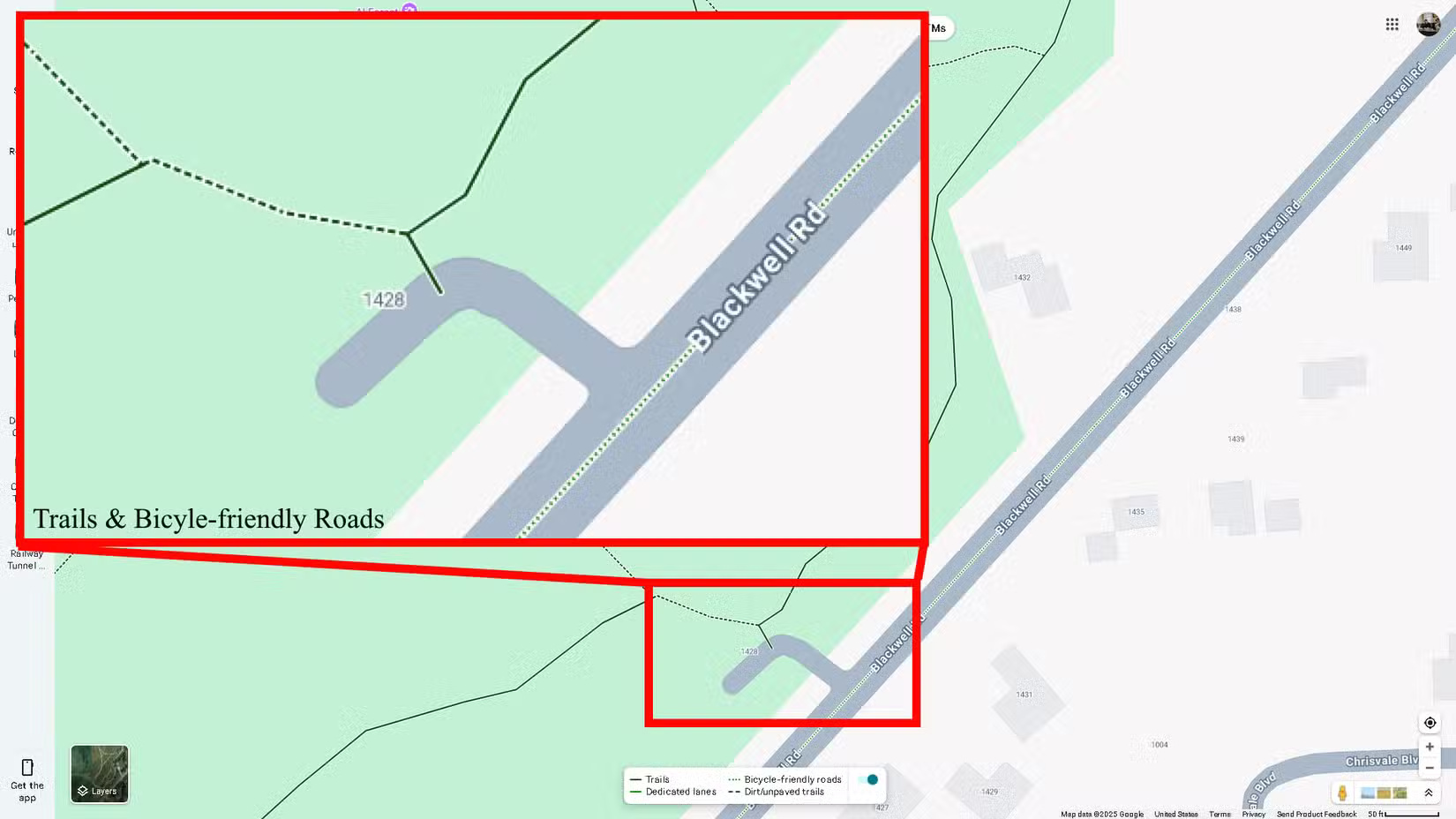
Green Lines : When Biking is enabled , you'll see a series of green lines to indicate trails, bike paths, dedicated lanes, and dirt roads. They're represented by a solid dark green line, a dashed green line, a solid light green line, and dashed dark green lines, respectively.
Buildings
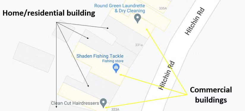
Light Gray : This color indicates non-commercial areas - some hospitals, health care centers, residential homes, and even nursing homes.
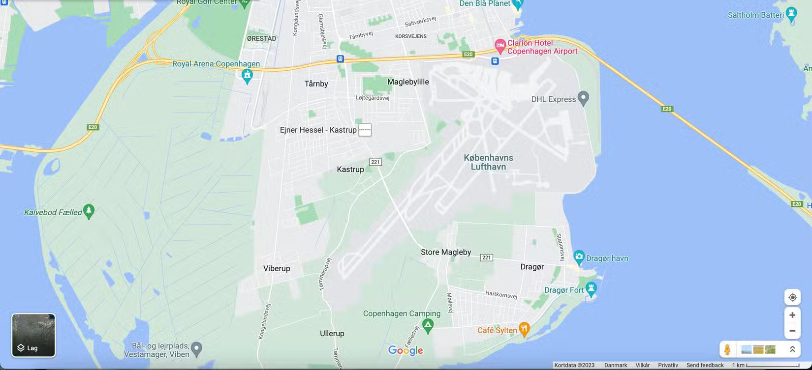
If you zoom in, you'll see subtle differences between the buildings. Residential buildings will be dark gray with a white background. Dark gray is also used to represent unique locations, such as airports, industrial parks, and large university campuses. In the example below, Copenhagen Airport in Denmark is highlighted in dark gray.
Important Note : Although universities are shown in dark grey on the map, if you zoom in enough to see all the different buildings on campus, some will be tan and some will be grey. Military bases will also be identified in grey.
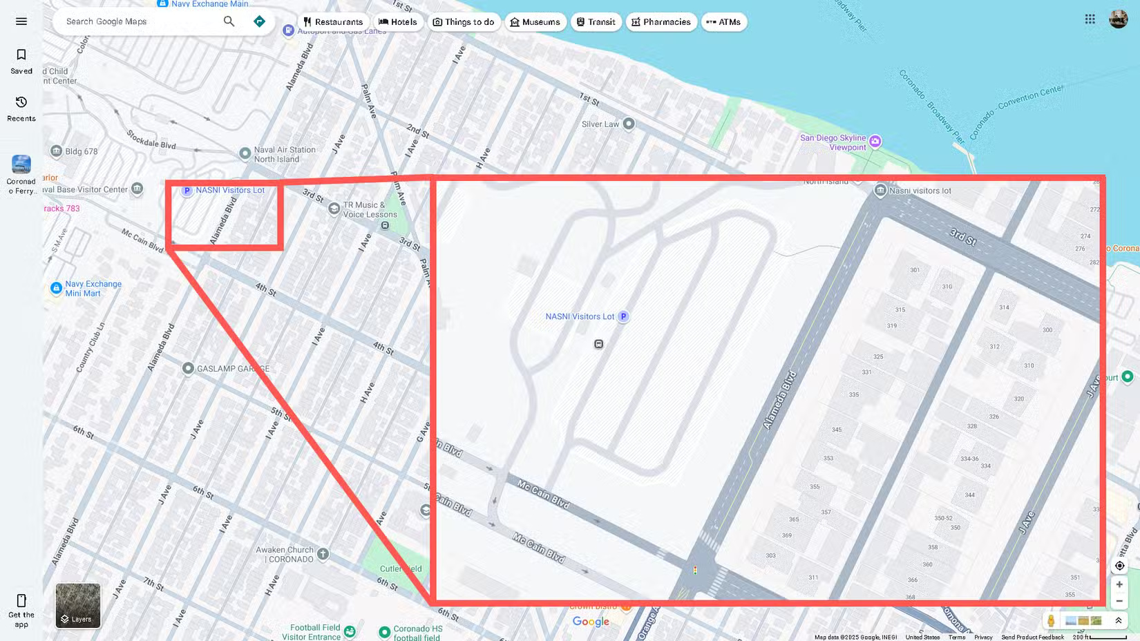
In the example below, you can see the separation between the US Naval Base in San Diego and the civilian residential area on the right. This is only different if you look at it from a distance. If you zoom in, both areas look the same, except for the roads. Roads on military bases are also grayed out.
Light Brown : This color represents commercial areas, commercial buildings, and some hospitals. After loading any city in the world into Google Maps, you will see the city divided into gray and tan. The tan areas represent the commercial centers of the city, as well as the city center and historical sites of the old town.
If you download a map for offline viewing, all of this data and color coding will remain as detailed as the live, online version.
Nature and parks
Dark Brown : This color is used for public beaches.
Blue : This color represents water and rivers. Large bodies of water, such as lakes, are blue. Meanwhile, rivers may appear as thin lines of blue.
Brown : Google Maps uses a lot of shades of brown; they can represent anything from deserts to national parks to mountain ranges. Depending on the location, they will often be labeled. Officially, Google Maps calls this the natural sand/shrub color.
Green : Whenever you see patches of green, you are looking at forests and recreational parks. National parks can also display green, although this varies from park to park.
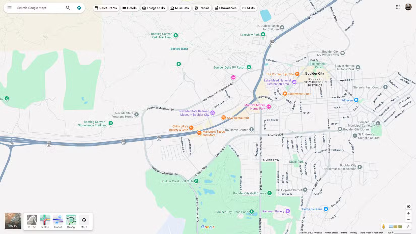
The example below shows an area around Boulder City, Nevada, where you can see a mosaic of blues, greens, browns, and tans representing Nevada's natural features.
Traffic
When you turn on the traffic layer in Google Maps, you can see the normal and live traffic conditions in the area represented by a series of green, yellow, and red lines. The color you see will tell you how light or bad the traffic is.
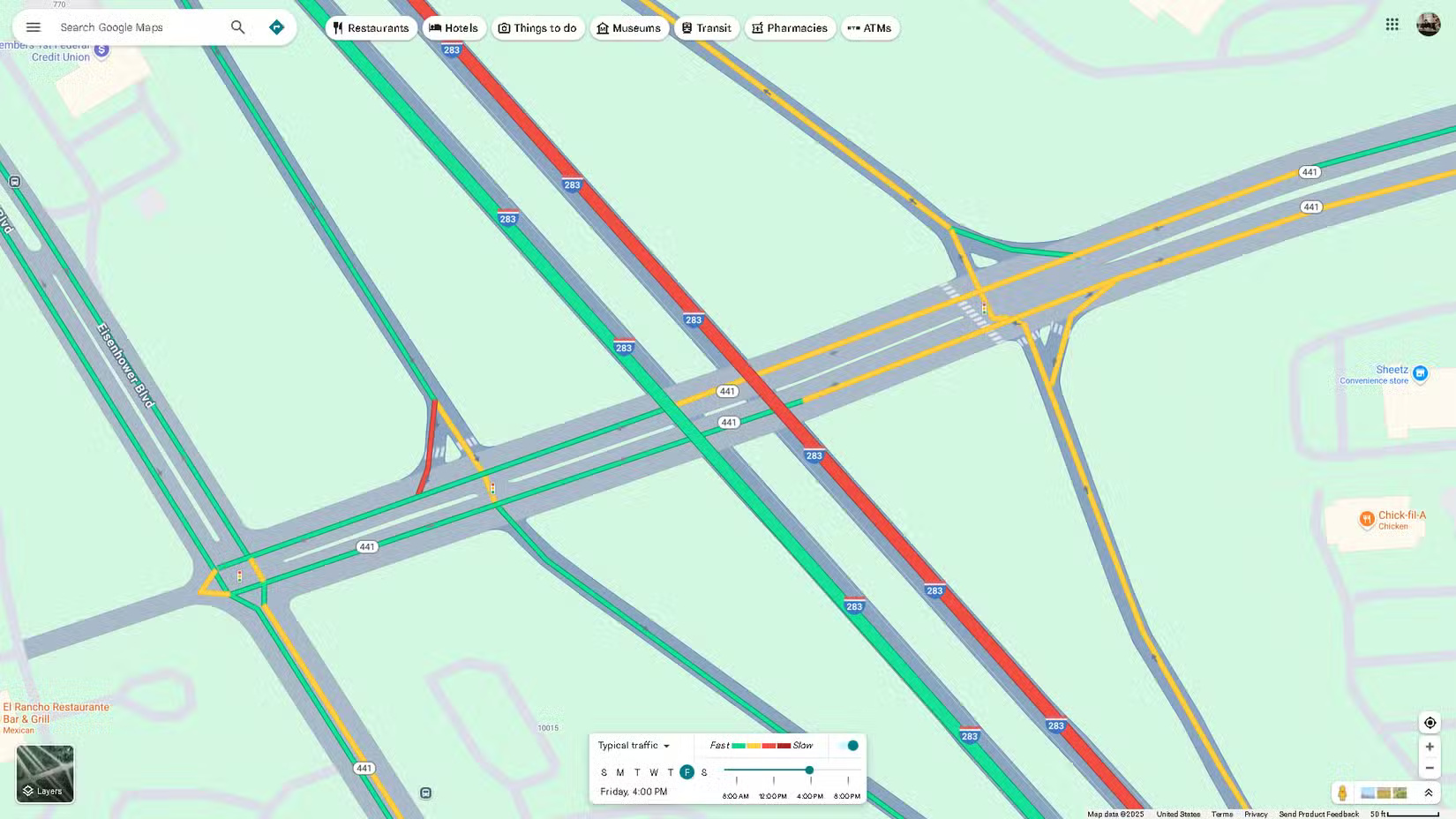
Green : When you see this color, the road has low traffic, so you shouldn't worry about being delayed.
Yellow : A yellow line means you should be concerned about fairly heavy traffic.
Red : There are two shades of red: Normal and dark red. If your map has the traffic layer turned on or Directions selected , red on a road means heavy traffic, possibly caused by an accident or construction. Dark red means very heavy traffic.
Blue : This color only appears when you have set a destination in Google Maps, indicating the most optimal route to take when traveling.
While Google Maps has changed some of its colors since launch, most of the original color scheme has remained the same. If you haven't used Maps in a while, the change from yellow lines to gray lines is the most obvious difference you'll notice. If you haven't used Maps in a while, it's the most confusing. They now look like miniature streets—with white lines and polka dots and all.