How does other flat design simulate design?
Flat Design (Flat Design) is considered a minimalist design philosophy, ie all graphic elements are made simplest with features such as clear color, angular, open space and All are shown in two-dimensional format.
For months you may have heard a lot about Flat Design when it was supposed to be the biggest change on the upcoming iOS 7.
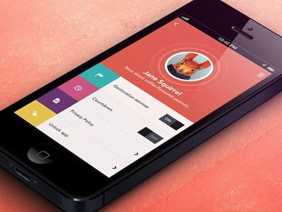
To explain this design philosophy, many people associate it with the Metro UI interface on Windows 8, but most of us still don't understand and why it becomes the current design trend . Flat design emphasizes maximum simplicity and goes against completely the simulation design philosophy (Skeuomorphic) that enhances the beauty and complex graphics. The flat design came into being before Microsoft developed Windows 8 but it is undeniable that Microsoft has contributed to spreading it more widely.
What is a flat design?
Flat Design (Flat Design) is considered a minimalist design philosophy, ie all graphic elements are made simplest with features such as clear color, angular, open space and All are shown in two-dimensional format.
A typical example of the flat interface that you can see most is Metro UI on Microsoft Windows 8 operating system or Windows Phone operating system interface. On the main screen, you will see an interface with completely separate colors, they are not designed in three-dimensional or skeuomorphic form, where simplicity is placed on top.

This design philosophy was born in association with minimalist style (Minimalist) but the simplicity does not mean flat design is boring for users. In a flat design philosophy, beautiful and detailed graphic components are considered unnecessary. If an element is not working, it will cause trouble for the user experience. This is the reason that minimalism is enhanced in flat design. Moreover, the high contrast colors will get better attention and direct the user to the location.
What is simulation design?
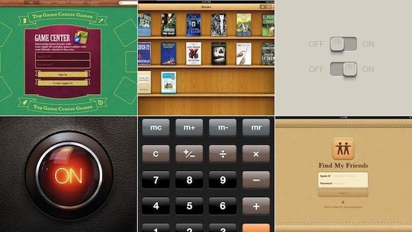
In order to understand the flat design and why it comes to the throne, you should also understand more about the philosophy that it opposes: Simulation design . If you have not heard what this type of simulation design (Skeuomorphic) is, it is the style of manipulating realities into a certain design. To make it easier to understand, the clock icon will look like a real-life clock, the computer icon will take the form of a normal computer . and more.
If Microsoft is known for its flat design, Apple is very fond of simulation design on its recent software products. Not only that, Apple uses a lot and effectively this design philosophy, partly to help their software stand out and look more beautiful. The image above is a good example of skeuomorphic at Apple.
Flat design is the solution to the problems of simulation design
Despite being heavily invested with a beautiful three-dimensional interface, the simulation design is not without problems. This philosophy relies entirely on objects in everyday life so it somewhat limits creativity and efficiency in design. Besides, the design components are not uniform when combined with two-dimensional or less "dimensional" design components.
Sometimes simulation design does not mean anything, for example with Find My Friends application (find friends around), its background is made to resemble creamy yellow leather but it is not a bit realistic at all. In addition, it will become limp when combined with other elements that do not follow the simulation effect.
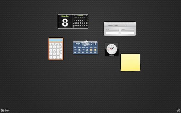
Explain the image: In the picture is the OS X widget window with widgets designed to simulate real objects. The watch is similar to a real watch but it makes it more difficult to watch the time than the electronic display board. Computer widgets are also more difficult to use than calculating directly with Spotlight.
Based on the problems of the simulation design philosophy that flat design was born with two completely different directions. All the limitations and weaknesses of the simulation philosophy are removed on a flat design to provide a simpler and more efficient user experience.
In 1984, when Apple introduced the first graphical user interface (GUI), simulation design began to be used to help users familiarize themselves with strange concepts on computers (think of the directory, desktop, trash .) but later, when the computer was too popular, people didn't need simulations to understand the function of a symbol or a button. Simulation design starts to become redundant. Modernists claim that do not add details without any function in a design today.
The principles of flat design
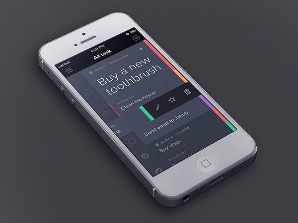
The flat design name derives from its shape, two-dimensional and flat form. The idea of this philosophy is formed without components including shadow effects, bevels, floating lines, granular backgrounds (not smooth) or other tools that give depth to the design. None of the above components is included in the flat design for actual simulation. Flat design has no added effects.

Flat design uses many simple user interface components such as function buttons or program icons (icons). Designers mainly use common shapes including rectangles, circles or squares for flat designs, which helps them stand apart. It is not necessary to cut the right angle but the shapes in this design philosophy can be softly bent. Users can easily touch or click on these interface elements without any trouble, it is made intuitive so that users do not have much knowledge about the design can understand. Simple ingredients are mainly used in flat design.
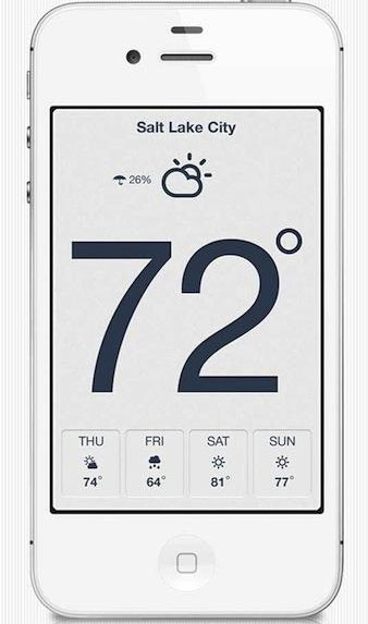
Because of the simplicity of the flat design components, the arrangement of artistic characters (Typography) is also particularly important. The typeface must match the overall interface of the design, in other words simple flat design, the font and font used must be simple to fit into the common space. Therefore, flat design also needs to focus on typography next to the graphic elements.
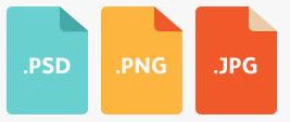
Color is a particularly important factor in flat design. Colors here are often bold and quite diverse in color compared to previous designs. While most palettes (color palettes) use two or three colors, the color palette in flat design uses 6 to 8 colors. In addition, colors are highly saturated and quite brilliant. Colors are also enhanced as typography.
Flat design is a trend
Although the flat design is being applied more and more in design, it is not forever when a new philosophy will replace it in the future. We can not guess which trend will go after the flat design but please be satisfied with the present, with a flat design .
Although Apple has not confirmed but rumors that iOS 7 will follow this philosophy and completely different from the current version of iOS. We can guess that because Apple replaced the former iOS manager manager Scott Forstall by Jony Ive, Apple's most important designer.
- 7 signs that your design style is out of date
- Firefox launched a new flat-design logo with 23 Beta version
- Change the flat Facebook interface with Flatbook
- NASA captures a large, square-shaped piece of ice
- How to activate Material Design interface on YouTube
- How to simulate Java on a PC to play games


 20 beautiful mezzanines for a small house
  Top 5 the best free home design software today 2020
  The easiest 3D interior design software to learn 2021
  What is Fluent Design?
  What designers can learn from the amazing UX design of the Candy Crush game
  Why do some websites with extremely 'bad' interfaces like Reddit and Wikipedia 'live so long'?