Principles for designing iOS apps
These design principles will help any designer who wants to build neat apps for iOS that can start in just a few seconds.
Table of Contents
Designing iOS apps can sometimes be a daunting task, but finding accurate and up-to-date information on all Apple devices should not be the case. These design principles will help any designer who wants to build neat apps for iOS that can start in just a few seconds.
The following principles describe how to design applications that comply with the official HIG for Apple's iOS, not what you can do with custom control features. The purpose of this document is to guide you to the basics, not to provide solutions to complex and unique design problems.
Screen resolution and specifications
EquipmentRetina Screen Vertical Size (px) Horizontal Size (px) iPhone XS Max Retina HD 1242 x 2688 2688 x 1242 iPhone XR Retina 828 x 1792 1792 x 828 iPhone X, XS Retina HD 1125 x 2436 2436 x 1125 iPhone 6+ , 6S +, 7+, 8+ Retina HD 1080 x 1920 1920 x 1080 iPhone 6, 6S, 7, 8 Retina 750 x 1334 1334 x 750 iPhone 5, 6SE ( 5, 5S, 5C, 6SE) Retina 640 x 1136 1136 x 640 iPhone 4 ( 4, 4S) Retina 640 x 960 960 x 640 iPhone (Generation 1, 2 & 3) No 320 x 480 480 x 320 iPad Air / Retina iPad (Generation 1 & 2/3 & 4) Retina 1536 x 2048 2048 x 1536 iPad Pro ( 12.9 "2018) Retina 2048 x 2732 2732 x 2048 iPad Pro ( 11" 2018) Retina 1668 x 2388 2388 x 1668 iPad Pro Generation 1 (10.5 ") Retina 1668 x 2224 2224 x 1668 iPad Mini (2nd, 3rd & 4th Generation) Retina 1536 x 2048 2048 x 1536 iPad (Mini, 1st and 2nd generation) No 768 x 1024 1024 x 768The difference between Point and Pixel
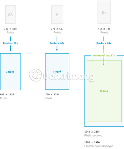
Pixel is the smallest physical element that we can control on a digital screen. The more pixels appear on a specific screen size, the higher PPI (pixel per inch) and the more clearly displayed content.
Point is a unit of measurement independent of resolution. Depending on the screen pixel density, a point may contain multiple pixels (for example, 1pt of 2x 2pixel on a regular retina screen).
When designing applications for different types of screens, you should think based on points, but design in pixels. This means you will still need to export all your assets at 3 different resolutions, no matter which application you're designing, at how much resolution.
Note:
If not added (by adding px to a value), this tutorial always refers to point when it comes to specific dimensions. If you need a pixel value, just need to multiply 2 for Retina screen or 3 for Retina HD screen.
Device Resolution assetPPPhone screen size XS Max @ 3x 458 6.5 ″ iPhone XR @ 2x 326 6.1 ″ iPhone X, XS @ 3x 458 5.8 ″ iPhone 6+, 6S +, 7+, 8+ @ 3x 401 5.5 ″ iPhone 6, 6S, 7, 8 @ 2x 326 4.7 ″ iPhone 5, 6SE ( 5, 5S, 5C, 6SE) @ 2x 326 4.0 ″ iPhone 4 ( 4, 4S) @ 2x 326 3.5 ″ iPhone (Generation 1, 2 & 3) @ 1x 163 3.5 ″ iPad Pro ( 12.9 "2018) @ 2x 264 12.9 ″ iPad Pro ( 11" 2018) @ 2x 264 11 ″ iPad Pro 1st generation (10.5 ") @ 2x 264 10.5 ″ iPad Air / Retina iPad (So system 1 & 2/3 & 4) @ 2x 264 9.7 ″ iPad Mini (2nd, 3rd & 4th generation) @ 2x 326 7.9 ″ iPad Mini (1st generation) @ 1x 163 7.9 ″ iPad (1st generation & 2) @ 1x 132 9.7 ″Downsampling on iPhone Plus models
The number of pixels rendered and physical pixels are equal on all iOS devices, with the exception of the iPhone 6 Plus, 7 Plus, 8 Plus, iPhone X, XS and XS Max Retina screens. Because its screen has a pixel resolution lower than native resolution of 3x, so the displayed content will automatically resize to about 87% of its original size (from 2208 x 1242pixel to match 1920 x 1080 pixel screen resolution) for Plus models.
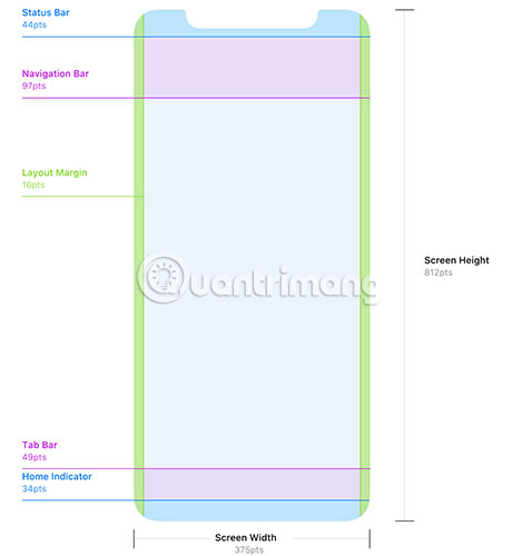
IPhone X safe zone
The iPhone X requires some special attention from designers. Unlike all other iOS devices, it has a screen with rounded corners and also has a cut above the screen (where the front camera, sensor and speaker are located). When designing applications for iPhone X, you must pay attention to the safety zone and layout margins to ensure the application user interface is not cut by the sensors or corners of the device.
Application icon
Device Application icon Icons on AppStore Icons in Spotlight Icons in SettingsiPhone + 6+, 6S +, 7+, 8+, X 180 x 180px 1024 x 1024px 120 x 120px 87 x 87px iPhone 4, 4S, 5, 5C, 5S, 6, 6SE, 6S, 7, 8 120 x 120px 1024 x 1024px 80 x 80px 58 x 58 px old iPhone (Generation 1, 2 & 3) 57 x 57px 1024 x 1024px 29 x 29px 29 x 29px iPad Pro 167 x 167px 1024 x 1024px 120 x 120px 58 x 58px Retina iPads ( Mini 2 & 3, Air, 3 & 4) 152 x 152px 1024 x 1024px 80 x 80 px 58 x 58px Old iPad ( 1, 2, Mini 1) 76 x 76px 1024 x 1024 px 40 x 40 px 29 x 29pxEffects are applied automatically
Application icon assets are often added to the application package as simple PNG files, in many different sizes. When displayed on the device, iOS will apply different effects to these application icons.
Round corner
Old round corners on the application icon are gone. Since iOS 7, application icons have used the superellipse shape (super ellipse). When designing an iOS app icon, you should use the official application icon templates provided by Apple.
Rounded corners should not be included in the final assets, but you may need them in your design process, if you want to add effects that are aligned with the icon's angle.
Warning:
If you use superellipse for the application icon because you want to apply effects aligned to the corners, make sure not to use any transparency for the area outside the mask. Transparency is completely unsupported for application icons, but instead is displayed in simple black. If the mask is not 100% accurate, users will see small black pieces on the rounded edges. You should set the background of the canvas to match the background of the application icon.
Border around the edge of the icon (in some situations)
If the application icon you are using has a white background, a 1pixel wide gray border will be applied to make it easier to identify the edges of the icon. This is only done in the Settings app (if your application is listed there) and AppStore.
Inheritance effects (iOS 6 and earlier versions)
On older iOS versions, these effects are automatically applied: Rounded corners (unlike the shapes that iOS 7 and above are using), drop shadows on the main screen and effects Shadows can be disabled.
Grid system
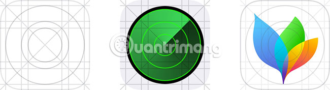
Apple has developed a golden ratio grid system that can be used to accurately scale and align elements on icons. However, even Apple designers do not strictly follow this grid system for the original application icons. Feel free to break the rules if your icon works better without aligning all elements in the correct grid.
Font
The default system font on all iOS versions before iOS 9 is Helvetica Neue. With the release of iOS 9, Apple introduced a completely new font called San Francisco, replacing Helvetica Neue as the default font. San Francisco has two forms: 'SF UI Display' and 'SF UI Text' , while 'Display' is used primarily for UI components, then 'Text' has a wider spacing and should be used. for long texts. You can download San Francisco fonts here if you are a member of the Apple Developer program. In addition to the default font, many other alternative fonts are also available for use. You can find a full list of pre-installed fonts at http://iosfonts.com/.
Font size
Element Font-weight (pt) weightSpacing / Line extension (pt) Type Navigation bar title (Navigation Bar) 34 Highlight -0.41 Text Navigation bar title 17 Sell bold -0.41 Text Button on navigation bar 17 Normal -0.41 Text Search bar 17 Normal -0.41 Text Button Tab Bar 10 Normal -0.24 Text Header in table 13 Normal -0.08 Text Line in table 17 Normal -0.41 Text Sub-line in table 15 Normal -0.24 Text Footer Table 13 Normal -0.08 Text Action Sheet (action table) 20 Normal / Sale bold 0.75 DisplayCustom fonts
Technically, every True Type Font (.ttf) can be used in iOS apps, but be careful about the license. It is safe to use completely free fonts for commercial purposes. Application licenses for commercial fonts are rarely available, and if available, prices are also very expensive. MyFonts currently offers the largest collection of fonts licensed for mobile applications.
Color Palette (Color palette)
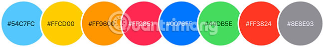
Since iOS 7, Apple has used a brilliant color palette for the interface of the operating system and pre-installed applications. Although you can use the default iOS color scheme listed above, you can (and probably should) use your own color, if you want to stand out.
Symbol
In iOS apps, icons are always a great way to support text labels, have a visual relationship with actions that are done or can completely replace the text (usually for actions Very popular like New, Delete, etc.). Typically, you will handle icons in the Navigation Bar, toolbar (Toolbar) or Tab Bar.
Button icon on the bars
The icons used in the Navigation Bar and Toolbar must be sketched with a width of 1 or 1.5pt. Since iOS 11, Apple recommends using a new icon style (glyph) for Tab Bar.


You should never include any additional effects such as shadows or shadows on these button icons because this is a duplicate from previous iOS versions (before redesigning iOS 7). Button icons must be painted in a monochrome color on a transparent background. The shape of the icon used as a mask and the color will be applied according to the program.
Activity View icon
Icons in Activity View (also known as Share Popover) have been designed in a sketchy fashion, but since iOS 8, Apple has returned solid fill icons on a plain white background.

Design elements are often used
iOS provides a large collection of ready-to-use views and control features, allowing rapid application developers to build interfaces. Some elements can be customized to a certain extent, but other factors are not and perhaps you should not do it. When designing an iOS app, you should understand your toolkit and keep abreast of them whenever possible.
However, in some cases, it may be worth building custom controls because you need a more customizable interface or want to change the functionality of an existing control feature (this is quite dangerous). ). Almost anything is possible, and sometimes breaking rules can be surprising but effective, but always think carefully before doing so.
Status bar
The status bar contains basic system information such as current network, time, battery status and more. The status bar is visually connected with the navigation bar and uses the same background. To match the style of the application and ensure readability, the content of the status bar has two different types: Dark (black) and bright (white).
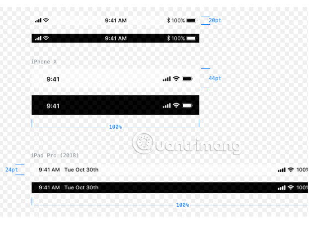
On iPhone X, the status bar is higher than all other iOS devices. Since the black area at the top of the screen cuts into the display area, the new status bar is divided into two parts. On the iPad Pro, there is a liquid LCD screen, the status bar is slightly higher than before.
The status bar may be hidden, but think carefully before doing so. For example, users may want to know if they are connected to a WiFi network, when the application regularly downloads web content or if Bluetooth is turned on, when the application requires Bluetooth connectivity with the hardware of third-party. A valid reason to hide the status bar is when you want to remove all distractions from a single element, for example, when displaying full-screen content as an image gallery.
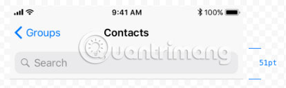
Navigation bar
The navigation bar contains control features for navigating through many app views and options for managing content for the current view. It will always appear at the top of the screen, just below the status bar. By default, the background and content below this bar will be a little fuzzy. The background color of the bar can be set to a monochrome, gradient or custom bitmap.
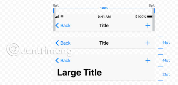
With the release of iOS 11, Apple introduced a new navigation bar: When the app content is in a scroll position of 0 (at the top), the title is moved to a separate line below the navigation bar area. originally and expanded massively. When the user starts scrolling down, the title slowly fades, returning to its original position and size.

Navigation bar on iPhone in landscape mode. The height of the bar is reduced to 12pt, except on the iPad. This is also a common way to hide the status bar in landscape mode.
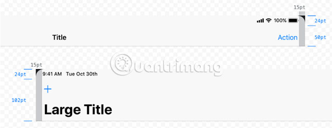
Factors must always follow a specific alignment model.
- The Back button must always be aligned to the left.
- The title of the current view must always be in the middle of the bar.
- Action buttons must always be aligned to the right. If possible, there should never be more than one main action to avoid missed clicks and to maintain simplicity.
With the release of iOS 12, Apple increased the height of the base navigation bar by 6pt (only on iPad devices). Large titles continue to add 52pt to the height of the navigation bar.
Toolbar (Toolbar)
The toolbar contains a set of actions to manage or manipulate the content of the current view. On the iPhone, the toolbar will always appear at the bottom of the screen, while on the iPad, this bar can also be displayed at the top of the screen.
Similar to the navigation bar, the background of the toolbar can be modified and blurs the content below by default.
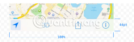
Toolbar should be used when a specific view requires more than three main actions, difficult to match or look messy in the navigation bar.
Besides Tab Bar, Apple has increased the height of the toolbar by 6pt on all iPad devices since iOS 12.
Search bar
The search bars have two different styles by default: Highlights and minimalist. Both versions have the same functionality.
- As long as the user does not enter text, the placeholder text is displayed inside the bar and the bookmark icon can also be used to access recent or saved searches.
- When a search term is entered, the placeholder will disappear and a button to delete the entered value will appear on the right side.
The search bar can use a prompt - a short sentence to introduce functionality in the search context (eg ' Enter a city, zip code or airport ').
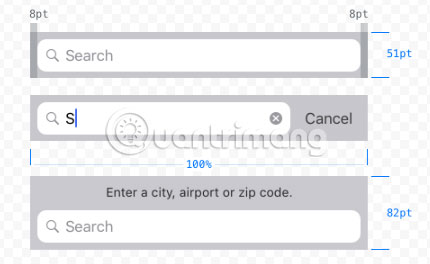
To provide more control over the search query, it is possible to string the search bar with a range bar. The range bar will use the same type as the search bar and may be useful when there are clearly defined categories for search results. For example, in a music application, search results can be filtered by album or song.
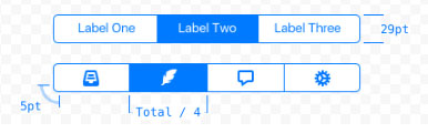
Tab Bar
The Bar tab is used to allow users to quickly navigate through separate views of the application and should only be used for this purpose. Tab Bar always appears at the bottom edge of the screen. By default, it's a bit fuzzy and uses the same type of blurring for the content below as the navigation bar.
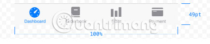
Tab bar can only contain a fixed maximum number of tabs. When there are more tabs than the maximum number, the last tab displayed will be replaced with the 'More tab' (containing the list of hidden tabs), with the option to rearrange the tabs displayed.
The maximum number of tabs displayed on iPhone is 5, on iPad is 7 and avoid more tabs than these numbers.
To inform the user about new information on the view mode, it is sometimes advisable to apply the badge counter (unread message) to the tab bar button. If the view is temporarily disabled, the related tab button should not be completely hidden. Instead, it should be faded to convey visual status disabled.
On the iPad, labels for tabs are displayed in larger font sizes and next to icons instead of below. Since iOS 12, the bar tab is also slightly higher, matching the larger height of the toolbar (50pt).

Table view mode
Table views are used to display a small amount of list type information in one or more columns, with the option to split multiple rows into separate sections or to group them. There are two basic tabular views used, depending on the type of data you are presenting.
Plain
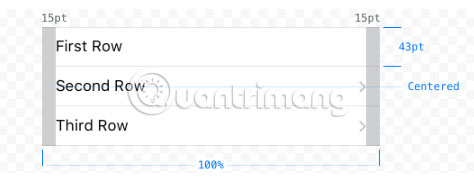
A plain form table contains some rows that can have headers at the top and footers after the last row. It is possible to display navigation along the right side of the screen to navigate through the table, useful when presenting a large data set that can be arranged in a certain way (for example, descending in alphabetical order the).
Grouped
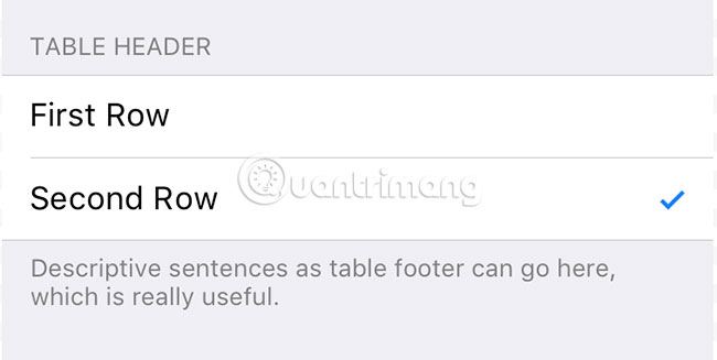
A grouped table allows you to arrange rows in groups. Each group may have a header (best used to describe the context for the group) as well as a footer (suitable for help text, etc.). A grouped table should contain at least one group and each group should contain at least one row.
For both types of table views, several types are available to present data in a way that allows users to easily scan, read, and modify.
Default
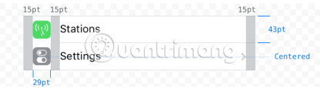
A row of the table by default has an optional image left to right and a title.
With subheadings
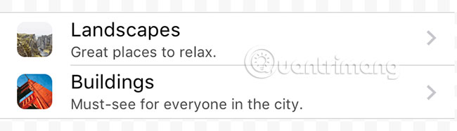
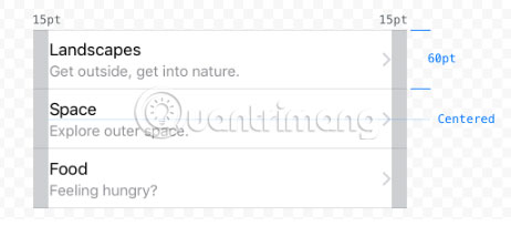
The subheading style table allows a small caption text to be placed under the row title. It is useful for further explanations or short descriptions.
With value
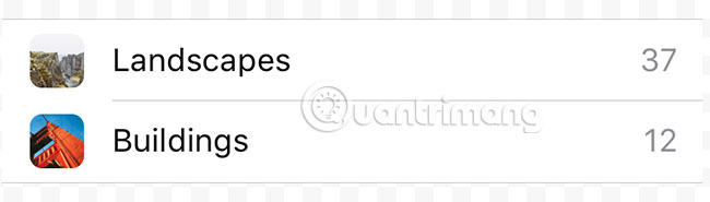
The table style with the enclosed value allows you to display a specific value related to the row title. Similar to the default type, each row can have an image and a title is aligned to the left. The title is followed by a label for the value (right-aligned), usually displayed in a slightly more subtle text color than the title.
Large boxes
When displaying subheadings in tabular view, you should consider using the large table cell type. The amount of information and control features you can display with this information is the same as with other table cell types, but because the padding section increases, the table does not seem to be very dense.
Dialog, Popover and Alerts
iOS offers a variety of temporary views, which can be used to display, edit and manipulate data in the most appropriate way in a particular situation. Although each view temporarily exists for a very specific purpose, all the temporary views still have one thing in common. When displayed, it is the highest index layer on the current view (they appear above everything else) and the content below is covered with a matte black background.
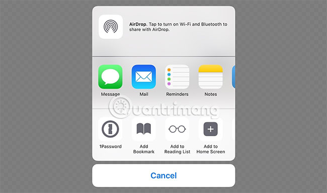
Activity View (Active view)
An Activity View is used to perform specific tasks. These tasks can be the default system tasks such as sharing content through available options or they can be fully customizable actions. When designing icons for custom task buttons, you should follow the same principles as for the active status of the solid - button fill icon, without effects, on the background. crystal-clear.
Action Sheet (action table)
Action Sheets are used to perform a single action from the list of available actions and force the application user to confirm or cancel the action.
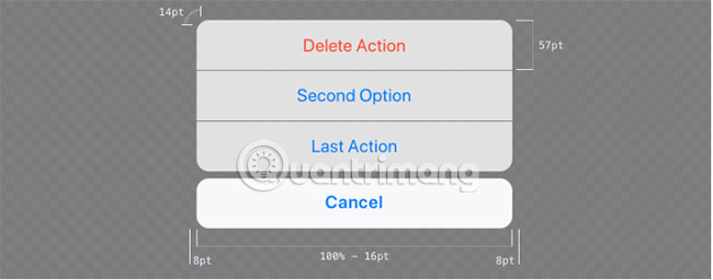
In vertical mode (and on small horizontal screen resolution), actions are always displayed as a list of slide buttons and located on the bottom edge of the screen. In this case, Action Sheet must always have a cancel button to close the view and not perform any of the listed actions.
When there is enough space available (for example on the iPad screen), Action Sheets will convert it to popover visually (displaying captions or suggestions for a certain element on the interface). No need to have a button to close the view anymore because touching the target anywhere other than popover will automatically close it.
Warning
The purpose of the alert is to inform users about important information and options that force users to make decisions about certain actions.
Alert view always contains title text, should not be longer than one line and one (for pure information alerts, for example, OK ) or two buttons (for warnings for decision making, wallet Example, Send or Cancel .
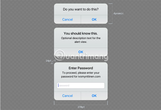
In addition, you can add a notification text, if needed, as well as up to two text entry fields, one of which may be the school that has the ability to mask sensitive information such as passwords or PINs.
Edit menu
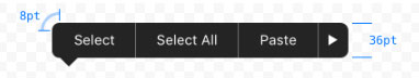
Menu Edit allows users to perform actions such as Copy, Paste, Cut , etc., when an element is selected (text, image or any other element) . Although it is possible to control the actions that the user can select, the intuitive interface of the edit menus is set and cannot be configured unless you build your own custom editing menu. .
Popover
Popover is useful when a specific action requires a lot of user input before continuing. A good example is adding an item, in which there are a few attributes that need to be set before the item can be created.
In a horizontal environment, popover is displayed below the relevant control feature (such as a button) with an arrow pointing to it while opening. The background of a popover uses a slightly reduced opacity and blurs the content below, like many other UI elements since iOS 7.
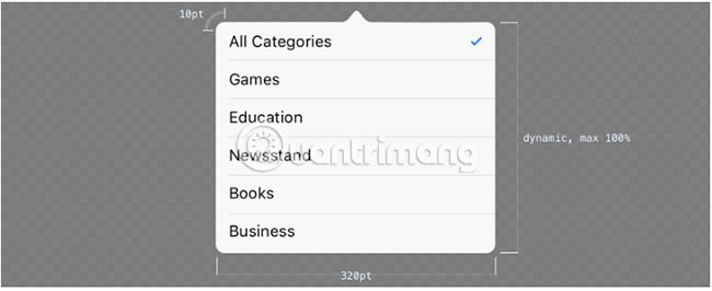
Popover is a powerful temporary view that can contain many different objects such as a separate navigation bar, tabular view, map or web view. When a popover increases in size due to the number of elements contained in it and touches the bottom edge of the view, you can scroll in popover.
Dialog box
The dialog is a useful view for tasks that require multiple user commands or inputs. They appear above everything else, and while opening and blocking interact with any other element below.
Typical dialog boxes often provide:
- A title to describe the task.
- A button to close the mode without saving or performing any other action.
- One button to save or send any entered information.
- Various elements for user input in the body of the dialog box.
There are three different types of dialogs available:
1. Full screen : Cover the entire screen.
2. Page sheet : In portrait mode, the dialog box includes only a portion of the content below, leaving a small portion of the main view visible below the matte black background. In landscape mode, the page sheet dialog box works like a full screen mode.
3. Biểu mẫu : Trong chế độ dọc, hộp thoại xuất hiện ở giữa màn hình, giữ cho nội dung xung quanh của chế độ xem cha hiển thị bên dưới nền đen mờ. Vị trí của hộp thoại tự động điều chỉnh khi cần hiển thị bàn phím. Trong chế độ ngang, hộp thoại biểu mẫu hoạt động giống như chế độ toàn màn hình.
Những tính năng kiểm soát
iOS cung cấp một loạt các tính năng điều khiển cho bất kỳ loại đầu vào cần thiết nào bạn có thể nghĩ đến. Bạn sẽ tìm thấy điều quan trọng nhất (thường được sử dụng), nhưng để có danh sách đầy đủ các tính năng điều khiển có sẵn, bạn nên xem iOS Developer Library (link tham khảo: https://developer.apple.com/documentation/uikit/views_and_controls).
Các nút
Có lẽ tính năng điều khiển được sử dụng nhiều nhất là những nút cũ. Kể từ iOS 7, thiết kế nút mặc định không thực sự trông giống như một nút bấm nữa, mà giống như một liên kết văn bản đơn giản. Điều khiển nút có khả năng tùy biến cao và cho phép bạn định kiểu mọi thứ, từ kiểu văn bản, hiệu ứng đổ bóng và màu sắc, cho đến một biểu tượng được đặt trên đầu hoặc ở giữa nếu không có nhãn văn bản, cũng như phần nền hoàn toàn tùy chỉnh.
Hãy nhớ rằng một nút có thể có một số trạng thái, cần được liên kết với ngôn ngữ trực quan: Mặc định, được highlight, được chọn và bị vô hiệu hóa.
Picker (bộ chọn)
Picker được sử dụng để chọn một giá trị từ danh sách các giá trị khả dụng. Tùy chọn tương đương trên web sẽ là một hộp chọn (picker control cũng được sử dụng khi chạm vào một tùy chọn trong Safari). Một phiên bản mở rộng của picker là datepicker, cho phép người dùng cuộn qua danh sách ngày và giờ, chọn các giá trị cho ngày, tháng có thể cấu hình.
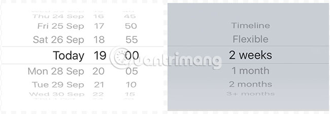
Hình bên trái là datepicker hiển thị bên trong chế độ xem dạng bảng, còn bên phải là picker dạng bàn phím.
Ngoại trừ màu nền, không thể thay đổi kiểu hoặc kích thước trực quan (giống như bàn phím) của picker control. Thông thường, chúng xuất hiện ở dưới cùng của màn hình, cùng vị trí với bàn phím, nhưng bạn cũng có thể sử dụng chúng ở các vị trí khác.
Segment Control (Kiểm soát phân đoạn)
Segment Control chứa một tập hợp các phân đoạn (segment, ít nhất là hai) có thể được sử dụng cho những việc như lọc nội dung hoặc để tạo các tab cho những loại nội dung được phân loại rõ ràng.
Mỗi segment có thể chứa nhãn văn bản hoặc hình ảnh (biểu tượng), nhưng không bao giờ có cả hai yếu tố này. Ngoài ra, không nên sử dụng một tập hợp các loại segment (văn bản và hình ảnh) trong một segment control. Độ rộng của một segment sẽ tự động thay đổi dựa trên số lượng segment (2 segment: 50% tổng chiều rộng, 5 segment: 20% tổng chiều rộng).
Thanh trượt
Điều khiển thanh trượt cho phép người dùng chọn một giá trị cụ thể từ một loạt các giá trị được phép. Vì việc chọn một giá trị hoạt động khá trơn tru và không có bất kỳ bước nào cần thực hiện thêm, các thanh trượt được khuyến nghị để chọn một giá trị ước tính, nhưng không chính xác. Ví dụ, một thanh trượt sẽ phù hợp khi đặt âm lượng âm thanh, vì người dùng có thể nghe thấy sự khác biệt và cảm nhận sự khác biệt giữa to và rất to, nhưng sử dụng thanh trượt cho một đầu vào văn bản để đặt giá trị dB chính xác sẽ không thực tế.
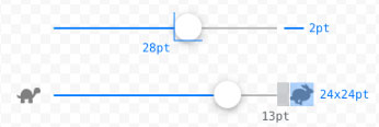
Có thể đặt biểu tượng cho giá trị tối thiểu và tối đa, được hiển thị ở cạnh bắt đầu và kết thúc của slider control, do đó cho phép bạn nắm bắt trực quan mục đích của thanh trượt.
Stepper
Stepper nên được sử dụng khi người dùng nên nhập một giá trị chính xác từ một phạm vi giới hạn của các giá trị có thể (ví dụ, 1-10). Một stepper luôn chứa hai nút được phân đoạn, một nút để hạ xuống và một nút để tăng giá trị hiện tại.
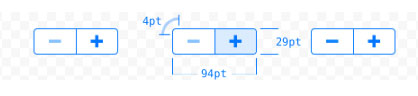
Stepper control có khả năng tùy biến cao:
- Bạn có thể sử dụng các biểu tượng của riêng bạn cho các nút stepper.
- Khi duy trì giao diện iOS gốc, bạn có thể tùy chỉnh màu của đường viền, nền và biểu tượng bằng cách sử dụng màu sắc, tự động đặt màu cho từng yếu tố này
- Nếu bạn muốn tiến xa hơn, bạn có thể sử dụng hình ảnh nền hoàn toàn tùy chỉnh cho các stepper cũng như cho dấu phân cách.
Switch (Công tắc)
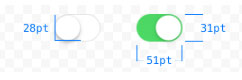
Công tắc cho phép người dùng nhanh chóng chuyển đổi giữa hai trạng thái: On (Bật) và Off (Tắt). Có hộp kiểm cho các ứng dụng iOS. Có thể tùy chỉnh màu cho trạng thái bật và tắt, nhưng sự xuất hiện của công tắc và kích thước của nó được đặt sẵn và không thể thay đổi.
Keyboard
Có nhiều loại bàn phím khác nhau để cung cấp lựa chọn tốt nhất có thể cho một loại nhập văn bản cụ thể. Mặc dù có thể xây dựng bàn phím hoàn toàn tùy chỉnh của riêng bạn, nhưng bàn phím mặc định cũng có thể được tùy chỉnh theo kiểu hoặc kích thước.
Was this article helpful?
Your feedback helps us improve.
Related Articles
 Quick Tips for Designing a Company App4 minutes read
 10 principles of UI/UX design for mobile apps8 minutes read
 9 principles of slide design in PowerPoint7 minutes read
 Principles of design stairs for tube houses4 minutes read
 5 Steps to Designing Your Life Wisely11 minutes read
 Learn the structure and principles of operation of the refrigerator7 minutes read
Reader Comments 0
Sign in with email or Google to join the discussion.