Why is the Windows interface increasingly fragmented?
Despite Microsoft's unification efforts, a fragmented and inconsistent user interface has plagued the operating system since the launch of Windows 95 and continues today, with Windows 11.
Consistency may not be a pipe dream for everyday Windows users, but it's still a point of contention for power users. The following article will explore the evolution of the Windows user interface, the issues that contribute to a fragmented user interface, and how competitors demonstrate a more cohesive approach.
Windows' inconsistent user interface development
Inconsistencies in the original Windows design can be traced back to Windows 95. While the successor to Windows 3.1 introduced a more cohesive design language with the Start menu and taskbar, it also marked a the beginning of a struggle at Microsoft with design conflicts due to the need to support legacy applications.

Windows XP, with its unified visual experience, brings Microsoft's line of business and consumer operating systems under one roof. While security is the biggest concern with XP, visual improvements have not taken place system-wide, creating inconsistencies.
With Windows Vista, Microsoft updated the look and feel of Windows with a beautiful, transparent design. However, some legacy applications and dialog boxes still retain the XP-style look and feel, including fonts, control styles, etc. This visual conflict continued with successive Windows upgrades, creating a fragmented user experience.

While hardware limitations slowed Vista adoption, the Aero design language found success in Windows 7, delivering a familiar experience with better performance, broad hardware capabilities, and many options. more personalized.

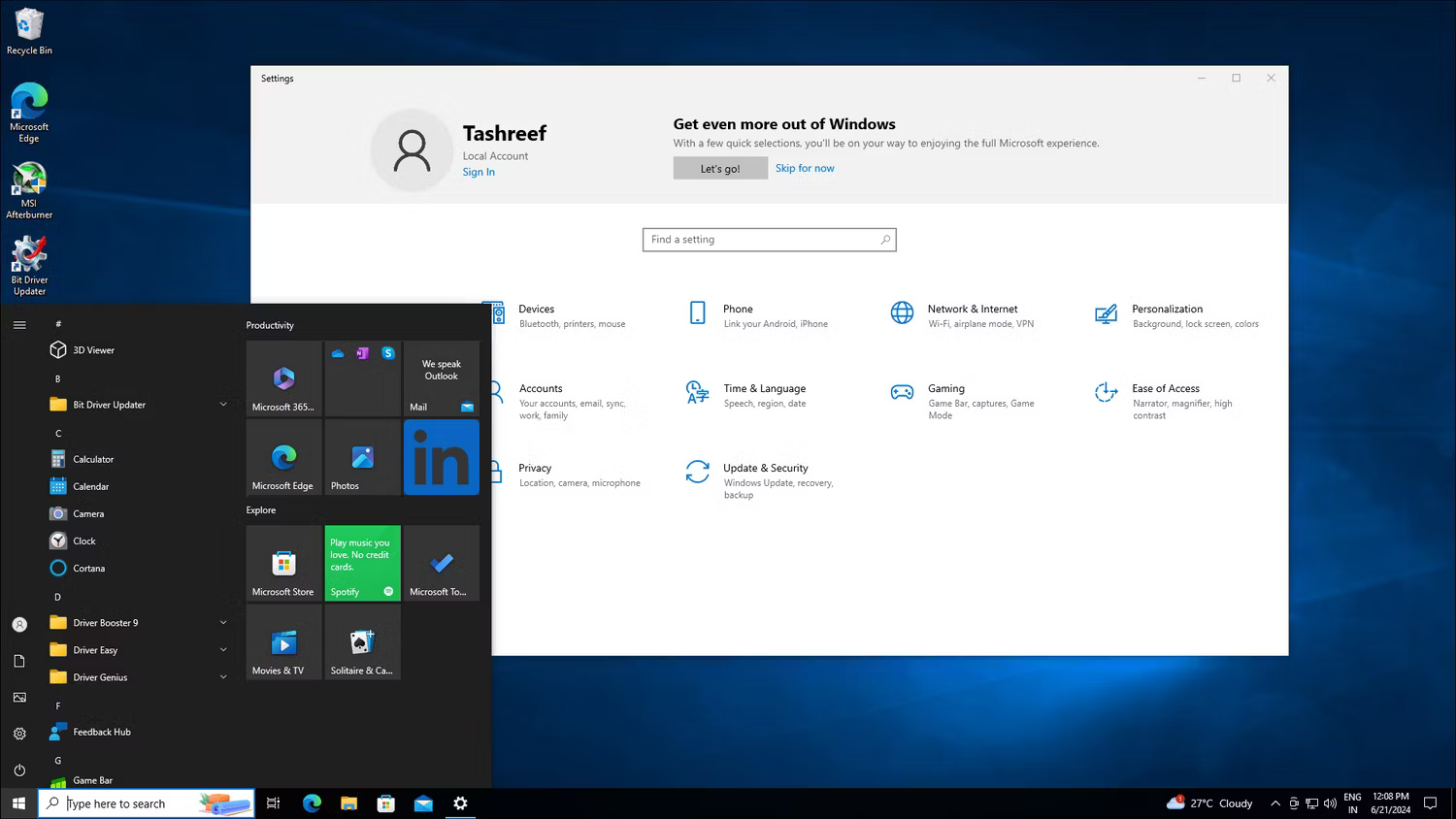
Windows 8, with its groundbreaking Modern (Metro) UI, is the biggest culprit. Designed with a focus on a touch-first interface, Metro UI received a negative reception from traditional PC users accustomed to keyboard and mouse input, and created a sharp contrast between the old and new applications.

Windows 10 fixes most of the problems, but some design differences remain. Despite the advent of Fluent Design System and Universal Windows Platforms (UWP) apps, the Start menu's design and functionality are not consistent with modern user interfaces.
Competitors are doing very well
In contrast, other operating systems like macOS prioritize a more uniform and consistent user interface. Since the transition from classic Mac OS to Mac OS X (now macOS), with significant design changes, macOS has kept the same core design principles without compromising modern aesthetics .

While macOS isn't completely free of inconsistencies, it has fewer visual differences than Windows. This is partly supported by the fact that macOS has been developed and tuned to work only with Apple hardware.
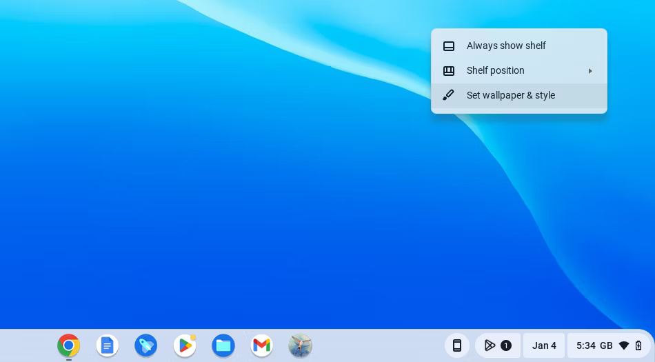
But even many Linux distributions, with their high levels of customization, adhere to specific design principles that prioritize a cohesive user experience. Other lightweight operating systems like ChromeOS, with their minimalist design and focus on web apps, provide a more unified experience across different apps and system components.

Windows has made significant changes to its user interface with each major release. Some of these changes are driven by external factors and some are for innovation purposes. For example, the rise of touchscreen devices in 2010 prompted Microsoft to redesign its popular operating system with Metro UI for a unified experience across devices. However, it was a major effort that did not yield results.
Microsoft still makes the same mistakes
Windows 11, building on the success of its predecessor, offers a more modern and streamlined user interface, but some inconsistencies still exist. Some of these points are part of a transition period, while others appear unfinished.

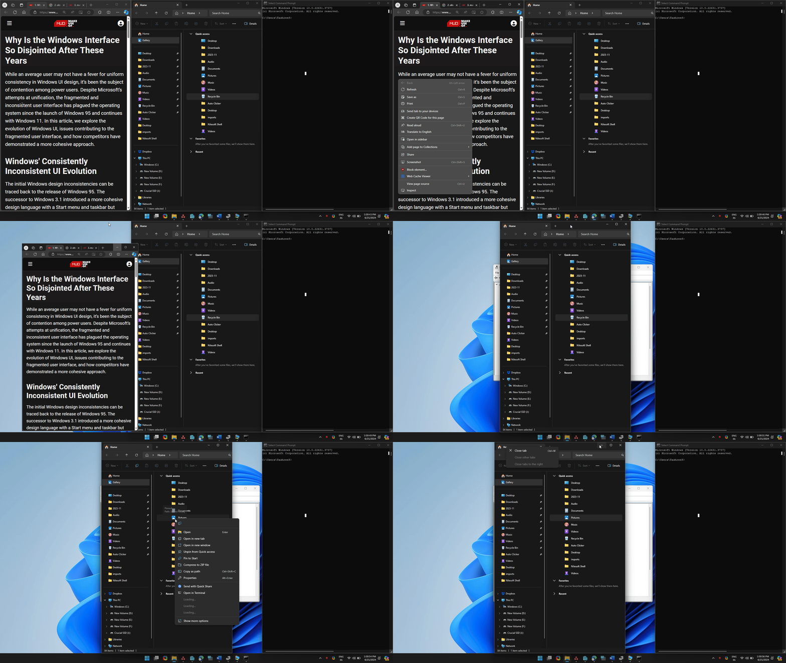
In addition to having too much going on, the new context menu is inconsistent across the operating system and is plagued by display issues with certain apps. The improved dark mode now supports more apps, but it's not without its problems. When enabled, it may not apply uniformly across all apps, especially when the app is open or minimized.
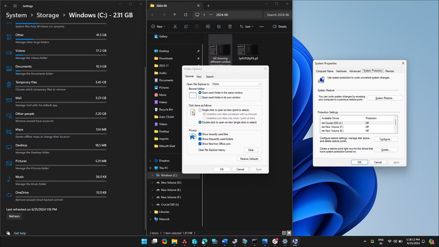
You will also find many instances of inconsistent design, where some parts of the system look like Windows 10 and even Windows 7. For example, advanced storage settings and Windows Recovery Environment remain old Windows 10 design elements. Digging a little deeper will find Windows 7 design elements for File Explorer, system restore, and Command Prompt options.

Furthermore, Windows 11 retains both the Control Panel and the old Settings app, creating a dual interface problem. However, this is expected to be temporary as Microsoft will phase out legacy elements as more options are migrated to the new Settings app.
Core applications like Device Manager and other administrative tools look like they've been revamped to look newer with rounded corners. Since these tools cater to advanced users and IT professionals, a comprehensive design revamp seems unlikely in the near future.
Solve legacy and compatibility challenges
Microsoft's commitment to backward compatibility, unclear transition points for older technologies such as UX frameworks, and a much larger legacy application ecosystem are among many factors contributing to Windows' fragmented user experience.
Responding to a query on Twitter (now but they will continue to support and develop the popular platforms that people are using today. .
Although each application with different requirements may prefer different frameworks, the existence and continuous development of multiple UI frameworks can contribute to visual differences even between applications. origin. This is a complex problem with no easy solution. While some of the blame lies with external factors, Microsoft's inability to align its modern native apps with the company's own user interface guidelines has left many questioning its commitment to innovation. with a cohesive design vision.
The future of the Windows user interface
While Microsoft has made strides toward a more unified experience with Windows 11, Fluent Design, and Project Reunion, the iterative approach to Windows development means there are more conflicts as New user interface components added. This is further complicated by backward compatibility, the needs of business users, and the scale of the Windows ecosystem.
Microsoft is addressing many of the UI consistency issues with newer updates but at a slower pace. While they are actively prioritizing AI in Windows 11 by adding new companion features, a dedicated update that addresses inconsistencies in the operating system's user interface could help bring the experience back to life. unified Windows experience. This will strike a balance between the addition of Copilot and core functionality improvements to the operating system.
- Refresh the Windows 10 interface with 11 custom tools
- How to bring Windows XP interface to Windows 10
- Inside Windows system
- How to install Windows XP interface for Windows 11
- Microsoft has revealed the new Windows 10 interface, inviting you to view and comment
- How to switch to Vietnamese interface for Windows 7


 0x80072F8F error when Activation Windows 7 and Vista, this is how to fix it
  How to fix error 0x0000011b when printing over the network on Windows 10
  What is the USO Core Worker Process or usocoreworker.exe? Are they viruses?
  Steps to change Taskbar position on Windows 11
  Download Ghost Win 10 32bit - 64bit Light, Get Self Full Driver
  3 ways to turn off Your Windows license will expire soon notification on windows