How to Use Basic Microsoft Office PowerPoint
Do you want to make a memorable presentation? PowerPoint gives you the ability to create a powerful visual aid that makes presentations more impressive.
Create a slideshow
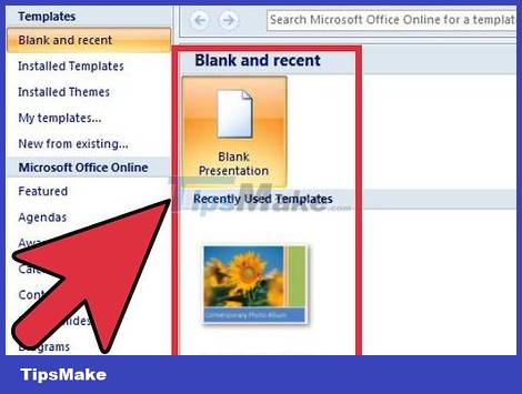
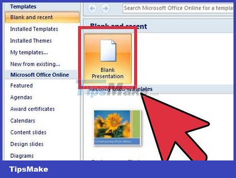
Choose a blank or templated slideshow. When you start a new PowerPoint file, you can create a blank or templated presentation. Drums allow you to be creative, but it will take a long time. The template is already designed, but not sure to meet your needs.
You can edit any aspect of the template, so feel free to choose whichever works best and tweak until you're satisfied.
You can apply the project's theme after adding content. Click on the Design tab and select a theme. The theme is immediately applied to the project. You can undo (Ctrl + Z) or return to a blank theme if you are not satisfied.
You can access the template from the File tab. Click on New and access the available templates. You can download more templates from online sources.
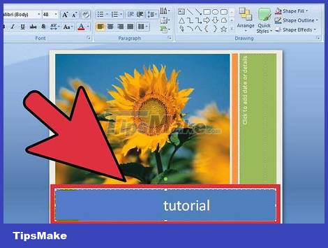
Give the slideshow a title. The title is the first thing that catches the eye of the audience. You should have a title that is easy to read and outlines the topic of your presentation. Most presenters will add the first or last name of the group to the title.

Add new slides to insert content. Press Ctrl + M to create a new slide. The blank slide will be added after the current slide. Slide includes title dialog and text dialog. You can choose to use them or insert objects via the Insert tab.
When adding a text dialog, you can click and drag to resize it. Or adjust by clicking and dragging in the corner of the dialog box.
You can click in any dialog box and start typing to insert content into the slide show. You can format text just like you do in Word, formatting options are available in the Home tab.
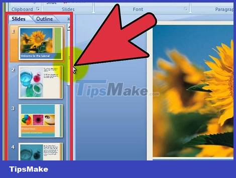
Navigate the slide show. You can use the pane on the left side of the window to quickly drag the slide. Click on it to open the slide and edit it. You can click on the Outline tab to see the outline of the presentation. Each slide will be labeled by its title.
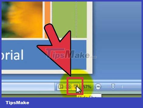
Review the slide show. You can test the slideshow by pressing F5. Click to change slides. Review the slide show to check if the length and information flow of each slide is reasonable.
Customize slideshow
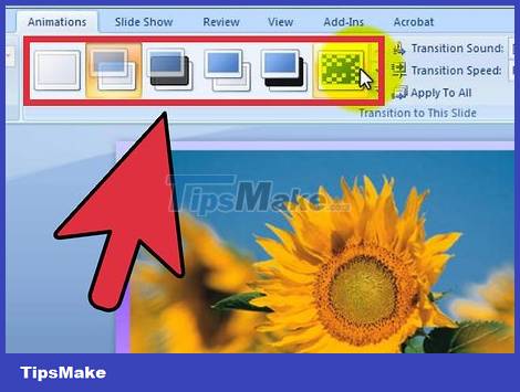
Add transitions between slides. After inserting content into the slide, you can add effects to keep your audience excited. Select the slide and click on the Transitions tab. You will see a list of common effects. You can click the arrow at the bottom to see the full list.
When you choose an effect, it affects how the slide appears. For example, if you add an effect to Slide 2, the effect will be applied when switching from Slide 1 to Slide 2. You can preview the effect in the editing window.
Do not add too many effects. This can distract the audience from the most important thing, the content of the presentation.
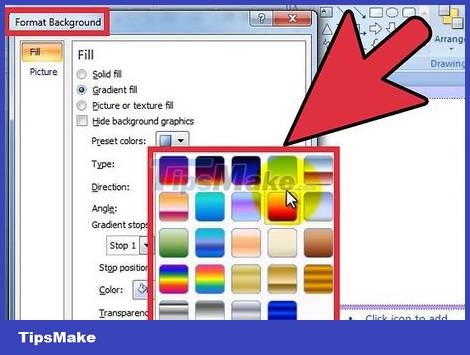
Add wallpaper. The white background is pretty boring. If your presentation is a standard font on a white background, half of the audience will doze off before moving on to the third slide. Use a subtle background image to impress your audience.
Right-click an empty area on the slide and select "Format Background", or click the Design tab and select the arrow icon next to "Background" on the far right.
Select a fill type. You can choose a color background, a dark background, or a textured background, or a background image. Experiment until you find the right background for your presentation.
By default, the background image is applied only to the active slide. Click "Apply to All" to add a background image to the entire slide.
Remember to choose a background that is easy to read.
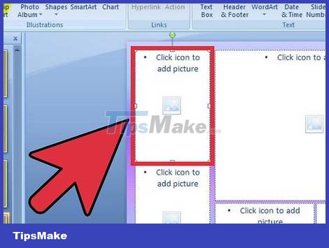
Add photos. Add photos, charts, and visual aids to help readers capture the ideas of the presentation and remember them. Images make the text less boring and easier for the audience to absorb.
Click on the Insert tab. There are many options for inserting objects. Click the Picture button to insert a picture from a file on your computer. You can click the Photo Album button to insert the whole album into the slide.
Use the Charts button to insert charts to help your audience easily understand the data. After selecting the Chart style, the Excel program will be opened, allowing you to import copied data from an existing spreadsheet.
Use the Shapes button to insert pre-made shapes or draw your own. You can use Shapes to outline important text or create arrows and other visual indicators.
Avoid using too many illustrations. If the presentation has many images, it is difficult for the audience to collect written information.
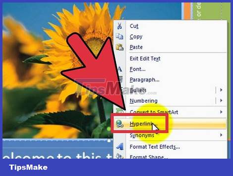
Add link. You can add a link to a slide for quick access to a website or email address. This is especially useful if you want your presentation to be widely known and people can easily visit the relevant website or email you.
To add a path, place your cursor in the text box and click the Hyperlink button in the Insert tab. You can choose a path to a file on your computer, an email address, a web page, or even another slide in your presentation.
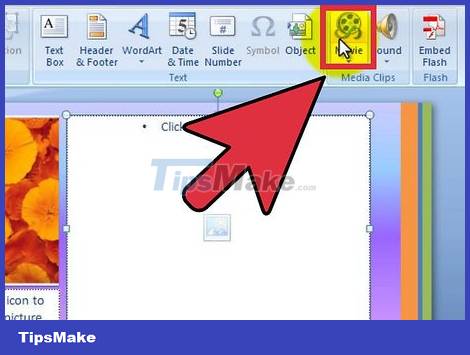
Embed video. You can add video files to slides. This works very well with reports or any video files related to presentations. The video will be played when the slide appears.
Click the Video button in the Insert tab. You can access your computer to find the video file.
You can embed YouTube videos although this is not the direct way. Refer to the tutorials on how to insert videos into slides for more details.
Make your slideshow memorable
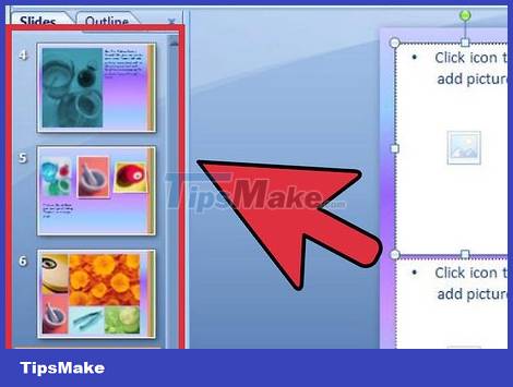
Limit the number of slides. A lengthy slide show will bore your audience, no matter how interested they are in your topic. Slides that are irrelevant or contain little content also reduce audience interest. Try to keep the presentation short and concise, remembering to use the space between each slide to its fullest potential.
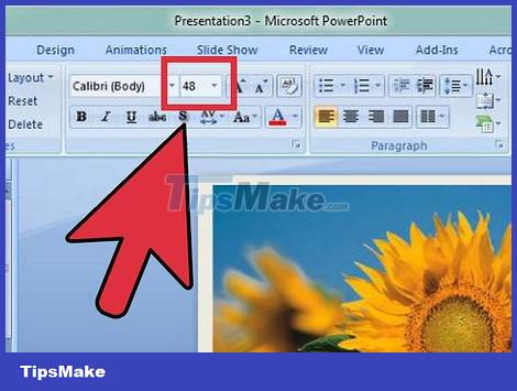
Select the appropriate font. Slideshows are meant to be read, otherwise they're nothing more than a presentation. Make sure that the audience can easily read the content on the slide. Font size 10 may be appropriate when you are sitting in front of a computer, but when shown, it is difficult for the audience to read.
In the notes section, remember to choose an easy-to-read font. Stylized fonts look good, but the audience doesn't care what it looks like if they can't read it.
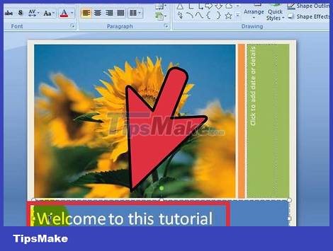
Apply a consistent, subtle style. The most complete presentation should have a consistent, careful style. Limit the use of color and icon styles to make the presentation stand out. If you don't know the design, you can refer to the template.

Check for spelling and grammar errors. If you misspell a word, you might not notice it, but someone down there will notice. Spelling and grammatical errors will reduce your credibility, so carefully check that the content is presented cleanly and correctly.
Have someone proofread for you. It will be easier for outsiders to detect errors.
Practice! PowerPoint is just one part of the presentation. The other part is yourself! Spend some time practicing your slide presentations. Time it and make sure that each slide accurately sums up the points you intend to make. Take notes or memorize the presentation, do not read the slide when giving the presentation.
Check out this guide for more information on giving presentations confidently, in class and at work.


 Steps to split slides in PowerPoint
  99+ Professional Slide Wallpaper
  How to insert a clock into PowerPoint
  How to make slides run automatically in PowerPoint
  How to make PowerPoint fireworks effect
  How to create bottom-up scrolling in PowerPoint?