How to design a website in Photoshop (Part 1): Create a theme for the craft shop
In this tutorial, we will create a layout for a craft shop. The article will not detail the specific font size or color code, but will instead focus on explaining the choice of fonts, colors, scales and other factors.
In this tutorial, we will create a layout for a craft shop. The article will not detail the specific font size or color code, but will instead focus on explaining the choice of fonts, colors, scales and other factors.
- 45 smart Photoshop tips you need to know (Part 1)
Documents :
You need:
- Main interface image and product image
- The font , in this example, uses two fonts, Source Sans Pro and Source Serif Pro from Font Squirrel
Determine business goals
Before you start designing the layout, you first need to define your business goals. The top priority to improve brand awareness or to sell products to new customers, or provide value first, get information and then sell products. You need to think about business goals and user needs to design convincing customer layouts.
Start identifying business goals by asking the following questions:
- What are you going to sell?
- Who will care about the product?
- Why should they buy from you?
- How to provide value?
This tutorial focuses on powerful images and widely uses negative space to create a comfortable feel for luxurious design and appeal to those who care about the image.
Prepare
Before embarking on Adobe Photoshop , determine the general colors, styles and orientations.
Step 1
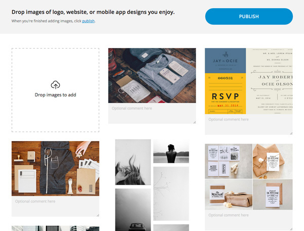
Collect images you like for moodboard table and color palette palette. Many people use Pinterest, but gomoodboard.com is very useful and completely designed to create moodboard tables.
Step 2
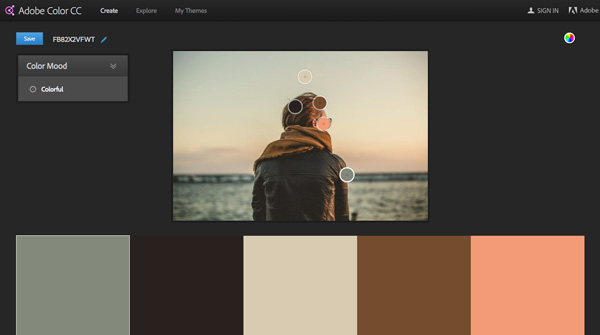
Next create a color palette for the design because a product is related to the brand and will attract customers. It's best to use a color palette tool like the Adobe Color CC (formerly named Kuler) to save time choosing colors.
Upload the image to the moodboard board and see what color is created. Adjust the color palette to fit your needs and save colors for future reference.
Select t ypeface (typeface)
Inspired by some moodboard items, we will choose Source Pro font, including sans and serif versions. Using a combination of two fonts will create a sense of balance and make the title look strong.
Prepare documents
Step 1
Open Adobe Photoshop and create a new document CMD + N. Determine the size to your liking, in this example 1400x3564px .
Step 2
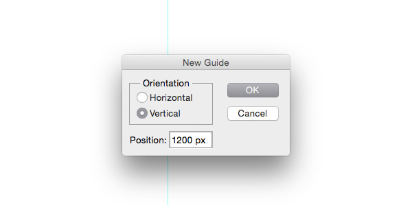
Then go to View> New Guide . to set up some guideline to make the layout have enough space and balance. Usually, users choose 1000px as the starting point and add some paths from the corner.
Note: The paths used for this tutorial: vertical with 200px, 500px, 550px, 700px, 850px, 900px and 1200px.
Tip: You can also use the GuideGuide Photoshop plugin to make this process faster.
Welcome new customers
We will start designing the store by creating an attractive upper area that attracts the visitor's attention and sends an instant message about the site.
Step 1
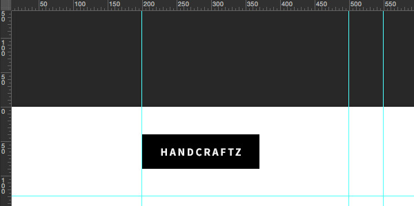
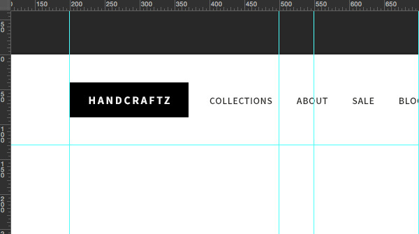
Create a new group called "Navigation" and place a new horizontal path with a value of 130px . This is where logos, navigation and search links will "reside." Put the logo on the left, if not, create a rectangle and put the text into it.
Step 2
Now set navigation items as plain text. From the planning stage, you should know what to put into navigation so potential customers find it useful. Use the Horizontal Type Tool (T) to write the link titles and place them next to the logo at a reasonable distance.
Step 3
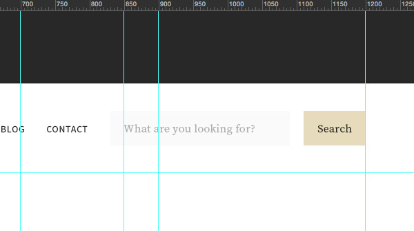
Searching is an extremely important function. Make your search field stand out and easily accessible by placing it on the right on the top navigation bar. To create it use the Rectangle Tool (U) and Horizontal Type Tool (T) . Note that the color is inspired by the image we used with Adobe Color CC.
Step 4
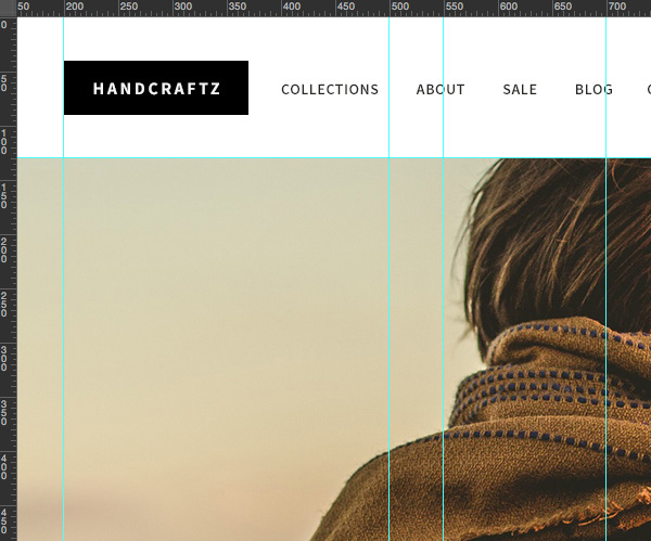
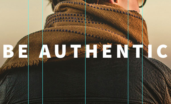
Now it's time to put a striking image that will be the highlight of the entire site when visitors first see it. As you can see in today's websites, we should choose high quality images with a clear focus, allowing text and user interfaces to be overlaid.
Use the Rectangle Tool (T) to draw a rectangle of 1400x700px (any color) and place it just below the top navigation bar (remember to set the horizontal path to 130px for this image). Then, drag a selected image and place this layer above the rectangle layer.
Hold down Alt and hover over the image layer until you see a small arrow pointing down, then release the mouse to create a Clipping Mask so that the image is only displayed in the rectangular area. Press CMD + T to resize the image, remember to hold down Shift to change the size of the image.
Step 5
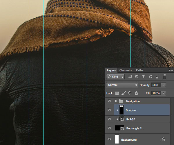
To make the image more appealing, add a color gradient that goes from transparent to black at the bottom. Select the Gradient Tool (G) and customize it to go from black # 000000 to transparent. Then hold down Shift and drag the mouse from the bottom of the image to the middle to create a gradient. After that, bring it to a Clipping Mask and reduce the Opacity to 50% . Rename this layer to "Shadow" for easy identification.
Step 6
Now it's time to use a strong subject line that attracts the visitor's eye and encourage them to learn more. Use large Sans Pro font size and bold with short title. Here use Source Sans Pro ( Black ) font size 70px and 160 for text tracking.
Step 7
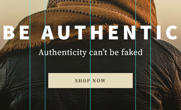
You have attracted the attention of users, now provide a subheading and most importantly an invitation. Here, for example, use the 28px font for Source Serif Pro font ( Regular format ) for the subheading and reuse the search button to keep the interface uniform.
Note the space used here. Always leave enough space around the elements so that they can see faster and more organized. Also, if you look closely, you will see that the text layers are closer together.
Create trust for customers
So you're done welcoming customers. After attracting attention and interest from customers, it is time for us to show some benefits that the store offers.
Step 1
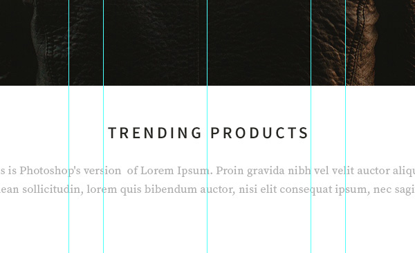
Keep the top of the page to a minimum to create a simple and clean aesthetic for the rest of the layout. Heading to attract visitors and a brief description will encourage them more. Here use font Source Sans Pro (Semibold) 24px and dark gray # 282723 . Be sure to leave plenty of space above the subject line to match the area above the head.
For descriptions use light colors to weaken visibility and know this is a subheading. In this example, use Source Serif Pro ( Regular ) font size 16px and gray #adada d .
Step 2
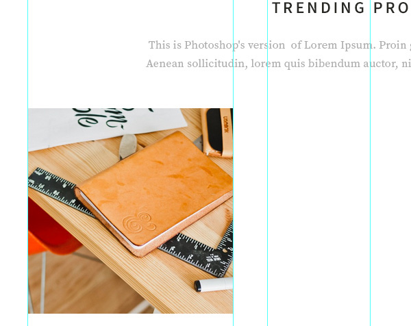
An effective way to create trust is to use attractive, high-quality images that stimulate and create desires from guests. Be sure to invest time to take great photos of your product or hire a professional photographer. For this tutorial, we will use fictitious products taken from Unsplash and Stock Up.
Select the Rectangle Tool (U) and draw a rectangle. Then drag the product image into Photoshop, place it on the rectangle and create a Clipping Mask. Resize the image if necessary by pressing CMD + T.
Step 3
To keep things simple, we will only provide basic information about the product including the title and price (this may cause curiosity to the buyer).
Select the same Source Serif Pro font and enter the title in dark gray as used for the headline of this section. Then use a lighter gray for the price, as it is a secondary information and does not require too much visual power. Another thing to keep in mind is that store elements such as titles, call-to-action buttons and description blocks need to be focused.
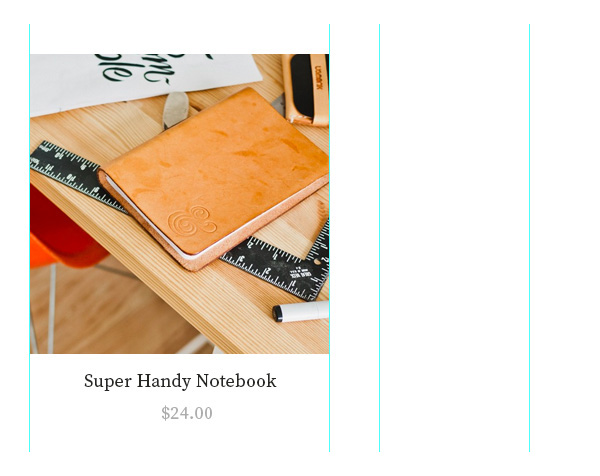
Step 4
Now place all the product layers into a group and copy them by pressing CMD + J , placing them between the previously defined vertical paths to create the distance.
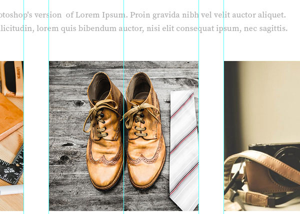
Step 5
In the " Trending " section, you should leave three products because it is a more convincing option. Now we will set the separator to divide the layout into sections. In this example use the 1px light gray Line Tool (U) # e6e6e6 to display but not too strong.
Tip: Hold Shift to easily draw a perfect horizontal line.
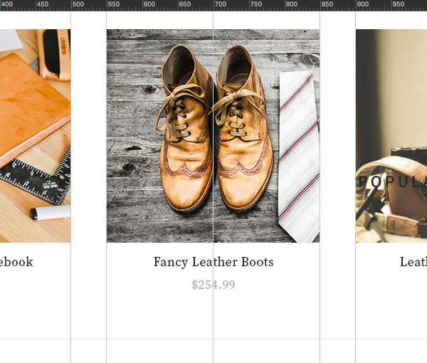
Step 6
Now let's create another part that shows more products and call it " Popular ". This section should choose popular products and attract users.
Create a copy by pressing CMD + J and customize the title, description and product of the "Trending" section. Copy more products and create a 3x2 grid for the best product.
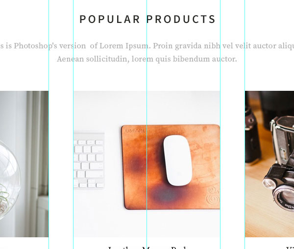
Collect buyer information
After exposing most images to evoke interest from buyers, now is the time to gather visitor information in case they don't want to buy now, so you can continue after.
Step 1
We will create a simple blog section using the same title format, description and some excerpts from blog posts to redirect users to content that may interest them.
Select the Rectangle Tool (U ) and draw a large rectangle that will be the background for this new part. Using subtle light gray to create a slight separation between products, the color used here is #fbfafa . Now copy the title and description of the previous section and place them on the new background.
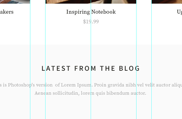
Step 2
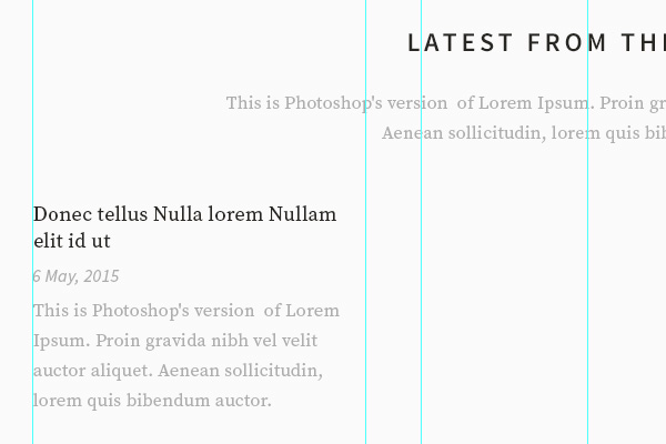
Now select the Horizontal Type Tool (T) and enter the title, date and short excerpt of the blog post. Again use Source Serif Pro font for title and description and Source Sans Pro for the day.
Even in this blog block, you will notice a clear visual hierarchy, the title is the darkest and largest and the other elements are smaller and lighter in color. Always use visual hierarchy to achieve rationality and keep consistency for large blog posts like product blocks.
Step 3
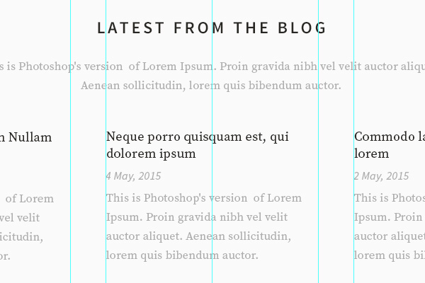
Now put all the blog posting layers into a group and copy it twice by pressing CMD + J , placing it between the vertical paths leaving the space as with the product.
Step 4
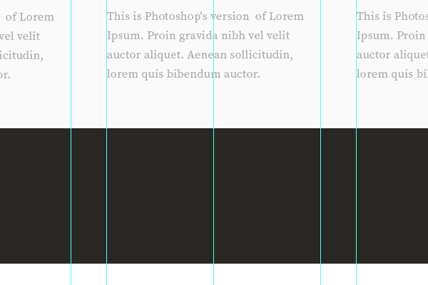
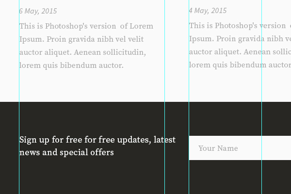
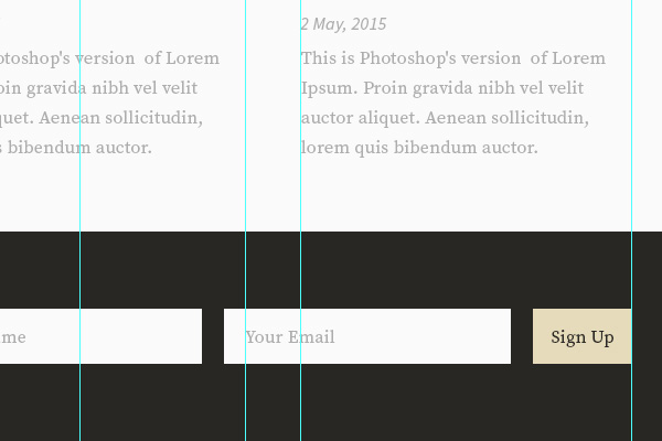
After displaying some valuable blog products and articles, it's time to create a template with a clear call to action to register. Using the Rectangle Tool (U) , choose a dark color, like color # 282723 and draw a background for the registration form. By using a darker background, you will create contrast that draws the attention of the viewer.
Step 5
Now write a short advertisement explaining why people should sign up, showing benefits rather than features. Then navigate to the design and copy the search button field to reuse for the registration form. Drag the copied layers and place them on the newly created background, then customize the input field and the call-to-action button.
Step 6
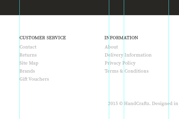
Finally, each template must have a footer with links so that people can scroll down and find navigation to the main pages like customer support, contact information, social networks and more.
Copy the blog posting text layers and customize them to display the link you choose. Divide different link groups and create evenly spaced columns in a row. Note, you should add the copyright line at the end of the layout.
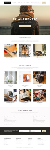
So we've completed the craft shop theme design, now go ahead and review the document layers, delete unnecessary documents to make it more perfect.
I wish you all success!
- How to use Photoshop CS5 - Part 6: Digital art
- Design website with Adobe Dreamweaver CS5 software - Part 3
- 6 leading website design companies in Vietnam
- Instructions for creating web pages in Wordpress from A to Z (Part 2)
- Instructions for creating a website for beginners
- Instructions for using Photoshop CS6 (Part 5): Create christmas cards with snowflakes on a red background


 How to create the index on the bottom, write the exponent in Word
  How to create exams on Microsoft Teams
  How to create sticker packages on Viber
  How to add bullet in Google Sheets