How to design a website in Photoshop (Part 2): Create a Landing page for travel websites
In this tutorial, we will use Photoshop CS6 to design a simple, clean Landing page for a travel website. In this process, you will be taught how to create custom grids with links, create fonts, use a lot of white space and compose web content in a professional way.
In this tutorial, we will use Photoshop CS6 to design a simple, clean Landing page for a travel website. In this process, you will be taught how to create custom grids with links, create fonts, use a lot of white space and compose web content in a professional way.
Documents
For easy tracking, you'll need the following documents (available for free):
- Photos related to travel
- Fonts PT Serif, Aller, Open Sans from Fontsquirrel.com
- Avatar
See more:
- 5 websites to find and download free fonts
- 8 "recognition" fonts used on applications or websites
Prepare documents
Step 1
Start by creating a new document ( File> New . ) using the settings shown below.

Step 2
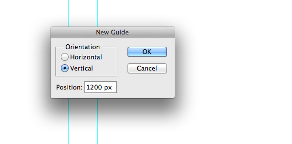
Set up a number of links to give the layout enough space and look balanced. This will ensure pixel perfection and site width. Divide the space into two vertical halves to create a central component. Go to View> New Guide . and place some links. Many people often choose 1000px as a web page width and add some paths from the corner to create space.
Note: The paths used for this tutorial: vertically at 200px, 260px, 700px, 1140px and 1200px.
Tip: You can also use the GuideGuide Photoshop plugin to make this process faster.
Step 3
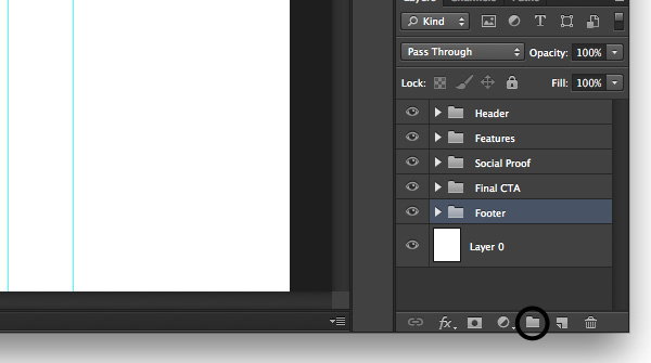
Next we will create class groups with Header, Features, Social Proof, CTA and Footer titles. Maintaining this Photoshop style will help everything to be organized and easily navigated or edited. To create a group, go to Layer> New> Group . and name each title as mentioned. To create a group quickly just click on the icon.
Header area design (title)
The title is very important for every website because it is the first opportunity to convince new visitors. This is where designers, need to use striking images and clear messages with some actions that call on visitors.
Step 1
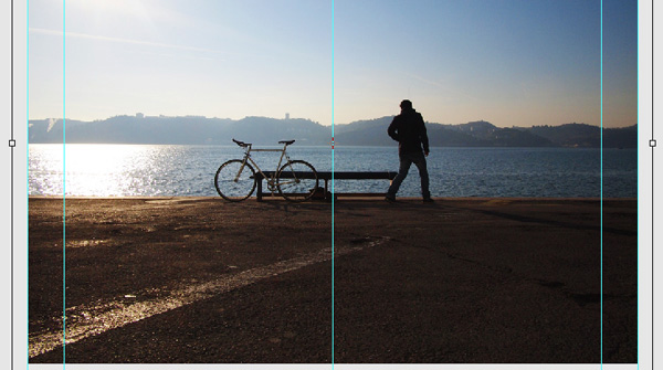
First we will change the background color to a color that attracts the gaze, in this example using light gray #ebebeb . Then open the Header group and use the Rectangle Tool (U) to draw a rectangle 1000x600px and place it between the vertical guides. Then, upload the image, drag it into the Photoshop document and place it on the rectangle layer. Next hold down the Alt key and hover over the image layer until you see a small arrow pointing down, then release. This will create a Clipping Mask. Now press CMD + T and resize the image to fit the need.
- 10 common problems in Photoshop and basic remedies
Tip: hold down Shift to change proportionally.
Step 2
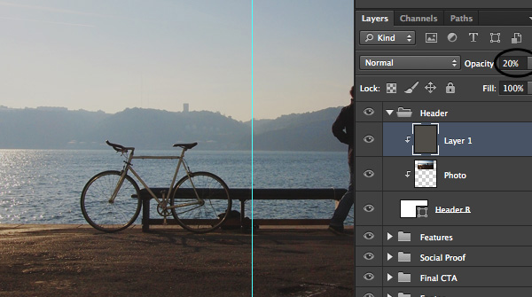
Now we need to add a transparent color layer to darken easily readable images and white text. Create a new layer above the image and create a Clipping Mask for it. Then, apply this layer with a glossy black color and change the Opacity to about 20% so that the image is still visible.
Step 3
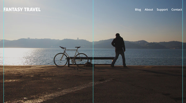
Now put a simple logo and navigation bar at the top. Select the Horizontal Type Tool (T) and write the title on the left hand side. Make sure the title is easy to read and has enough space around it. The logo will be in the top left corner because this is a popular web convention and what many visitors expect. Here use the Aller font for the title and Open Sans for navigation items.
Step 4
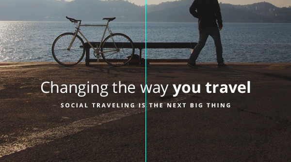
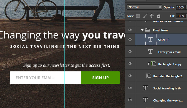
Now to design the main message, you should limit strapline to one or two sentences and make sure it's short, easy to read. In this case use the 32-bit Open Sans font to write the main message, emphasizing the main phrase, in this example " you travel " by highlighting it.
The second line is much smaller, thus forcing it to take secondary importance, so people will read it after the main message. Here, we will style with larger distances between letters because the letters are uppercase. Note where the message is placed, always think about the contrast so the reader can read it more easily.
Step 5
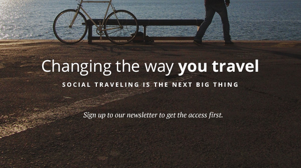
Create a simple call-to-action information that informs visitors what they should do. In this case, it's a simple message that shows visitors signing up for the newsletter, using a 14px PT Font font (italic).
Step 6
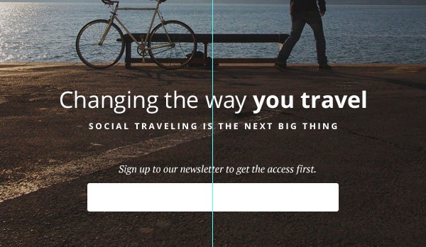
Create a simple email form that allows visitors to enter their email address and subscribe to the list. Create a new group named Email . Use the Rounded Rectangle Tool (U) with a radius of 3px to create a simple white ( #FFFFFF ) input.
Step 7
Add hint text so everyone understands where to write their email address and create a call-to-action button. Use Open Sans gray color 13px (slightly bold) ( #bdbdbd ) for input and white Open Sans text (bold) 13px ( #FFFFFF ) for button text. Choose an attractive color for your main call to action to make it stand out and encourage action.
In this example, we will use green ( # 51a200 ) for the main call to action. Select the Rectangle Tool (U) and draw a rectangle placed above the white input. Then hold down the Alt key and hover over the blue rectangle until you see the down arrow icon, release the key to create a Clipping Mask.
Design Area Features (Features)
This is the main part if people are interested in what you offer, they will scroll down to see more details.
Step 1
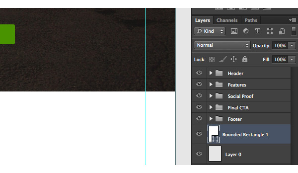
Collapse the Header group by clicking on the small arrow next to the group name. Now we need to create a slightly different background for the site body area. Here use the Rectangle Rounded (U) tool with a radius of 5px and white #FFFFFF . Set the newly created shape just above the main background layer.
Step 2
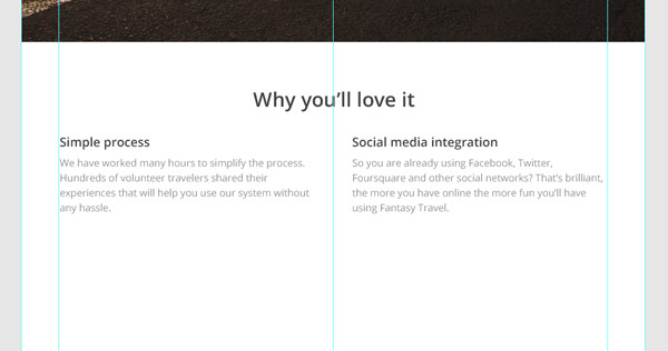
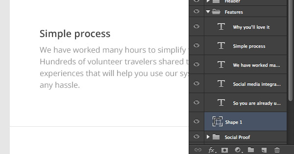
Expand the Features group and start typing the site's internal score. In this case, we will add the main message line and two column features with a title and a short paragraph.
When creating attractive information for the website, you need to make sure it is clear and not too long. Use different font weights, sizes and colors to create image hierarchies. Finally, but it is very important to use a lot of space. In this case, we use the Open sans font variant, # 545454 dark gray and light gray # a2a2a2 .
Design of Social Proo area f (Testimonial)
Step 1
Now it's time to design the second area for the site body, which will help visitors to take care and act. We will design a standard area that shows a few testimonials.
First, it is necessary to separate the previous area subtly. Here use the Line Tool (U) set to 1px with light gray # e8e8e8 .
Step 2
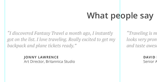
Minimize the Features group and expand the Social Proof group. Again record the same title used in the past. The key to design cleanup is consistency, so once you use a previous color and size, apply to the following designs.
For Social proof area, you should use customer comments or quotes. The font used for quotes is PT Serif and the rest is Open Sans with different variations in size and weight.
Step 3
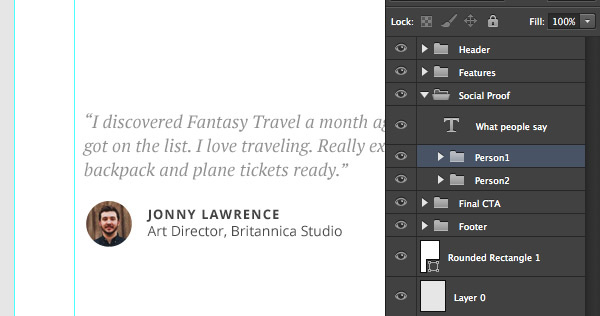
You should leave some space before the name to create an avatar. Select the Ellipse tool (U) and hold down the Shift key to draw a circle. Finally copy and paste the avatar above the circle layer and hover over the avatar layer holding the Alt key to create a Clipping Mask.
To make things better organized, create two groups within the Social Proof team and put testimonial classes into separate groups.
Design for Final CTA area (Call to action)
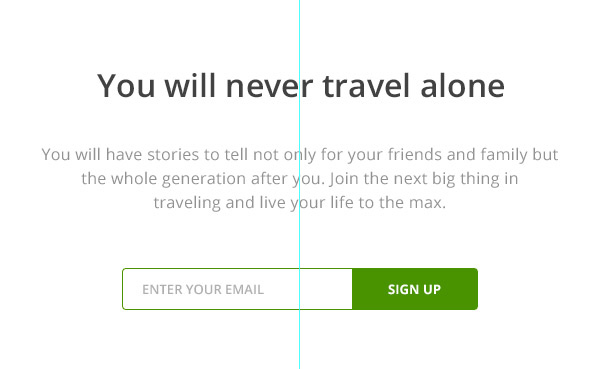
You should always repeat the call to action so that those who are hesitant will decide after seeing a lot on your site.
Step 1
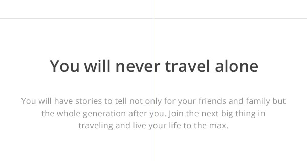
Separate the previous area by using the same line. Find the straight line layer and simply press CMD + J to duplicate it and then move it below the testimonials to create space.
Then, write a simple headline and subheading for more information or instructions. As you can see, here still use the same style, weight and font size used for the previous sections. Try to unify a style.
Step 2
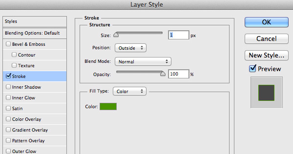
Go to the Header group and find the sample group, then copy it ( CMD + J ) and switch to the Final CTA group. Put it below the message and customize it a little by adding a green stroke around the input field.
Right click on the input layer and choose Blending Options . then apply Stroke effect as shown below, the color used here is # 51a200 .
Design Footer area (footer)
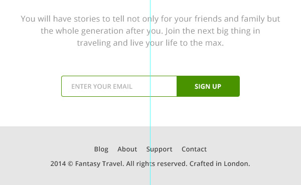
We have completed the Final CTA team so please shrink it and expand the Footer team. Finally, enter some links to internal pages and put a simple copyright text on a new line. Here use Open Sans font (slightly bold) for links.
Note how to put it outside the main background to distinguish it from the main content. Make sure to use a consistent distance above and below the copy so that it looks balanced.
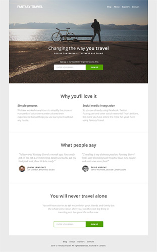
In this tutorial, we have gone through the entire process of creating a landing page for a very simple and clean travel website that includes some key parts to attract visitors, encourage Next action.
I wish you all success!
See also: Instructions for designing websites in Photoshop (Part 1): Create a theme for craft shops
- How to design a website in Photoshop (Part 1): Create a theme for the craft shop
- Instructions for creating websites with Dreamweaver CC part 3
- Website design tutorial in Photoshop (Part 3): Create professional website layout
- Design website with Adobe Dreamweaver CS5 software - Part 3
- 6 leading website design companies in Vietnam
- Instructions for creating a website for beginners


 How to create the index on the bottom, write the exponent in Word
  How to create exams on Microsoft Teams
  How to create sticker packages on Viber
  How to add bullet in Google Sheets