7 signs that your design style is out of date
Let's TipsMake.com point through 7 signs that your design style is obsolete in the article below!
- 20 impressive ads where creators can read our thoughts
- Enjoy 19 unique gadgets around the world
- Admire the 10 exotic houses perfectly hidden between nature
If you have been working in the design industry, you may find that at any time the design styles are constantly changing.
You may be using some common design style to saturation, or you may not even realize the new technology is changing day by day.
Believe it or not, you probably realize that everything changes with time and the design style is the same. Let's TipsMake.com point through 7 signs that your design style is obsolete in the article below!
Serifs font used only in the past

Serif usually refers to the collection of letters that appear with small head and foot strokes forming stops at one or two sides ( that is, the letter L is called one side, and the T is two sides ).
Serif letters are very popular and familiar; often appear in documents, books, and daily typing . Most people use modern serif characters like Georgia, Garamond and Courier New as the default font on the network; The default Time news Roman is on Word.
You've seen companies like Google and Clippers LA , recently opted for a sans-serif font logo. Do you know why? Because the screen of mobile phones and tablets is low resolution, Sans Serif font is the best choice to help people read the text on it.
However, 4K resolution ( resolution is four times higher than full HD high definition resolution - 1080p (1920 × 1080 pixels) - is one of the current high resolution standards ) growing. and the resolution on mobile phone screens has also become better. What does this mean? Serif typefaces font - the typeface typeface is being implemented in digital design thanks to the high screen resolution.
Constantly trying to keep up with the latest color trends today
Every year there is a vote of the best color of the year.
Pantone color is called Rose Quartz and Serenity is the color tone of 2016 , a combination of two shades that brings a sense of calm and relaxation. However, Behance ( a website developed and sponsored by Adobe, based in New York City, USA) found bright red is the most used color. Editorial Media Graphics Rebecca Huval argues that light green becomes the most decorated color in start-up offices.
The problem is not what color you choose, but how you use that color . Remember not to overdo it with the " explosion " of colors.Consistency, color saturation design ensures your design will stand out from other designs and look better on phones - even with reflection.Whatever the color, all of them are being shown bold and strong.
See also: Greenery - The main color of green color of 2017
Just finish everything when sitting at the desk

You cannot know when creative inspiration will attack you and it is important for you to capture that inspiration right away. Why wait until you return to your desk?
The distraction is not only a major factor that disrupts your creativity, iPad Pro and Apple Pencil ( Apple Pencil is an accessory introduced by Apple with the iPad Pro ) to help designers have a lot of experience. Just like on paper so you can easily sketch and record ideas at any location. Its benefits are mobile applications that can put your ideas into production without having to scan and copy.
Many people think that the best camera is the camera that suits you , so use your phone to capture content or download color, pattern and color applications. These elements are always available on the computer screen when you're ready to sit down to work.
Just observe from a corner
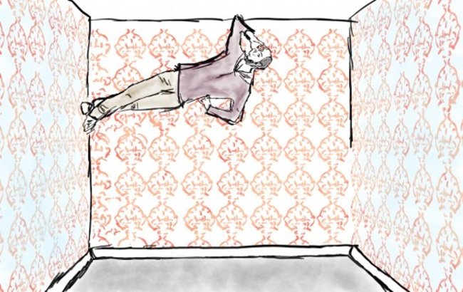
When surfing Instagram, you'll find the newsfeed filled with selfies, selected photos and attractions. You don't want your design to be too simple and popular, so it's important to change your perspective as well as the viewing angle. Literally.
Adobe's Scott Braut recommends incorporating candid portraits ( sneak pics ) into your design or a cityscape from some interesting perspective. You are not a photographer? No problem - free photography is a great way to start using striking images in your design.
You can even go further by adding your own illustrations to the beginning of these designs.
Throwbacks - look back too far
Despite the high definition screen, the gradient - looking back at the early days of the Web - came back in 2015.
We have also witnessed the popularity in the color approach to logo design, which can be caused or catalysts for Adult coloring books' popularity and increased 4 main points in design, simulation design ( skeuomorphic - create new but keep the structure, essential design characteristics of the original, even unnecessary functions ) and hand-painted art ( hand lettering - draw text and decorate them, very different from writing them .
When it comes to " cyclical trends ", you should use them appropriately. They are great for temporary projects ( for example, a music festival or a new app ) but do not apply to a company's branding.
Flat design (flat design) is falling sharply
Flat design - flat design can be said to be a 2D design, do not use effects that used to be very popular with designers like shading, shapes . but choose a simple, easy-to-look style The images are the most intuitive and comfortable for the users of the product ( the product here can be web or application ).
Flat design is developed and formed based on minimalism ( minimalism ), so flat web interfaces often simplify all elements from image, layout to small details.
It's easy to see that flat web design trends are very popular when using web applications, phone applications . Only 2D shapes and buttons include images, without any complex details. any impurities in the design. More detailed websites, ' colorful ' have much lower traffic than those with simple structure, reasonable layout and plenty of space for customers to experience important information and images. .
Flat design has been very popular with designers. Just like the cyclical trends mentioned above, the recurrence of flat design is a normal cycle in the design industry. Although popular today, sometimes this flat design style can be repeated, controversial and boring. Please break that depth pattern!
Your template is looking like . other Templates
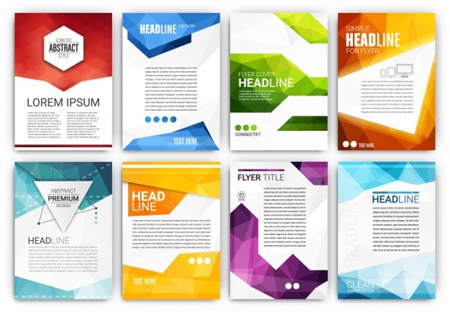
Template is a layout page layout, layout is designed, when using just put the information objects in a little editing can complete the design. With the template available, the designer will save time and thought ideas at work. For example, if the photo frames are available, you just need to put the image in, or the website is built in size image and then just replace the information and the image is used.
When it comes to creating online content, especially for small businesses, Templates seem to be the easiest way to choose.The problem is, no matter how good your template is, it still looks like a template.
See also: 10 design tips to expand the space for a small room
Having fun!
- Microsoft explains the meaning of the Fluent Design logo templates that are about to be used on Windows 10
- What signs show your CPU is about to die?
- How to Learn Web Design
- DATE function - The date function in Excel
- How to fix date errors when copying to another Excel file
- How to fix the date #VALUE error in Excel


 20 beautiful mezzanines for a small house
  Top 5 the best free home design software today 2020
  The easiest 3D interior design software to learn 2021
  What is Fluent Design?
  What designers can learn from the amazing UX design of the Candy Crush game
  Why do some websites with extremely 'bad' interfaces like Reddit and Wikipedia 'live so long'?