Why does flat design become the trend?
Flat design will have the task of replacing outdated Skeuomorphic as an inevitable rule of evolution. The new flat design term has been popular in the past few years but has quickly become a mainstream trend of the future.
Flat design will have the task of replacing outdated Skeuomorphic as an inevitable rule of evolution.
The new flat design term has been popular in the past few years but has quickly become a mainstream trend of the future. In the near future, flat design will appear again on one of the main technology products of iOS 7 . So what is a flat design? And why it becomes the trend of technology in the future.
What is a flat design?
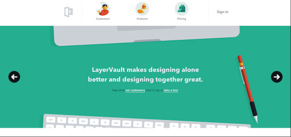
In terms of definition, flat design is a method that does not use any additional effects in the design such as shading, bevels, embossing, gradients and other factors that contribute to depth, highlight of on-screen design to create simpler images. The "flat" name of this design itself also implies the meaning of not containing 3D elements. Flat design is also considered to have relatives with Minimalist , a minimalist style design.
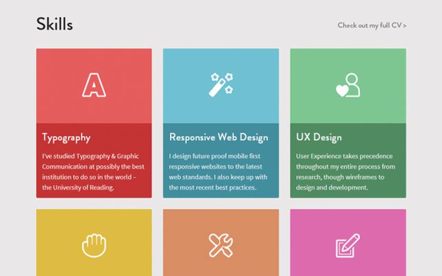
Therefore, it is easy to see in a flat-style design that images, buttons and symbols are often simplified to the maximum, different from the simulated design style of Skeuomorphic material. used on iOS devices. Easy to understand, the design is as flat as the Live Tiles interface of Windows Phone users or Metro UI on Windows 8.
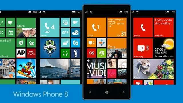
The Live Tiles interface is a good example of a flat design.
That being said, it does not mean that the flat design does not use any effect, the flat design still contains some effects but the number is less than the other design styles.
Why flat design to the throne?
1. Simplicity
As mentioned above, the most striking feature of flat design is simplicity. This is also the most outstanding advantage of this design. The simplicity of flat design facilitates designers to make their products easier. Instead of focusing on eye-catching effects and images for their design products, they only need to focus on less complex elements.
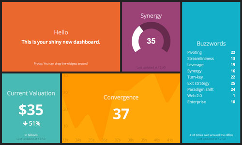
One of them is color, the element that can be considered the dominant of this design style. Try taking Windows Phone as an example: Windows with multiple colors are simpler and easier to design than icons of iOS or Android. Instead of having to design images for their own products, designers simply choose a color tone and then apply certain effects. In addition, the combination of tones in a design is also said to be simpler than requiring the creation of relevant and similar images.
2. Causing a strong and highly effective effect
Using colors as a background, flat design also brings positive to users because they will not be confused by a series of 3D images as usual. The flat design interface often places efficiency on the beauty. The select buttons in the flat design do not need to be designed too much and too complicated. As long as everything is clearly defined, it will be effective for users.
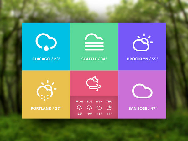
Not only that, the use of eye-catching colors can also contribute to attention and create a stronger effect for users. Especially when the designer knows how to mix effectively with strong opposites like white and black. That's probably what Johnny Ive wants to guide iOS 7 to be released soon.
In addition to color, flat design also has the ability to impress users through another factor that is Typography. There are many definitions of Typography in design, however, to make it easier for readers to understand Typography is the arrangement of fonts stylized in a particular order or rule to make others notice. .
Typography is one of the reasons for flat design effectiveness because with this design, users will get more information instead of just looking at beautiful icons. Those who have used the interface of Windows Phone or Windows 8 can easily see this. Being able to view application information directly without having to open the application is really a new and convenient experience.
3. Overcoming weaknesses of Skeuomorphic design (simulated style of material)
Skeuomorphic is a style of simulation design that is as realistic as possible by using images that relate to realistic objects as well as apply depth creation effects. Let's take a look at the examples below to see more clearly.
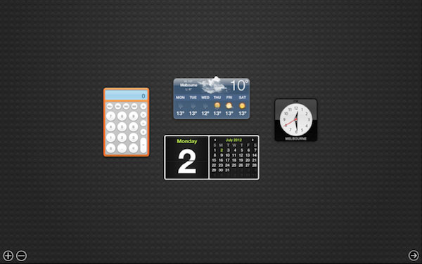
Some examples of Skeumorphic design
However, Skeuomorphic has revealed some flaws as follows:
- Interface sometimes difficult to observe: Like the clock icon Apple uses in the image above. Obviously, when we look at the watch image like this, we will lose more time than the digital clock with only hours and minutes.
- How to simulate sometimes makes it difficult for developers: Finding and creating images in Skeuomorphic causes many difficulties for designers.
- Spend a lot of mobile device screen space for unnecessary decorations: This is a reality of Skeuomorphic design that is imaginative with eye-catching decorations. For example, the design image of the above calendar interface, users often just want to know what day is, what day. Not necessarily displaying a whole month as a real calendar.
- Restricting creativity: Skeuomorphic design that takes the form is a real thing. So the designers don't need to imagine much about what they intend to do but just think of how to make it as possible as possible. And it is highly likely that there will be many "big ideas meet" with a little difference.
- Many hardware resources: Applying many effects in Skeuomorphic design is also a disadvantage of this style because it will make mobile devices weak in hardware power, little in terms of time. The battery will have to put strength to show Skeuomorphic on the screen.
These disadvantages can be completely overcome with a flat design with the above described.
Interim
The " pseudo-material" style (Skeuomorphic) is 33 years old with the mission of creating a link between old, familiar materials and something completely new and difficult to use as a computer to help users grasp. Getting easier with technology.
However, the era is different now, the rich development of mobile devices along with the ability to quickly capture the user's technology devices are making Skeuomorphic gradually regress. And flat design will have the task of replacing outdated Skeuomorphic as an inevitable rule of evolution.
- Firefox launched a new flat-design logo with 23 Beta version
- 7 signs that your design style is out of date
- Change the flat Facebook interface with Flatbook
- Humorous but equally meme series of meme about the world created by netizens following the trend # 10YearsChallenge
- NASA captures a large, square-shaped piece of ice
- How to activate Material Design interface on YouTube


 20 beautiful mezzanines for a small house
  Top 5 the best free home design software today 2020
  The easiest 3D interior design software to learn 2021
  What is Fluent Design?
  What designers can learn from the amazing UX design of the Candy Crush game
  Why do some websites with extremely 'bad' interfaces like Reddit and Wikipedia 'live so long'?