Google Docs, Sheets and Slides update the new Material interface
Google recently launched a new Material design style interface for a series of G Suite applications on the web platform including Google Docs, Sheets and Slides.
Google recently conducted a new Material design style interface for a series of web-based G Suite applications including its Google Docs, Sheets and Slides to synchronize the experience and help manage file storage. User storage becomes easier.
- Google launched Gallery Go, a lighter version of Google Photos for low-profile devices
- Appeared software can penetrate iCloud, Google Drive
- Google launched the website for Fuchsia, Android's successor operating system
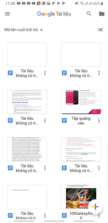
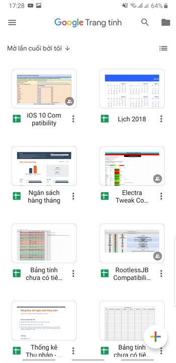
The new Material design language makes applications more transparent, removes the gray background of the title bar, moves the Google logo (Docs, Sheets, Slides) to the middle position, the Search engine icon and Folder to open files from device memory or Google Drive arranged on the side.
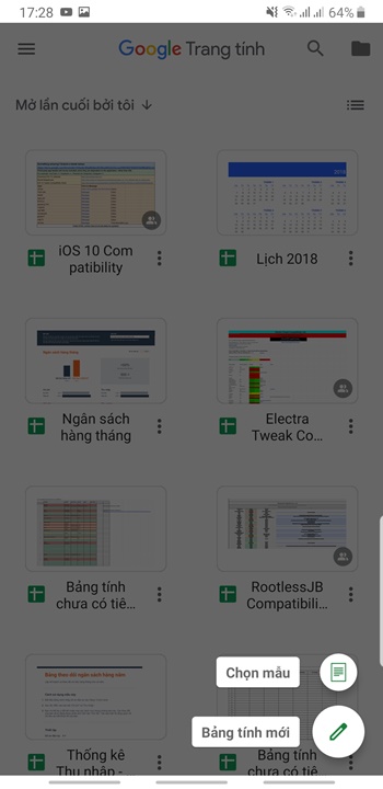
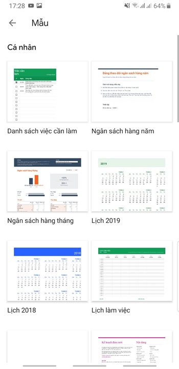
The background color of the quick action icons (Select template and Spreadsheet / Document / New slide) is changed to white and added a colorful plus sign. The data files are displayed on the main page with a rounded and more compact border.
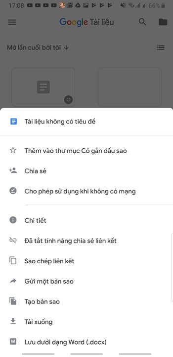
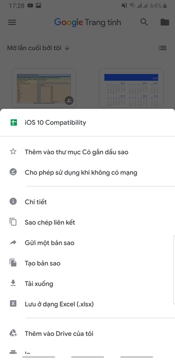
The functions in the expanded Menu section remain the same.
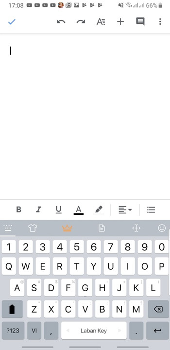
Below is the new interface image on Google Docs, Sheets and Slides, please see.
New interface of Google Docs:

New interface of Google Sheets:

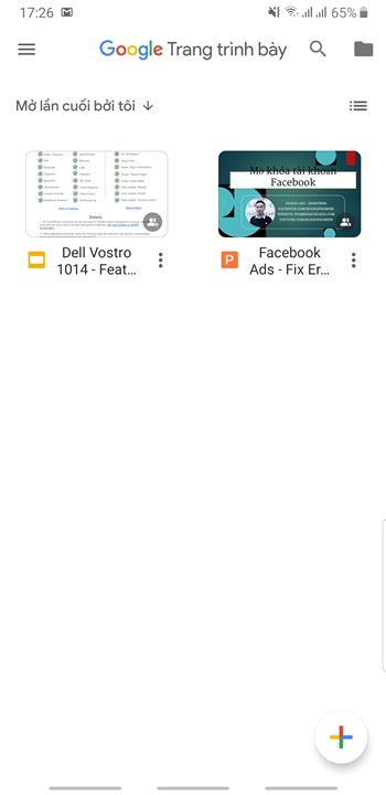
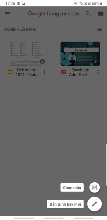
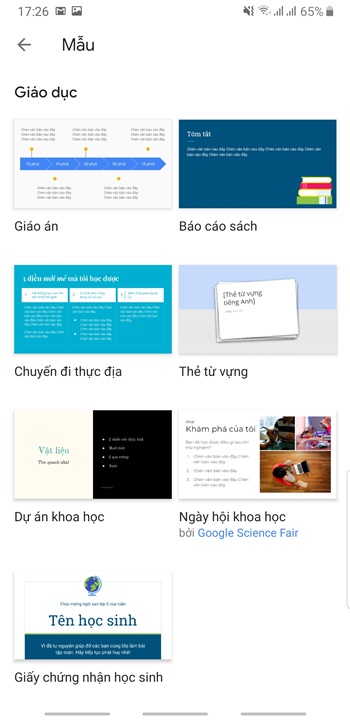
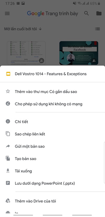
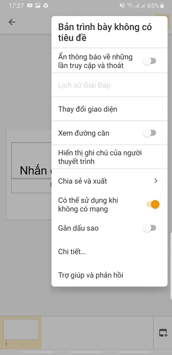
New interface of Google Slides:
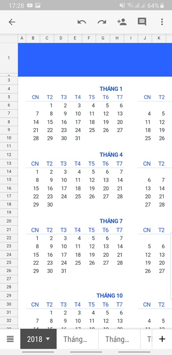
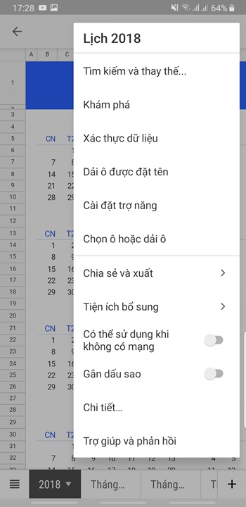
According to information shared on page 9to5google, these three applications have been upgraded to a new interface by Google since mid-June through a closed testing program. Currently, Google has released public updates to all Android users. To download or upgrade the new update, you can access the link below.
- Google Docs
- Google Sheets
- Google Slides
You've just finished reading the article "Google Docs, Sheets and Slides update the new Material interface" edited by the TipsMake team. You can save google-docs-sheets-and-slides-update-the-new-material-interface.pdf to your computer here to read later or print it out. We hope this article has provided you with many useful tech tips and tricks. You can search for similar articles on tips and guides. Thank you for reading and for following us regularly.
- Latest updates of Google Docs, Sheets & Slides that you still expect
- 10 tips to create beautiful Google Docs
- Gmail started updating the new Google Material Theme interface on both iOS and Android
- How to open and create Google Docs with keyboard shortcuts
- Google Drive for creating quick access shortcuts from the desktop
- How to embed Google Slide into Google Doc