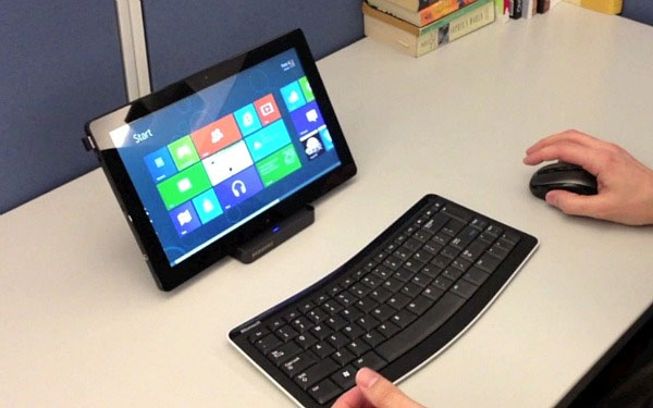
Windows 8 has a multitude of technical errors
After the cult appearance, it seems that the glamor around Windows 8 has faded away and this most modern device is receiving more and more criticism and complaints from users.
After the cult appearance, it seems that the glamor around Windows 8 has faded away and this most modern device is receiving more and more criticism and complaints from users.

Windows 8 is poorly rated for functionality
According to most users, Windows 8 is optimized for content consumption, not content production and other multitasking functions. However, the consumption of content can be easily done on a myriad of other media (such as tablets and phones), while new production and multitasking are the most suitable functions for The computer is ignored in Windows 8.
The conversion between different environments (such as Modern and Desktop) affects users.
Users will need to remember two different interfaces. They will have to learn about Windows 8, but will not be able to forget Windows 7. At the same time, they will need to monitor which application is suitable for which structure.
Moreover, since Windows 8 follows some mobile phone design principles (such as content prioritization), not all of these guidelines are suitable for non-touch screens of parts. Large desktop or laptop computer.
Many applications waste a lot of space for providing very large images and the text is too small. The idea of hiding drivers to prioritize content may be appropriate on mobile phones, where screen space is limited, but not suitable for a large screen, especially if people Use it takes more time to access the hidden features.
Windows 8 really has a usability problem
As reflected by quite a lot of users, the Windows 8 Switcher function displays each Modern style application as a thumbnail, but lapses all desktop applications into a single thumbnail image. , with the reason that Windows 8 identified desktop computers as an application.
This is extremely inconvenient. Users will be forced to remember which applications are running on the desktop and return to the application if they want to continue working. In general, switching between applications often takes a lot of time. Users will have to go to the start page, select applications, and then, for applications running on the desktop, they must access the desktop interface and select the application from there. Compared to older versions of Windows, with just one click, you will be able to immediately select the applications that are running from the taskbar, then Windows 8 is indeed 'far from'.
The hidden menu design is time consuming to use
The hidden design menu is one of the main reasons that users have slower speed when using Windows 8. A recent study of information technology experts on mobile devices has given conclude that, whenever a menu is designed to be hidden, even though the user already knows about the existence of this menu, they will still have to take a moment to think about using it. how is that application
- Some good tips for Windows 10 Technical Preview (Part 2)
- Some good tips for Windows 10 Technical Preview
- What is technical SEO?
- Please read the Windows 10 Technical Preview download
- Installing Windows 10 Technical Preview on a virtual machine is available in Windows
- How to fix boot errors on Windows 8


 0x80072F8F error when Activation Windows 7 and Vista, this is how to fix it
  How to fix error 0x0000011b when printing over the network on Windows 10
  What is the USO Core Worker Process or usocoreworker.exe? Are they viruses?
  Steps to change Taskbar position on Windows 11
  Download Ghost Win 10 32bit - 64bit Light, Get Self Full Driver
  3 ways to turn off Your Windows license will expire soon notification on windows