Microsoft changed the context menu on Windows 11 confusing many users
Microsoft has officially released the first Windows 11 Insider Preview beta. In this release, design improvements and some new features have been released by Microsoft.
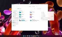
The most notable feature of Windows 11 Insider Preview is the new context menu. The context menu is the menu that appears when you right-click on the desktop or applications, drives, folders. As you can see, the new menu has a more open look, inspired by Fluent Design. .
Microsoft has asked developers to follow a context menu design template for applications on Windows 11. In addition to aesthetics, the new context menu also brings consistency to Windows 11. On Windows 10, each application there's a context menu that creates a mess.
However, the new context menu also confuses many users. For example, the context menu when clicking on the home screen is completely refreshed. The options familiar with the old interface such as New (create folders.), Refresh. will be hidden inside the Show more options button.
Those who have a habit of right-clicking and then selecting Refresh will definitely have to get used to the new operation again.
Another thing to note is that Windows 11 will not allow application icons to display large sizes with labels on the Taskbar. All apps will display with small icons, no captions, and if an app has multiple windows, it will be displayed as multiple icons stacked on top of each other.
This is the kind of design that many people think Microsoft learned from Apple's macOS. It enhances the aesthetics and also makes Windows 11 more flexible across many devices. However, for older users, this type of display will cause many difficulties.
Was this article helpful?
Your feedback helps us improve.
Related Articles
 How to bring Windows 10's right-click menu to Windows 113 minutes read
 Microsoft is committed to improving the context menu experience on Windows 113 minutes read
 The context menu of Windows 11 will have a new eye-catching design3 minutes read
 This small application helps bring the context menu interface of Windows 10 to Windows 113 minutes read
 How to restore the old context menu in Windows 114 minutes read
 How to add items to the 'Create New' context menu in Windows 105 minutes read
Reader Comments 0
Sign in with email or Google to join the discussion.