How to create movie posters in GIMP
Do you believe you can design an impressive movie poster without going to Photoshop? That's right, in this tutorial, TipsMake.com will show you how to create a great movie poster by drawing, editing and free GIMP graphic design.
Do you believe you can design an impressive movie poster without going to Photoshop? That's right, in this tutorial, TipsMake.com will show you how to create a great movie poster by drawing, editing and free GIMP graphic design.
(The version used in this article is 2.9.8, also called Development Version ).
Movie poster design with GIMP tool
- 1. Create a new image
- 2. Enter the image
- 3. Rotate and adjust the image size with the Transform tool
- 4. Create a 'Black Hole' layer
- 5. Create Event horizon
- 6. Add the main text
- 7. Add the caption text
- 8. Add astronaut images
- 9. Add release date
- 10. Add Zoom Motion Blur effect
- 11. Add Vignette layer
- 12. Add the name of the cast
1. Create a new image

Start by creating a new image of any size you like. There are a few standard sizes for posters, but the article will use 24x36inch (60x91cm). The resolution of the image is set to 72ppi in advanced options to ensure the file size is not too large. But usually, for the best print quality, the resolution should be at 300ppi. This resolution may cause the warning appearing in GIMP to indicate that the file size will be very large. But if the computer can handle such large files, just click OK to create the image.
OPTION: You can also change the 'Precision option' to '32 -bit floating point ' and optionally ' Gamma ' to ' Linear Light ' if you want to make the most of GIMP's capabilities with high-performance computers. , there is more RAM to handle the job.
2. Enter the image

After the canvas is empty, open the image in GIMP by going to File> Open and locating the file on the computer. Users can also just click and drag the file from its location into the GIMP canvas and the image will be placed on its own layer (the file name matches the layer name).
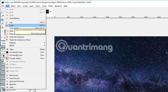
Or, if you open the image using the first method, the user will have to go to Edit> Copy on the imported image.
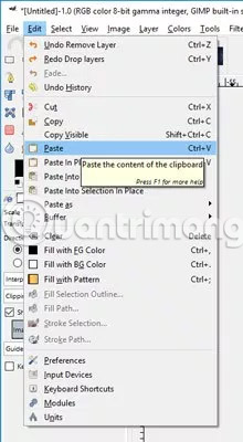
Then select the tab (if you're using one-window mode) containing an empty canvas in GIMP and select Edit> Paste . This step will create a layer containing the floating selection.
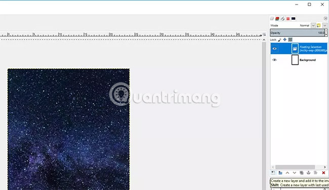
Click on the layer containing the floating selection and click on the 'Create new layer' icon in the Layers panel . This will add the image to its own layer.
Double click on the layer name in the Layers panel and change the name to 'Galaxy'.
3. Rotate and adjust the image size with the Transform tool
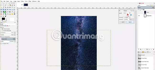
Next, with the Galaxy layer selected, click on the Rotate tool and click on the Galaxy image. The 'Rotate' dialog box will appear. In the example case, we will rotate the image 90 degrees, so enter 90 into the Angle section . Then click the Rotate button . Depending on the size of the image in use, it may take several seconds or longer to apply the effect.
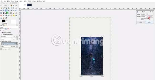
The reader may notice that the image is much larger than the canvas, so select the Scale tool and click the image to display the Scale dialog box . Make sure the unit is set to inch and we will reduce the size of the image so that it is slightly larger than the canvas (the canvas size is 24 × 36inch and the image size will be about 47 × 84inch). To do this, make sure the chain link icon is locked (to keep the ratio between width and height), then set the width to 25inch. Height will automatically adjust accordingly. After that, users can click on the 4 boxes in the middle of the image to align them so that it is in the center of the canvas. Click the Scale button to apply the effect.
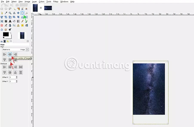
When the image is scaled down, the user can use the Alignment tool so that the image is centered on the canvas. Select Alignment tool from Toolbox, in Tool Options, click on the image, change 'Align Relative to:' to 'Image', then click on 2 options 'Align center of target' and 'Align middle of target' .
4. Create a 'Black Hole' layer
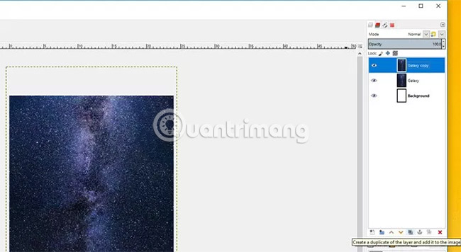
Duplicate the main Galaxy layer by clicking on the layer and clicking the 'Duplicate' icon in the Layers panel .
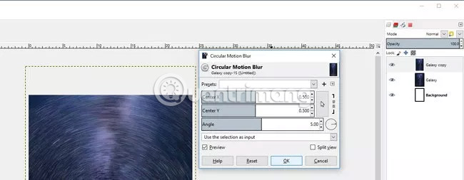
Click on the Galaxy Copy layer and go to Filters> Blur> Circular Motion Blur . Adjust the settings in the Circular Motion Blur dialog until you get the desired results, then click OK to apply.

Duplicate the main Galaxy layer again (NOT the layer that applied the Blur effect ) and apply the Circular Motion Blur filter to this new layer (named Galaxy copy # 1 ). However, this time, reduce the Angle to 1 so that the Blur effect is not too strong. Click OK.
Now, there will be two layers with the Circular Motion Blur effect , with one layer having the Blur effect stronger than the other (the stronger Blur layer should be at the top of the Layers panel ).
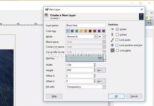
Create a new layer and name it 'Black Hole' . Make sure the 'Fill with' option (located at the bottom of the New Layer dialog box ) is set to 'Transparency'. Then click OK.
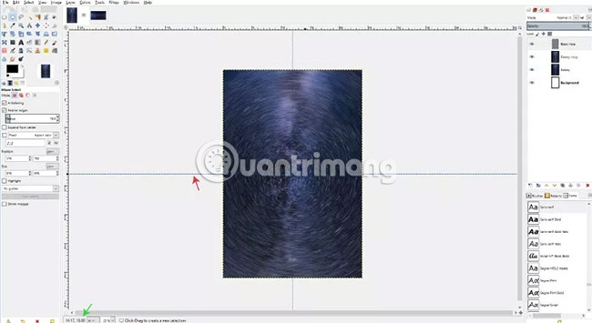
Click the ruler on the left side of the canvas and drag to make the standard line appear. Drag the standard line, use the units displayed at the bottom left of the canvas and place it in the middle of the layout (drag until the left unit is '12 .00 ', ie 12 inches, or the center of the image according to vertical calibration line).
If you like, users can also click on the standard line with the Alignment tool and select the option 'Align to center of target' .
Repeat this step for the horizontal calibration line, but drag the calibration line from top to bottom, until the right figure shows up at the bottom left of the canvas with a value of 18. The two standard lines will intersect in the middle of the composition. .
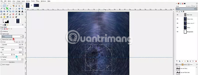
Now select the Ellipse tool from the Toolbox (or press E on the keyboard) and check 'Feather edges' in the options. Place the Feather edges into a 50 radius . Click and drag the mouse in the center where the standard lines intersect, then hold Ctrl and Shift to make sure the ellipse is drawn in a perfect circle and expand from the center out.
The ellipse in the example is about 750 × 750pixel, shown in Tool Options.
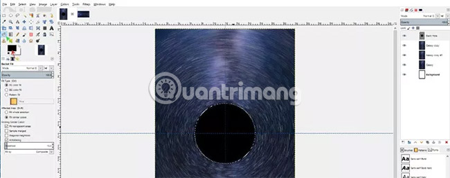
Then, select the Bucket Fill tool from the Toolbox (or press Shift + B on the keyboard) and fill it with black for the ellipse. Now, we will have a black circle with blurry edges.
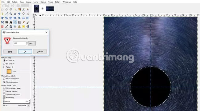
With the selection still active, go to Select> Grow and change the unit to pixels (px). The selection will be increased by 100pixel.
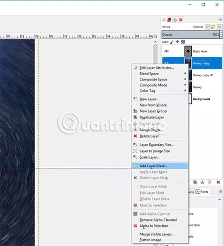
Then right-click on the Galaxy Copy layer and select 'Add layer mask' .
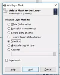
In the 'Initialize Layer Mask to:' section , select 'Selection'. This option creates a layer mask from the elliptical selection area you just drew. The layer below will now be visible, in addition to the area in the ellipse selection.
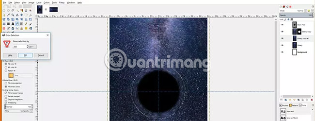
Next, click on the Galaxy copy # 1 layer. Go to Select> Grow and make the selection 200pixel increase . Click OK.

Right click on the Galaxy copy # 1 layer and go to Add Layer Mask . In the 'Initialize Mast Layer to:' section , select 'Selection' again.
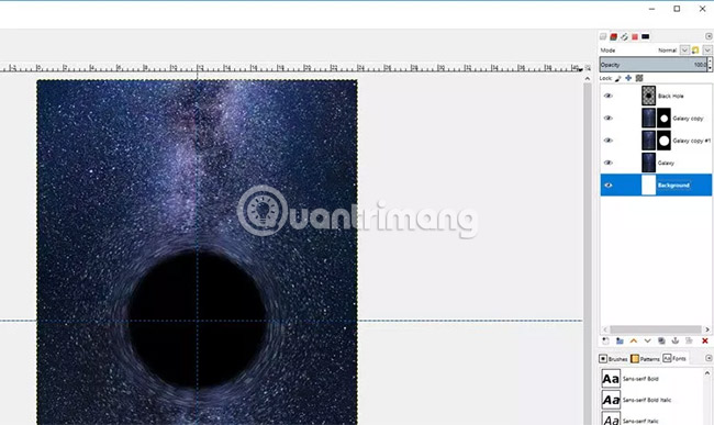
This will let the user see the original Galaxy image, except the inside of the 2 mask just created. There should also be two more loops around the black hole, a fainter and a smaller circle. If not, make sure the stack layer is the same as in the example (users can click and drag layers in the Layers panel to move them up or down at will).
Go to Select> None to deselect the ellipse selection.
5. Create Event horizon
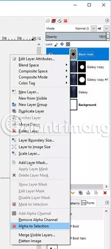
Now that we have the black hole, the next step is to create Event horizon. It is the point where light no longer escapes the black hole. To do this, right-click on the 'Black Hole' layer and select 'Add Alpha to Selection' . This option will create a selection around the circle we filled in.
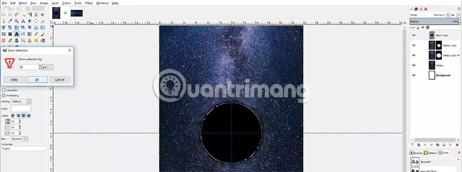
Then go to Select> Grow and increase the area of 50pixel.
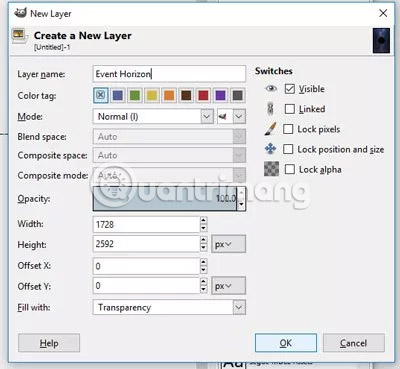
Create a new layer and name it 'Event Horizon'. Drag this new layer below the 'Black Hole' layer .
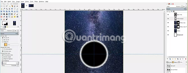
Select the Bucket Fill tool and change the foreground color to white. Fill the selection with white. Go to Select> None to deselect the selection.
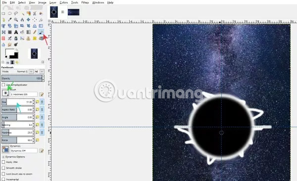
Select the Paint Brush tool and select the Hardness brush 025. Adjust the size of the brush by using brackets on the keyboard ( [ or or ] ), or by using the Size slider in Tool Options and drawing random strokes out of the white circle.
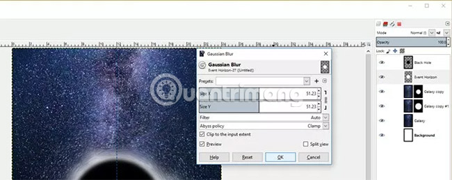
Next, go to Filters> Blur> Gaussian Blur . Adjust the x and y values to about 50. Click OK to apply.
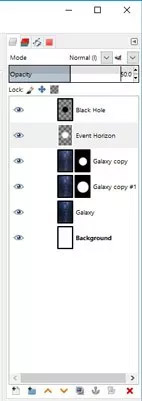
Reduce the Event Horizon layer's opacity to about 50%.
Users can calibrate to see what the layout looks like by going to View> Show Guides (if selected, the standard line will be hidden).
6. Add the main text
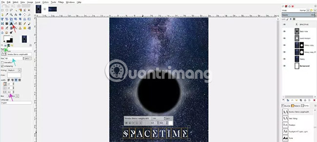
Select the Text tool from Toolbox. In Tool Options, change the font to any font you want to use (for example, using the free Exodus font). Select the font size (in the example is 150). The distance between the letters is also increased to 35. Click anywhere on the canvas and enter the movie name. For example, naming the fictional film is Spacetime.
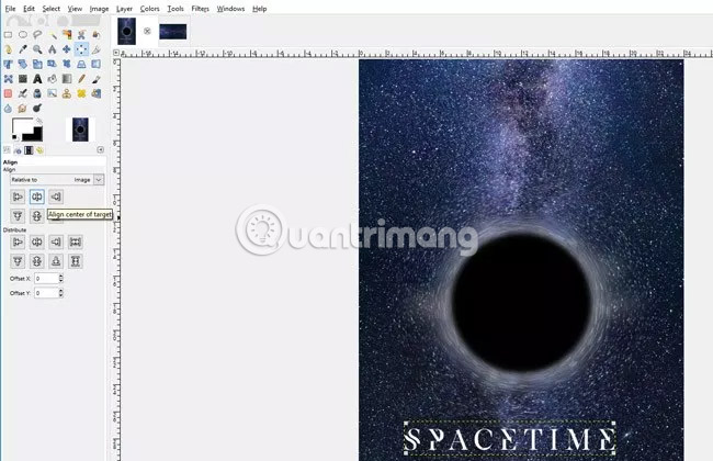
Users can select the Move tool to locate the text, then switch to Alignment tool , click on the text and select 'Align center of target' to center the text on the page.
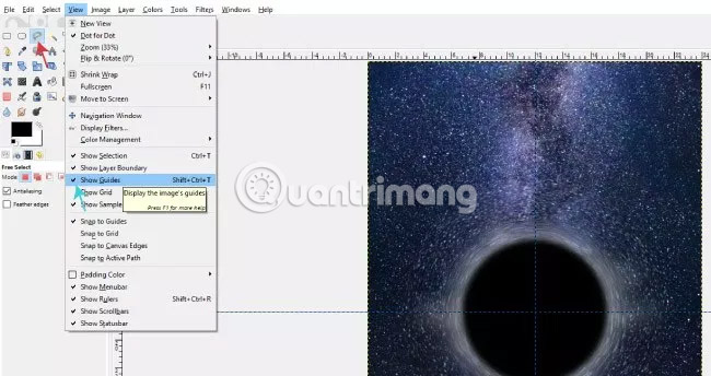
If you want the main text to stand out, create a black polygon behind the main text. To do this, select the Free Selec t tool from Toolbox. Make sure that the standard lines are displayed again by going to View> Show Guides .
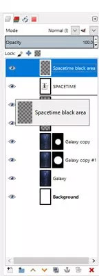
Create a new layer and name it 'Spacetime Black Area' . Make sure that the layer is set to transparent and click OK. Move this new layer below the Spacetime text layer .
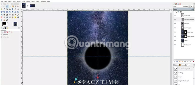
Now, with the lasso tool , click to create the points (called nodes) around the diamond-shaped text. Note how to create nodes on the central grid line at the top and bottom of the text and external nodes beyond the width of the text.
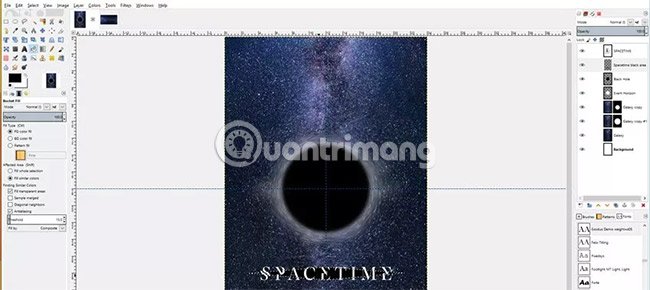
Select the Bucket Fill tool (which will turn the diamond into a selection) and fill this selection with black. Go to Select> None to uncheck this area.
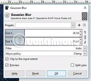
Now, with the 'Spacetime black area' layer selected, go to Filters> Blur> Gaussian blur . Increase the size for X and Y a bit (about 26). Click OK to apply.
7. Add the caption text
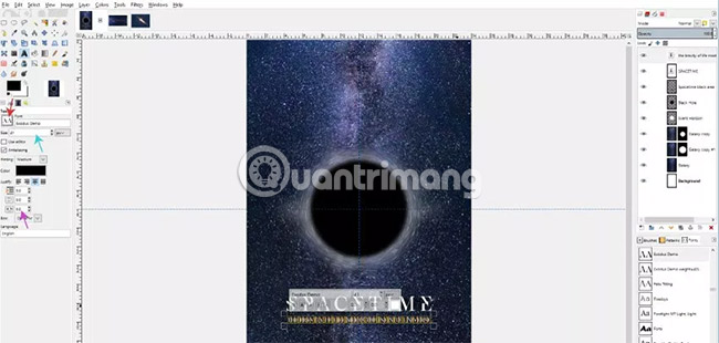
Select the Text tool again and change the text to Exodus Demo (this is the free version of the advanced font, so normal characters will work and special characters won't). Change the font size to 41px. Also, change the distance of the letters back to 0 . Enter the subtitle text, in this case 'The Brevity of Life Meets the Infinite Universe' .
You can use the Alignment tool again to center the caption text.
8. Add astronaut images
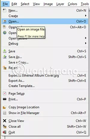
Open the downloaded astronaut image in GIMP by going to File> Open and selecting the astronaut's photo.
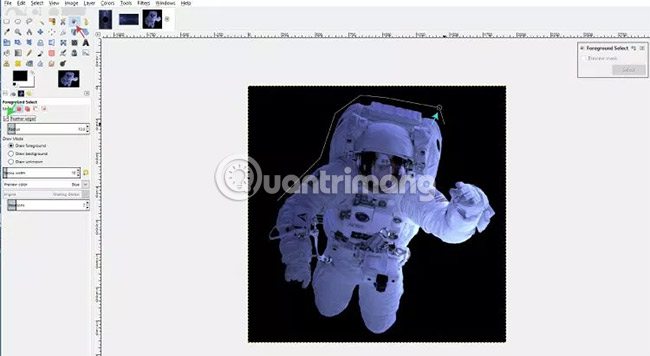
Delete the background of the photo so that only the astronaut image is included in the poster layout. To do this, select the Foreground Select tool . The mouse pointer will look like the original lasso tool. Make sure 'Feather edges' is selected in Toolbox. Start by clicking to create nodes around the foreground object trying to separate. Leave a space between the foreground and the background when drawing this line (ie do not draw close to the foreground object). Press Enter when connecting the last point with the first point. The image will turn into blue.
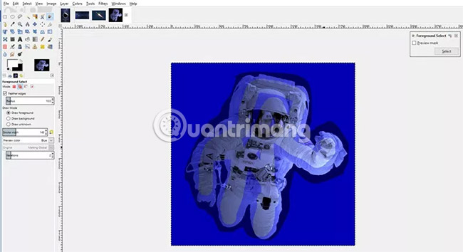
Now, the mouse pointer will look like a paint brush. Choose foreground color different from the background color of the current image (this case uses white) and randomly draw a line through the foreground object. This line is not necessarily correct because GIMP uses an algorithm to determine which is foreground and which is the background. When drawing and releasing the mouse, the blue areas will turn transparent wherever the brush is used. Press Enter when finished.
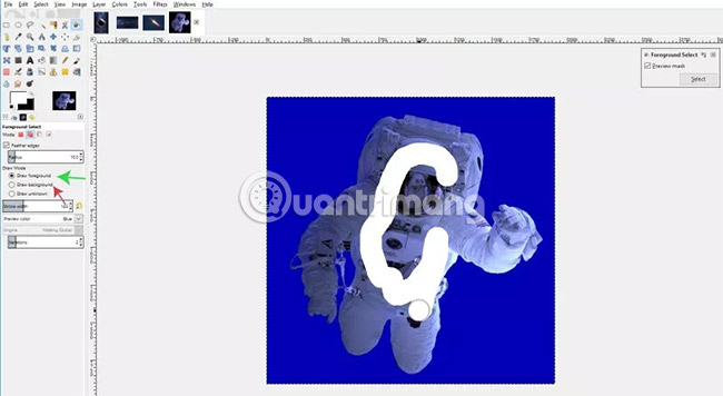
If there are extra parts of the background, in Tool Options, the user can change the drawing mode to 'Draw Background' and draw a line through the parts that need to be distinguished from the foreground. Users can also set the drawing mode to 'Draw Foreground' for any part of the foreground to be accidentally selected as a background (these sections will be highlighted in blue).
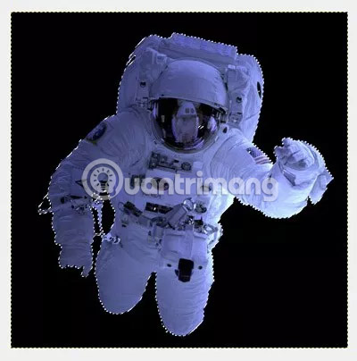
Press Enter to apply the tool, create a selection around the object.
Now, the user will see a rough selection around the foreground object. Copy this part by going to Edit> Copy or pressing Ctrl + C on the keyboard.
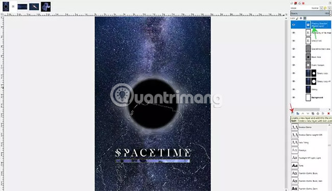
Go back to the poster layout and press Ctrl + V to paste. The astronaut image without the background will be pasted as a floating layer. Click the new layer creation icon to add this image to its own layer.
Users can double click on the name of this layer and change it to 'Astronaut'. Then, click and drag the layer until it is above all the other layers in the composition. Now users will see astronaut images on canvas.
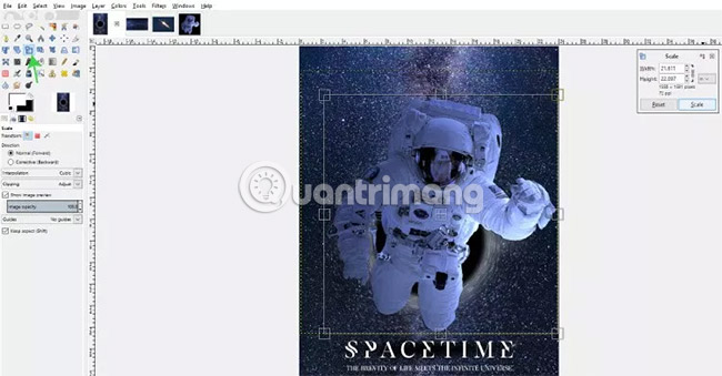
Select the Scale tool and click on the astronaut image. Drag the Scale tool to reduce astronaut image size. Click Scale when the desired size is available.
Next, select the Move tool from the Toolbox or press the M key on the keyboard and adjust the astronaut image so that it is in the middle of the layout.
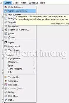
Now, change the astronaut's color temperature because by default, it looks a bit too green. Go to Colors> Color Temperature (if you're using GIMP version 2.9 and above).
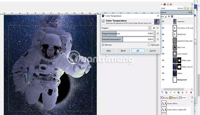
Set the initial temperature to 4100K and set the intended color temperature to 5500K. This will give the astronaut image a warmer color, and make it more intimate with the photo.
9. Add release date
Reselect the Text tool , choose a font (for example, use Nexa Bold), font size (75px) and, if desired, apply any spacing between the desired text (eg, add 10px ). Then, click on the part near the bottom of the canvas. Enter the release date of the movie.
Next, select the Alignment tool and click on the text. Click 'Align center of target' to center the text on the page
10. Add Zoom Motion Blur effect
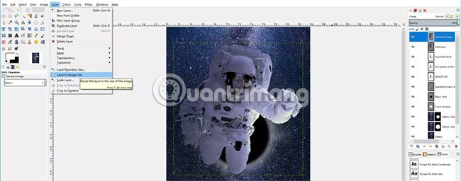
Next, make the astronaut look like he's moving towards the black hole - like being sucked into it! To do this, start by copying the Astronaut layer . Then increase the size of this layer by going to Layer> Layer to Image Size .

With the Astronaut copy layer still selected, go to Filters> Blur> Zoom Motion Blur .
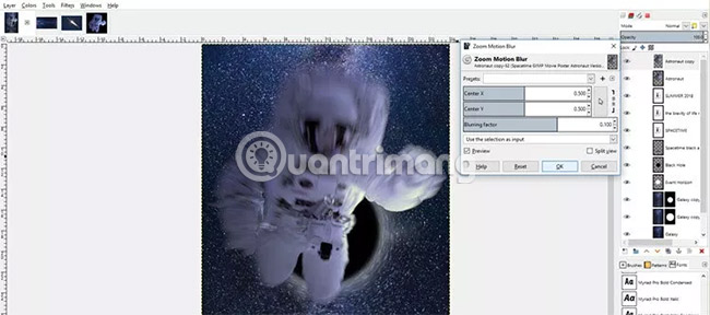
Adjust the setting of Zoom Motion Blur to match as shown in the image above (or until you get the desired look). The goal is to make astronauts look like they're moving toward the black hole. Right now, the Blur effect covers the entire astronaut image, but we just want it to cover the lower half to make the astronaut move backwards.
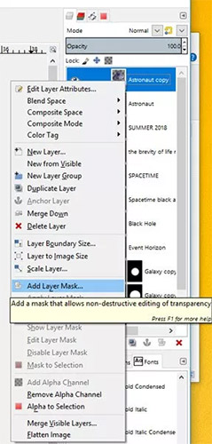
Right click on the Astronaut copy layer and select 'Add Layer Mask' . In the 'Initialize Layer Mask to' section , select White (full opacity) .
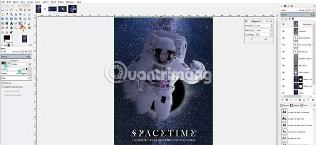
Now, select the Gradient tool , change the gradient to 'FG to Transparent' and change the 'Shape' to 'Linear'. Click the position near the astronaut's head to start, then drag to near the knee to finish the gradient. If you are using GIMP 2.9.8 or higher, users will be able to edit the gradient directly to be able to move around the start and end points, as well as adjust the opacity of the gradient to make it possible. the point where the Zoom Motion Blur effect starts to fade. Remember that because we are on a white layer mask, when painting black on the mask (as we are doing with the gradient), it will hide the objects on that layer anywhere black. This is why Zoom Motion Blur fades when you apply a gradient that changes from black to transparent.
Once you've adjusted the gradient as desired, press Enter to apply the gradient. Now it's time to blur the astronaut's lower part with Zoom Motion Blur .
11. Add Vignette layer
Create a new layer and name it Vignette. Make sure this layer is at the top of the Layers panel .
With the layer selected, go to Filters> Light and Shadow> Vignette (if you're using GIMP 2.9.8) - or if you're using GIMP 2.8, go to Tools> GEGL Operation and select Vignette from the drop-down list.
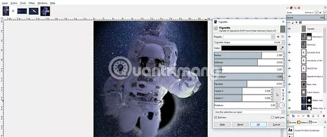
Adjust Vignette's settings until it looks like you want. If you want Vignette in the middle of a bit, you can increase the value of the 'Rotation' slider . Click OK to apply.
12. Add the name of the cast
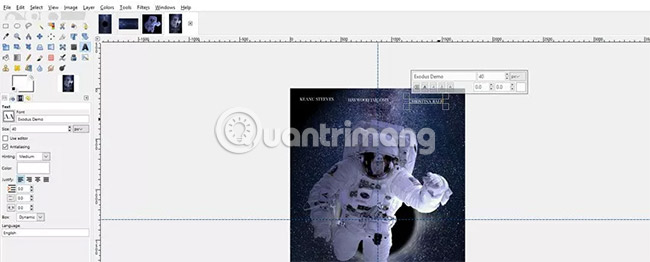
Users can add the name of the cast at the top of the canvas. To do this, click on the Text tool , make sure the font is still set to Exodus, the font size is 40, the text color is white and click near the top of the layout to create a new text layer. (place this layer on the Vignette layer ). Enter the name of the first actor. Click elsewhere on the layout, near the beginning to enter the name of the second actor. Do the same with the remaining actors.

Users can align the names of the actors by clicking and dragging the standard line from the top down and placing it at the bottom of one of the actor names (any name wants to use the standard to align other names. ). Then, select the Move tool (click on the M key on the keyboard or select from the Toolbox) and move the remaining names accordingly. Make sure to click on the text layer containing the content you want to move before clicking on the text with the Move tool . Users also need to click directly on the text, otherwise any clicked layers will be moved. Users may need to select the Zoom tool from the Toolbox (or by pressing the Z key on the keyboard) to click and enlarge the name, before using the Move tool to move. Users can also use the keyboard arrows to further adjust the position of the text after clicking it with the Move tool .
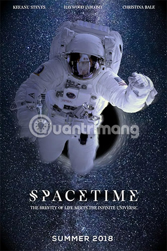
Hope you are succesful.


 How to create clipping mask in GIMP
  How to create spherical images in GIMP
  How to sign a document with GIMP
  How to Color Inside the Lines in FireAlpaca
  How to swap and combine faces in GIMP
  How to Create a Realistic Lightsaber in GIMP