How to Create Interesting App Icons
App Icons are the first thing the users notice. This is the your first and last chance to grab users' attention among millions of apps competing for attention in app stores. You want to make sure your design gets your potential users'...
Table of Contents
Method 1 of 3:
Basic Design Guidelines
-
 Remember the magical formula: Icons must be recognizable and beautiful. Being beautiful will ensure that the users notice it for the first time. Being recognizable will help you when your user will come back or search for your app. Know that when users see an app icon, they instantly create an opinion about the quality of the app. First impression matters! So make it as powerful and attractive as possible.
 -
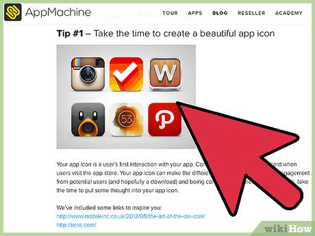
 Use symbols and shapes. E.g., blue box with an enclosed 'f'- Facebook, a small flying bird against blue background- twitter, Cursive 'P' against red- Pinterest, and a comical robot - Android. All these icons capitalize on the power of symbol and shapes. These are simple yet beautiful and recognizable. Don't go for complicated designs unless you can pull it off well.
 -
 Color it carefully. Colors say a lot about your app in particular and business in general. Use colors carefully. Don't make it clownish. Try not to use more than three colors. Know a little about color psychology. Green is usually associated with nature. Red is romantic, Blue signifies peace and orange oozes energy. Purple is royal. Similarly, know how colors choice is determined by gender, age, and region.
 -
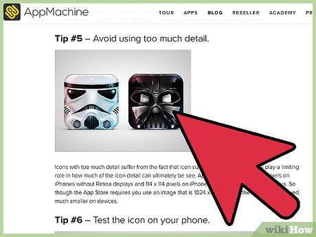
 Don't clutter. Remember simplicity is a virtue in visual arts and design. Don't use long string of texts. Similarly, don't use photos unless you are a rock star or Hollywood celebrity.
 -
 Make sure your icon is related to the product you are selling. For example, use heart symbol for dating and matchmaking app. Computer or cellphone for cellphones and gadgets. Eateries can have food symbols. Religious symbols are universally recognized, so bank on this phenomenon.
 -
 Consider the iOS. Google has laid out icons design guideline for developers. This has led to more unified icons. Apple on the other hand already had the "squircle" design for their native apps, and has always been very rich aesthetically, which led to synchronized designs by others, too.
Method 2 of 3:
Android Icons
-
 Use grids and basic shapes: The basic shapes and grid let you focus on each element in the consecutive layers e.g., lighting, shading, color, geometry, etc.
 -
 Light carefully. According to Google's guide, lighting is like cutting and folding a paper. Think of this as origami. Fold the paper into any shape and then illuminate (light) it.
 -
 Observe the shadows. According to above analogy, note how edges create shadows and where. Shadows give depth to 2D image.
 -
 Color according to their suggestions. According to Google's outline, the color opacity is 54% on lit background. Inactive background will be 26% opacity-wise. On black background, opacity is 100% and inactive icon will have 30% opacity.
 -
 Dig into any other details. Google's icon guideline further delineates other elements such as geometry, strokes, human iconography, etc.
Method 3 of 3:
Apple Icons
-
 Use universal imagery. For example, movie related app can use a clapper board. Instead of using some obscure or less known aspects of movie making e.g., coloring, sound dubbing, etc.
 -
 Don't use photo or screenshot. Photos hardly look good on icons and the whole point of using them is lost when seen at small sizes.
 -
 Shun transparency, embrace Opacity. Transparent icons rarely look good. Most of the time they get merged into bright background.
 -
 Don't use iOS similar icons. iOS users are very sophisticated breed of people. They have been using different iOS applications religiously. Making icons very similar to those of the native iOS apps will drive them away from your app instantly. Moreover, you may end up with copyright issues.
 -
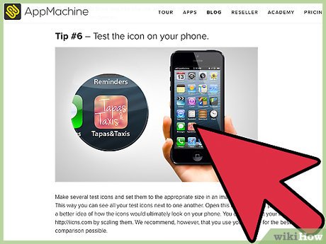 Have multiple icons of different sizes for multiple devices. Users have different devices which will have different rendering. Refer to the Apple Image and Icon size table on Apple's website.
 -
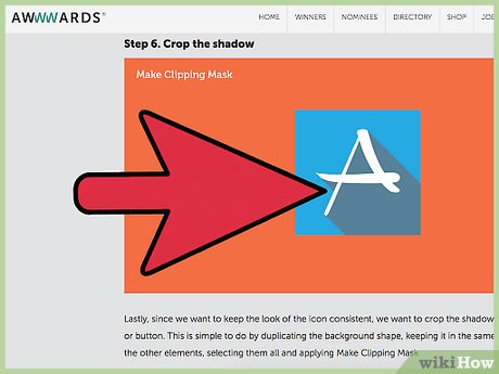
 Have a large version of your app for App Store Display. This can be richer and more detailed, though no visual effects can be applied.
- The larger icon should measure 1024 x 1024 pixels. It needs to be named iTunesArtwork@2x. For @1x devices, create app icon using 512 x 512 pixels and named iTunesArtwork.
Was this article helpful?
Your feedback helps us improve.
Related Articles
 The meaning behind familiar technology symbols5 minutes read
Reader Comments 0
Sign in with email or Google to join the discussion.