Form - Form in CSS
Forms - forms are an integral part of any kind of website. Let's see how to build the display interface part of a basic form.
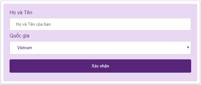
Forms - forms are an integral part of any kind of website. In this article, TipsMake.com will show you how to build the display interface of a basic form. This interface can be done quite nicely with CSS, like this:

Format sections in the form
School entered
Use width attribute to determine the width of the input field:
 input {
  width: 100%;
 }

This code will apply to all elements. If you want to style a specific input type, you can use Attribute Selector:
- input [type = text]: specifies the type for all fields with the type attribute, the text value.
- input [type = password]: specifies the type for all fields with the type attribute, the password value.
- input [type = number]: specifies the type for all fields with the type attribute, the number value.
Add padding and margin for the input field
 input[type=text] {
  width: 100%;
  padding: 12px 20px;
  margin: 8px 0;
  box-sizing: border-box;
 }
Use the padding attribute to make space inside the text field more extensive. You should also use margin to have space outside the school, helping schools to be separated by a certain distance.
Form does not have padding and margin:

The form has both padding and margin:

Add a box-sizing attribute : border-box to allow the padding and the border of the box to fit within the predefined element size.
Simple code like this for you to see more, try changing the values to see the difference:
Format Border
Use the border attribute to resize and border colors, combine with border-radius properties to format rounded corners.
 input[type=text] {
  border: 2px solid purple;
  border-radius: 4px;
 }

For example:
If you only want the frame to have only the lower border, use the border-bottom attribute :

 input[type=text] {
  border: none;
  border-bottom: 2px solid purple;
 }
Color format
Use background-color attribute to add background color to input field and color attribute to change text color:
 input[type=text] {
  background-color: #58257b;
  color: white
 }

For example:
Impress the entry field
By default, some browsers will add a blue border around the input field when users click to fill in the information. You can remove this by adding outline: none attribute .
Should use selector : focus to make an impression for the input field, drawing attention to users when they click on the box:
Use another colored background Emphasize with border borderinput[type=text]:focus {
background-color: lightblue;
}
 input[type=text]:focus {
  border: 3px solid #555;
 }


 input[type=text] {
  width: 100%;
  padding: 12px 20px;
  margin: 8px 0;
  box-sizing: border-box;
  border: 1px solid #58257b;
  outline: none;
 }

 input[type=text]:focus {
  background-color: #e9d8f4;
 }
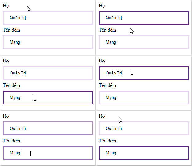
Add the transition CSS attribute to animate the border color (take 0.5 seconds to change the color when clicking).
 input[type=text] {
  width: 100%;
  padding: 12px 20px;
  margin: 8px 0;
  box-sizing: border-box;
  border: 3px solid #e9d8f4;
  -webkit-transition: 0.5s;
  transition: 0.5s;
  outline: none;
 }

 input[type=text]:focus {
 border: 3px solid #58257b;
 }
Input field has icon / image
You can add an icon or image to the input field, usually at the top to express the purpose of the field, use the background-image attribute and locate it with the background-position attribute . Note, setting the left padding size is wide enough to have space for the icon. The most obvious example is the magnifying glass icon before each search bar on websites:
 input[type=text] {
  background-color: white;
  background-image: url('searchicon.png');
  background-position: 10px 10px;
  background-repeat: no-repeat;
  padding-left: 40px;
 }

For example:
Effects for search box
To make a point here, use the CSS transition attribute to create the effect, making the search box stretch out after the user clicks on it, which looks pretty nice.
 input[type=text] {
  -webkit-transition: width 0.4s ease-in-out;
  transition: width 0.4s ease-in-out;
 }

 input[type=text]:focus {
  width: 100%;
 }

For example:
Textarea box format
Use the resize attribute to fix the textarea box size.
 textarea {
  width: 100%;
  height: 150px;
  padding: 12px 20px;
  box-sizing: border-box;
  border: 2px solid #ccc;
  border-radius: 4px;
  background-color: #f8f8f8;
  resize: none;
 }

For example :
Discover more
create css form html form css learningShare by
Samuel DanielYou should read it
- Create forms (forms) in Access 2016
- HTML form
- MS Access 2007 - Lesson 12: Design Forms
- MS Access 2003 - Lesson 36: Defining individual Forms
- How to create a website contact form with Google Forms
- The Quiet Details That Make a Sports Betting Platform Feel Reliable
- Instructions on creating toy set images with ChatGPT AI
- How are AI agents changing the journalism industry?
- Counter - Counter in CSS
- Design Layout - Website layout in CSS
- CSS specificity