Border Image - Create image borders in CSS
CSS Border Image is adding images that appear on the border for elements..
CSS Border Image is adding images that appear on the border for elements. You don't need to use any HTML code to call the Border Image.
The border-image attribute in CSS
The border-image attribute in CSS allows you to specify an image that will use the regular border replacement around an element.
Attributes are worth following:
- The image is used as a border
- Where to crop pictures
- Identify parts that are repeated or prolonged.
In this article, TipsMake.com will use the following image named " Border-image.png ":

The border-image attribute cuts the image into nine style sections like the checkerboard flag as follows:

Now notice the sections 1, 3, 7, 9 are four corners and it is fixed, part 5 is the central position and the rest will be affected by values like round, repeat or stretch only determined.
Example 1: The middle part of the image is repeated to create a border:
 #borderimg {
  border: 10px solid transparent;
  padding: 15px;
  border-image: url(border-image.png) 30 round;
 }
In this example, the middle part of the image is repeated to form a border.
Note : Internet Explorer 10 and earlier versions do not support the border-image attribute.
The border-image attribute in CSS
In this example, the middle part of the image is repeated to form a line
rim:
border-image: url (border-image.png) 30 round;
Original image:
Note: Internet Explorer 10 and older versions do not
Support border-image attribute.
Example 2: The middle part of the image is stretched to create a border.
 #borderimg {
  border: 10px solid transparent;
  padding: 15px;
  border-image: url(border-image.png) 30 stretch;
 }

In this example, the middle part of the image is stretched to form a border.
The border-image attribute in CSS
In this example, the middle part of the image is stretched to form a line
rim:
border-image:
url (border-image.png) 30 stretch;
Original image:
Note: Internet Explorer 10 and older versions do not
Support border-image attribute.
Cut the Border Image to create a new border
The way to slice images to make different borders will create a lot of novelty, completely change the look of the border.
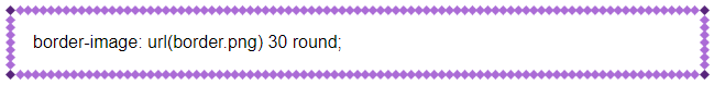
Type 1 slice:
 #borderimg1 {
  border: 10px solid transparent;
  padding: 15px;
  border-image: url(border-image.png) 50 round;
 }

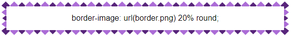
Type 2 slice:
 #borderimg2 {
  border: 10px solid transparent;
  padding: 15px;
  border-image: url(border-image.png) 20% round;
 }
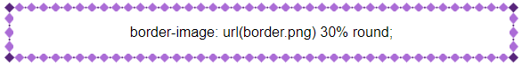
Type 3 slice:
 #borderimg3 {
  border: 10px solid transparent;
  padding: 15px;
  border-image: url(border-image.png) 30% round;
 }
The border-image attribute in CSS
border-image: url (border-image.png) 50 round;
border-image: url (border-image.png) 20% round;
border-image: url (border-image.png) 30% round;
Note: Internet Explorer 10 and older versions do not
Support border-image attribute.
 Marvin Fry