Rounded Corner in CSS
The Rounded Corner in CSS is the use of the border-radius attribute to circle the elements.
Table of Contents
The Rounded Corner in CSS is the use of the border-radius attribute to circle the elements.
The Border-radius property in CSS
The Border-radius attribute in CSS is used to determine the radius of the element's corners and round it to that radius.
For example:
1. Bo round the corners of an element with the specified background color
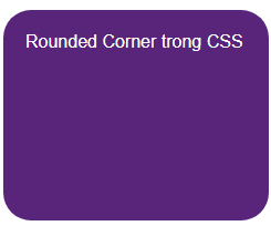
 #rcorners1 {
  border-radius: 25px;
  background: #58257b;
  color:white;
  padding: 20px;
  width: 200px;
  height: 150px;
 }
2. Round the corners of an outer border element
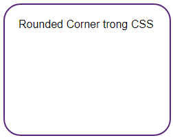
 #rcorners2 {
  border-radius: 25px;
  border: 2px solid #58257b;
  padding: 20px;
  width: 200px;
  height: 150px;
 }
3. Bo round the corners of an element with the background as a defined image

 #rcorners3 {
  border-radius: 25px;
  background: url(paper.gif);
  background-position: left top;
  background-repeat: repeat;
  padding: 20px;
  width: 200px;
  height: 150px; }
Full code:
Border-radius attribute
Round the corners of an element with the specified background color:
Rounded Corner in CSS
Bo round the corners of an outer border element:
Rounded Corner in CSS
Bo round the corners of an element with the background as a defined image
Rounded Corner in CSS
The value of the corners of border-radius
The border-radius attribute can have from one to four values. First you need to distinguish the corners in an element:

- Corner-1: top-left corner
- Corner-2: top-right corner
- Corner-3: bottom-right corner
- Corner-4: bottom-left corner
1. The border-radius case has 4 values
These four values will correspond to four corners: border-radius: angle-1 angle-2 angle-3 angle-4
For example:

 #rcorners1 {
  border-radius: 15px 50px 30px 5px;
  background: #58257b;
  padding: 20px;
  width: 200px;
  height: 150px;
 }
2. The border-radius case has 3 values
These three values correspond to the following:
- First value: Angle -1
- Second value: Angle-2 and Angle-4
- Third value: Angle-3
For example:

 #rcorners2 {
  border-radius: 15px 50px 30px;
  background: #58257b;
  padding: 20px;
  width: 200px;
  height: 150px;
 }
3. The border-radius case has 2 values
These two values correspond to the following:
- First value: Angle -1 and Angle-3
- Second value: Angle-2 and Angle-4
For example:

 #rcorners3 {
  border-radius: 15px 50px;
  background: #58257b;
  padding: 20px;
  width: 200px;
  height: 150px;
 }
4. Border-radius case has 1 value
This value applies to all four corners, creating an image with equal angles
For example:

 #rcorners4 {
  border-radius: 15px;
  background: #58257b;
  padding: 20px;
  width: 200px;
  height: 150px;
 }
Full code :
The value of the corners of border-radius
Border-radius: 15px 50px 30px 5px:
Border-radius: 15px 50px 30px:
Border-radius: 15px 50px:
Border-radius: 15px:
Previous post: CSS Specificity
Next article: Border Image - Create a picture border in CSS
Was this article helpful?
Your feedback helps us improve.
Related Articles
 How to corner in AI3 minutes read
 How to rounded corners of photos in Photoshop3 minutes read
 How to use Hot Corner on Mac4 minutes read
 How to create a rounded image in Photoshop5 minutes read
 Why doesn't the iPhone drop the notch?5 minutes read
 Windows 11 transparency and rounded corners don't affect PC performance2 minutes read
Reader Comments 0
Sign in with email or Google to join the discussion.