Table of Contents
Many older Bootstrap examples rely on jQuery, Glyphicons, or Bootstrap 4 data attributes. Bootstrap 5 uses plain JavaScript and data-bs-* attributes instead. The solutions below update several common dropdown, tooltip, button, modal, video, and popover patterns for Bootstrap 5.
These examples assume that Bootstrap CSS and bootstrap.bundle.min.js are already loaded. The bundle includes Popper, which positions dropdowns, tooltips, and popovers. For broader context, compare Bootstrap with other popular CSS frameworks.
Should a dropdown open on hover?
Bootstrap dropdowns open on click by design. Click works with touch screens and can be operated with a keyboard, while hover has no direct touch equivalent. Keep the standard behavior for primary navigation and important actions.
<div class="dropdown">
  <button class="btn btn-secondary dropdown-toggle" type="button"
    data-bs-toggle="dropdown" aria-expanded="false">
    Account
  </button>
  <ul class="dropdown-menu">
    <li><a class="dropdown-item" href="/profile">Profile</a></li>
    <li><a class="dropdown-item" href="/settings">Settings</a></li>
  </ul>
</div>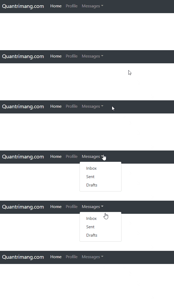
If a desktop-only decorative menu must also respond to hover, treat that as an enhancement rather than replacing click. Limit the CSS with @media (hover: hover) and (pointer: fine), and retain the Bootstrap button so keyboard and touch users can still open the menu.
How do you add a tooltip to an icon?
Give the trigger an accessible label or visible text, add data-bs-toggle="tooltip" and data-bs-title, then initialize the tooltip in JavaScript. Bootstrap 5 tooltips are opt-in.
<button type="button" class="btn btn-outline-secondary"
  aria-label="Account information"
  data-bs-toggle="tooltip"
  data-bs-title="Account information">
  <svg aria-hidden="true" width="16" height="16" viewBox="0 0 16 16">
    <circle cx="8" cy="8" r="7" fill="none" stroke="currentColor"/>
    <path d="M8 7v5M8 4.5h.01" stroke="currentColor"/>
  </svg>
</button>

<script>
  const triggers = document.querySelectorAll('[data-bs-toggle="tooltip"]');

  [...triggers].forEach((element) => {
    new bootstrap.Tooltip(element);
  });
</script>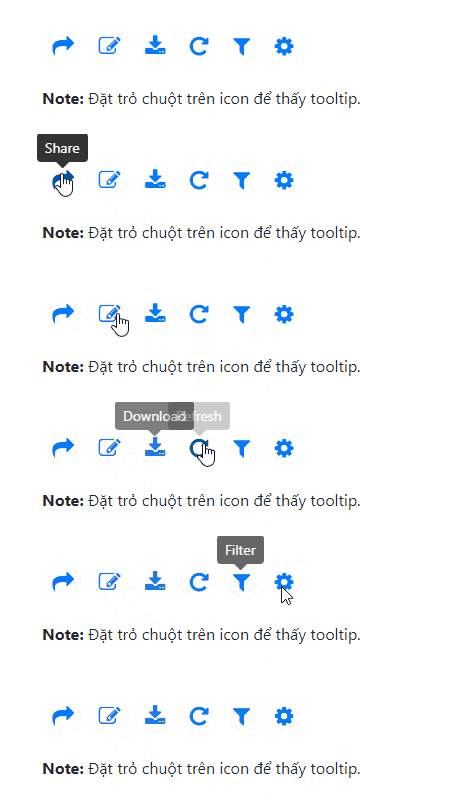
Use bootstrap.bundle.min.js or provide Popper separately. The official tooltip documentation lists supported options and initialization methods.
How do you put an icon inside a submit button?
Use a <button> element rather than <input type="submit">. A button can contain an SVG, an icon font element, and text without positioning tricks.
<button class="btn btn-primary d-inline-flex align-items-center gap-2"
  type="submit">
  <svg aria-hidden="true" width="16" height="16" viewBox="0 0 16 16">
    <path d="M2 8l4 4 8-8" fill="none"
      stroke="currentColor" stroke-width="2"/>
  </svg>
  Create account
</button>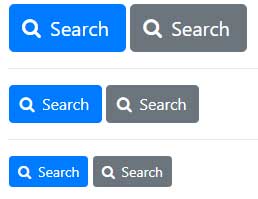
The text provides the accessible name, so the decorative SVG is hidden from assistive technology with aria-hidden="true". Bootstrap itself does not bundle Glyphicons. Use an inline SVG or install an icon library separately.
How do you center a Bootstrap modal vertically?
Add modal-dialog-centered to the modal dialog. No resize listener, calculated margin, or jQuery code is needed.
<button class="btn btn-primary" type="button"
  data-bs-toggle="modal" data-bs-target="#confirmModal">
  Open confirmation
</button>

<div class="modal fade" id="confirmModal" tabindex="-1"
  aria-labelledby="confirmTitle" aria-hidden="true">
  <div class="modal-dialog modal-dialog-centered">
    <div class="modal-content">
      <div class="modal-header">
        <h2 class="modal-title fs-5" id="confirmTitle">Confirm</h2>
        <button type="button" class="btn-close"
          data-bs-dismiss="modal" aria-label="Close"></button>
      </div>
      <div class="modal-body">Continue with this action?</div>
      <div class="modal-footer">
        <button class="btn btn-secondary" type="button"
          data-bs-dismiss="modal">Cancel</button>
        <button class="btn btn-primary" type="button">Continue</button>
      </div>
    </div>
  </div>
</div>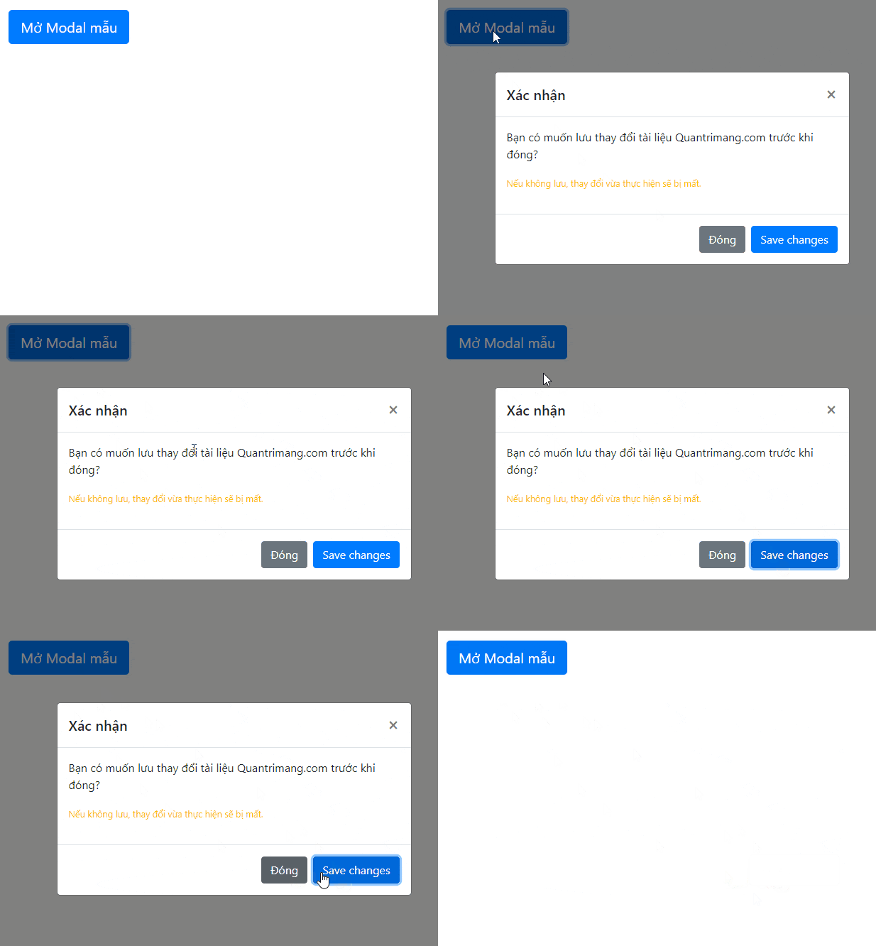
How do you stop a YouTube video when its modal closes?
Place the responsive YouTube iframe in the modal body, then listen for Bootstrap's hidden.bs.modal event. Resetting the iframe's src stops playback after the closing transition. Replace VIDEO_ID with the ID of the video you are authorized to embed.
<div class="modal fade" id="videoModal" tabindex="-1"
  aria-labelledby="videoTitle" aria-hidden="true">
  <div class="modal-dialog modal-lg modal-dialog-centered">
    <div class="modal-content">
      <div class="modal-header">
        <h2 class="modal-title fs-5" id="videoTitle">Video guide</h2>
        <button type="button" class="btn-close"
          data-bs-dismiss="modal" aria-label="Close"></button>
      </div>
      <div class="modal-body">
        <div class="ratio ratio-16x9">
          <iframe
            src="https://www.youtube-nocookie.com/embed/VIDEO_ID"
            title="Video guide"
            allow="accelerometer; autoplay; encrypted-media; picture-in-picture"
            allowfullscreen></iframe>
        </div>
      </div>
    </div>
  </div>
</div>

<script>
  const videoModal = document.getElementById('videoModal');
  const videoFrame = videoModal.querySelector('iframe');
  const videoUrl = videoFrame.src;

  videoModal.addEventListener('hidden.bs.modal', () => {
    videoFrame.src = '';
    videoFrame.src = videoUrl;
  });
</script>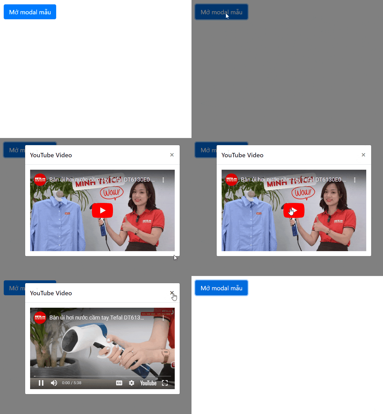
The iframe above is an encoded code example, not a live embed. Using youtube-nocookie.com reduces some tracking before playback, but the site's privacy notice and consent requirements still depend on its audience and jurisdiction.
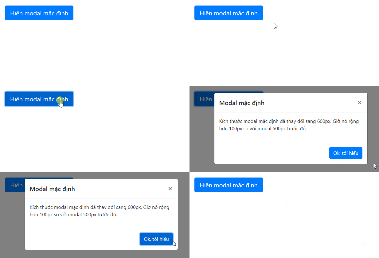
How do you change a modal's width?
Start with Bootstrap's built-in dialog sizes: modal-sm, modal-lg, and modal-xl. Add the size class beside modal-dialog:
<div class="modal-dialog modal-xl modal-dialog-centered">
  <div class="modal-content">...</div>
</div>
For a deliberately custom maximum width, scope a CSS variable to one modal instead of overriding every dialog:
<div class="modal fade custom-modal" id="reportModal" tabindex="-1">
  <div class="modal-dialog">
    <div class="modal-content">...</div>
  </div>
</div>
.custom-modal {
--bs-modal-width: 42rem;
}
Keep a sensible margin on narrow screens and test long content. Bootstrap also provides responsive fullscreen classes. See the Bootstrap modal documentation for sizes, accessibility attributes, and events.
How should a popover be dismissed?
For short supplementary text, the simplest pattern is a focus-triggered popover that closes when the user moves focus elsewhere. Bootstrap recommends an anchor with tabindex="0" for consistent focus dismissal.
<a class="btn btn-outline-secondary" tabindex="0" role="button"
  data-bs-toggle="popover"
  data-bs-trigger="focus"
  data-bs-title="Account status"
  data-bs-content="Your profile is ready for review.">
  Show status
</a>

<script>
  const popoverTriggers =
    document.querySelectorAll('[data-bs-toggle="popover"]');

  [...popoverTriggers].forEach((element) => {
    new bootstrap.Popover(element);
  });
</script>
A custom close button inside a popover requires HTML content and additional event handling. Prefer plain text unless the interface genuinely needs interactive content. If content can include user input, do not disable Bootstrap's sanitizer. The popover documentation describes the available triggers and lifecycle methods.
When testing these components, use both a mouse and keyboard, inspect the browser console for missing JavaScript, and confirm that every control has a visible label or an accessible name. A capable editor can also catch malformed attributes; see these free HTML editing tools.
Related Articles
 Answer 12 Frequently Asked Questions About iOS 11. 3 Update6 minutes read
 The Secret to Answering the 15 Most Frequently Asked Interview11 minutes read
 A Compilation of Exercises on Bootstrap 56 minutes read
 Frequently Asked Questions About Office 201914 minutes read
 Frequently Asked Questions About the Default Password6 minutes read
 49 Most Asked Questions That Apple Asked in the Job Interview9 minutes read
Reader Comments 0
Sign in with email or Google to join the discussion.