Table of Contents
A common Bootstrap layout stacks content vertically on narrow screens and places it in columns when more width is available. Choose the breakpoint where the horizontal layout should begin, then apply matching responsive column classes such as col-sm-6 or col-md-6.
How stacked-to-horizontal grids work
Every Bootstrap row has 12 template columns. A numbered class specifies how many units an element spans, while the breakpoint prefix specifies the minimum viewport width where that span takes effect.
| Class | Below its breakpoint | At and above its breakpoint |
|---|---|---|
col-sm-6 | Full width below 576px | 6 of 12 units from 576px |
col-md-4 | Full width below 768px | 4 of 12 units from 768px |
col-lg-3 | Full width below 992px | 3 of 12 units from 992px |
Bootstrap uses minimum-width rules, so a class continues to apply at larger breakpoints until another responsive class overrides it. See the Bootstrap grid documentation for all six tiers.
Create two columns that stack below 576px
Give both columns col-sm-6. They occupy the full row by default and become equal halves at the small breakpoint:
<div class="container">
  <div class="row g-4">
    <section class="col-sm-6">
      <div class="p-4 bg-primary text-white rounded">
        First column
      </div>
    </section>
    <section class="col-sm-6">
      <div class="p-4 bg-secondary text-white rounded">
        Second column
      </div>
    </section>
  </div>
</div>
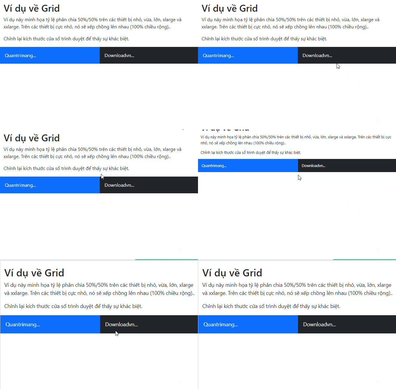
Below 576px, the sections appear one after the other at 100% width. At 576px and wider, each occupies half of the row. The g-4 class creates a gutter between them.
Choose proportional numbered columns
The numbered spans do not need to be equal. Use any combination that suits the content:
| Layout | Classes |
|---|---|
| 25% / 75% | col-sm-3 and col-sm-9 |
| 33.3% / 66.7% | col-sm-4 and col-sm-8 |
| 50% / 50% | col-sm-6 and col-sm-6 |
<div class="row g-3">
  <aside class="col-sm-4">Sidebar</aside>
  <main class="col-sm-8">Article</main>
</div>
A row may intentionally use fewer than 12 units. When active spans require more than 12, later columns wrap to a new line.
Use automatic equal-width columns
Remove the number when Bootstrap should divide the row evenly. The breakpoint remains part of the class:
<div class="container text-center">
  <div class="row g-3 mb-4">
    <div class="col-sm"><div class="p-3 border">1 of 2</div></div>
    <div class="col-sm"><div class="p-3 border">2 of 2</div></div>
  </div>

  <div class="row g-3">
    <div class="col-sm"><div class="p-3 border">1 of 4</div></div>
    <div class="col-sm"><div class="p-3 border">2 of 4</div></div>
    <div class="col-sm"><div class="p-3 border">3 of 4</div></div>
    <div class="col-sm"><div class="p-3 border">4 of 4</div></div>
  </div>
</div>
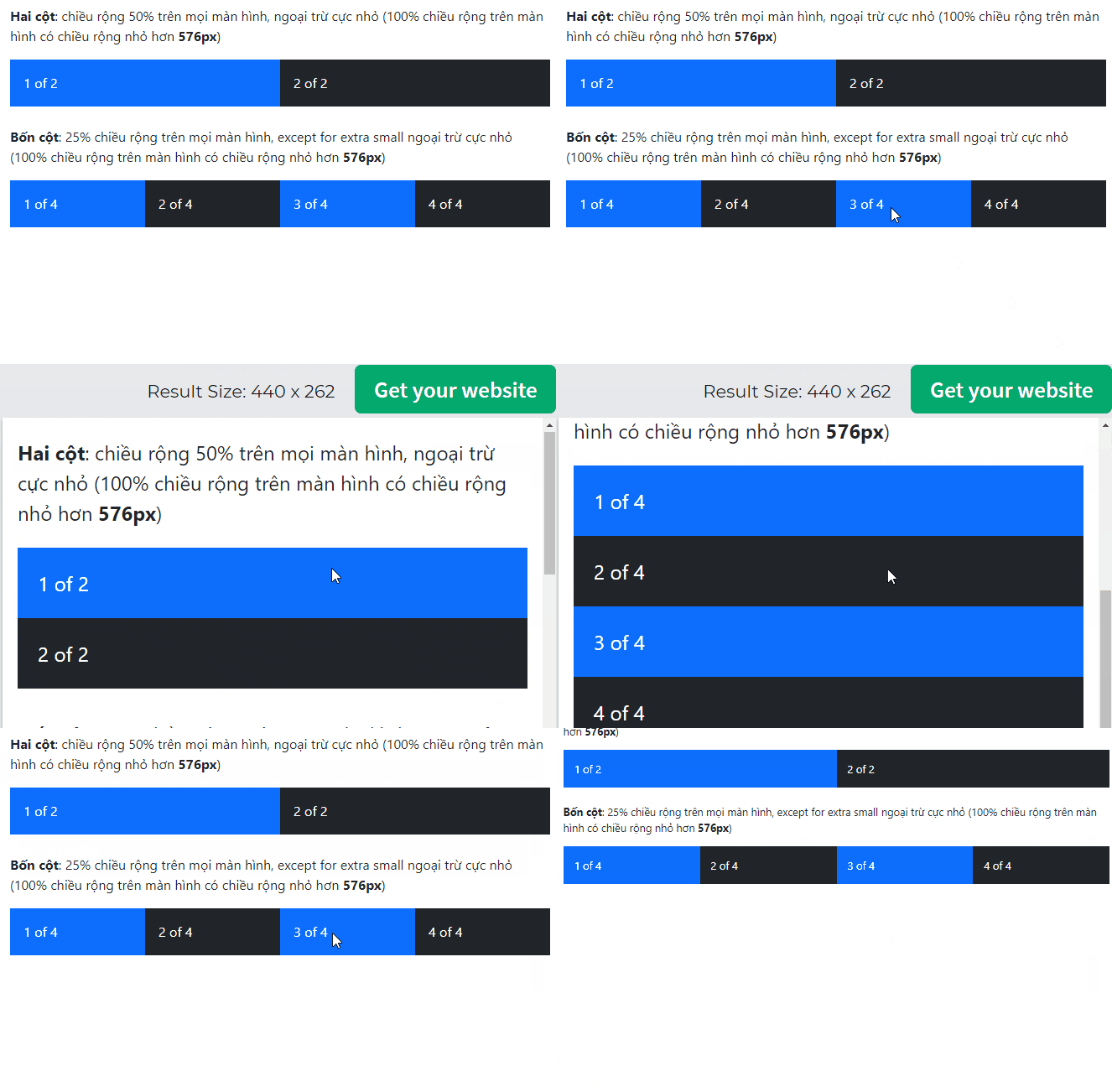
The first row becomes two equal columns and the second becomes four equal columns from 576px. Both rows stack below that point.
If equal widths should apply at every viewport size, use plain col. If the items are repeating cards, consider setting row-cols-1 row-cols-sm-2 row-cols-lg-4 on the row.
Choose a container
The column behavior is the same inside either Bootstrap container:
containeruses a responsive maximum width and centers the layout.container-fluidremains 100% wide at every viewport.container-mdand similar responsive containers are fluid below one breakpoint and constrained above it.
<div class="container-fluid px-4">
  <div class="row">
    <div class="col-md-8">Main content</div>
    <div class="col-md-4">Sidebar</div>
  </div>
</div>
Containers control the outer page width; column classes control proportions inside each row.
Change the design at more than one breakpoint
Combine responsive classes to describe a mobile-first progression:
<article class="col-12 col-sm-6 col-lg-4">Card</article>This card spans the full row by default, half the row from 576px, and one third from 992px. Read each class as a rule that takes over at a wider minimum width.
Check the finished layout
- Include the responsive viewport meta tag.
- Put grid columns directly inside a
row. - Use gutter utilities instead of adding unrelated margins to columns.
- Test the exact breakpoint transitions and check for cramped text or controls.
- Make images responsive with
img-fluidwhen they may exceed a column.
For wider comparisons, see these popular CSS frameworks. One of these HTML editors can also help you validate the markup and inspect responsive classes.
Related Articles
 Lesson 42: Large Grid in Bootstrap 54 minutes read
 Lesson 41: Grid Medium in Bootstrap 54 minutes read
 Lesson 39: Ultra-Small Grid Styles in Bootstrap 54 minutes read
 Lesson 40: Small Grid in Bootstrap 54 minutes read
 Lesson 3: Grid System in Bootstrap 511 minutes read
 Lesson 28: Offcanvas in Bootstrap 55 minutes read
Reader Comments 0
Sign in with email or Google to join the discussion.