Table of Contents
Bootstrap can be customized at two levels. For a few isolated changes, load a small CSS file after Bootstrap. For project-wide colors, spacing, breakpoints, utilities, or component options, compile Bootstrap's Sass source with your own variable values.
The Sass approach creates one tailored Bootstrap stylesheet and keeps the framework's source files untouched, making future updates easier to review.
CSS overrides or Sass variables?
| Method | Best for | Main tradeoff |
|---|---|---|
| Custom CSS after Bootstrap | A few selectors or one-off component changes | May require repeated selectors and specificity work |
| Compile Bootstrap Sass | Theme colors, breakpoints, utilities, and broad design-system changes | Requires a build step |
If you use CSS overrides, include Bootstrap first and your stylesheet second:
<link rel="stylesheet" href="/css/bootstrap.min.css">
<link rel="stylesheet" href="/css/site.css">
Do not increase specificity more than necessary. A long chain of overrides becomes difficult to maintain.
Install Bootstrap and Sass
This workflow uses Node.js, npm, Bootstrap 5, and Dart Sass. From the project directory, run:
npm install bootstrap
npm install --save-dev sass
A simple project can use this structure:
your-project/
├── dist/
│   └── css/
├── scss/
│   └── custom.scss
├── index.html
├── package.json
└── node_modules/
Bootstrap's package contains compiled distribution files, JavaScript, and the source Sass partials under node_modules/bootstrap/scss. Never edit those files directly; an npm update can replace them.
Override Bootstrap theme colors
Create scss/custom.scss. Set variables before importing Bootstrap:
$primary: #0f766e;
$secondary: #475569;
$success: #15803d;
$danger: #b91c1c;

@import "bootstrap/scss/bootstrap";
Many Bootstrap Sass variables use the !default flag. This means Bootstrap supplies its default only when your stylesheet has not already defined the variable. The order is therefore essential: custom values first, Bootstrap import second.
Add repeatable build commands
Add scripts to package.json so every developer and deployment process uses the same commands:
{
  "scripts": {
    "css:build": "sass --load-path=node_modules scss/custom.scss dist/css/custom.css --style=compressed",
    "css:watch": "sass --watch --load-path=node_modules scss/custom.scss:dist/css/custom.css"
  }
}
Compile once with:
npm run css:buildDuring development, watch the Sass file and rebuild after each save:
npm run css:watchThe --load-path=node_modules option allows @import "bootstrap/scss/bootstrap" to resolve without a long relative path.
Load the compiled stylesheet
Reference the generated CSS in the page:
<link rel="stylesheet" href="/dist/css/custom.css">Do not also load the full default bootstrap.min.css. The compiled custom.css already contains Bootstrap with your overrides, and loading both duplicates rules.
Bootstrap JavaScript is separate from the Sass build. Components such as collapse, dropdowns, modals, and tooltips require the appropriate Bootstrap JavaScript. Static grid and styling classes do not.
Preview the default and custom theme
The original project appearance provides a useful baseline before recompilation.
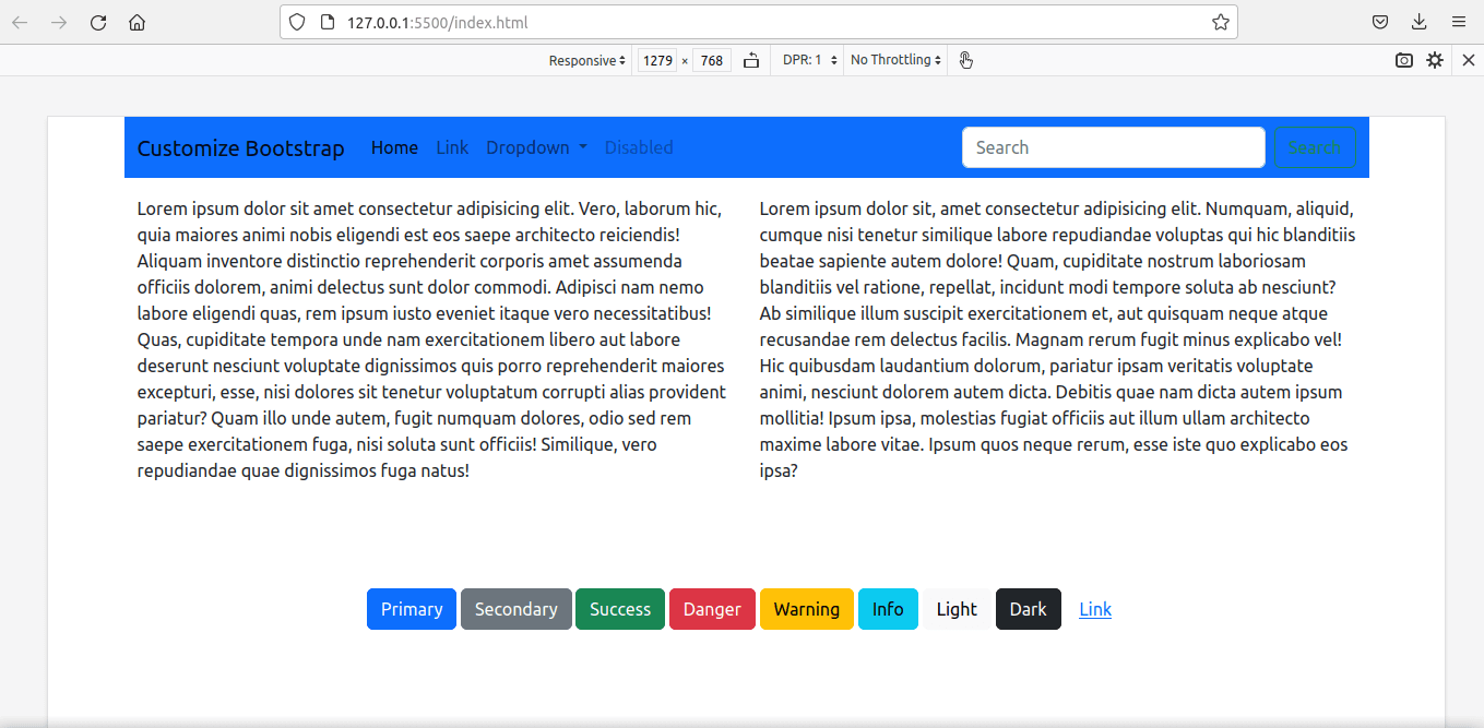
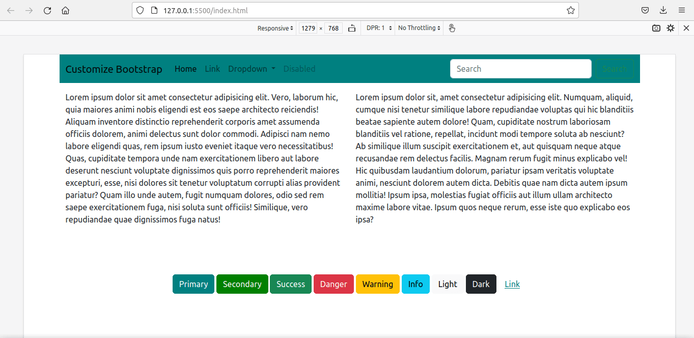
After the variables are changed and custom.scss is compiled, classes such as .btn-primary, .bg-primary, and other theme-derived styles use the new values.
Change Bootstrap grid breakpoints
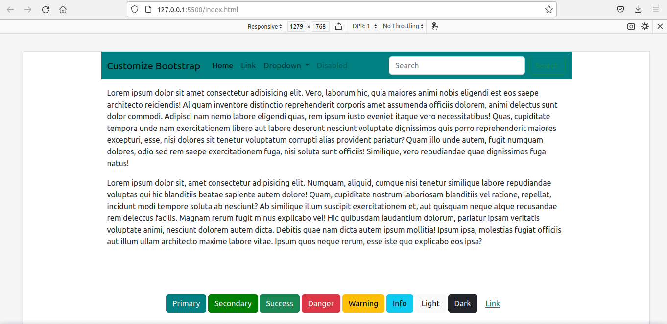
Bootstrap's responsive grid uses the $grid-breakpoints Sass map. Container widths use $container-max-widths. If you redefine them, keep every required key in ascending order and make each container width sensible for its corresponding breakpoint.
$primary: #0f766e;
$secondary: #475569;

$grid-breakpoints: (
  xs: 0,
  sm: 576px,
  md: 768px,
  lg: 992px,
  xl: 1280px,
  xxl: 1600px
);

$container-max-widths: (
  sm: 540px,
  md: 720px,
  lg: 960px,
  xl: 1220px,
  xxl: 1520px
);

@import "bootstrap/scss/bootstrap";
Compile again and test every responsive component, not only the container. Changing the maps affects grid classes, responsive utilities, navbar behavior, and any mixin or component that uses those breakpoints.
Modify a Sass map instead of replacing it
Replacing the complete map is easy to read when you intentionally control every value. For a smaller change, Bootstrap also supports importing its configuration in the documented order and merging your values into an existing map.
The import order matters because later partials depend on earlier functions, variables, dark-mode variables, maps, and mixins. Follow the import stack for the exact Bootstrap version installed rather than copying an old partial list. Sass and Bootstrap are also moving away from legacy import patterns over time, so treat compiler deprecation warnings separately from actual build failures.
Import only the Bootstrap parts you need
The full bootstrap.scss import is the simplest and safest starting point. A production project can reduce its CSS by importing required configuration followed by only the components it uses. However, partial imports have dependencies and must follow Bootstrap's documented order.
Measure the compiled result before adding this complexity. A smaller file is useful, but an incomplete import stack can remove required base styles or utilities.
Common problems
Variables have no effect
Confirm that variables are defined before the Bootstrap import and that the page loads the newly generated CSS rather than an older file or cached asset.
Sass cannot find Bootstrap
Verify that bootstrap exists in node_modules and that the build command includes --load-path=node_modules, or use the path format expected by your bundler.
Duplicate Bootstrap styles
Load either the compiled custom Bootstrap file or the default distribution file, not both.
Navbar toggler does not work
Sass compiles CSS only. Include Bootstrap's JavaScript bundle when an interactive component requires it, and use markup that matches the installed Bootstrap version.
Breakpoint changes cause unexpected layouts
Check the order of map values, container widths, responsive utilities, and component behavior at widths just below and above every breakpoint.
Maintenance checklist
- Pin and review dependency updates through
package.jsonand the lockfile. - Keep all overrides in project-owned Sass files.
- Run the production CSS build in continuous integration or deployment.
- Test color contrast after changing theme colors.
- Test navigation, forms, focus states, and responsive layouts.
- Read the migration notes before updating Bootstrap or Sass.
Bootstrap's official Sass customization documentation contains the version-specific import order, variables, maps, and compilation notes. For browser-based Sass experiments, see these CodePen features for web development. You can also compare Bootstrap with other options in this overview of popular CSS frameworks.
Related Articles
 Lesson 30: Flexing in Bootstrap 59 minutes read
 How to Use Sass in React6 minutes read
 Answering Frequently Asked Questions About Bootstrap7 minutes read
 Lesson 4: Typography in Bootstrap 512 minutes read
 Lesson 29: Utilities in Bootstrap 59 minutes read
 A Compilation of Exercises on Bootstrap 56 minutes read
Reader Comments 0
Sign in with email or Google to join the discussion.