Table of Contents
Bootstrap 5 typography combines sensible global defaults with classes for headings, alignment, font size, weight, wrapping, lists, and other text treatments. The most important rule is to choose the correct HTML element for meaning first, then add a Bootstrap class only when the visual treatment needs to change.
Bootstrap uses a native system font stack and sets the base font size to 1rem, which normally follows the browser default of 16px. The default line height is 1.5. Because the root size is not forced to a fixed pixel value, visitors can retain their preferred browser text size.
Use semantic headings from h1 to h6
HTML provides six heading levels, <h1> through <h6>. Bootstrap styles all of them automatically. Pick a level from the document outline, not from the size you want: an <h3> should introduce a subsection of an <h2>, for example.
<h1>Account settings</h1>
<h2>Profile</h2>
<h3>Contact details</h3>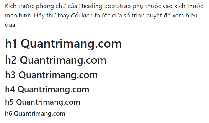
If the semantic level is correct but you need the appearance of another heading size, use a class from h1 to h6:
<h2 class="h4">Profile</h2>
<p class="h5">Visually heading-sized text</p>
A class changes presentation, not meaning. A paragraph with class="h2" is still a paragraph to assistive technology. When the text really introduces a section, use an actual heading element.
Create a display heading
Display headings are larger and lighter than ordinary content headings. Bootstrap 5 provides display-1 through display-6. They work well for a prominent page title or hero statement, but using several on one page can weaken the hierarchy.
<h1 class="display-3">Build a better workspace</h1>
<p class="lead">Organize projects, files, and team updates in one place.</p>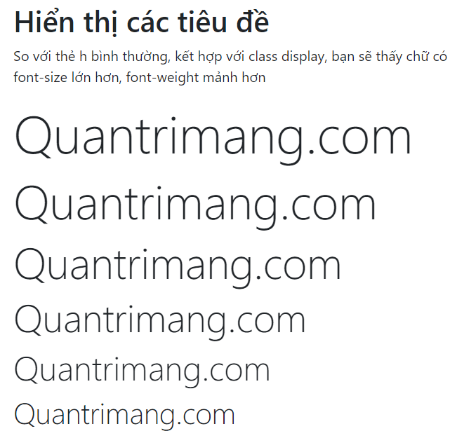
Bootstrap enables responsive font sizing for large type, allowing it to scale more naturally across viewports. Still test long headings on small screens, particularly when words cannot wrap.
Emphasize supporting text
Add lead to a paragraph that needs more visual prominence than normal body copy:
<p class="lead">
  This introduction stands out from the rest of the article.
</p>
Use the semantic <small> element for side comments, legal text, copyright notices, or other fine print. Use the small class when you want the same appearance without that semantic meaning.
<h2>
  Billing summary
  <small class="text-body-secondary">Updated today</small>
</h2>

<p><small>Taxes may apply.</small></p>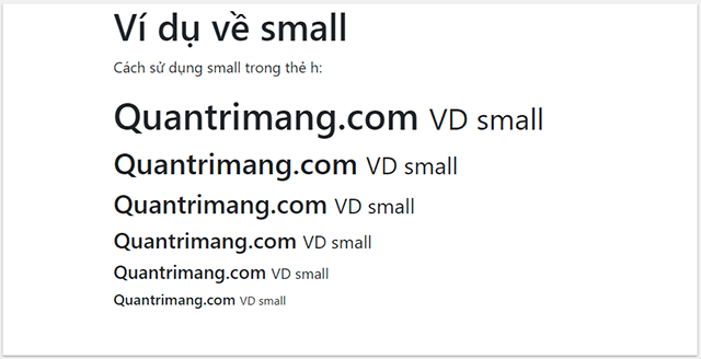
Use inline text elements for their meaning
Bootstrap styles common HTML elements, but each element has a purpose. Do not choose one only because of how it looks:
<strong>marks strong importance;<em>adds stress emphasis.<mark>highlights text that is relevant in the current context.<del>marks deleted content;<ins>marks an addition.<s>identifies content that is no longer accurate or relevant.<small>is for side comments and fine print.
<p>Search results for <mark>Bootstrap typography</mark>.</p>
<p><strong>Important:</strong> Save your work before continuing.</p>
<p>Price: <del>$49</del> <ins>$39</ins></p>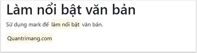
If you need only a visual style, Bootstrap supplies classes such as mark, small, text-decoration-underline, and text-decoration-line-through.
Write accessible abbreviations
The <abbr> element identifies an abbreviation. Put the expanded form in its title attribute, and consider spelling it out in visible text the first time because hover-only information is not equally available on every device.
<p>
  <abbr title="HyperText Markup Language">HTML</abbr>
  defines the structure of a web page.
</p>
Add initialism for a slightly smaller rendering:
<abbr title="Cascading Style Sheets" class="initialism">CSS</abbr>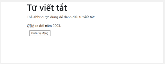
For more on selecting meaningful elements, see the guide to modern HTML5 structure.
Format a blockquote and attribution
Wrap a quotation in <blockquote class="blockquote">. When the quote needs attribution, place both parts in a <figure> and put the attribution outside the blockquote in a <figcaption class="blockquote-footer">. Use <cite> for the title of the source work.
<figure>
  <blockquote class="blockquote">
    <p>A short quotation belongs here.</p>
  </blockquote>
  <figcaption class="blockquote-footer">
    Author in <cite title="Source title">Source title</cite>
  </figcaption>
</figure>
Add text-center or text-end to the surrounding figure when the design calls for different alignment. Do not copy a quotation without verifying its wording and source.
Style lists without losing list semantics
Use normal <ul> or <ol> markup when sequence or grouping matters. Bootstrap's list-unstyled class removes bullets and the left margin from immediate child items while preserving the underlying list. Apply it separately to a nested list if that list should also be unstyled.
<ul class="list-unstyled">
  <li>Dashboard</li>
  <li>Reports</li>
  <li>Settings</li>
</ul>
To put items on one line, combine list-inline on the list with list-inline-item on each item:
<ul class="list-inline">
  <li class="list-inline-item">Privacy</li>
  <li class="list-inline-item">Terms</li>
  <li class="list-inline-item">Contact</li>
</ul>
A description list pairs terms with their descriptions. It uses <dl>, <dt>, and <dd> rather than ordinary list items:
- HTML
- Defines the content and structure.
- CSS
- Controls presentation and layout.

Format code and keyboard input
Use <code> for a short inline fragment, such as an element name or command. The markup in the example must be escaped so the browser displays it as text:
<p>Add the <code><main></code> element to the page.</p>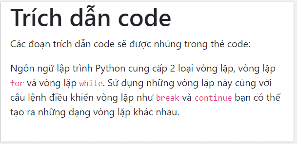
Use <kbd> for user input, including keyboard shortcuts. Separate keys make the sequence clearer:
<p>Press <kbd>Ctrl</kbd> + <kbd>S</kbd> to save.</p>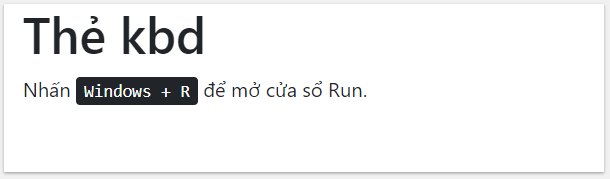
For a multiline code sample, use <pre><code>...</code></pre>. Escape HTML characters inside the code block and preserve line breaks and indentation:
<pre><code>function greet(name) {
  return "Hello, " + name;
}</code></pre>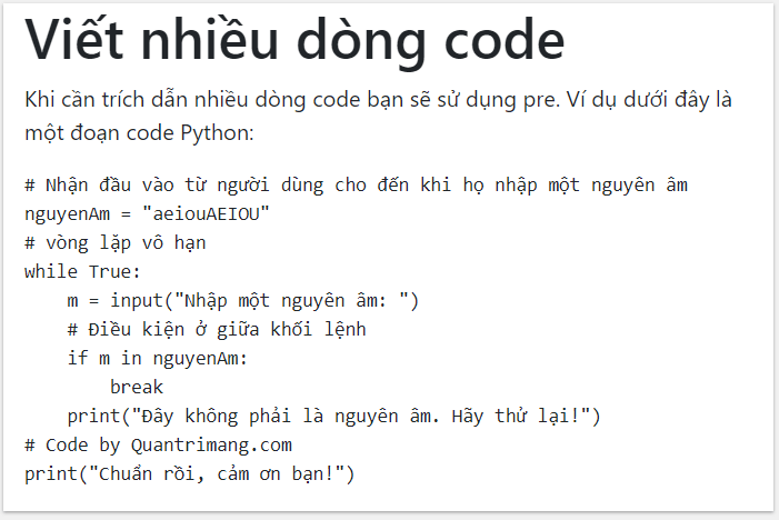
If a code line may be wider than the content area, add project CSS such as overflow-x: auto to the preformatted block rather than forcing the page itself to overflow.
Bootstrap 5 text utility reference
| Task | Useful classes | Notes |
|---|---|---|
| Alignment | text-start, text-center, text-end | Responsive forms include text-sm-* through text-xxl-*. |
| Font size | fs-1 through fs-6 | Changes size without making the element a heading. |
| Weight | fw-light, fw-normal, fw-medium, fw-semibold, fw-bold | Available weights also depend on the loaded font. |
| Style | fst-italic, fst-normal | Use semantic <em> when the text has emphasis. |
| Line height | lh-1, lh-sm, lh-base, lh-lg | Very tight line height can hurt readability. |
| Wrapping | text-wrap, text-nowrap, text-break | Use text-break for long unbroken strings. |
| Case | text-lowercase, text-uppercase, text-capitalize | Visual transformation does not rewrite the source text. |
| Decoration | text-decoration-none, text-decoration-underline, text-decoration-line-through | Do not remove link underlines without another clear link cue. |
| Monospace | font-monospace | Changes the font family, not the element's semantic role. |
Bootstrap 5 uses logical alignment names start and end. The older Bootstrap 4 classes text-left and text-right, along with font-weight-* and font-italic, should be replaced by the Bootstrap 5 equivalents shown above.
Keep typography readable
- Maintain a logical heading order and avoid choosing levels only for visual size.
- Use relative sizing so browser zoom and user font preferences continue to work.
- Check long headings, navigation labels, and code samples at narrow widths.
- Avoid centered or uppercase styling for long passages because both can slow reading.
- Do not use
text-nowrapwhere it can force content outside a small screen. - Keep visible link and focus cues when removing or changing text decoration.
You can test the examples in one of these HTML editors for Windows. For version-specific details, refer to Bootstrap's official typography documentation and text utility reference.
Related Articles
 Lesson 42: Large Grid in Bootstrap 54 minutes read
 Lesson 38: Grid Systems from Stacked to Horizontal in Bootstrap 54 minutes read
 Lesson 30: Flexing in Bootstrap 59 minutes read
 Lesson 15: Pagination in Bootstrap 54 minutes read
 Lesson 29: Utilities in Bootstrap 59 minutes read
 Lesson 39: Ultra-Small Grid Styles in Bootstrap 54 minutes read
Reader Comments 0
Sign in with email or Google to join the discussion.