Table of Contents
This tutorial builds a responsive login and registration interface with React and Bootstrap. The form switches modes with React state and uses accessible labels, browser autocomplete, and basic client-side validation. It is a user-interface example only: a production app still needs a server or identity provider to verify credentials securely.
What you need
- A current Node.js release and npm
- Basic knowledge of JSX, React state, HTML, and CSS
- A code editor and terminal
Create React App is deprecated for new projects, so this example uses Vite. React's Create React App deprecation notice explains the change. If you are still learning the library, these free React tutorials provide additional practice.
Create the React project
Run the following commands:
npm create vite@latest react-auth-ui -- --template react
cd react-auth-ui
npm install
npm install bootstrap
npm run dev
Open the local URL printed by Vite. The initial project should load in the browser.
Load Bootstrap
Open src/main.jsx and import Bootstrap's CSS before the application's own stylesheet:
import { StrictMode } from 'react';
import { createRoot } from 'react-dom/client';
import 'bootstrap/dist/css/bootstrap.min.css';
import './index.css';
import App from './App.jsx';

createRoot(document.getElementById('root')).render(
  <StrictMode>
    <App />
  </StrictMode>
);
This form uses only Bootstrap styles, so the Bootstrap JavaScript bundle is not required.
Create the login and registration component
Replace src/App.jsx with the component below. The mode state determines which fields and labels appear. Switching modes also clears the status message.
import { useState } from 'react';

export default function App() {
  const [mode, setMode] = useState('signin');
  const [status, setStatus] = useState('');
  const isSignUp = mode === 'signup';

  function switchMode() {
    setMode(isSignUp ? 'signin' : 'signup');
    setStatus('');
  }

  function handleSubmit(event) {
    event.preventDefault();
    const form = event.currentTarget;

    if (!form.checkValidity()) {
      form.reportValidity();
      return;
    }

    setStatus(
      isSignUp
        ? 'Form is ready to send to a registration endpoint.'
        : 'Form is ready to send to a sign-in endpoint.'
    );
  }

  return (
    <main className="auth-page">
      <section className="auth-card" aria-labelledby="auth-title">
        <div className="auth-card__body">
          <h1 id="auth-title" className="h3 text-center mb-3">
            {isSignUp ? 'Create an account' : 'Welcome back'}
          </h1>

          <p className="text-secondary text-center mb-4">
            {isSignUp
              ? 'Enter your details to register.'
              : 'Sign in to continue to your account.'}
          </p>

          <form onSubmit={handleSubmit}>
            {isSignUp && (
              <div className="mb-3">
                <label className="form-label" htmlFor="name">
                  Full name
                </label>
                <input
                  className="form-control"
                  id="name"
                  name="name"
                  type="text"
                  autoComplete="name"
                  required
                />
              </div>
            )}

            <div className="mb-3">
              <label className="form-label" htmlFor="email">
                Email address
              </label>
              <input
                className="form-control"
                id="email"
                name="email"
                type="email"
                autoComplete="email"
                required
              />
            </div>

            <div className="mb-3">
              <label className="form-label" htmlFor="password">
                Password
              </label>
              <input
                className="form-control"
                id="password"
                name="password"
                type="password"
                minLength="8"
                autoComplete={isSignUp ? 'new-password' : 'current-password'}
                required
              />
              <div className="form-text">Use at least 8 characters.</div>
            </div>

            <button className="btn btn-primary w-100" type="submit">
              {isSignUp ? 'Create account' : 'Sign in'}
            </button>
          </form>

          {status && (
            <p className="alert alert-info mt-3 mb-0" role="status">
              {status}
            </p>
          )}

          <p className="text-center mt-4 mb-0">
            {isSignUp ? 'Already registered?' : 'New here?'}{' '}
            <button
              className="btn btn-link p-0 align-baseline"
              type="button"
              onClick={switchMode}
            >
              {isSignUp ? 'Sign in' : 'Create an account'}
            </button>
          </p>
        </div>
      </section>
    </main>
  );
}
The button that changes modes has type="button", so it does not accidentally submit the form. Each input also has a visible label and an autocomplete value that helps browsers and password managers identify the field.
Style the page
Replace src/index.css with the following styles:
:root {
  font-family: system-ui, sans-serif;
  color: #212529;
  background: #f2f5f9;
}

* {
  box-sizing: border-box;
}

body {
  margin: 0;
  min-width: 320px;
}

.auth-page {
  min-height: 100vh;
  display: grid;
  place-items: center;
  padding: 1.5rem;
  background:
    radial-gradient(circle at top left, #dbeafe, transparent 45%),
    #f2f5f9;
}

.auth-card {
  width: min(100%, 28rem);
  overflow: hidden;
  border: 0;
  border-radius: 1rem;
  background: #fff;
  box-shadow: 0 1rem 3rem rgba(15, 23, 42, 0.14);
}

.auth-card__body {
  padding: clamp(1.5rem, 5vw, 2.5rem);
}
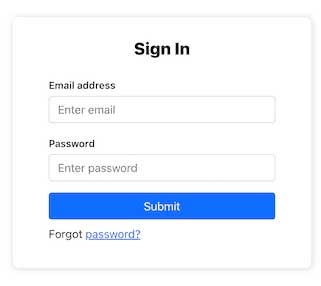
The completed login view should resemble the original design while adapting to smaller screens:
Test both form modes
Open the page and check the following behavior:
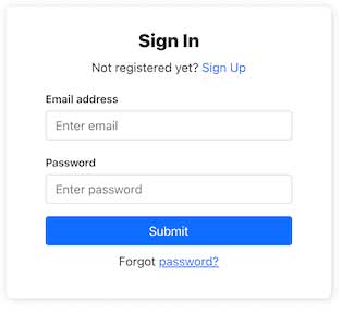
- The login mode asks for an email address and password.
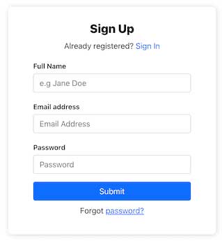
- The registration mode also asks for a full name and changes the password autocomplete value.
- Submitting empty or invalid fields displays browser validation.
- The mode-switch button changes the form without reloading the page.
- Keyboard focus remains visible on inputs, links, and buttons.
Connect the UI to authentication safely
The current handleSubmit function deliberately does not authenticate a user. Replace the status update with a call to your application's authentication service, then handle loading, success, and error states. Use HTTPS in production, do not log passwords, and enforce validation and access control on the server rather than trusting the browser.
For a larger application, use the routing and data-loading patterns recommended by the framework you choose. Bootstrap handles the presentation layer; it does not provide authentication, session management, or account recovery. You can compare it with other options in this guide to popular CSS frameworks.
Related Articles
 Lesson 30: Flexing in Bootstrap 59 minutes read
 Answering Frequently Asked Questions About Bootstrap7 minutes read
 Lesson 4: Typography in Bootstrap 512 minutes read
 How to Customize Bootstrap with Sass10 minutes read
 Lesson 29: Utilities in Bootstrap 59 minutes read
 A Compilation of Exercises on Bootstrap 56 minutes read
Reader Comments 0
Sign in with email or Google to join the discussion.