Table of Contents
Bootstrap's col-lg-* classes apply column widths from the large breakpoint, which begins at a viewport width of 992px. Below 992px, a column that has only a col-lg-* class stacks at full width. At 992px and above, it joins the grid row at the width specified by its class.
Understand the large breakpoint
Bootstrap uses a mobile-first grid with min-width media queries. A rule applied at one breakpoint continues at wider breakpoints unless another class overrides it.
| Tier | Minimum width | Class prefix |
|---|---|---|
| Extra small | 0 | .col- |
| Small | 576px | .col-sm- |
| Medium | 768px | .col-md- |
| Large | 992px | .col-lg- |
| Extra large | 1200px | .col-xl- |
| Extra extra large | 1400px | .col-xxl- |
These are Bootstrap's default breakpoints. A project that recompiles Bootstrap from Sass can customize them, so check the project's configuration when working in an established codebase. The official Bootstrap grid documentation covers the complete grid API.
Create a 4/8 layout on large screens
The grid has 12 template columns. A col-lg-4 element takes four columns, or one third of the row, while col-lg-8 takes the remaining eight columns.
<div class="container">
  <div class="row g-4">
    <aside class="col-lg-4">
      <div class="p-3 bg-light border rounded">Sidebar</div>
    </aside>
    <main class="col-lg-8">
      <div class="p-3 border rounded">Main content</div>
    </main>
  </div>
</div>
On a narrow screen, both elements occupy the full row and appear one after another. At 992px and above, they become a 33.3%/66.7% layout. The g-4 class adds space between the columns.

Use different proportions at several breakpoints
You can place more than one responsive class on each column. The browser applies the rule for the current width and keeps it active until a wider rule replaces it.
<div class="container">
  <div class="row g-3">
    <div class="col-sm-3 col-md-6 col-lg-4">
      <div class="p-3 bg-primary text-white">First column</div>
    </div>
    <div class="col-sm-9 col-md-6 col-lg-8">
      <div class="p-3 bg-secondary text-white">Second column</div>
    </div>
  </div>
</div>| Viewport | First column | Second column |
|---|---|---|
| Below 576px | 100% | 100% |
| 576px to 767.98px | 25% | 75% |
| 768px to 991.98px | 50% | 50% |
| 992px and wider | 33.3% | 66.7% |
This is why col-lg-4 also governs extra-large and extra-extra-large screens in this example: no col-xl-* or col-xxl-* class replaces it.
Make columns horizontal only on large screens
When both elements have only col-lg-6, they stack below 992px and become equal halves from the large breakpoint upward:
<div class="container">
  <div class="row g-3">
    <section class="col-lg-6">
      <div class="p-4 border rounded">Product details</div>
    </section>
    <aside class="col-lg-6">
      <div class="p-4 border rounded">Order summary</div>
    </aside>
  </div>
</div>
Use this pattern when a side-by-side presentation would feel cramped on tablets. If you want two columns from the medium breakpoint instead, use col-md-6.
Create equal-width large columns automatically
Omit the number to let Bootstrap divide the row equally among all col-lg elements. These columns stack below 992px and share the available width at larger sizes:
<div class="container text-center">
  <div class="row g-3">
    <div class="col-lg"><div class="p-3 border">1 of 4</div></div>
    <div class="col-lg"><div class="p-3 border">2 of 4</div></div>
    <div class="col-lg"><div class="p-3 border">3 of 4</div></div>
    <div class="col-lg"><div class="p-3 border">4 of 4</div></div>
  </div>
</div>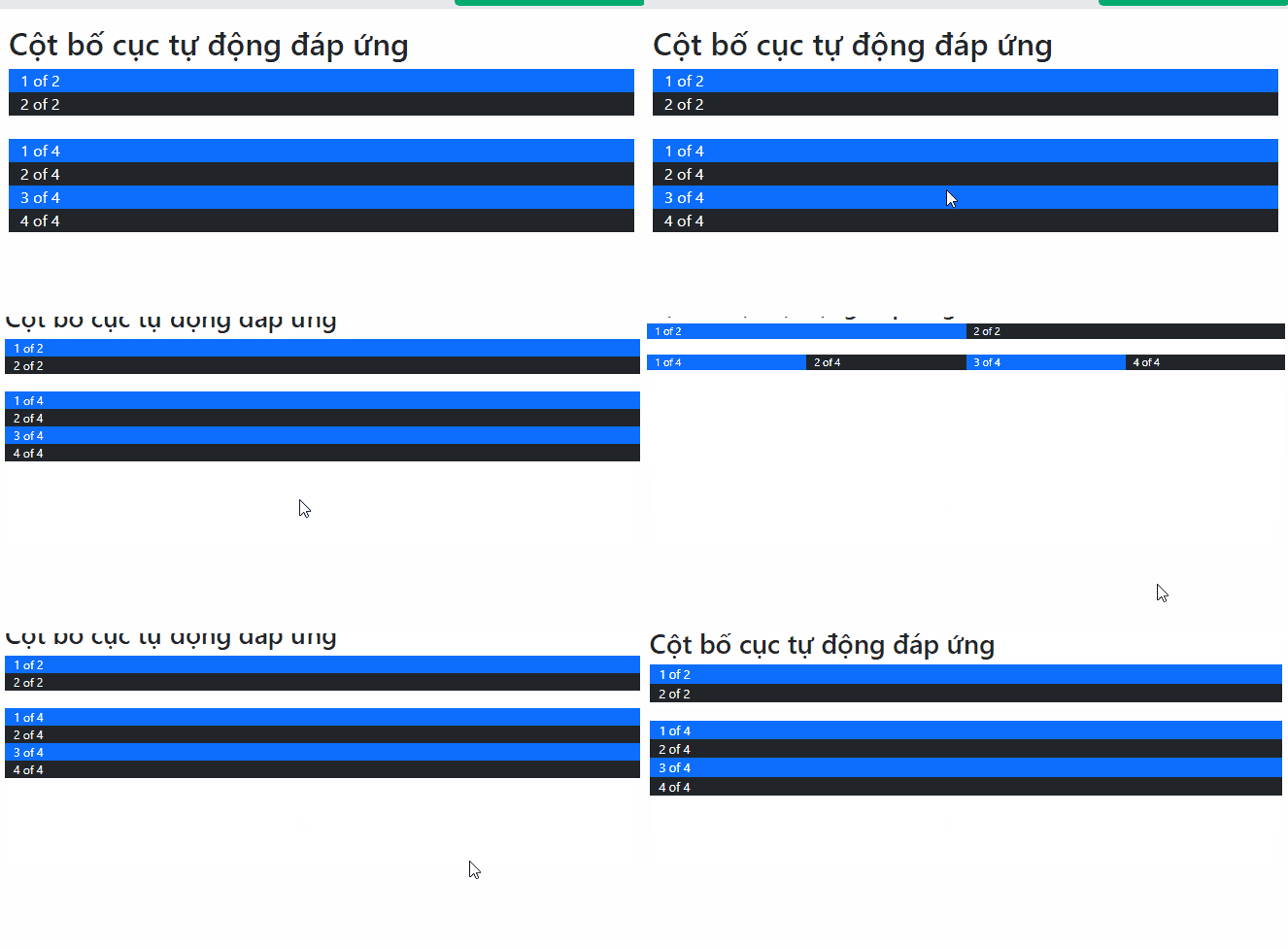
Use plain col instead if the columns should remain equal at every viewport width. For repeating card layouts, responsive row-cols-* classes can be more concise:
<div class="row row-cols-1 row-cols-md-2 row-cols-lg-4 g-3">
  <div class="col">Card 1</div>
  <div class="col">Card 2</div>
  <div class="col">Card 3</div>
  <div class="col">Card 4</div>
</div>
Check the grid in the browser
- Include the viewport meta tag so responsive breakpoints match the device width.
- Place columns directly inside a
rowand place the row inside a container. - Resize the viewport across 576px, 768px, 992px, 1200px, and 1400px to confirm each transition.
- Use browser developer tools to inspect which class currently supplies a column's width.
- Keep each row's intended numbered spans at 12 or fewer to avoid unexpected wrapping.
If you are still choosing a layout toolkit, this comparison of CSS frameworks explains how Bootstrap fits among other options. After the grid is stable, components such as the Bootstrap 5 modal can be added without changing the underlying layout rules.
Related Articles
 Lesson 38: Grid Systems from Stacked to Horizontal in Bootstrap 54 minutes read
 Lesson 41: Grid Medium in Bootstrap 54 minutes read
 Lesson 40: Small Grid in Bootstrap 54 minutes read
 Lesson 3: Grid System in Bootstrap 511 minutes read
 Lesson 39: Ultra-Small Grid Styles in Bootstrap 54 minutes read
 Lesson 30: Flexing in Bootstrap 59 minutes read
Reader Comments 0
Sign in with email or Google to join the discussion.