Table of Contents
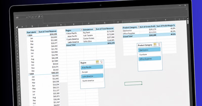
You can turn a PivotTable into a practical interactive dashboard by building several small PivotTables from one clean source table, then controlling them with shared slicers and a date timeline. The important part is not visual decoration: each PivotTable should answer one business question, and every filter should update the whole dashboard consistently.
Prepare the source data first
Place the raw data on its own worksheet with one header row. Each row should represent one transaction, and each column should contain one type of information, such as Date, Region, Salesperson, Product Category, Quantity, Total Revenue, and Total Cost. Remove merged cells, blank header names, subtotal rows, and completely blank rows.
Select any cell in the data and press Ctrl+T, confirm that the table has headers, and give the resulting Excel Table a useful name such as SalesData. Using an Excel Table matters because new rows are included when the PivotTables are refreshed. If PivotTables are new to you, see TipsMake's basic PivotTable guide first.
Plan the dashboard around specific questions
A useful sales dashboard might answer these questions at a glance:
- How is revenue changing by month?
- Which regions and salespeople contribute the most revenue?
- Which product categories generate the most revenue and gross profit?
Create a blank worksheet named Dashboard. Leave space at the top for a title and filters, then reserve separate areas for three focused PivotTables. Small PivotTables are easier to read and arrange than one large report containing every field.
Create the first PivotTable: monthly revenue
- Click inside the
SalesDatatable and choose Insert > PivotTable. - Place the PivotTable on the Dashboard sheet, for example at cell B3.
- Drag Date to Rows and Total Revenue to Values.
- If Excel shows Count instead of Sum, open Value Field Settings and select Sum. A Count usually means the source column contains text, blanks, or numbers stored as text.
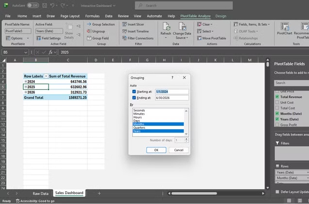
- Right-click a date, choose Group, and select Months and Years. Including Years prevents January from different years being combined.
- Use Number Format in Value Field Settings to apply the appropriate currency format.
Build focused PivotTables for region and product
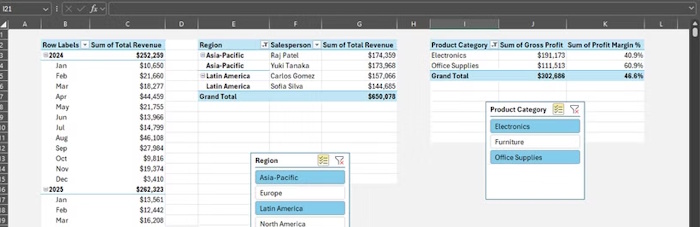
Copy the first PivotTable twice and place the copies beside or below it. Copying is convenient because the reports keep the same source and PivotTable cache, which also makes shared slicers easier to manage.
- Region and salesperson report: put Region and then Salesperson in Rows; keep Total Revenue in Values.
- Product report: put Product Category in Rows; add Total Revenue and Gross Profit to Values.
Rename value headings so they are easy to understand. Sort revenue from largest to smallest when ranking is more useful than alphabetical order. Avoid displaying every possible dimension at once; filters can reveal detail without making the dashboard crowded.
Calculate profit without distorting the result
Add a Gross Profit column to the source table and use the row formula:
=[@[Total Revenue]]-[@[Total Cost]]
The Excel Table fills that formula down automatically. Refresh the PivotTables, then add Gross Profit to Values and summarize it by Sum.
Be careful with profit margin percentages. Adding a row-level percentage to a normal PivotTable and summing or averaging it can produce a misleading total. Overall profit margin must be weighted:
Total Gross Profit / Total Revenue
If the PivotTable uses the Data Model, create a measure such as:
Profit Margin := DIVIDE(SUM(SalesData[Gross Profit]), SUM(SalesData[Total Revenue]))
Format the measure as Percentage. Without the Data Model, show Total Gross Profit and Total Revenue in the PivotTable and calculate their ratio in a worksheet cell outside the report. This preserves the correct total.
Make the layout readable
Select each PivotTable and use the Design tab to remove elements that do not help the reader. For multi-level row labels, Report Layout > Show in Tabular Form and Repeat All Item Labels can make exported or copied results easier to read. Turn off subtotals where they only add clutter, but retain grand totals when they provide useful context.
Add slicers and a date timeline
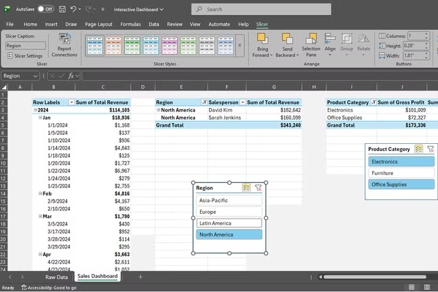
- Click a PivotTable and choose PivotTable Analyze > Insert Slicer.
- Select useful categorical fields such as Region and Product Category.
- For dates, choose PivotTable Analyze > Insert Timeline and select the Date field.
- Select a slicer, open its Slicer tab, and choose Report Connections (called PivotTable Connections in some versions).
- Check all three PivotTables and repeat this step for every slicer and the timeline.
A shared slicer works only with PivotTables that use the same data source. If a report does not appear in Report Connections, rebuild it from the same Excel Table or copy an existing PivotTable and change its fields. Microsoft provides current details for connecting slicers to PivotTables and using a PivotTable timeline.
Refresh and test the dashboard
When source data changes, choose Data > Refresh All or press Ctrl+Alt+F5. The Excel Table expands to include new rows, but the PivotTables still need a refresh before those rows appear. You can also right-click a PivotTable and choose Refresh when only one report needs updating.
Before sharing the workbook, test every slicer and the timeline. Confirm that all reports change together, clear each filter, compare grand totals with the source data, and check that revenue and cost columns contain real numbers rather than text. Leave enough space around PivotTables because their size can change after filtering or refreshing.
Common problems and quick fixes
| Problem | Likely cause | Fix |
|---|---|---|
| A slicer controls only one report | It is not connected to the other PivotTables | Open Report Connections and select each compatible PivotTable. |
| A PivotTable is missing from Report Connections | It uses a different source or cache | Copy a working PivotTable or rebuild it from the same Excel Table. |
| Revenue shows as Count | The source column contains text or mixed data types | Clean the source values, refresh, and change Value Field Settings to Sum. |
| New transactions do not appear | The report has not been refreshed | Use Refresh All and verify that the source is the named Excel Table. |
| Date grouping fails | The Date column contains blanks, text, or invalid dates | Correct the source column so every populated value is a valid Excel date. |
| Profit margin total looks wrong | Row percentages were summed or averaged | Calculate the ratio of total gross profit to total revenue. |
The result is an interactive dashboard that remains compact: one clean source table, several purpose-built PivotTables, shared filters, and a refresh process that keeps the numbers current.
Related Articles
 2 Excel Functions You Need to Know Before Struggling with: Key Takeaways7 minutes read
 How to Create Pivot Tables in Excel10 minutes read
 How to Add Columns in a Pivot Table: Complete Guide6 minutes read
 How to Add a Column in a Pivot Table5 minutes read
 How to Calculate the Percentage Change in Pivot Table in Excel6 minutes read
 Update Excel PivotTable Data: Step-by-Step Guide4 minutes read
Reader Comments 0
Sign in with email or Google to join the discussion.