How to design professional leaflets with GIMP
In this tutorial, TipsMake.com will show you how to create a professional flyer using the free image processing and graphic design program (open source) GIMP, version 2.9.8
In this tutorial, TipsMake.com will show you how to create a professional flyer using GIMP's free image processing and graphic design (open source) program, version 2.9.8. If you have an older version of GIMP (ie GIMP 2.8), you can still follow it because many of the features used in this tutorial are also found in most other GIMP versions. Follow the steps below, you will have a beautiful leaflet. Let's learn how to do it right away!
Instructions for designing professional leaflets with GIMP
- Step 1: Download the image and install the brush
- Step 2: Create new documents and open images
- Step 3: Delete the background of the image
- Step 4: Add the gradient background to the flyer layout
- Step 5: Add shapes to leaflets
- Step 6: Put the first image into the composition
- Step 7: Add the Paint Splatter layer behind the dancer image
- Step 8: Add laser light to the picture
- Step 9: Mix the elements
- Step 10: Add text
- Step 11: Add the rest of the text
- Step 12: Style text
- Step 13: Adjust the final details before completing
- Step 14: Add textures
- Step 15: Export the final work
Step 1: Download the image and install the brush
The article will use GIMP Splatter Brushes, fonts Nexa Bold and Nexa Light, Development version of GIMP tool.
Step 2: Create new documents and open images
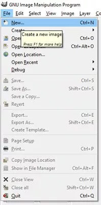
To get started, open GIMP and create a new document by going to File> New .
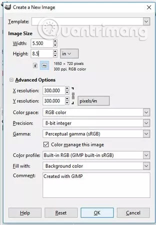
Change the unit from pixel (px) to inch (in.) And then set the size for the leaflet. In this example, we will use the size of 5.5 inches x 8.5 inches . Click 'Advanced Options' and make sure the X and Y resolutions are set to 300 pixels / print. This is the best installation if you intend to print leaflets.

Open the image by going to File> Open . Navigate to the folder containing the downloaded image, then click on the file (you can create a preview of the image by clicking on the 'Click here to generate image preview' option under the 'Preview' column. ) . Repeat this step until all images are opened in GIMP.
Step 3: Delete the background of the image
Once you've opened the image of the dancing girl and the laser light, use the tabs at the top (if you're in one-window mode) to navigate to the girl's image. We will delete the background of this image, then copy and paste the result into the flyer layout.
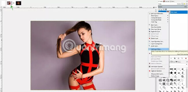
Start this process by adding a layer mask to the layer of the main image. To do this, click on the 'Main Image' layer (change the name of this layer by double clicking on the name in the layer panel, enter a new name, then press Enter. You can also right-click the layer. and go to the Edit Layer Attributes section to change the name) and click Add Layer Mask .

The 'Add a Mask to the Layer' dialog box will appear. In the 'Initialize Layer Mask to:' select 'White (Full Opacity)' , then click Add. Now you have a layer mask added to the Main Image layer .
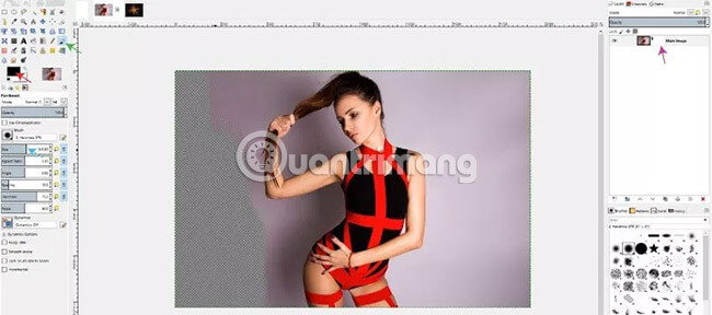
Next, select the Paintbrush tool and set the foreground color to black. Select a soft brush and increase the size of this brush by using the size slider or using the [ or ] key on the keyboard. Make sure that the layer mask is selected, then paint black around the girl's image to erase the background areas. You can increase or decrease the brush size to suit each area.
Drawing on a layer mask is considered a non-destructive editing operation, because you can always bring deleted items back into the composition by turning the color of the brush into white. Conversely, when using the Eraser tool , you cannot bring back the items you deleted, unless you undo the changes you have made (you can undo all the processes you have done after making a mistake). .
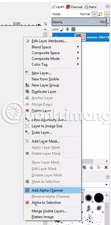
You will see the background behind the girl becomes transparent when drawing. When applying layer masks, you will see a monochrome color. This means that you cannot apply 'Alpha Channel' to the layer. To apply alpha channel, right click on the layer containing the main image and click on the 'Add Alpha Channel' option . When the alpha channel is added, you can create transparent areas with a layer mask (be sure to click on the layer mask before starting to paint again).
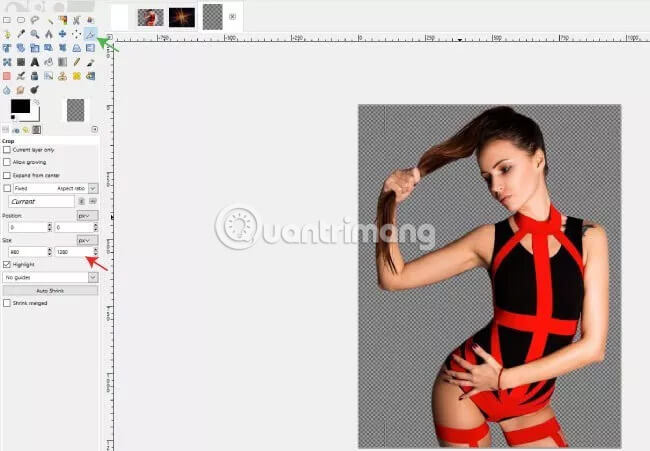
After the background has been deleted, select the Crop tool and crop the image so that the extra space around the girl image is minimal.
Step 4: Add the gradient background to the flyer layout
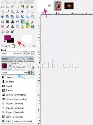
Use the tabs at the top of the window, navigate to the empty leaflet layout. Select the Blend tool and select the pink color for foreground (HTML: 931562) and dark pink (HTML symbol: 1b0504) for the background. Set the Gradient to 'FG to BG (RGB)' and set the shape of the gradient to 'Linear'.
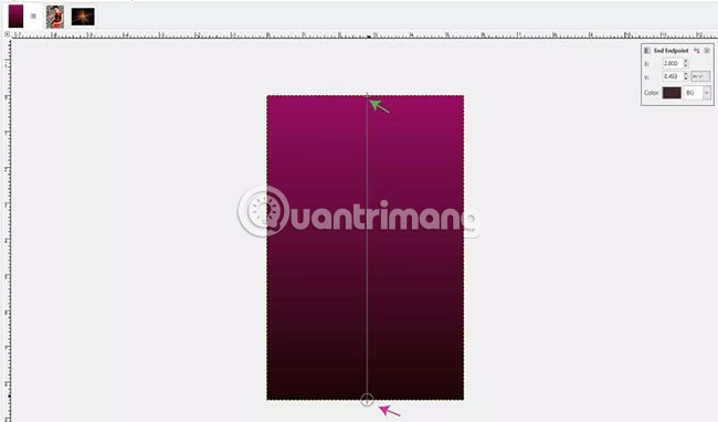
Click on the top of the layout. Hold down the Ctrl key on the keyboard and drag the gradient down to the bottom. Holding Ctrl is to make sure the gradient is drawn in a straight line. Leave the lighter color at the top, then gradually switch to a darker color at the bottom. In the latest version of GIMP (2.9.8), you can edit the gradient directly - which means you can change the foreground and background colors, change the orientation, shape and type or move the position of the gradient - with changes displayed on the layout as soon as you make them. The gradient (in blend mode) will be applied when you select another tool and will no longer be editable at that time. Often people will use the Move tool when ready to apply the settings for the gradient.
Step 5: Add shapes to leaflets

Once you have the background for the leaflet, select the Paths tool in the Toolbar. Then create a new layer (the new layer creation icon is located at the bottom left of the Layers panel ) and name it 'Wavy shape'. In GIMP 2.9.8, you can add color tags to the layer, helping to keep the relevant layers in order in the layer panel. For example, we will place a purple tag for this layer. Make sure the background for the layer is set to Transparent. Click OK to create a new layer.
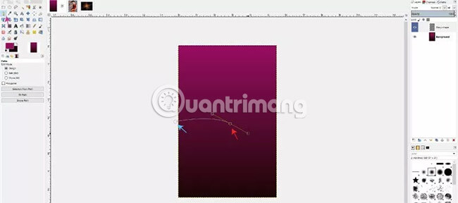
Use the Paths tool to create points and draw paths through the composition. If you click and drag, a curved path at that point will be created.
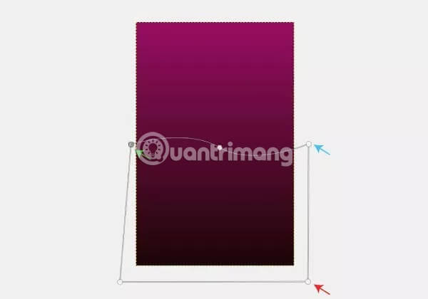
When creating a curved point, the next point you draw will have the path bent in the opposite direction by default. This is the desired effect because for example it is in need of a wavy shape. Draw the remaining points along the path path outside the layout, around the bottom frame. The last point should be drawn a little lower than the first point, then click and drag that point so that the point coincides with the first point you draw. This will connect the points to create a complete shape.
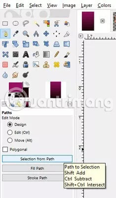
Next, click on 'Selection from path' to create a selection using the points you've just drawn.
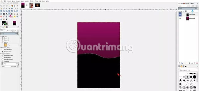
Select the Bucket Fill tool , choose black as your foreground color and with the Wavy shape layer selected, fill it with black. When the selection is filled, go to Select> None to deselect the selection. Reduce the opacity of the Wavy shape layer to about 50% by using the "Opacity" slider, making this layer blend better with the background.
Step 6: Put the first image into the composition
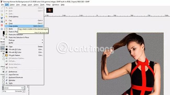
Now, we have the background and shape created for the flyer layout. Next, we will place the dancer image (deleted the previous background) into the layout. Navigate to the dancer image and go to Edit> Copy Visible .
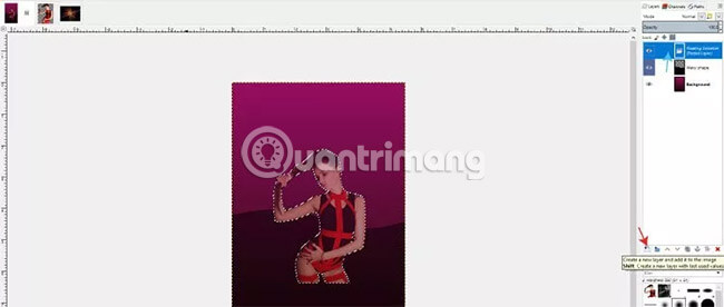
Then, navigate back to the flyer layout and press Ctrl + V on the keyboard. This will place the removed background image into a floating selection layer. Click on that layer and select 'Add new layer' . This will add a dancer image to a separate layer (called 'Pasted Layer' by default). You can double click on the layer name to change its name to 'Dancer' ).
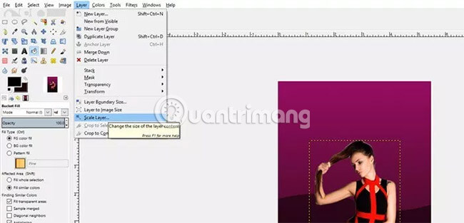
Now, you need to expand this layer a bit because the dancer image looks a bit small. With the Dancer layer selected, go to Layer> Scale Layer .
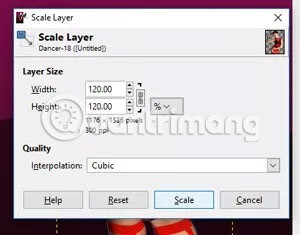
Change the percentage unit (%), as well as increase the width and height to 120%. Click Scale.
Select the Move tool (from the toolbox or press the M key on the keyboard) and move the dancer image up a bit, so that the head of the girl is slightly below the top edge of the leaflet.
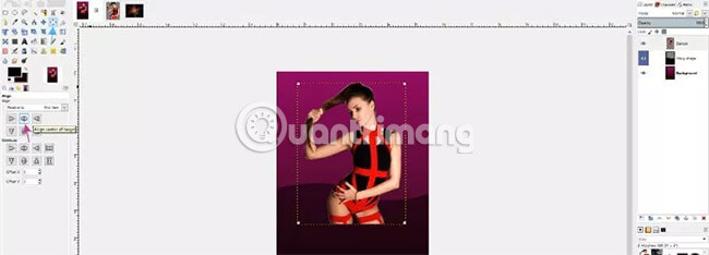
You can ensure that the girl image is centered on the composition by selecting the Alignment tool , clicking on the dancer image and selecting 'Align center of target' .
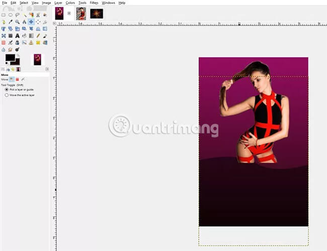
Since we want the previously created wavy shape to start just below the girl's feet, we will select the Move tool , click on the Wavy shape layer and drag the wavy shape down a bit.
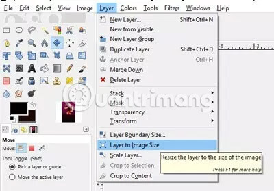
A part of the girl's legs may overlap with the wavy shape at this time. Fix this error by going to Layer> Layer to Image Size .
Step 7: Add the Paint Splatter layer behind the dancer image
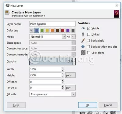
Create a new layer in the Layers panel and name it Paint Splatter. You can assign a purple tag to this layer to keep it connected to other background elements (for example, the Wavy shape layer also has a purple tag). Click OK to create the layer.
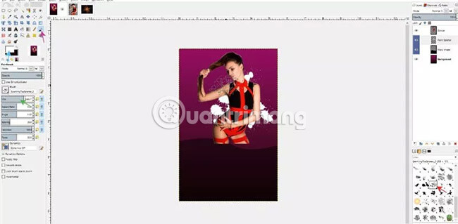
Select the Brush tool , then select one of the Paint Splatter brushes downloaded and installed at the beginning of this tutorial. It's easier to find the Paint Splatter brushes in the Brush panel below the Layers panel on the right side of the GIMP window. It doesn't matter which brush Paint Splatter doesn't work because you'll use a series of random brushes to create a part of the background behind the dancer. Increase or decrease the size of the brush by using brackets [] on the keyboard or by dragging the 'Size' slider in Tool Options of Paintbrush. Change the foreground color of the paintbrush to white.
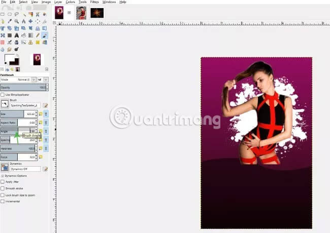
Make sure that the Paint Splatter layer is below the Dancing girl layer in the Layers panel , then start painting by clicking on the different points around the girl. You can increase and decrease the brush size or change to different splatter brushes when drawing. A good rule of thumb for this tutorial is to keep all the stains on the girl's hips because I will fade her legs next. You can also drag the 'Angle' slider in paintbrush options if you want to change the angle of the brush.
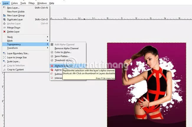
When you have completed the background with paint stains, draw a gradient on the sores to make it more vivid. To do this, make sure the Paint Splatter layer is still selected, then go to Layer> Transparency> Alpha to Selection . This will turn paint stains into a selection.
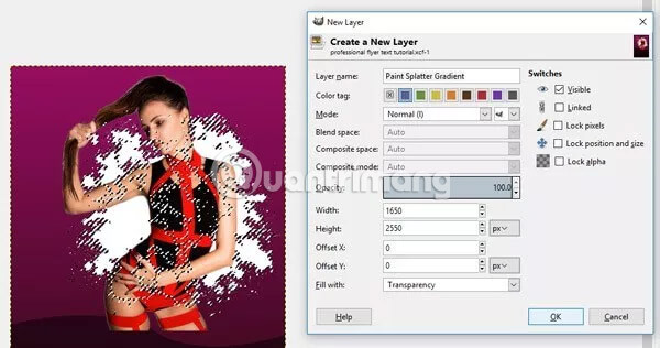
Now create a new layer and name it Paint Splatter Gradient . You can put a purple tag for it, then click OK.
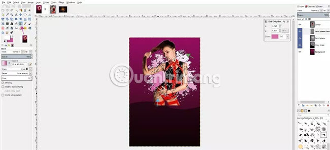
Select this new Paint Splatter Gradient layer and the Blend tool (gradient). Change the foreground color to white and the background color to light pink (symbol HTML: cd58a0). With the shape still set to Linear and gradient is still set to FG to BG (RGB) , click on the upper right and drag down to the bottom left of the selection to draw the gradient. If you have a newer version of GIMP and need to adjust the gradient before applying it, feel free to do so, then select the Move tool to apply the changes.
Once you've applied your changes, go to Select> None to deselect the selection. You should now have a painty area with a gradient.

Now select the Move tool , hide the original Paint Splatter layer and click again on the Paint Splatter Gradient layer. Reduce this layer's Opacity to the Gradient Splatter layer to blend better with the background.
Step 8: Add laser light to the picture
Navigate to the downloaded laser light image and go to Edit> Copy or press Ctrl + C on the keyboard. Go back to the leaflet layout and press Ctrl + V on the keyboard or go to Edit> Paste .
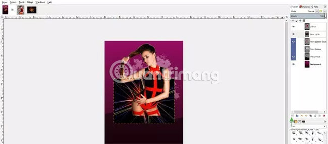
This will add a laser image to the composition as a floating selection layer. Click on this floating selection layer and click 'Create a new layer' to add this layer to its own Pasted Layer . After that, you can rename the layer by clicking on the class name and typing the new name 'Laser Lights'.
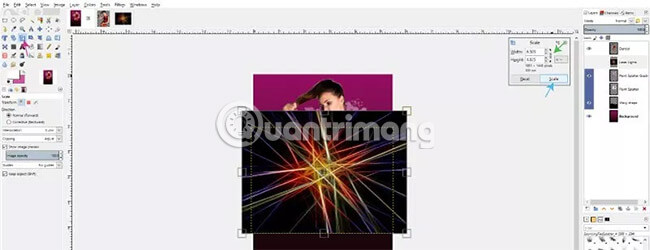
Select the Scale tool from the toolbox, make sure the chain icon is locked (this tool ensures the proportion), click and drag the Laser image layer to resize the layer. Increase the size of the layer until it fits into the outer edges of the composition. When scaled up to the right size, click on 'Scale'.
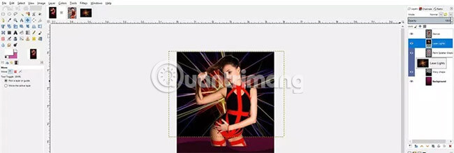
Select the Move tool to move the image up until it slightly overlaps the part of the leaflet. Then, click and drag the Laser Lights layer so that it is below the Paint Splatter Gradient layer in the Layers panel .

Then, with Laser Lights layer still selected, change the layer mode to 'Screen'. This will remove all black areas in the image, just leave the laser light and delete the background.

Because there are many different laser colors that do not match the colors in this composition, the next step is to remove those laser colors. To do this, go to Colors> Hue-Saturation and reduce the saturation to -100. If you're using GIMP 2.9.8, you can check the 'Split View' box to preview the changes. Click OK to apply the changes.
Step 9: Mix the elements
Now we have the dancers, paint stains and laser lights. You may notice that there are hard edges at the end of the dancer layer (the girl's legs) and where the laser lights end (the bottom of the layer). It is better to mix these layers better so that the elements are more intertwined with the background and produce a more professional looking work.
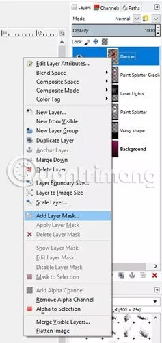
Start this process by right-clicking on the Dancer layer and selecting 'Add Layer Mask' . In 'Initialize Layer Mask to:' , select 'White (Full Opacity)' . Click Add to apply layer mask.
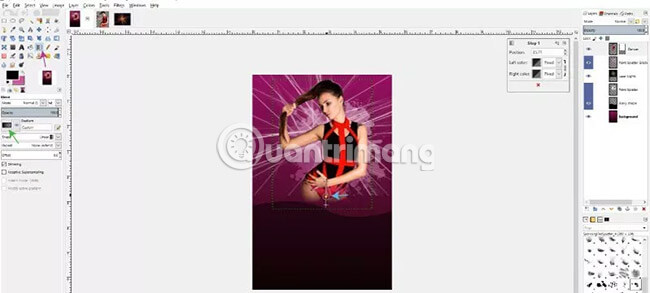
Next, select the Blend tool and change the foreground color to black. Change the gradient to 'Foreground to Transparent' and make sure the shape is still set to Linear. Click right below the Dancer layer and drag the gradient up so it ends around the excess line of the girl's shape. In GIMP 2.9.8, you can adjust the level of fade by dragging a yellow dot along the directly edited gradient line. You can also adjust the start and end points of the gradient before applying changes.
When you're done, click the Move tool to apply the changes.

Repeat this step with the Laser Lights layer , making sure the laser beams are not in the transparent part of the dancer image.
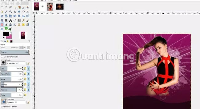
Once you've blended the elements, you'll want to erase any paint stains that appear behind the transparent parts of the dancer. To do this, click on the Paint Splatter Gradient layer, select the Eraser tool and delete the sores that appear behind the girl.
Step 10: Add text
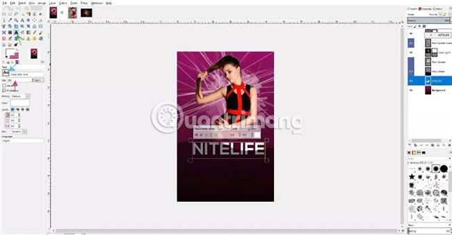
Select the Text tool from the toolbox and change the foreground color to white. Change the font to Nexa Bold (previously downloaded) and change the font's size to 288. Click anywhere on the layout (somewhere near the top of the wavy image) and enter the title. main for advertising (in this case 'NITELIFE', capitalize all letters). This step will create a new text layer in the Layers panel . You will need to click and drag this layer to the top to make sure it is not hidden behind or blocked by another layer.
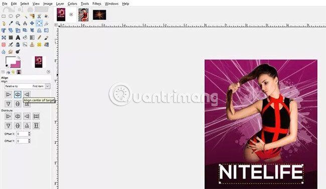
Then you can center the text by clicking on the Alignment tool , select the text layer and then click on 'Align center of target' . You can use the Move tool if you need to change the position of the text on the layout.
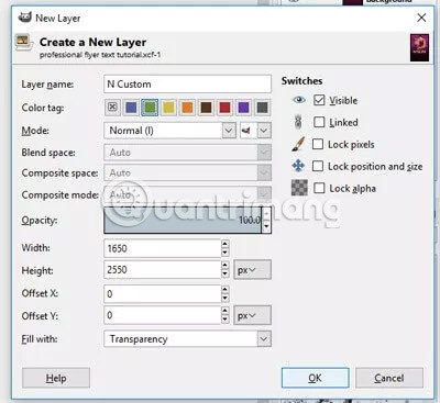
Then add a bit of customization to the text by adding a line at the beginning of the letter N. To do this, create a new layer and name it 'N Custom'. Add a green tag and click OK. Make sure the 'N Custom' layer is above the text layer. Select the Zoom tool (from the toolbox or press the Z key on the keyboard) and zoom in on the letter N.
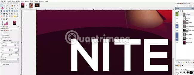
Next, select the Rectangle Select tool and draw a rectangle with a thick edge with the original lines in the text and align it with the top part of the letter N.
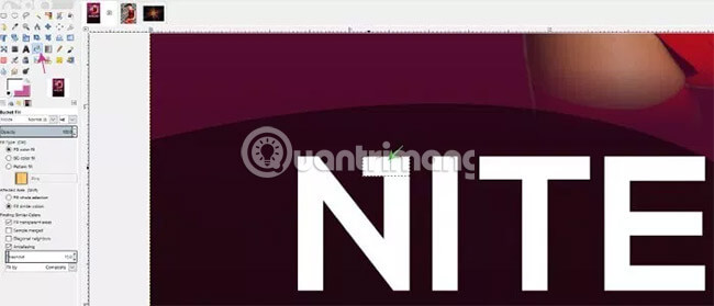
Then, select the Bucket Fill tool and fill this selection with white. To deselect the selection, go to Select> None .
Select the Zoom tool and hold down the Ctrl key on the keyboard while clicking to zoom out.
Step 11: Add the rest of the text
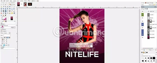
Select the Text tool and change the font to Nexa Light. Reduce the font size to 116 and change the spacing to 32. Then, click the layout above Nitelife main text and type the words 'ENJOY THE' (print all letters). You can use the Move tool if you need to adjust the position of this piece of text - just make sure you click on the text layer on the move, otherwise you will accidentally move any element. is clicking.
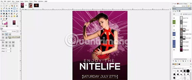
Reselect the Text tool and now enter the date you want to display for the ad. Change the font size to 100, reduce the spacing of letters back to 0 and click the layout below the main NITELIFE text. For example, you will enter SATURDAY JULY content 27TH (uppercase all letters).
After that, select the Alignment tool , click on the text and click 'Align to center of target' . Again, use the Move tool if you need to adjust the text position.
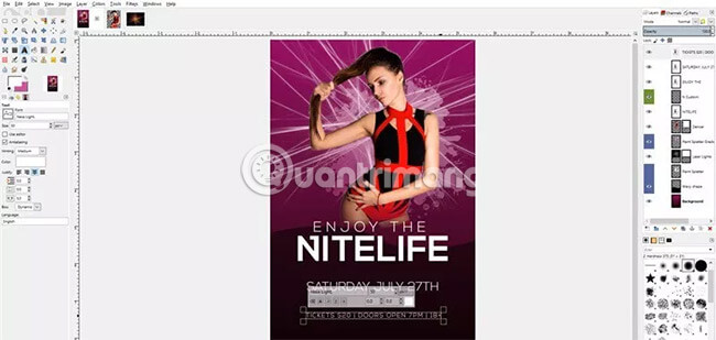
Reselect the Text tool , change the font size to 50, increase the spacing to 5 , click the layout below the date text and enter the text line with more detailed information about the event ( 'TICKETS $ 20 | DOORS OPEN AT 7 PM | 18+ ' ). Use the Alignment tool to center this text.
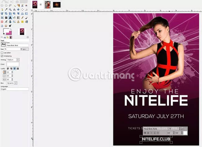
For the last line of text, select the Text tool , change the font to Nexa Bold, increase the font size to 75 and reduce the distance to 0 . Enter the website address in the leaflet. Then use the Move tool and Alignment to center the text and place it in the desired position.
Step 12: Style text
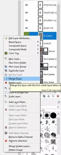
Now we have set up all the documents. It's time to style them. Let's start creating neon light with NITELIFE text. Click on the 'N Custom' layer and make it merge with the original NITELIFE text layer.
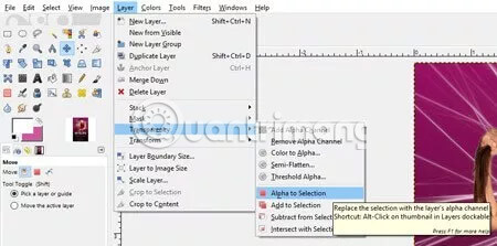
Then, with the 'N Custom' layer selected, go to Layer> Transparency> Alpha to Selection to create a selection around the NITELIFE text .
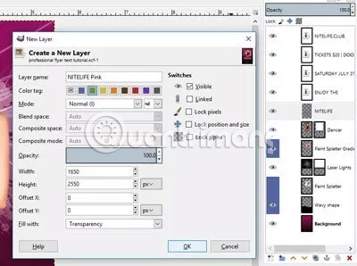
Next, create a new layer and name it NITELIFE Pink. Specify a green tag for this layer and click OK.
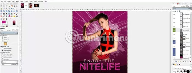
With the NITELIFE Pink layer selected, I will use the Bucket Fill tool and choose the pink color for the foreground color (HTML symbol: c11e82) to fill the selection.
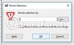
Then go to Select> Shrink and minimize the selection by 5 pixels (you may need to change the unit from inch to pixel).
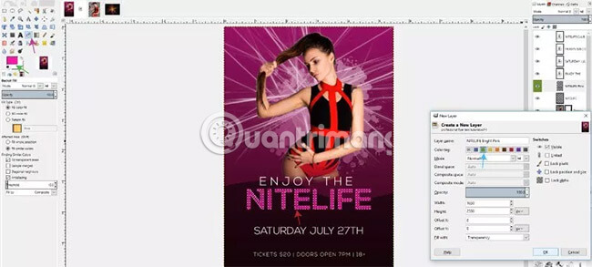
Create a new layer and name it NITELIFE Bright Pink , give it a green tag. After that, change the foreground color to a brighter pink (the HTML symbol: f826a7) and use the Bucket Fill tool to fill the selection.
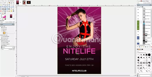
Then go to Select> Shrink for the last time and minimize the selection by 10 pixels. Create a new layer, name it NITELIFE Highlight, assign it a green tag and click OK. Change the foreground color to white and fill the selection. Next, select Select> None .
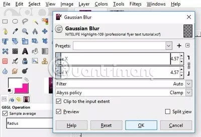
Go to Filters> Blur> Gaussian Blur and adjust the X and Y values between 4 and 5 . Click OK to apply.
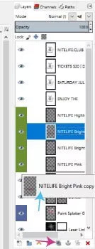
Next, duplicate the NITELIFE Bright Pink layer and drag it below the NITELIFE Pink layer .
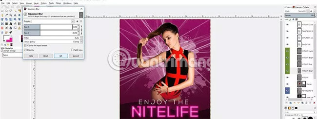
With the NITELIFE Bright Pink Copy layer selected, go to Filters> Blur> Gaussian Blur and increase the X and Y values to about 30. This will create a bright pink light around the text. Click OK to apply.
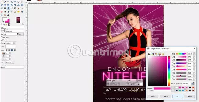
Now, select the Text tool and the JULY text , then change the color of the text to bright pink (the HTML symbol: f826a7 ).
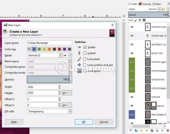
Next, add a rectangle behind the third text row ( TICKETS $ 2 0, etc.) to make this line of text more prominent. To do this, create a new layer and name it 'Tickets Rectangle' and assign a purple tag to it. Then, click and drag this layer so that it is below the original TICKETS text layer.
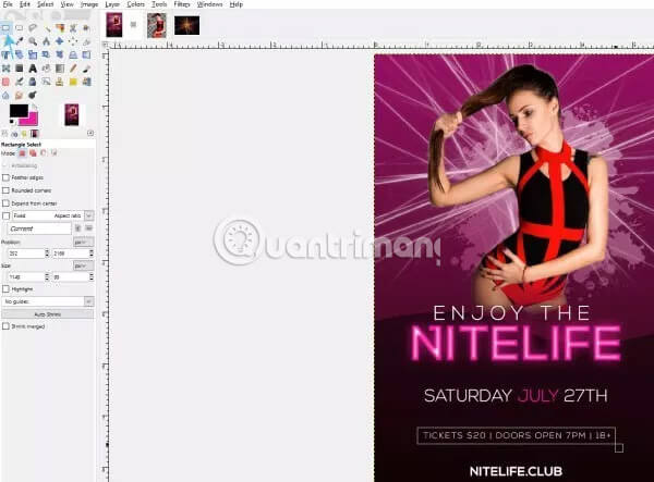
Select the Rectangle Select tool and draw a rectangle around the text.
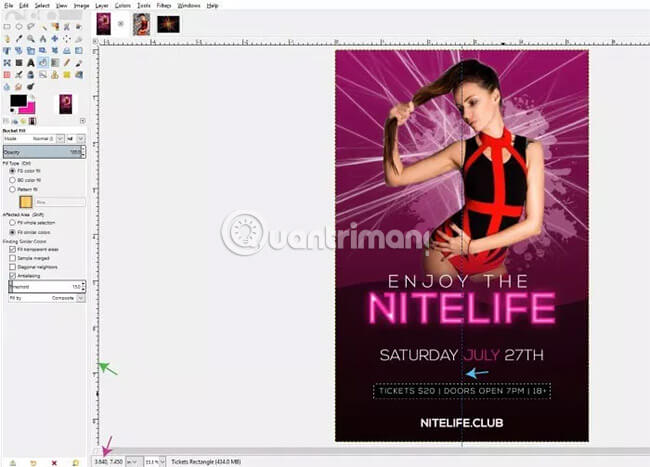
If you want to make sure the rectangle is centered on the image, you can create a standard line by clicking the rulers at the outer edges of the GIMP layout window and set the size to 2.75 inches (located in the lower left corner of the layout window). With the calibration curve just created, you can now center the rectangle (with the + sign in the middle of the rectangular selection). When the rectangle is centered, select the Bucket Fill tool , change the foreground to black and fill the rectangle selection.

Then go to Filters> Light and Shadow> Drop Shadow to add a shadow effect to the rectangle.
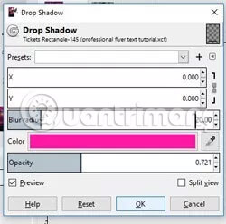
Set the offset value X and Y to 0 , then increase the radius of the Blur effect to 20. Change the color to bright pink and set the opacity to between 70 and 75. Click OK to apply.
Step 13: Adjust the final details before completing
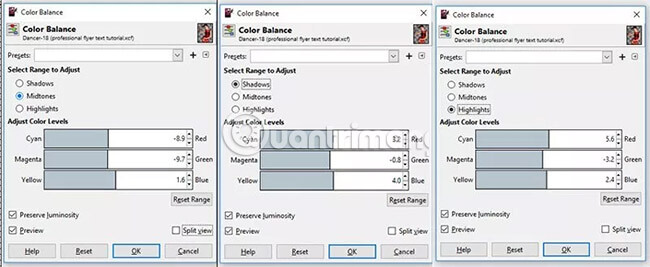
We have now set the main elements, including the desired background and text. Next, we will adjust the final details to finalize the composition and blend everything together. Start by adjusting the color on the dancer image, by selecting the Dancer layer and switching to Colors> Color Balance . The settings for tones, shadows and highlights made the dancer part blend better with all purple and pink patches in the overall image.
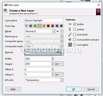
Next, we'll add a bright pink border outside for the girl image. Create a new layer and name it Dancer Highlight, then assign a yellow tag.
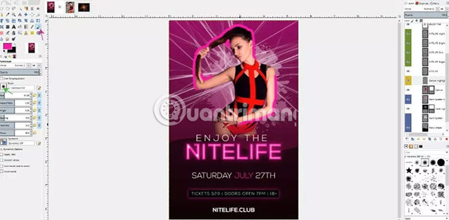
After that, select the Paintbrush tool and change the foreground color to bright pink. Change the brush to a soft brush and paint along the highlighted edges in the upper part of the dancer.
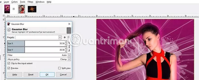
After painting the highlights, go to Filters> Blur> Gaussian Blur and make sure both X and Y values are set to 30. Click OK to apply.
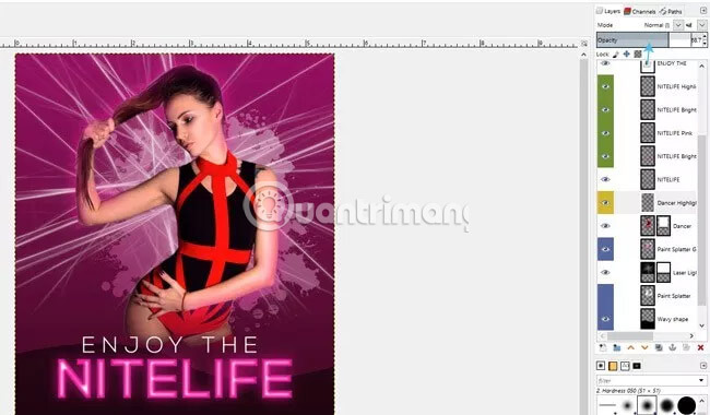
Finally, reduce the opacity of the Dancer Highlight layer to below 70. As you can see, now the image appears as if the dancer has a beautiful pink light around, suitable for the ambient light. Text of the main title and the general tone of the composition.
Step 14: Add textures
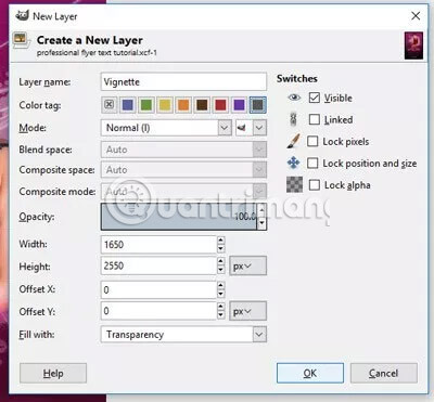
Now, add a pattern around the outer edge of the leaflet. In the latest version of GIMP, there is an integrated vignette feature that makes this task very easy. Create a new layer and name it Vignette, then add a dark gray tag for this layer. Click and drag this layer to it at the top of the Layers panel .
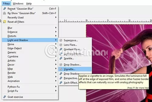
Next, go to Filters> Light and Shadow> Vignette .
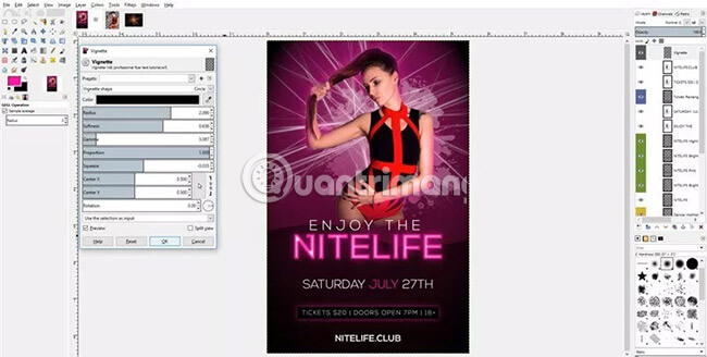
Use the settings shown in the image above or adjust to get the desired look, by increasing the settings of Radius, Softness, Squeeze and Color . Click OK to apply.
Step 15: Export the final work
You can save the layout just created in the original XCF file format in GIMP by going to File> Save (or pressing Ctrl + S on the keyboard). However, if you want to export this layout to another format like JPEG or PDF, just go to File> Export and navigate down to the 'Select File Type By Extension' option to select the file type.

Hope you are succesful.


 How to create clipping mask in GIMP
  How to create spherical images in GIMP
  How to sign a document with GIMP
  How to create movie posters in GIMP
  How to Color Inside the Lines in FireAlpaca
  How to swap and combine faces in GIMP