Table of Contents
Canva can extract colors from an uploaded palette image and apply them to compatible elements on a design page. This is useful when you want to test a coordinated color scheme quickly instead of recoloring each element one at a time.
Start with a palette that has clear, distinct swatches. If you need inspiration, compare these online color palette generators. The automatic result is only a starting point: always check contrast and adjust individual elements when needed.
Apply colors from an image to a Canva page
1. Prepare the design and palette
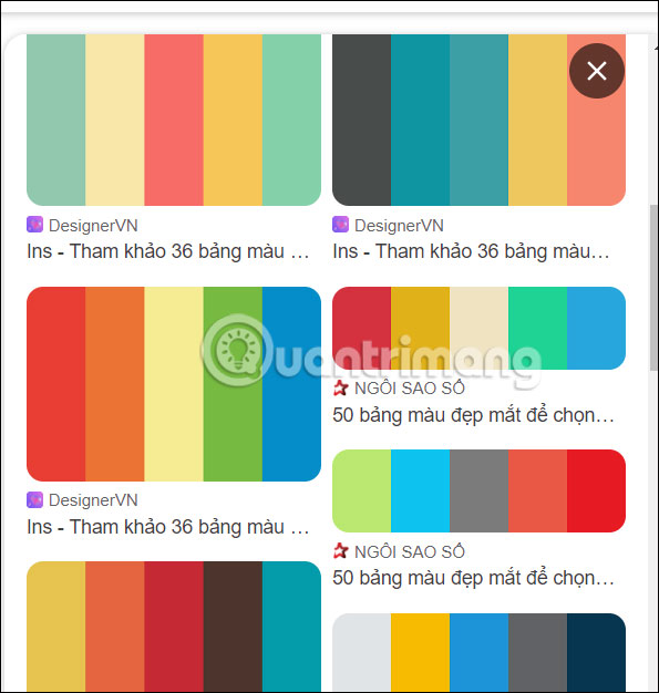
Open an existing Canva design or create a new one. Save the color palette you want to use as an image with clearly separated swatches. A palette with a small number of deliberate colors is easier to evaluate than one containing many similar shades.
2. Upload the palette image
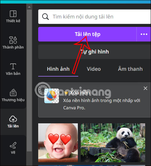
Open Uploads, select the palette image, and wait for it to finish uploading. Add the image to the current page so Canva can detect its colors.
3. Place the palette on the page
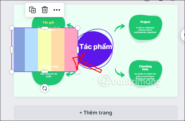
Drag the uploaded palette onto the design. Its temporary position does not need to be precise because you can remove the reference image after applying the colors.
4. Apply the detected colors
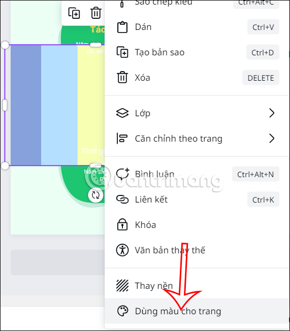
Right-click the palette image and choose Apply colors to page or the similarly worded Use colors for page option shown in your version of Canva. The editor will map colors detected in the image to compatible page elements.
The page should now use the new palette. If the arrangement is not right, use the same command again when Canva offers another color combination, or undo the change and try a different palette.
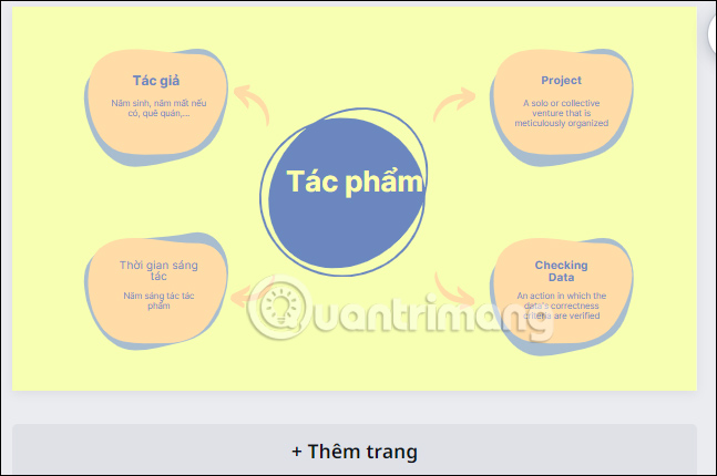
Review the recolored design
Automatic color mapping may treat backgrounds, text, icons, and decorative shapes differently than you expect. Before downloading the design, check these points:
- Text contrast: body text and buttons must remain easy to read against their backgrounds.
- Visual hierarchy: reserve the strongest accent color for elements that need attention.
- Brand consistency: replace any automatically chosen shade that falls outside the required palette.
- Photos and illustrations: make sure the new colors still work with imagery that was not recolored.
- Every page: repeat the review across a multipage design instead of assuming one page represents the whole document.
Remove the palette reference image if it is not part of the final layout, make any manual corrections, and download the finished design.

If Canva’s workflow does not suit the project, these Canva alternatives offer other approaches to templates, brand colors, and design editing.
Related Articles
 How Do I Convert Between Different Design Formats in Canva: Explained4 minutes read
 5 Steps to Design a Free Logo on Canva3 minutes read
 How to Design iPhone Logos and Cards with Canva7 minutes read
 Design Infographics in Canva AI from Data4 minutes read
 Guide to Creating 3D Designs Using AI in Canva4 minutes read
 How to Create Leaflets Using Canva9 minutes read
Reader Comments 0
Sign in with email or Google to join the discussion.