Table of Contents
Canva AI can turn a structured brief into an infographic draft, but it should not be trusted to invent, calculate, or verify the data. Prepare the facts and their sources first, tell Canva how the information should be organized, and then review every number, label, chart, and citation in the editor.
1. Prepare the content before prompting Canva
Collect the exact text and data you want the infographic to communicate. Reduce the material to one main takeaway plus a small number of supporting points. For each statistic, keep its source, date, geographic scope, unit, and denominator.
A useful preparation table looks like this:
| Item | Value | Context | Source |
|---|---|---|---|
| Main takeaway | One sentence | Audience and purpose | Supporting documents |
| Statistic | Exact value and unit | Place, period, sample, denominator | Publisher, title, date, URL |
| Category or step | Short label | Required order or grouping | Course or project material |
Do not upload confidential or personal information unless the Canva account and organizational policy are approved for that data.
2. Give Canva AI a complete design brief
Open Canva AI from the available create or assistant interface and describe the intended output. Product labels can change, so look for the option that creates a design or draft from a prompt.
Create a vertical educational infographic for ninth-grade history students.

Topic: [exact topic]
Main takeaway: [one sentence]
Use only the facts and dates in the content below. Do not add statistics, quotations, people, or events.

Structure:
1. Short title
2. Timeline with five dated events
3. Three causes
4. Three consequences
5. Source note at the bottom

Style: high contrast, simple flat icons, two typefaces, restrained color palette, ample white space.
Accessibility: large body text, labels in addition to color, no text embedded inside decorative images.
Canvas: [A4 print / 1080 × 1920 screen].
Content and sources:
[paste the verified material]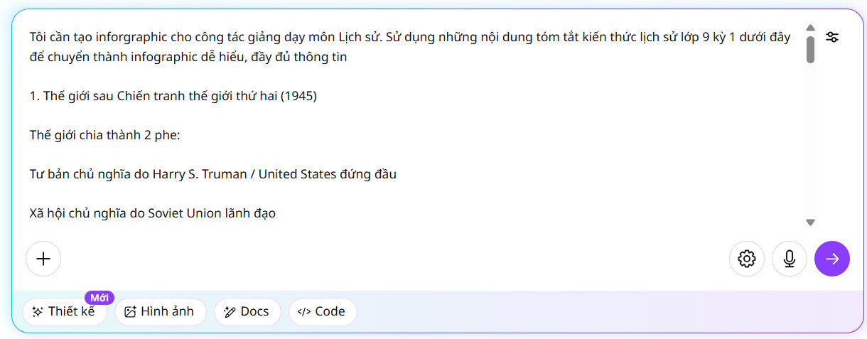
A separate chatbot is not required to write this prompt. If you use one to organize the brief, verify that it has not inserted facts, figures, or citations that were absent from your source material.

3. Evaluate the generated drafts
Canva may present several proposed designs or an option to add more. Select a draft based on information structure, not decorative appeal.
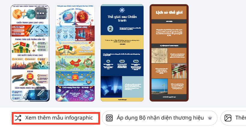
Before choosing, check:
- The main takeaway is visible without reading every detail.
- Sections follow a logical order.
- Numbers have units and labels.
- A chart type matches the data relationship.
- Text is not already too small at the intended output size.
- There is room for sources and accessibility adjustments.
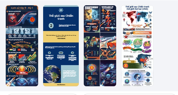
Reject a visually polished draft if it changes the data, turns categories into a false timeline, uses area or volume to exaggerate differences, or lacks space for essential context.
4. Open the draft in the Canva editor
Choose Use Canva editor or the equivalent option shown with the selected draft. This converts the generated result into a design you can inspect and edit.
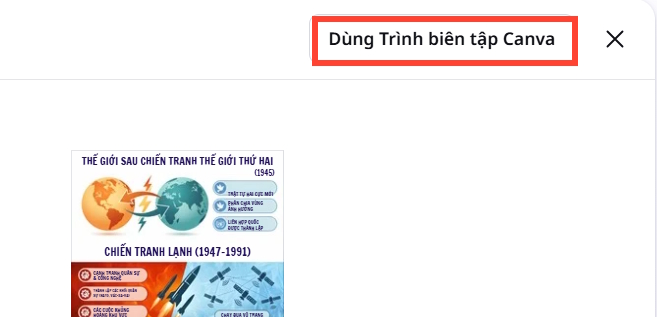
If some generated content is a single flattened image, you may not be able to edit each word or shape independently. Regenerate with a simpler brief or rebuild the affected section with Canva text boxes, charts, lines, and icons.
5. Replace generated text with verified copy
Compare the design line by line with your source table. Correct dates, spelling, units, names, headings, and citations. Shorten text without changing its meaning.
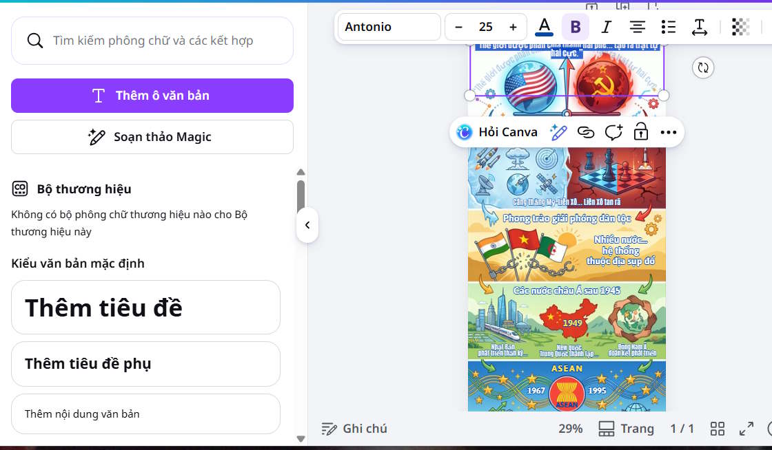
Use a clear hierarchy:
- One concise title.
- Short section headings.
- One idea per label or callout.
- Supporting detail in smaller—but still readable—text.
- A source area that remains legible after export.
6. Rebuild charts from the underlying numbers
Do not accept a chart merely because it resembles the values. Enter the verified data into Canva's chart tool and check the result.
- Use bars for comparing categories.
- Use a line for a genuine time series with evenly ordered dates.
- Use a pie or donut only for a few parts that add to a meaningful whole.
- Use a timeline for ordered events, not quantities.
- Show the axis, baseline, unit, sample, and time period needed to interpret the chart.
Avoid 3D effects, pictograms with misleading areas, truncated axes that exaggerate small changes, and unlabeled percentages. Recalculate totals independently when a graphic shows parts of a whole.
7. Improve readability and accessibility
Use high contrast and do not communicate categories through color alone. Add text labels, patterns, or distinct shapes. Keep body text large enough for the actual medium and leave white space between sections.
For digital publication, provide useful alternative text in the page or content-management system. The alt text should state the main takeaway and essential values rather than list every decorative element. If the infographic contains substantial information, publish an accessible text or table version alongside it.
8. Review Canva AI examples critically



Use these drafts for layout ideas, then assess whether the reading order, type size, factual content, and visual encoding work for your own audience. Different data may require a different format even when the template looks attractive.
9. Add sources and usage information
Place short source references near the relevant chart or in a clearly labeled footer. Include enough information for a reader to find the original material: organization or author, title, date, and URL when appropriate.
Check the license for icons, photos, templates, and uploaded material. A Canva account may allow use of an element in a design without granting permission to resell the element by itself or reuse protected source material without authorization.
10. Export and test the final design
Use PDF Print for a physical handout when appropriate, or PNG/JPG for a digital image. Choose the target dimensions before final proofreading; resizing can change line breaks and spacing.
After export:
- Open the downloaded file rather than relying on the editor preview.
- View it at the size readers will actually see.
- Check that no text is cropped, blurred, or too small.
- Verify every number and source one final time.
- Print a test copy if the infographic will be distributed on paper.
- Confirm that the file size is reasonable for the website, email, or presentation.
Canva's official infographic maker page describes its templates, charts, collaboration, and AI-assisted tools. Feature availability can depend on the plan and account, so use the current editor as the source for exact controls.
Final quality checklist
- The infographic communicates one clear takeaway.
- All facts come from verified source material.
- Charts use the correct values, units, axes, and denominators.
- The reading order is obvious.
- Text remains readable at final size.
- Color is not the only way information is distinguished.
- Sources and licenses have been checked.
- An accessible text alternative is available for information-heavy graphics.
AI can accelerate the first layout, but the finished infographic depends on editorial judgment: correct data, honest visual comparisons, concise writing, and a design the intended reader can actually understand.
Related Articles
 5 Steps to Design a Free Logo on Canva3 minutes read
 Design Infographics on Gamma AI with Just Voice Commands3 minutes read
 Create Infographics on Lovart Extremely Quickly3 minutes read
 How to Create Infographics with AI Simply: Step-by-Step Guide7 minutes read
 How Do I Convert Between Different Design Formats in Canva: Explained4 minutes read
 How to Create Data Sheets in Canva3 minutes read
Reader Comments 0
Sign in with email or Google to join the discussion.