Table of Contents
On Windows
Key Takeaways About Analyze Trends in Excel
- On Windows Open the Excel document.
- Double click on the Excel document that stores the data.
- If you haven't entered the data you want to analyze into the table, open Excel and click Blank workbook to create a new document.
Key Details About Analyze Trends in Excel
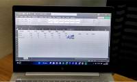
Open the Excel document. Double click on the Excel document that stores the data.
If you haven't entered the data you want to analyze into the table, open Excel and click Blank workbook to create a new document. You can import data and draw charts based on it.
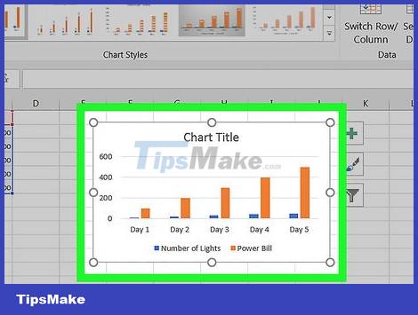
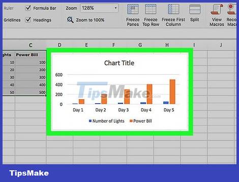
Select chart. Click on the chart type you want to use to create a trendline.
If you haven't already drawn a graph from the data, do so before continuing.
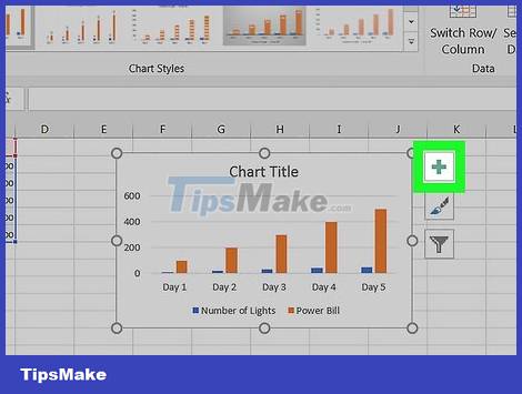
Click on + . This is the green button located in the upper right corner of the chart. The menu will appear.

Click the arrow to the right of the "Trendline" dialog box. Many times you have to drag your mouse to the far right corner of the "Trendline" dialog box to see the arrow appear. Click to return to the 2nd menu.
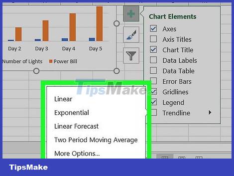
Select trendline. Depending on your needs, you can choose one of the following options:
Linear _
Exponential _
Linear Forecast
Two Period Moving Average
You can click More Options. to open the advanced options panel after selecting data to analyze.
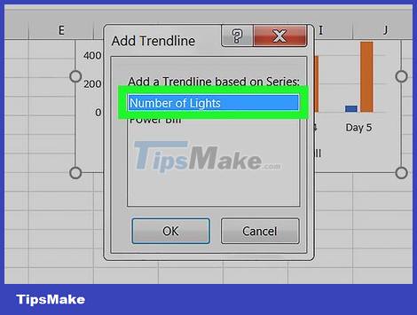
Select data to analyze. Click on the data series name (e.g. Series 1 ) in the window. If you have named the data, you can click on the data name.
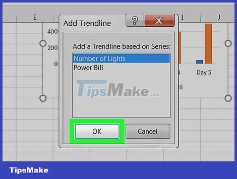
Click OK . This button is at the bottom of the pop-up window. This is the operation of adding a trend line to the chart.
If you click More Options. , you can name the trendline or change its direction to the right side of the window.

Save document. Press Ctrl+ Sto save changes. If you haven't saved the document before, you'll be asked to choose a save location and file name.
On Mac
Open the Excel document. Double click on the data store document.
If you haven't entered the document you want to analyze into the table, open Excel to create a new document. You can import a document and draw a chart based on it.
Select data in the chart. Click on the data series you want to analyze.
If you haven't already drawn a graph based on your data, draw one before continuing.
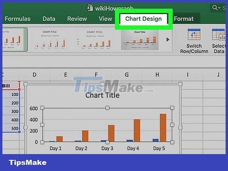
Click the Chart Design tab. This tab is at the top of the Excel window.
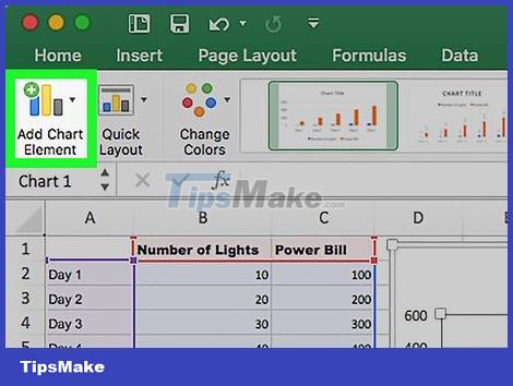
Click Add Chart Element . This option is on the far left side of the Chart Design toolbar . Click here to view the menu.
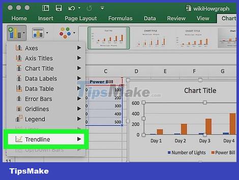
Select Trendline . The button is at the bottom of the menu. You will see a new window appear.
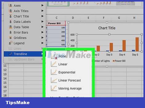
Select trendline options. Depending on your needs, you can choose one of the following types:
Linear
Exponential
Linear Forecast
Moving Average
You can click More Trendline Options to open the advanced options window (e.g. trendline name).

Save changes. Press the ⌘ Command+ key Save, or click File and then select Save . If you haven't saved the document before, you'll be asked to choose a location and file name.
Frequently Asked Questions
How do you Analyze Trends in Excel?
On Windows Open the Excel document.
What should you check before working with Analyze Trends in Excel?
Double click on the Excel document that stores the data.
What can you do if the first method does not work?
If you haven't entered the data you want to analyze into the table, open Excel and click Blank workbook to create a new document.
Was this article helpful?
Your feedback helps us improve.
Related Articles
 How to Visualize a Trend in an Excel Cell7 minutes read
 10 AI Tools for Excel: Formulas, Analysis and Charts11 minutes read
 5 Smartphone Trends That Should Be Eliminated7 minutes read
 Complete Tutorial of Excel 2016 (Part 5): Basics of Cells and Ranges11 minutes read
 Google Trends: Discover What the World Is Looking For?9 minutes read
 4 Most Anticipated AI Trends in 2025: Complete Guide5 minutes read
Reader Comments 0
Sign in with email or Google to join the discussion.