Gradient - color linear transformation in CSS
The gradient allows the creation of colored background elements, which are the transition effects between two or more specified colors.
Table of Contents
Gradient - the color of linear transformation in CSS allows the creation of colored elements in the background as the transition effects between two or more specified colors.

There are 2 types of CSS supported by CSS:
- Linear Gradient: Scans colors starting from one side, can be up, down, left, right, diagonal.
- Radial Gradient: Scanning colors comes from the mind.
Linear Gradient
To create a Linear Gradient, you need to define at least two stops of color . Color stops are the colors you want to display forwards.
You can specify additional directions (direction) or angle (angle) to start the transition effect. Some directions like:
- to top
- to bottom
- to bottom right
- to right
- to left
- .
Syntax Linear Gradient
background-image: linear-gradient(direction, color-stop1, color-stop2, .);
Parameters:
- direction: Direction to determine the starting point of the transition effect (to bottom, to top, to right, to left, to bottom right .)
- color-stop1, color-stop2 . : Color stops. A color stop includes a color value and an optional stop position (in percentages from 0% to 100% or along the gradient length).
For example
1. Linear Gradient - Top to Bottom (Default direction)
The following example shows a Linear Gradient starting from the top (top). Linear Gradient starts with purple and changes to pink:
 #grad {
  background-image: linear-gradient(purple, pink);
 }
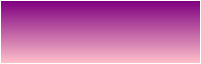
Linear Gradient - Top to Bottom
Note : Internet Explorer 9 and earlier versions do not support gradients.
2. Linear Gradient - Left to Right
The following example shows a Linear Gradient starting from the left. Linear Gradient starts with purple and changes to pink:
 #grad {
  background-image: linear-gradient(to right, purple, pink);
 }

Linear Gradient - Left to Right
3. Linear Gradient - Diagonal (Diagonal Direction)
You can create a diagonal gradient by defining both vertical and horizontal directions.
The following example shows a Linear Gradient starting from the top left (and going to the bottom right). Linear Gradient starts with purple and changes to pink:
 #grad {
  background-image: linear-gradient(to bottom right, purple, pink);
 }
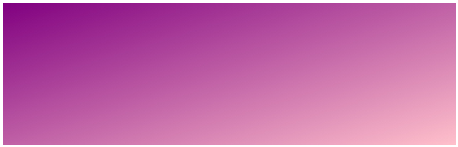
Linear Gradient - Diagonal
Use Angle (Angle)
You can choose another way to format the gradient that is to use an angle instead of defining the direction (to bottom, to top, to right, to left, to bottom right .) using the following syntax :
background-image: linear-gradient(angle, color-stop1, color-stop2);
Parameters:
- Angle: the angle determined by the horizontal line and gradient line going counterclockwise. In other words, 0deg will create bottom to top Gradient, 90deg will create left to right Gradient.
Example: Use angle in Linear Gradient
 #grad {
  background-image: linear-gradient(-90deg, purple, pink);
 }

Linear Gradient - Use Angle
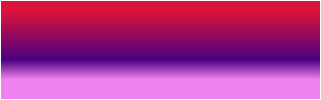
Use multiple color stops
The following example shows a Linear Gradient (from top to bottom) with multiple color stops:
3 stops of color are equally spaced
 #grad {
  background-image: linear-gradient(indigo, crimson, pink);
 }

7 stops color equally
 #grad {
  background-image: linear-gradient(crimson, lightsalmon, gold, seagreen,
 midnightblue, indigo, violet);
 }

3 color stops are not evenly spaced
 #grad {
  background-image: linear-gradient(crimson 10%, indigo 55%, violet 80%);
 }
Note: If you do not specify a% value after each color stop, the gradient is automatically spaced.
Full code:
Linear Gradients - Use multiple color stops
3 color stops are equally spaced:
7 color stops are equally spaced:
3 color stops are not evenly spaced
7 color stops are equally spaced from left to right
 #grad {
  background-image: linear-gradient(to right, crimson, lightsalmon, gold,
 seagreen, midnightblue, indigo, violet);
 }
Use Transparency
In addition to the above gradients, you can use transparency - transparency in CSS to create gradient gradation effects.
To add transparency to the color, you use RGBA Color as introduced in the color-intensive lesson to identify color stops. The last parameter in RGBA () specifies the opacity / transparency of the color, with a value between 0.0 and 1.0, the smaller the value, the more transparency.
For example: A background linear gradient starts with a completely transparent color and gradually changes to purple:
 #grad {
  background-image: linear-gradient(to right, rgba(88,37,123,0),
 rgba(88,37,123,1));
 }

Linear Gradient - Transparency
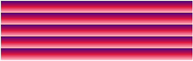
Repeat a Linear Gradient
The repeating-linear-gradient () function is used to repeat Linear Gradient.
 #grad {
  background-image: repeating-linear-gradient(indigo, crimson 10%, pink 20%);
 }
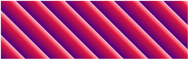
 #grad {
  background-image: repeating-linear-gradient(45deg, indigo, crimson 7%,
 pink 10%);
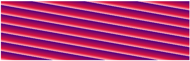
 #grad {
  background-image: repeating-linear-gradient(190deg, indigo, crimson 7%,
 pink 10%);
 #grad {
  background-image: repeating-linear-gradient(90deg, indigo, crimson 7%,
 pink 10%);
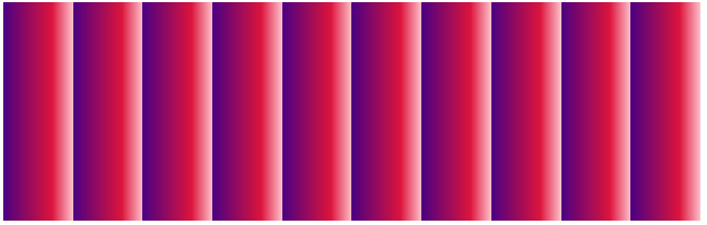
Full code:
Repeating Linear Gradient
Corner 45deg:
Angle 190deg:
90deg angle:
Radial Gradient
Radial Gradient creates a transition effect from the center of the element .
To create a Radial Gradient you must also specify at least two color stops.
Radial Gradient syntax
background-image: radial-gradient(shape-size-at position, start-color. last-color);
Parameters:
- shape: Determine the shape of the gradient. Possible values:
- ellipse (default)
- circle
- size: Determine the size of the gradient. Possible values:
- farthest-corner (default)
- closest-side
- closest-corner
- farthest-side
- position: Determine the position of the gradient, the default is from the center.
- start-color . last-color: Color stops. A color stop includes a color value and an optional stop position (in percentages from 0% to 100% or along the gradient length).
For example
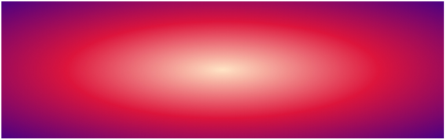
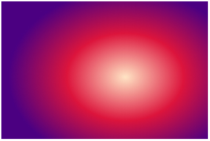
1. Stops colors equally
 #grad {
  background-image: radial-gradient(bisque, crimson, indigo);
 }
Radial Gradient - Stops colors equally
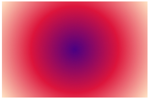
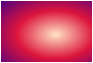
2. Color stops are not evenly spaced
 #grad {
  background-image: radial-gradient(bisque 5%, crimson 20%, indigo 65%);
 }

Radial Gradient - Color stops are not evenly spaced
Shape parameter value
The shape parameter is used to determine the shape of the gradient , which can be either a circle value or an ellipse.
For example, a gradient originating from the center with a shape is a circle:
 #grad {
  background-image: radial-gradient(circle, bisque, crimson, indigo);
 }
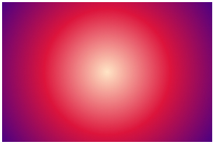
Radial Gradient - Shape
Size parameter value
The size parameter determines the size of the gradient. Possible values:
- farthest-corner (default)
- closest-side
- closest-corner
- farthest-side
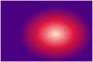
closest-side:
 #grad1 {
 background-image: radial-gradient
 (closest-side at 60% 55%, bisque,
 crimson, indigo);
 }
farthest-side:
 #grad2 {
 background-image: radial-gradient
 (farthest-side at 60% 55%, bisque,
 crimson, indigo);
 }

closest-corner:
 #grad3 {
 background-image: radial-gradient
 (closest-corner at 60% 55%, bisque,
 crimson, indigo);
 }
farthest-corner (default):
 #grad4 {
 background-image: radial-gradient
 (farthest-corner at 60% 55%, bisque,
 crimson,indigo);
 }
Full code:
Radial Gradient - Use the size parameter
closest-side:
farthest-side:
closest-corner:
farthest-corner (default):
Repeat a Radial Gradient
The repeating-radial-gradient () function is used to repeat the Radial Gradient.
 #grad {
  background-image: repeating-radial-gradient(bisque, crimson 10%, indigo 15%);
 }
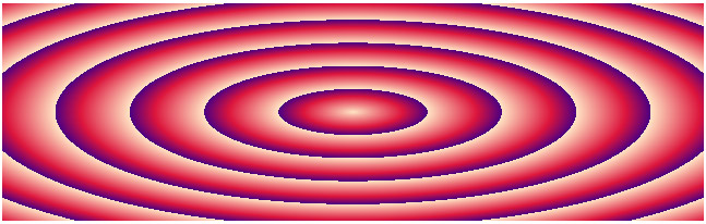
Repeat a Radial Gradient
Previous lesson: Deep understanding of Color in CSS
Next lesson: Shadow effect in CSS
Was this article helpful?
Your feedback helps us improve.
Related Articles
 How to Create a Gradient in Photoshop9 minutes read
 Instructions for using the gradient tool in Photoshop4 minutes read
 It is possible to change the gradient color frame of chat in the Facebook Messenger application on all devices2 minutes read
 Canvas element in HTML54 minutes read
 Synthesize the most beautiful CSS Background Gradient template6 minutes read
 Coloring gradients in Photoshop - Guidelines for using gradients in Photoshop6 minutes read
Reader Comments 0
Sign in with email or Google to join the discussion.