The terminology of color, wheel color and skill used to color
Have you ever wondered how designers can find the perfect color combination? In this article, Quantrimang will work with you to learn useful terms about colors. Invites you to read the track
Color affects a lot of our minds. It can change the way we feel about an object within seconds. In this article, Quantrimang will work with you to learn useful terms that make mastering colors easier.
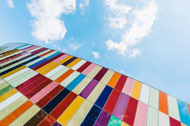
Color theory and color wheel
Have you ever wondered how designers can find the perfect color combination? Simply because of Color theory. Color theory is a realistic combination of art and science, used to determine which colors look good together.
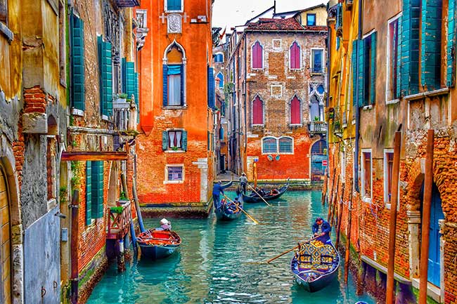
Wherever there is light, the place has color. We often think that colors stand alone. The color we often see alone is always affected by the surrounding colors. Rather, it is a combination of surrounding elements.
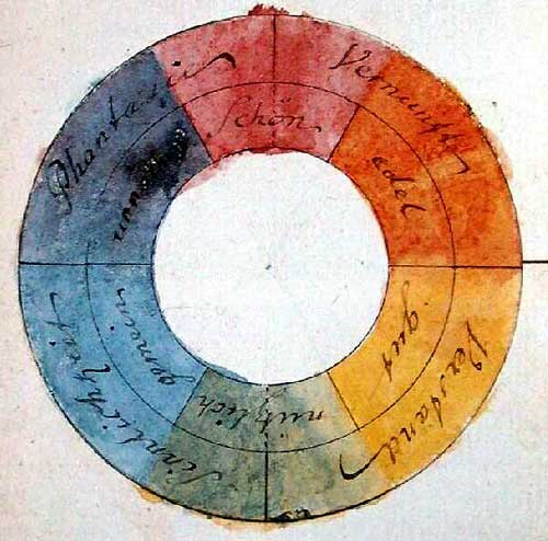
Color Wheel was invented in 1666 by Isaac Newton. He mapped the color spectrum to a circle, creating the most used color reference tool in design. The color wheel is the basis of color theory, because it shows the most obvious relationship between colors.
The colors combine with each other to look very beautiful, giving the viewer a balance, easy to call it Color harmony (Color harmony) . And the color wheel itself is a tool for designers to create harmony by using dithering rules . However, note that the color wheel is just a color reference tool, not a color picker.
There are two types of colored wheels:
- RYB (Red - Yellow - Blue, Red - Yellow - Blue) wheels are often used by many artists in the field of painting.
- RGB (Red - Green - Blue, Red - Green - Blue) color wheel : most used in color display in cathode ray tubes, liquid crystal displays or plasma screens, for example like a computer screen or a television.
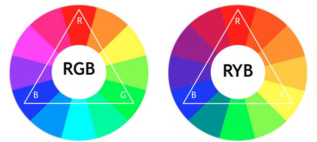
The colors make up the color wheel
There are 12 main colors on the color wheel , divided into three levels: main color (first color), silver color, tertiary color . Primary colors cannot be created by mixing other colors. Secondary color is the result of combining two main colors. The tertiary color is obtained by mixing the second color band.
Primary color (primary color - first grade color)
RYB color wheels , the three main colors include Red, Yellow and Blue.
RYB Red (Red) Yellow (Yellow) Blue (Blue)- According to color theory, mixing three basic colors together in different proportions will create all the remaining colors.If mixed with the same ratio will be black .
The color wheel is RGB , the three main colors include Red, Green and Blue.
RGB Red (Red) Green (Green) Blue (Blue)- According to color theory, mixing three basic colors together in different proportions will create all the remaining colors.If mixed with the same ratio will give white (light).
Secondary color
Secondary color is the result of mixing two basic colors together.
RYB color wheels have three quadratic colors including Purple, Orange and Green.
Red (Red) + Yellow (Yellow) = Orange (Orange) Yellow (Yellow) + Blue (Blue) = Green (Green) Blue (Blue) + Red (Red) = Purple (Purple)The RGB color wheel has three quadratic colors including Blue, Dark Pink and Yellow.
Red (Red) + Green (Green) = Yellow (Yellow) Green (Green) + Blue (Blue) = Blue (Cyan) Blue (Blue) + Red (Red) = Dark Pink (Magenta)Tertiary color
The third color is the color created by combining the primary colors with the second color.
RYB color wheels with six tertiary colors include:
Red (Red) + Orange (Orange) = Orange (Vermillion) Orange (Orange) + Yellow (Yellow) = Orange Yellow (Amber) Yellow (Yellow) + Green (Green) = Chartreuse Green (Green ) Green) + Blue (Blue) = Blue (Teal) Blue (Blue) + Purple (Purple) = Green purple Purple (Purple) + Red (Red) = Purple red (Magenta)Six- color RGB color wheel includes:
Red (Red) + Yellow (Yellow) = Orange (Orange) Yellow (Yellow) + Green (Green) = Banana green (Chartreuse) Green (Green) + Blue (Cyan) = Green (Spring green) Green Cauliflower (Cyan) + Blue (Blue) = Blue (Azure) Blue (Blue) + Dark Pink (Magenta) = Purple Violet (Violet) Dark Pink (Magenta) + Red (Red) = Pink Rose (Rose)RYB and RGB color codes
12 main colors of RYB:
RED# FF0000
(255,0,0)
# FF8000
(255,128,0) YELLOW
# FFFF00
(255,255,0)
# 80FF00
(128,255,0) GREEN
# 00FF00
(0.255,0)
# 00FF80
(0.255,128) CYAN
# 00FFFF
(0,255,255)
# 0080FF
(0,128,255) BLUE
# 0000FF
(0,0,255)
# 8000FF
(128,0,255) MAGENTA
# FF00FF
(255,0,255)
# FF0080
(255,0,128)
12 main colors of RGB:
RED# FE2712 RO
# FC600A ORANGE
# FB9902 YO
# FCCC1A YELLOW
# FEFE33 YG
# B2D732 GREEN
# 66B032 BG
# 347C98 BLUE
# 0247FE BP
# 4424D6 PURPLE
# 8601AF RP
# C21460
Color combination (Color combination)
Complementary color scheme (Complementary)
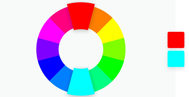
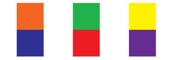
This is the most common color combination, using two opposite colors on the color wheel. These colors look naturally beautiful when walking together because of the strong impact on the viewer because of the high contrast, together they will look brighter and more prominent. However, avoid using the same color ratio, you should choose a predominant color and the remaining color for smaller accompanying details to help prevent roughness.

Monochromatic color scheme (Monochromatic)
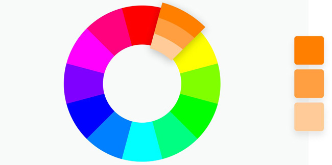
Monochromatic color scheme means that you will get a favorite color and use tint, shade, tone variations (explained in the content below) to create subtle, full-color works Different dark colors, forming a long monochromatic color .
Monochromatic color scheme is both minimalist and high value for the work. This color scheme is very eye-catching and pleasant to the viewer, bringing a high level of focus, the viewer is not distracted but only focuses on the important content.

This is a combination of flexible colors, easy to apply for design projects to decorate houses, small apartments . help the space become more bright and spacious. For a large space, monochromatic increases the expanse of that space.
Analogous color schemes (Analogous)
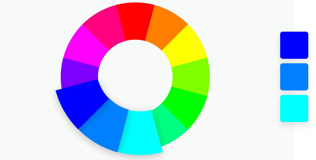
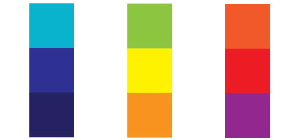
The same color is a group of three colors standing side by side in the wheel of color (regardless of heat - cold), standing close to each other looks quite similar to create very elegant and attractive color schemes.
Combining similar colors in a variety of colors than a monochromatic color scheme. However, if you leave the colors with equal proportions, they are easy to overwhelm, looking a little confused. The best way to balance is to choose a dominant color and use the remaining colors as a highlight.

Triadic triadic (Triadic)
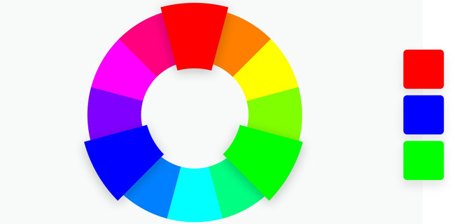
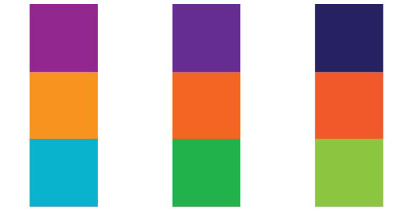
This color scheme uses three equally spaced colors on the color wheel to create a color band with high contrast, but less than the complementary color scheme. This combination creates rich, vibrant color bands.
Three colors are located at three different angles on the color wheel, so they combine and complement each other to create a balance for this color scheme. However, it is also because of this balance, although there are three colors used, but sometimes you will still see this combination is quite monotonous, safe and lack of creativity.

Four color schemes (Tetradic)
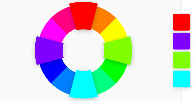
This color scheme uses four equally spaced colors on the color wheel. However, you must be careful not to use all four colors at the same level as it will create chaos. The more colors in your palette, the harder it is to balance.
The four color scheme works best when you choose a dominant color and use the remaining colors as highlights.

Hot and cold colors
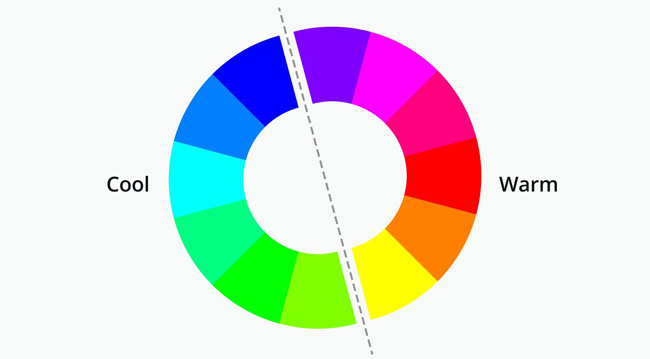
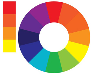
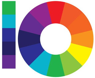
The color wheel is divided into hot and cold colored areas. Color combinations using color wheels will often balance between hot and cold colors. According to color psychology, color "temperature" will evoke different feelings when we look at a design. For example, warm colors will give viewers a sense of comfort and energy, while dark colors give a sense of tranquility and tranquility.
Hot colors range from Red to Yellow. The vibrant colors in this range are like the sun, used when you want to draw attention. Hot colors have a strong effect, affecting the space around it.
Cold colors are between Green and Purple. These colors bring a cool, gentle mind.
Tint, Shade and Tone
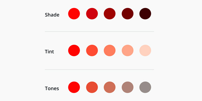
Tint is the color created after adding white to the original color to increase the brightness of the color. Tint helps reduce the "intensity" of color, which is quite useful in balancing colors when mixing colors.
Shade is the color created after adding black to the original color to reduce the brightness and increase the darkness of the color. Shade creates deeper and more diverse colors. Shade to impress and can overwhelm other colors.
Tone is the color created after adding gray to fade the original color. Tone is a more refined version of the original color.
Properties of colors
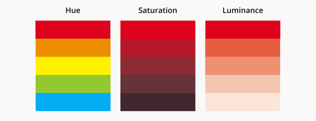
Hue - Tone
Hue is a combination of 12 different colors on the color wheel. Hue is the element used to transform into the aforementioned Tint, Shade, Tone by adding black, white, and gray colors to the original tones.
Saturation - Saturation
Saturation is not created when you mix Hue with other colors but simply the way colors are displayed under different lighting conditions. Saturation helps depict dark or light colors according to different light-intensity intensity. This value is also known as color intensity.
Luminance - Brightness
Luminance is the brightness or darkness of a certain color, changing the brightness of colors by dragging their Luminance to the right or left.
Color is the essence of humanity. Learn how to use colors effectively in your work and life, the results will really make you satisfied.


 How to Draw a Circle in Gimp
  How to play Among Us in color blind mode
  Create Button in CSS
  How to add color coded terminal code to Microsoft Word
  How to create and use custom gradients in Google Slides
  How to change the Facebook background color