2D Transform in CSS
Transform in CSS are properties used to transform the original elements, allowing us to change position, shape or rotate elements in dimensions.
Table of Contents
Transform in CSS are attributes used to "transform" the original elements, allowing us to change position, shape or rotate elements in dimensions.
There are two common types: 2D and 3D transformation.
( Transformation is a generic method of changing the shape, size and position of an element).
In this article, TipsMake.com will work with you to learn about 2D Transform, values and usage as well as the most specific examples for you to easily visualize.
What is 2D Transform?
2D Transform are properties used to handle 2D moving effects.
The syntax for creating transforms is as follows:
transform: value;
The commonly used values are translate (), rotate (), scale (), skewX (), skewY (), matrix (). As follows:
Value Description translate (x, y) Move element by x-axis and y-axis translateX (n) Move element by x-axis translateY (n) Move element by y-scale axis (x, y) Change width and height of the scaleX element (n) Change the width of the scaleY element (n) Change the height of the element rotate (angle) Rotate the element in an angle (skew) skew (x-angle, y -angle) Format element tilted by an angle skewX (angle) Element format tilted by an angle x axis x skewY (angle) The element format is tilted by an angle along the y matrix axis (n, n, n, n, n , n) Combine scale, skew and translateTransform translate ()
Translate () moves an element from its current position to the given parameters in the X axis and Y axis. X is translated horizontally and Y is vertically translated.
Example : Move element
to 100 pixels right, back down to less than 50 pixels from the current position
 div {
  -ms-transform: translate(100px,50px); /* IE 9 */
  -webkit-transform: translate(100px,50px); /* Safari */
  transform: translate(100px,50px);
 }
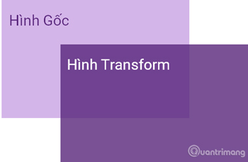
Original image:

(* The examples in the article are all transformed from this image)
Image has been moved:

Website TipsMake.com
Đang chuyển đổi chuyển đổi ()

Rotate () in Transform CSS used to rotate an element clockwise or counterclockwise at a certain angle, the unit used is degree (deg). The positive angle rotates in a clockwise direction, and the angle is negative.
Example : Rotate element
clockwise 20 deg:
 div {
  -ms-transform: rotate(20deg); /* IE 9 */
  -webkit-transform: rotate(20deg); /* Safari */
  transform: rotate(20deg);
 }

Full code:
Website TipsMake.com
Website TipsMake.com
Transform scale ()

Scale () used to change the width and height of the element. Understand simply that you can zoom the element up or down arbitrarily, with x being the horizontal zoom and y being the vertical zoom. Scale has no units that are scaled to the root element, for example, 1 is left intact and doubled, 3 is 3 .
Example: Increase element
Twice the width and three times its original height
 div {
  -ms-transform: scale(1.5,2); /* IE 9 */
  -webkit-transform: scale(1.5,2); /* Safari */
  transform: scale(1.5,2);
 }

Full code:
Website TipsMake.com
Website TipsMake.com
Transform skewX ()
SkewX () tilts an element along the X axis with the transmission angle.
Example: Tilt element
30 degrees on the X axis:
 div {
  -ms-transform: skewX(30deg); /* IE 9 */
  -webkit-transform: skewX(30deg); /* Safari */
  transform: skewX(30deg);
 }
skewX (30deg)
 skewX (-30deg)

Transform skewY ()
SkewY () tilts an element along the Y axis with the transmission angle.
Example: Tilt element
30 degrees on the Y axis:
 div {
  -ms-transform: skewY(30deg); /* IE 9 */
  -webkit-transform: skewY(30deg); /* Safari */
  transform: skewY(30deg);
 }
skewY (30deg)
 skewY (-30deg)

Transform skew ()
Skew () is a combination of both skewX and skewY, tilting an element by both the X and Y axes with the input angle.
Example: Tilt element
30 degrees on the X axis and 10 degrees on the Y axis.
 div {
  -ms-transform: skew(30deg, 10deg); /* IE 9 */
  -webkit-transform: skew(30deg, 10deg); /* Safari */
  transform: skew(30deg, 10deg);
 }

Full code:
Website TipsMake.com
If the second parameter in skew () is not specified, the program will automatically understand that number is x and y will have a value of 0. So the following example will tilt the element
 div {
  -ms-transform: skew(20deg); /* IE 9 */
  -webkit-transform: skew(20deg); /* Safari */
  transform: skew(20deg);
 }
Transform matrix ()

Matrix () is a combination of all methods 2D Transform, synthesis of scale, skew and translate. Matrix () has six parameters, containing functions that allow you to rotate, zoom and move elements.
Syntax of matrix:
matrix(scaleX(),skewY(),skewX(),scaleY(),translateX(),translateY())
For example:
 div {
 -ms-transform: matrix(1, -0.3, 0, 1, 0, 0); /* IE 9 */
 -webkit-transform: matrix(1, -0.3, 0, 1, 0, 0); /* Safari */
 transform: matrix(1, -0.3, 0, 1, 0, 0);
 }
Previous lesson: Using Web Font in CSS
Next lesson: 3D Transform in CSS
Was this article helpful?
Your feedback helps us improve.
Related Articles
 3D Transform in CSS3 minutes read
 Appears a free game that allows you to practice being a hacker2 minutes read
 How to transform into a superhero in Avengers: EndGame3 minutes read
 Transform experiment images into visual experiments in Canva.3 minutes read
 Transform lesson content into catchy songs using Gemini.3 minutes read
 Pictory AI - Transform text into engaging videos in minutes6 minutes read
Reader Comments 0
Sign in with email or Google to join the discussion.