3D Transform in CSS
3D Transform are attributes used to process 3D moving effects for elements in 3 axes: x, y and z.
Table of Contents
Transform in CSS are attributes used to "transform" the original elements, allowing us to change position, shape or rotate elements in dimensions.
There are two common types: 2D and 3D transformation.
(Transformation is a generic method of changing the shape, size and position of an element).
In this article, TipsMake.com will work with you to learn about 3D Transform, values, usage as well as the most specific examples for you to easily imagine.
What is 3D Transform?
3D Transform are attributes used to process 3D moving effects for elements in 3 axes: x, y and z.
 Some examples of 3D transform
The syntax for creating transforms is as follows:
transform: value;
The values commonly used with 3D transform are:
- rotateX ()
- rotateY ()
- rotateZ ()
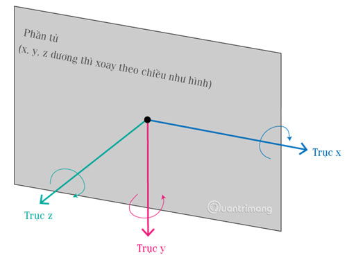
Transform rotateX ()

RotateX () is used to rotate the element around the X axis at a certain angle.
 #myDiv {
  -webkit-transform: rotateX(150deg); /* Safari */
  transform: rotateX(150deg);
 }
Original image:

(* The examples in the article are all transformed from this image)
Figure Transform
The usual div element.
Website TipsMake.com
The div element is rotateX 150deg.
>
Website TipsMake.com
Transform rotateY ()

RotateY () is used to rotate the element around the Y axis at a specified angle.
 #myDiv {
  -webkit-transform: rotateY(130deg); /* Safari */
  transform: rotateY(130deg);
 }

The usual div element.
Website TipsMake.com
The div element is rotateY 150deg.
Website TipsMake.com
Transform rotateZ ()

RotateZ () is used to rotate the element around the Z axis at a certain angle.
 #myDiv {
  -webkit-transform: rotateZ(90deg); /* Safari */
  transform: rotateZ(90deg);
 }

The usual div element.
Website TipsMake.com
The div element is rotateZ 150deg.
Website TipsMake.com
To use this attribute fluently, you must practice a lot and capture the coordinates for easy navigation. With transform, you can completely create an interface with many 2D and 3D shapes, making the website more lively and professional. TipsMake.com will explore this issue further in the following lessons. Have you remembered to it!
Previous lesson: 2D Transform in CSS
Next lesson: Transition transition effect in CSS
Was this article helpful?
Your feedback helps us improve.
Related Articles
 2D Transform in CSS6 minutes read
 Appears a free game that allows you to practice being a hacker2 minutes read
 How to transform into a superhero in Avengers: EndGame3 minutes read
 Transform experiment images into visual experiments in Canva.3 minutes read
 Transform lesson content into catchy songs using Gemini.3 minutes read
 Pictory AI - Transform text into engaging videos in minutes6 minutes read
Reader Comments 0
Sign in with email or Google to join the discussion.